Fortnum & Mason Lighting London, Royal Exchange Shop, Retail Architecture Photos
Fortnum & Mason London Lighting
The Royal Exchange Store Information design by Jestico + Whiles Architects
15 + 14 Feb 2019
Fortnum & Mason London Store Lighting News
Speirs + Major light Fortnum & Mason at The Royal Exchange, London
Location: Royal Exchange Building, central London, EC3V 3LR
Phone: +44 20 7734 8040
Lighting Design: Speirs + Major
The Lighting of Fortnum & Mason, The Royal Exchange, London
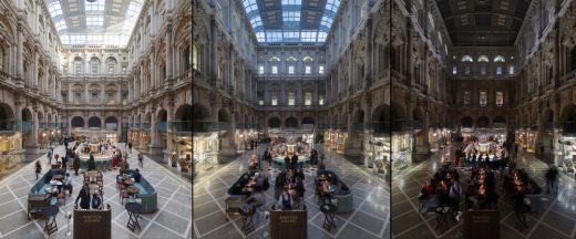
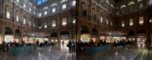
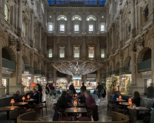
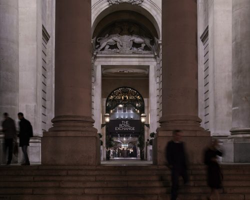
Iconic British brand Fortnum & Mason have recently opened a new bar/restaurant and retail outlet within the neo-classical setting of the Royal Exchange Building in London.
Photos by James Newton
14th February 2019 – The lighting design by Speirs + Major is beautifully complementary, characterised by rigorously considered details and collaborative integration. The resulting warmth and ambience supports a luxurious dining and shopping experience.
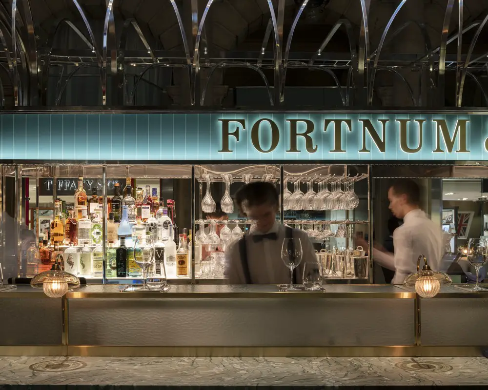
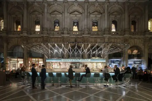
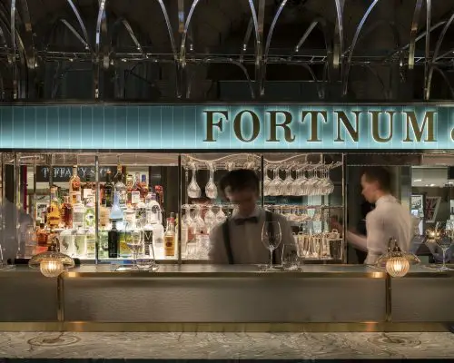
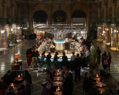
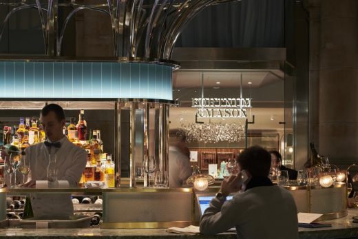
At the centre of the atrium, the new bar shimmers like an art-deco cocktail cabinet, exuding welcome. Food, drinks and faces appear vibrant and appealing. Through exceptional attention to detail, we have used light to enhance the structure, delivering ambience and functionality, all the while remaining unobtrusive.
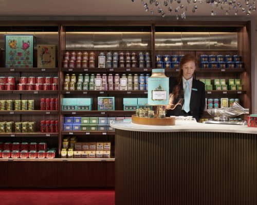
For the retail outlet, we built on the strategy Speirs + Major created for Fortnum & Mason’s central Piccadilly store. The focus is on creating high levels of contrast to draw attention to the vibrant merchandise, providing maximum flexibility, and an injection of visual interest with animated light for after dark.
Following an in-depth study of the diurnal and seasonal lit conditions, the design for each element of the bar evolved collaboratively with the client and key design partners.
The varied material palette and eau de nil colour are key to the Fortnum & Mason aesthetic. Extensive testing and mock-ups revealed that to bring out the best in each aspect of the bar, the colour temperature of the light would need to be tuned to suit each element.
Colour temperatures range from a cooler neutral 4000K for the steel canopy to 3500K which was found to be the best tonal match for the ‘eau de nil’ branding and the under bar cladding.
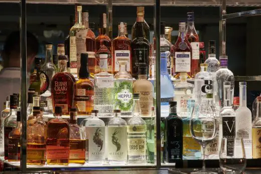
A warmly domestic 2700K lights the bar counter and bottle displays. Even the internal fridge lighting is considered – with a dedicated salmon fridge lit to 2400K to reveal the warm tones in the fish.
Arguably the most striking element in the tableau is the glittering twisted steel canopy that references the balustrading in the flagship Fortnum & Mason Piccadilly store.
Keith Bradshaw, Speirs + Major Principal elaborates:
“To create the sparkle, we worked with the client and UDS to extensively test various approaches to light ing the canopy profile. Through this process, we made some suggestions for modifications that would improve the effect of light without unduly impacting t he appearance of the structure. Slightly rounded corners on the profile section created a more consistent reflective effect as you move around the structure, while a brushed – satin effect on the less visible inner surface is better able to catch the light, creating an impression of a glowing core.
Aside from consciously decorative lighting fixtures, the light sources are designed to be as inconspicuous as possible.
Bradshaw explains:
“We worked closely with the fabricators of the brand signage element that wraps around the bar. Our concept was for this to have a soft, even glow. Through mock – ups, we were able to resolve the detail of the linear light strips such that the light source is never visible – either in actuality or by reflection. ”
Bradshaw continues:
”We were also able to achieve the required levels of functional light on the bar counter while maintaining the impression that the light is coming from the warm decorative custom fitting selected by UDS. By integrating tiny downlights into the steel canopy, we subtly boosted light levels on the bar while adding a little extra sparkle in the canopy.”
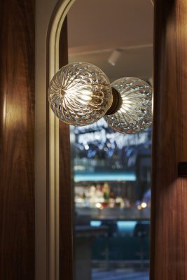
Customised low-level art-deco style lights create an intimate atmosphere at the banquette seating that surrounds the bar. These fixtures offer diners the choice of three levels of intensity, depending on personal preference.
The lighting design for the retail outlet builds on the strategy that Speirs + Major created for the central Piccadilly store. The focus is on creating high levels of contrast to draw attention to the vibrant merchandise, providing maximum flexibility, and an injection of visual interest for after dark.
Keith Bradshaw:
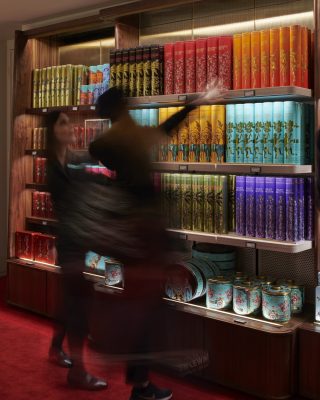
“For the loose furniture and gondolas, we employed simple track mounted lighting, carefully positioned and focused. We were particularly attentive to the back wall of the store, as this forms the major sightl ine looking in from outside. It was key for us to integrate light into the shelving system on this wall, but equally, we needed to provide Fortnum & Mason with enough flexibility to be able to adapt the shelving to suit changing displays.
To solve this, we developed a new electrified system with moveable shelves in collaboration with Unibox. Uniquely the shelf lighting is also dimmable offering another level of flexibility in shaping the lit impression of the space.“
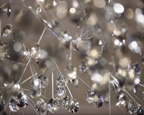
A further key feature is the chandeliers that hang over the service areas. Designed by UDS, these are made of clusters of nickel-plated ‘teaspoons’.
Light shines through these chandeliers, generating sparkle and adding texture on the floor. After dark, these lights are programmed to move gently, providing a subtle level of animation that intrigues potential customers dining in the bar/restaurant area outside.
Client: Fortnum & Mason
Architect: Universal Design Studio (UDS)
Lighting Design: Speirs + Major
Photography © James Newton & Speirs + Major
Facade to Piccadilly store:
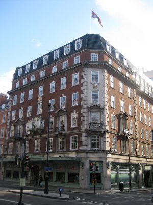
photo © Adrian Welch
Address: 181 Piccadilly, London W1A 1ER
Phone: 0845 300 1707
Opening Hours: 10:00 am – 8:00 pm (check with operator)
3 Mar 2009
Fortnum & Mason store
Fortnum & Mason store refurbishment, 181 Piccadilly, central London
Date built: 2007
Design: Jestico + Whiles
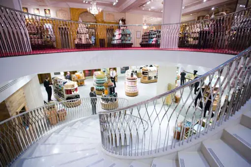
Fortnum & Mason shop picture from Jestico + Whiles architects
Fortnum & Mason images / information from Jestico + Whiles
Fortnum & Mason architects : Jestico + Whiles
Main Store Location: Fortnum & Mason, 181 Piccadilly, London, UK
Contact Fortnum & Mason: 0845 602 5694
Phone: +44 20 7734 8040
Address: The Courtyard, The Royal Exchange, City of London, EC3V 3LR, England, UK
London Building Designs
Contemporary London Architectural Designs
London Shop Buildings – key retail design in the British capital
Hermès London Store, Mayfair, west London
Harrods Store, Knightsbridge, south west London
Peter Jones Store, Chelsea, south west London
London Architecture Links – chronological list
London Architecture Walking Tours – bespoke UK capital city walks by e-architect
Design: Kohn Pederson Fox – KPF
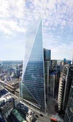
image courtesy of the architects
The Scalpel City of London Skyscraper
Hilton Hotel Canary Wharf London also by Jestico + Whiles architects
Hilton Hotel London also by Jestico + Whiles architects
Comments / photos for Fortnum & Mason London Lighting, Royal Exchange Store page welcome

