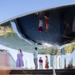
Orthogonal Architecture Article, Right angled building project design, International property style architects
Orthogonal Architecture : Right Angles
Architecture Discussion by Professor Richard Weston
post updated 14 February 2024
Orthogonal Architecture
8 March 2011
A year or two ago I heard an interview with Zaha Hadid about her Aquatics Centre for the London Olympics in which she observed that ‘there’s nothing special about the right-angle’. Tell that to Mondrian, I thought! I bet even Ms Hadid sleeps on a horizontal bed and walks in a vertical posture – her load centred under the influence of gravity unless a strong wind demands otherwise.
Sometimes, of course, structural or other requirements do demand otherwise – as in Nikolaus Pevsner’s notorious misunderstanding of Antoni Gaudí’s Sagrada Familia. In Pioneers of Modern Design he criticized the inclined columns as irrational, clearly unaware of Gaudí’s admirably simple explanation of the rationale behind his brilliant elimination of the ‘crutches’ of buttresses deployed in medieval Gothic: ‘my columns lean for the same reason that I place my walking stick at an angle if I wish to lean on it for support.’
The same structural logic does not, however, inform the redundant leaning ‘column’ beneath Maire Gullichsen’s studio in Alvar Aalto’s Villa Mairea. Aalto was persuaded to remove it by his engineer only to replace it at Maire’s insistence, who thought the design looked much more ‘natural’ with the leaning non-column. She was right, and we can now ‘read’ the paired vertical and leaning columns as a metaphoric evocation of a twin-stemmed birch tree on the edge of the ‘pine forest’ of the living space within. I remain a sufficiently unreconstructed modernist to worry about the structural ‘deception’ involved.
For most of architecture’s long history, the right angle has been, so to speak, its default setting. The reasons are various: practical, structural, symbolic, empathetic – and, for the last few centuries, a consequence of drawings boards and T- and set-squares. All that, of course, has changed with the arrival of CAD systems, computer-aided manufacturing and numerical techniques for analyzing complex three-dimensional structural forms.
V&A Exhibition Road Project Designs
Shortlisted Architects’ News
picture © Amanda Levete Architects
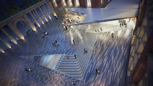
These thoughts were prompted by the shortlisted designs for the V&A’s Boilerhouse Yard – site of Daniel Libeskind’s ambitious, ill-fated and determinedly anti-orthogonal ‘Spiral’ extension. As befits our economically straitened times the new brief calls for a far more modest underground gallery with public plaza above. Tony Fretton ’s proposal, not surprisingly, is of Miesian probity in its observance of traditional orthogonal norms, but all the other finalists opt for swirling angles, flowing curves or the unashamedly biomorphic.
In several we find versions of what seems to me one of the more exciting challenges to taken-for-granted orthogonality in recent architecture – the attempt to fuse separate floors into a continuous surface, seen here at its most elegant in Amanda Levete’s proposal. The doyen of this idea is, of course, the most consistently interesting architect at work today, Rem Koolhaas, and like many of his ideas its roots lie in Le Corbusier, in the Villa Savoye by Le Corbusier, ultimately, but more directly in the Firminy Church and Strasbourg Conference Centre project.
Metropol Parasol Building, Seville, Spain
J. MAYER H. Architects
photograph © Gonzalo Navarro
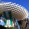
Pevsner, one imagines, would be deeply troubled by Jun Aoki’s biomorphic proposal (which looks surprisingly like something by old-style Future Systems), but he would surely be rendered apopleptic by the sight of J. MAYER H. Architects‘ ‘Metropol Parasol’ in Seville. I saw this project when the mushroom-shaped parasols were still heavily scaffolded and I am as much at a loss now as I was then to know what to make of this extraordinary conception.
In the flesh, or rather in the polyutherane-coated timber, it seemed gross and overblown in the deeply civilized context of Seville, and most of the budget appeared to have been spent on visual statement rather than useful space. We will doubtless be told that it is quintessentially Spanish in its Gaudí-esque exuberance, but Gaudí’s work lives on as testimony to his profound love of God and nature and this, I fear, is likely to be judged a last, overblown gasp of a credit-fuelled economy on the brink of collapse.
Sunset Chapel, Acapulco, Mexico
Bunker Arquitectura
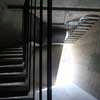
photo : Esteban Suárez
Although the curvilinear is the most widely favoured trope for designs supposedly emulating nature, a small mausoleum in Mexico by BNKR Arquitectura seeks to echo the granite outcrops of the surroundings, transforming gently curved surfaces into bold, faceted ones. Surmounting a huge granite boulder on the site necessitated raising the chapel several metres to capture the crucial view of the setting sun, and to me the result appears more like an improbably poised glacial erratic than something that has eroded in situ. Angular and rock-like it certainly is, with the unexpected result that the one thing that feels slightly out of place here is the necessarily right-angled cross.
Nanjing Youth Olympic Games, China
Populous
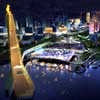
image © Populous
Judging by the Masterplan for the 2014 Youth Olympic Games in Nanjing, China, the irresistible rise of the East remains largely untouched by the economic problems afflicting the West. Designed by Populous, the architecture and design practice behind the London 2012 Olympic Stadium, it will be interesting to see if the extravagant and to my eyes optimistic ‘greening’ of the residential towers can be achieved. If not, the leaning columns and endlessly jiggled mullions will have to carry the burden of ‘naturalizing’ the economically stacked floorplates.
The history of efforts to ‘naturalize’ architecture since the onset of the Industrial Revolution has yet to be written, and central to them in my view is that bastion of the orthogonal, Mies van der Rohe. Building on Otto Wagner’s suggestion that fine natural materials would have to act as a substitute for the ‘close-up’ qualities traditionally given by craftsmanship, the rectangular planes of the Barcelona Pavilion luxuriated in the teeming patterns of exotic stones and shifting reflections of sky, water and vegetation.
The rebuilt version offers, judging by the photographs taken in 1929, a pale shadow of the original atmosphere – the patterns created by the book-matched veneers of the central onyx wall, for example, are far too geometric. Mies’s work has come to fascinate me because several years ago I was captivated by the patterns revealed by high-resolution scans of minerals. To my complete surprise one of these has just been used by Patel Taylor to create a three-storey façade for a house in Camden and many others are now on sale as scarves in Liberty – the story of their ‘discovery’ and development is covered in the series ‘Britain’s Next Big Thing’ which starts at 8.00pm on March 29 on BBC2.
Professor Richard Weston:

Richard Weston
Comments on this Orthogonal Architecture article by Professor Richard Weston are welcome.
Architectural Design
Contemporary Architecture – architectural selection below:
Architecture Context : article by Trevor Tucker. Sep 2010
Resisting Boredom : article by Joyce Hwang. Jan 2011
Architecture Narrative : article by Trevor Tucker. Aug 2010
Sustainable Architecture Design : article by Trevor Tucker. Aug 2009
Sustainable Buildings – Building Issues : article by Adrian Welch
Comments / photos for the Orthogonal Architecture – Article written by Professor Richard Weston page welcome.


