re-act now Architects, Bucharest architecture practice, Romania buildings design office
Re-Act Now, Bucharest Architects Studio
Contemporary Romanian Architecture Studio. Modern Southeast Europe design firm news + info.
post updated 25 January 2026
Latest Buildings by re-act now Bucharest Architects, Romania:
20 Sep 2019
Romanian buildings designed by re-act now
More Buildings by re-act now – Bucharest Architects office, Romania:
Buildings by Re-Act Now, Architects
28 Jun 2018
CRAZY_Undr Club, Constanta, Romania
Design: re-act now Architects
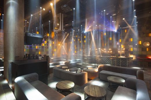
photo : Andrei Margulescu
CRAZY_Undr Club
28 Jun 2018
Funky Resto – Bar in Bucharest, 33A Dorobanti, Bucharest, Romania
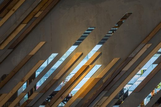
photo : Gabriela Enache
Funky Resto – Bar in Bucharest
+++
17 May 2017
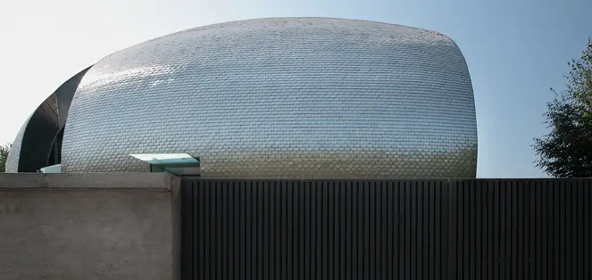
The Egg House, Baneasa, Bucharest, Romania
Also called The Egg Villa, the house would be more than a perfect dome, indifferent to the main natural landmark, the wood and to the cardinal points. It is closed towards the street, opening towards the main light source and providing insights of the forest and the key points of the house.
The concept starts from two primary volumes growing out of the land – one covered in stone ant the other one in wood – and sheltered by its protective dome, like a tehnologic umbrella.
The stairs, main compositional component, connects the two natural volumes as a tehnological binder in metal and glass. The illumination intercepts and stresses the volume, while the dome absorbs the shadows and their games.
Project team: Mario Kuibus, Anca Pop, Claudiu Bica
Structure design: Icipe 1 A
Installation design: Roinstar
Execution: Scorillo, Suki, Strial, Bel Profile
Area: 980 sqm
Year of completion: 2005
Photos: Andrei Margulescu
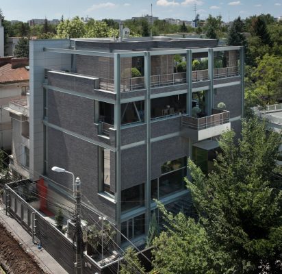
Sontu Residence, Bucharest, Romania
A positioning of the site in the most representative area of Bucharest. An intention of theme drawn on a 5 meters tall living with no interior columns, across the 180 square meters.
Another intention of theme drawn for orthogonal volumes. A story that has been identified: we “hang” the rooms on a wireframe type prism. A materiality in locative non-normality: black bricks & “I” profiles. An entrance in colours that reminds us of the importance of the windows for Gothic cathedrals. A house just like a nostalgic and technological hybrid. A house with a sublime panorama towards the Herastrau park.
Area: 1000 sqm
Year of completion: 2006
Photos: Andrei Margulescu
Casa Covaci, Bucharest, Romania
The building is located on Covaci street, in a historical area with architectural value from the old centre of Bucharest. It is one of the fortunate situations in attempting to revitalize the old centre, where the demands and the resources of the investor have coincided with the strategy adopted by the municipality regarding this problem.
The project supposes the refunctionalization of the space by developing a complex of public functions, so that the individual configuration and functioning of these on all
levels do not affect the quality of the exterior image.
By associating the name of the café from the first floor of the building, Grand Café Amsterdam, with the interior architecture, the furniture details and the large glasses towards the street, we are reminded of the atmosphere of Amsterdam.
The result of covering the interior court and integrating this court into the building, is a «functional passage» which facilitates the communication between the functions from the first three levels of the building, the club located in the basement, the café at the first floor, and the restaurant at the upper floor. The offices opened on two levels and with separate access from Sun street are located in the upper story.
For the architect, the closing of a work responding to the problems the city was confronting, as closely as possible to the initial vision of the project, is a positive experience, both for him and for the city.
Area: 1100sqm
Location: Constanta
Year of completion: 2010
Photos: Andrei Margulescu
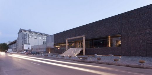
Restaurant and club in Constanta, Romania
The primary theme we received from the client was that of integrating the concept of an architectural object that would function as restaurant and club in the center of Constanta town on a plot neighbouring on one side the central park and on the other side an important transition street. Thus the object was supposed to become the “new place” in town. of course neither in our case the architectural object couldn’t dissociate itself from correctly analyzing, among others, the target of the two major functional spaces: the users.
The discussions with the beneficiary turned out the users are mostly the same for both functions but partly completely different. so since the plot on the other hand failed to impose additional constraints on the concept, we realized that the mark of the place is the mark of the moment, of the user, of his present and future spirit for cultural expectations… and we were the ones that had to begin imprinting this mark. The idea of a whole actually not being a whole but two entities to generate the whole decided our gesture and formal discourse that followed. We knew those two worlds meet but don’t want to know each other. It’s like someone would have a double personality and one doesn’t recognize the other while they both live in the same body.
The proposal of a “body” with two cosmopolite “minds”, with no prejudices, with no spiritual canons, each of them disposed on the functional space suitable for its own opening to socializing or feeling experiment, has straightly become a materialization of two physical worlds into a binomial of cohabitation: simple and contrasting, human and abstract, concrete and brick. What we’ve been searching for and in the end resulted is the hybrid mechanism in which fake and original, host and intruder, certitude and doubt weave and confuse each other becoming through their own force two powerful elements at the level of the final projection. Now and here memories and cultural flashes from all sides can initiate their action and receive for this a universal scene right now and right here and a denial of parametric “othodoxies” of the day … a blank page.
Function: Restaurant & Club
Area for clients: cca 1800sqm
Location: Constanta
Year of completion: 2013
Photos: Andrei Margulescu
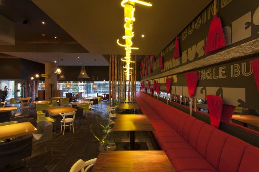
Crazy – interior – Restaurant and Café, Constanta, Romania
the puzzle of innocence and truth
The restaurant and the cafe, from the ordinary man’s view, is probably, the most common place for “socialization”. on investor’s opinion though the situation can not be that relaxed. the concept for the design of a restaurant and cafe based on success principles assumed to a certain desired customer’s “profile” was a challenge we trustfully assumed.
Thus, the story was about the importance of mixture but also about being open to new and cosmopolite that was expected from the “target” customer through a special offer proposed in menus, opened to the latest worldwide gastronomical and services trends. the “target” customer pointed out in the discussions with the investor is someone that consumes new urban culture but who doesn’t necessarily belong to a definite community or social group.
So the important thing was that anybody could be part of this socialization. we found ourselves dragged into the uncomfortable situation of imagining ourselves being both: child and grandparent, friend and husband, pupil and student, new-comer and familiar, local and foreigner, … in a word: an entire Universe opened to us. and as long as the Universe’s certainties and truths is what we do not control, we realized that maybe we have to get the discussion to an opposite direction and spontaneously a question raised: which are the certainties and truths we believe in? the only thing that’s sure are the flashes of our memories since we were kids…these are probably our only personal truths when trying to get to pure sentiments and sensations mentally graved in the innocent perception of the child we once were.
These perceptions cannot be tricked or feint by the intellect or the moral filter of the adult that we are now. so what is sure are the flashes of our childhood spent in countryside or parks when we climbed fences or trees, when we ate every day on the same chair in our home kitchen and we looked at the wall of clay and roller painting, when we were visiting the neighbours and see the big crystal mirror welcoming us at the entrance, when on our way home from school we were climbing a brick wall or tree timber recently cut, when we were playing fools with the broom mugging, when we were being watched by mother’s big eyes, when we were watching foreign movies on tv or at cinema and were reading different words from images that had no meaning, when we were reading comic books, when,when,when… that’s how appeared the confession of some corner, of images, of materials, of lights, of worlds, as a huge puzzle that was only waiting to be solved.
Location: Constanta
Year of completion: 2013
Photos: Andrei Margulescu
Entourage 3, Bucharest, Romania
ATTENTION: CONSTRUCTION SITE !
“Entourage” means firstly, socialization but also what we want to become and leave behind us, into a big marriage with the future.
Our socialization on different layers, we must take it as a positive game, firstly with ourselves. It is a game that make us not to be subordinated to some dogmas, it is a game that should make us expect to learn continuously. To learn that we are different and that it is ok to be so. That also we are in a continuous workout in this construction site of our souls and our perceptions.
The construction site as a simple environment, instantly accesible, existing in non-finished, recycled state is what is enough to have and use in this performance of mutual meeting. It is a stage in which the purity of materials – wood, concrete, metal, glass – exposes to meeting in the same time with our entourage and our sublimation…
The rough materials brought into dialogue by the rhythm and the anti-rhythm are a constant theme of this place ambient. The bar is a first counter where since you enter you register and dock to the proposed socialization game. The three huge masques graphic as an enlighting wall across to entrance is composed from diverse faces, mixed, culturally ambiguous, show the light of the great déjà vu, in which we are encountered.
The filter of an imposing “E” at entrance reminds us that we pass the portal to a new state of mind – Entourage3.
Function: Cafe & Restaurant
Name: Entourage3
Location: Bucharest
Year of completion: 2014
Area for clients: cca 250sqm
Photo credits: Andrei Margulescu
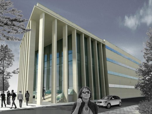
Radauti Law Court, Suceava, Romania
In a project like this the form, the function and the structure are three objects for study, whose combination can create a story.
The lawcourt is an important function who needs more representativeness in the community. The symbolism of some conflicting binomials which cause the act of justice happen led our proposal to the translation of two worlds: an open one, transparent and free vs. a paralysed one, obturate and collective.
Year of completion: 2010
Area: 3300 sqm
Time Out Lounge, Iasi, Romania
A location in the central area of city Iasi at the beginning of a beautiful, green, well known universitary area is a potential „hot spot“. The design was made in the context of changing the initial esthetic paradigm. The new intervention also gave the opportunity for a new spatial extension towards the backside as a possible covered „hidden garden“.
The newly created story invites the synergy of an overtextured esthetics to the state of a manifesto. In this context of overtexturing, the juxtaposition, the optical illusion and the collage are the most used elements of the process, being used even obsessively here and there as repetitive instruments to implement the manifesto. During this materialized „rush hour“ of the esthetical instrumentalization, the sense of belonging to a universal culture was the conceptual engine that we have accessed in choosing the characteristic landmarks. Thus the metropolitan space is provocative and at the same time provoked like a cultural perpetuum mobile that bends and draws up inside a big loop of a need to know the old and new values…
Year of completion: 2016
Area: 300 sqm
Photos: Andrei Margulescu
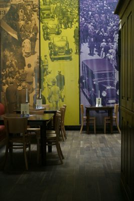
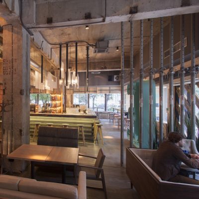
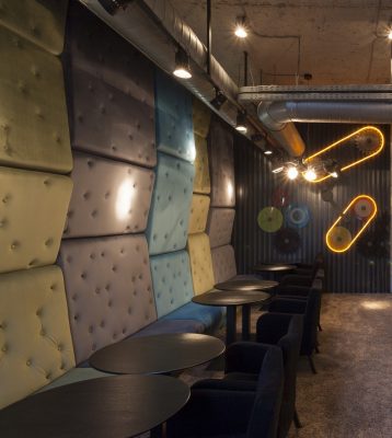
[t] shirt Club, interior, Constanta, Romania
The “[t]shirt” club in Constanta, Romania is one of many clubs that you can find in the specific area, as a scene of events and entertainment for young and middle age people. The design of a club is mostly related both to knowing the events that should happen there and to the kind of client that consumes these events.
The need for fun in the context of socializing is the main engine of clubs. of course the expectations at this need are possibly different for every individual if we questioned them particularly but generally the common wish is to break out the daily routine.
To break out the daily routine, if we try to define it, means actually trying to project oneself into a space and time different from the common ones. The projection into the “unusual” on the other hand, is a sensitive perception associated to a space and time expanded, dilated, novel, surprising, confident, confused, imposing, nervous, hallucinating, dependent, childish, hilarious, etc… but generally, in order to be mentally accepted and even adored by everyone, this “unusual” doesn’t have to be strange in a range of conscious and unconscious aspirations of a generally accepted common mentality. A good movie is good because your mental can accept it by its own rules and the dialogue reality versus aspiration holds onto a harmonic limit. as long as the limit isn’t disturbed the movie is good.
Conclusion: [t]shirt is the new Constanta scene proposed for “evading” to the “unusual” of the day which holds you onto the dialogue reality versus aspiration in harmonic resonance…
Year of completion: 2013
Photos: Andrei Margulescu
13 May 2017
+++
Re-Act Now, Architects
Featured Buildings by re-act now Architects in Bucharest, Romania, alphabetical:
Apartment H, Constanta, Romania
2010
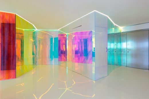
The apartment is located in a block of flats in Constanta, directly on the Romanian seacoast of the Black Sea.
It was the priming intention of having a beautiful open space with a continuous “sea coast feeling”.
The white colour is almost everywhere.
A glass partition cut out the main sensation of “innocence” of the existing space, through its folding trace and through a special spectral film sticked directly on it.
The 3M Radiant Color Film product is usually supposed to be used on some small gadgets or promotional products. This 3M film gives through its optical properties a “real life” to the entire space.
A continuous change of colours and reflections is perceived by whoever is moving inside the apartment.
In the end having a “living” element is the main chalenge on a white surrounding.
Floor area: 230 sqm
Materials used and furniture:
– the flooring with solid epoxy coating
– rough concrete pillars
– glass partitions with 3M Radiant Color Film
– the furniture consists most of translucent white MDF and Corian.
Photo: Andrei Margulescu
c.a.p., concept house in Bucharest, Romania
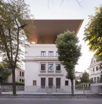
A concept house in a representative area in Bucharest appears as both a subject and an object, towards becoming a place of fashionable meetings and events as well as offices.
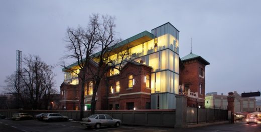
The new design approach is hosted by the newly rebuild classical façades of the old building, completely revitalized inside.
A height gain of the building has appeared as a necessity to the functional role of a belvedere point, while spicing the concept with the 360 degree view to the neighborhood and the city.
The major vision for the building is the classical syntagma of a composition: sculpture above pedestal.
The sensation of levitation between the classical pedestal and the abstract bronze intervention stresses upon the duality amidst the old and the new, while revealing the special function of the belvedere point present at this height.
The gigantic bronze canopy protects and intrigues the viewer towards the street, suffering an abstract undefined transformation towards the back of the house.
The house is a sign within the city, a sign that refreshes the identity of the place by new coordinates.
The gaining in height of the house is in fact a Cantilevered Abstract Product of the city.
It’s a c.a.p.
Function: mixed -use
Name: c.a.p.
Location: Bucharest
Year of completion: 2014
Total Built Area: 3500 sqm
Photo: Andrei Margulescu
The Information Centre of the European Union, Bucharest, Romania
ARRANGEMENT OF THE EUROPEAN INFORMATION CENTER, BUCHAREST, 1999
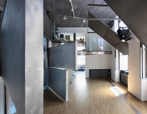
The architectural product must be seen as a reactive system that responds permanently to the imperatives of time, it is an answer to the problem that arise. It is an “organism”, a “biological being” which adapts, memorizes, learns, retroacts. The Information Centre of the European Union has been conceived as a place intended for the citizen…
The idea was to create a personalized space and that is valid for the entire centre of Bucharest, where we encounter spaces without style, without personality, but which can easily bear with interventions. Leaving from this premise, we have used metaphor and visual effects and we have even turned to a secondary metallic structure, in order to “crack” the grappling of the bearing wall.
Designed in a V-shape, the sides of the plan are articulated by a rotunda serving as a receiving space; it is plated on the circular wall and over the ceiling with undulated plexiglas that covers the entire suite of flags of the European states, in an enigmatic play of colors. From this epigraph of flags, we have cut the entrances to the other functional areas, respectively the information area and the exhibition area.
In order to supplement the work space, we have designed a partial superposition over the two sides of the plan with metallic structures having an industrial aspect, without many retouching or polishing, forming, practically, two split levels joined together by a bridge that crosses the receiving area, respectively the rotunda. Having itself a metallic structure, a rather hi-tech one this time, the bridge is made of glass plates, including the stepping area and it is meant to be a metaphor symbolizing a transparent arch, a sincere connection among the European states. The information area as well as the discussion area located above it, is planished with laminated parquetry applied across floor, the walls and the ceilings, conferring warmth and visual comfort.
The exhibition area has a versatile character of exhibition panels anchored at one end by a joint-type system, the mobility of the consoles thus created allows for the transformation of the expo hall into a conference hall or a hall for seeing certain video materials. The panels are compounded from polished and clinched aluminium plates, which are themselves decorative, judging by the quality of detail and of the junctions. On the wall opposite to the windows, there is a storage area circumscribed by the public space through a colored polyplane curtain inscribed with messages transcribed in various international languages and not merely.
In order to obdurate the light, the windows are covered with a reversibile metallic module, manoeuvred by a system of sheaves with counterweight, chosen especially for the rudeness of the technical solution.
Concept of theme: Mario Kuibus, Teodor Frolu
Project team: Mario Kuibus, Anca Pop
Photo: Andrei Margulescu
Area: 230 sqm
Client: European Commission in Romania
+++
Floreasca 1 Residences, Bucharest, Romania
2015
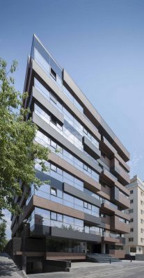
The apartment house proposed here lays in one of the representative areas of bucharest, in an area where “the built” is mostly residential and where the two lakes in the neighbourhood lead you towards a possible romantic atmosphere.
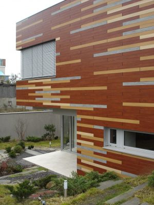
The importance of the location makes necessary to approach the proposal from the perspective of a possible urban object “landmark”. in a residential theme context the materiality of the façade received a special meaning starting with the concept.
Thus, the texture coated on wood has the role of creating a sensation of “home”. the volumetry introduces the concept of prismatic compositional hybrid having the role of sugesting the multitude of intimate spaces as being “little houses” belonging to a “mother-house”. the general sensation created by the proposed concept bringing states of: relaxation, intimacy, integrating the perspectives of natural landscape, safety and mental comfort, could create the assumptions of a possible “home”.
Area: 8200 sqm
Photo: Andrei Margulescu
+++
Madrigalului Residence, Bucharest, Romania
2006
The access ramp takes you to the core of the house, as if in a pageant, emphasizing the volumetric perception of the built environment so as the house could be clearly seen from the first visit.
Also it’s important the double whirling, spiral-like symbol of the house and the terrain in that protection area that rendered the house its soaring spirit. Each flight of stairs turned opaque and introverted and the skylight seemed like an explosion blowing to the sky.
The second spiral oriented in the opposite direction reveals when you surround the house reaching the starting point of the access ramp.
The project team
– Arhitecture:
MARIO KUIBUS, ALINA STOICA, IRINA PUSCAS, IULIA FLOREA
– Structure engineering:
CAZA SRL – Eng. ANATOLIE CAZACLIU
– Mechanical and electrical engineering :
DAMIRO SRL – Eng. ROBERT CURCULESCU
+++
Marasescu Residence, Bucharest, Romania
2008
The expansion and construction of upper floors at a house in Bucharest, finally led to a total
re-thinking of the old structure, which led to the removal of a large part thereof. A house affording comfort, confidence and cultural «safety» was, in part, the theme received.
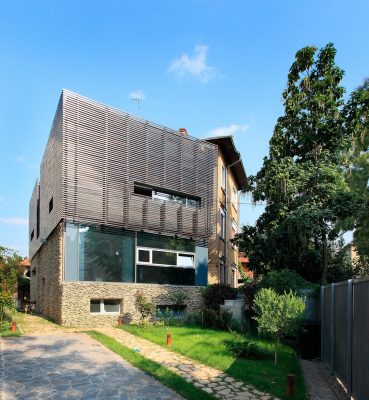
If we analyze house archetypes anywhere, we will realize that in many cultures, old or new, here or anywhere, houses are perceived as «friendly», «human», «safe» when conceptually
there is a stone pedestal overtopped by an upper wooden structure.
We realized that this was the answer that we had to give to the theme proposed: a house with a «stone» pedestal and an upper «wooden» structure.
We found a simple scheme, which also allowed us to give meaning to things: stone in the «day» area of the house and wood in the «night» one. As for the rest, everything went
«normally»: spaces expanded vertically, from the semibasement to the uppermost floor, compartments marked by graphically customized glass, the atrium-greenhouse at the
uppermost floor as a transitory space towards the couple’s bathroom, a skylight over the staircase, with windows in astral colors (violet, yellow, orange etc.), and the like, things
that are culturally «safe»…
Proket Team: Mario Kuibus, Roxana Dumitriu, Irina Plesnila, Cornelia Zaharia
Photo: Andrei Margulescu
Area: 300 sqm
+++
Occupy Offices, Bucharest, Romania
2016
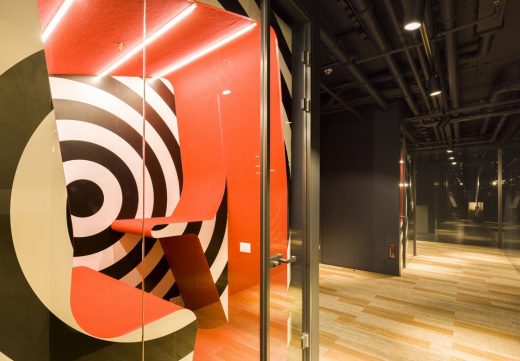
The design theme we have received had the aspiration to design certain office spaces that should offer a perspective to the classical concept of office spaces. The location of the project is the 11th floor of Green Court office building ensemble situated in the newly defined northern Bucharest area of real estate office developments.
It is the story of transiting an atypical world, non-corporate, which makes you experience different sensations both as somebody working there and also as a visitor. The intimate sensation of a world „in between worlds“ or of a hybrid organism which makes you go through it and „use“ it, is the first impact of the viewer. The permanent or temporary user doesn’t need to know if the sensation of relaxation and contemplation or of action and activation comes from lighting, materials or eventually from the spatial relationship… He needs to feel that the environment he founds himself in is one that challenges him professionally and determines him to return with positive energies.
Project team: MARIO KUIBUS | RUXANDRA OSIAC | CODRUT NICA | MIHAIL NEAGU | IRINA ALEXANDRESCU | RALUCA CIOBANU | ANDREI ROSANU
Client: NORTH ESTATE PROPERTIES
Photo: ANDREI MARGULESCU
Area: 1100 sqm
+++
Rahova Commodities Exchange, Bucharest, Romania
2008
What could we do in the context of revitalizing architecture to keep a more vivid picture of an old building with special features? It is a question to which we can respond in two ways.
The valuable part – the special one – will be restored and the unworthy one we rebuild – in a first variant – absolutely in the same stylistic story as the old valuable one or we dress it – in a second variant – in a completely new concept in major contrast with the existing situation.
We chose the second variant, first because the challenge that came with it was more entitled in the context of Bucharest where such approaches are lacking but also because the new functions that the house needed were based on a great flexibility and a general transparency.
Total area: 3000 sqm
Photo: Andrei Margulescu
+++
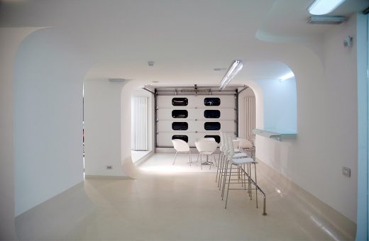
Smart Showroom, Bucharest, Romania
2005
Architecture-Film, Film-Architecture is a duality that no one can deny both in architecture and film design. In fact, we make up stories that come to us from no matter what areas of rational or imaginary worlds; they satisfy our creative ego and help us reach an ocean of daytime dramas of the mind. “Smart» showroom is an output of such dramas. We felt that by doing a stage support to exhibit some recent cars as design and technological objects is a challenge we should not miss.
At first glance, the space seemed unsuitable for a car showroom because it was divided on two levels, of which most stretched on the upper floor – three thirds – and just a third on the
street level. We were lucky to find that the promotion of «Smart» follows a dynamic, open trend as to border cases. The brand itself tries to revolutionize the perception of the car as an innovating design object within urban context, being at the same time a sort of good, consumption product, accessory, clothes, wristwatch – swatch … Moreover, we were supposed to bring those car from the street to the upper floor, which was another challenge. From this mass of contextual cases and scenarios we extracted the idea of generating a sort of «sky lab», space shuttle.
This «laboratory» could add new features to the brand philosophy into a package for sale. Thus, we worked with specific elements of a «space factory,» such as: a septic image of all spaces –white – where the colorful cars can be easily identified; – a «gate» (silvery sectional gate) on the floor level, through which the cars are uploaded from the street in a sort of technical performance defining the interior; an aluminum and glass chat room, and a brainstorming space; a café area furnished with Tom Vac chairs and a bench along the walls and a bar; they are all white; some platforms «to beam» the cars to another dimension – they work like display stages; a «rebellious» area that can be unveiled in key moments: it is colorful and appeals to a decorative language on vertical stripes; it is placed in the toilet area.
The overall white the visitor perceives on entering makes one feel like being part of 00 episode of Smart Trek Enterprise.
Project team: Anca Pop, Mario Kuibus, Traian Cĺmpeanu, Valentin Varlan
Structure design: Sicon 21
Technical expertise: Romulus Simion, Ionel Dinu
Installation design: Damiro Engineering
Area: 560 mp / sq m
Beneficiary: Auto Rom
+++
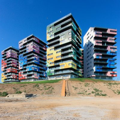
Spectrum Residences, Constanta, Romania
2010
In an absolutely amazing geographical setting, in a «spur» of the gulf referred to as the «Fishery», somewhere at Constanta’s northern limits towards Mamaia, where the strip of land between the sea and Ghiol lake is minimal, is located the «Spectrum» Residential Complex, proposed by us.
In this land «spur», the placement of «sea guards» appeared as an absolutely extraordinary theme.Observing the place from the land and from the sea, I realized that the situations are somehow different. If, when looked on from the land, the sea was overwhelming in intensity and greatness, not the same thing could be said about the vicinity with the buildings on the waterfront.
A mix of houses and apartment blocks built during various periods of time, one looking poorer than the other and without personality, conveying a sensation of poverty, sadness, lack of optimism, lack of courage. The list could go on…
The fact that an open «manifesto» could mean a rebirth of these places became obvious from these initial observations.
The appearance of the «guards» should have been set against these aspects: coming from the waterfront, you almost failed to notice them and coming from the water, they should have become that presence of major impact, overwhelming, intriguing and fascinating, which on the one hand disturbs, but on the other creates history in a place devoid of history and identity.
This play between transparence and invisibility on the one hand, when you are walking on the waterfront, and between presence and materialization, when at sea and on the shore, made me think of crystals. Crystals are of that materiality which makes us either regard them as pieces of glass in a context, or as a sublime play of colors and spectral illusions of that materialized «something»…
What could be clearer, in this case, than the fact that our «guards» on 13 levels should have become crystal «incarnations», forever in charge of guarding the Fishery Gulf? In order for the optical illusion effect to be perceptible from all sides, additional chamfering of the newly created surfaces was required. The invisibility, the chameleonic are best conveyed by mirror-like, silvery surfaces. Just like the clouds and the sky reflect on the silvery belly of a plane, the same way the silvery surfaces of the facades that we perceive from the land, which disappear in the background with the sea and sky, turn their presence into a prolongation of the natural landscape.
The «spectral crystallization» of the facades looking onto the sea ends the story about the things above, make everything appear unreal, hallucinating, filtered, illusive… It is a mental-visual trance that you welcome and which remains in your mind, in your senses, in the conscious and subconscious.
If we also want to know what these «characters» shelter, we might as well mention here the apartments the living rooms of which are provided with balconies that generally face the sea, on the spectral facades, while on the side with silvery facades, towards the land, there are the bedrooms. A strong community space was created upon our suggestion, following models already established in other countries, on two underground levels (along with the parking lots). In the community spaces we also find a swimming pool, a fitness area, halls of private events, a laundry, a bar with a mini restaurant, appurtenances.
The concept of this complex, as a complex developed not only speculatively, is largely due to
the beneficiary, who did his best not to «ruin» the story of the project in all its development stages. Architects, the world is not lost! There still are kind-hearted beneficiaries!…
PHOTO CREDITS: ANDREI MARGULESCU
TOTAL AREA: 30.720 SQM
+++
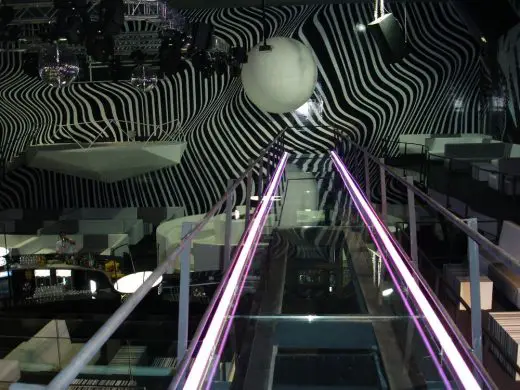
Wish Club, Constanta, Romania
2007
The club is hosted in the space of a former cinema theatre from Constanta, located in an essentially «socialist» residential area; like other areas in the same category from all over the country, it ceased to be a manageable location and received various versions of functional operation.
Any potential proposal to insert a club function could not elude reality, dominated as it was by the strong influence of the existing spatiality typical for a cinema hall, marked by the existence of an inclined plane in the hall meant for viewing movies. Investors desired to create for their «target» clients a space with a «surprise» atmosphere. As proposed events were extremely diverse in terms of their perspective, they created the premise of a potential client base expected to be heterogeneous in terms of cultural approach and perception. The ambiguity of the events’ themes and of clients’ cultural positioning, combined with the necessity to stage «the spectacular», led to a sensation of staging «the unreal» as main theme.
Given its dynamism, we considered that the space needed no spectacular transformations; instead, the graphical impact in an extremist and raving overcollation,like in a wild race throughout ambiguous «worlds» and sensations, is what determined us in our story. Our scarce volumetric interventions included: the entrance space located at the ceiling level, in a large black spatial «wave», hypnotically attracting the visitor to a «sea» of music and dance towards the main hall area, the diamond stage and the «sphere» screen placed against the background wall of the hall, the glass-made «catwalk» in its suspended incursion and, in terms of spatiality, slightly out of centre in the volume of the hall.
Thematically speaking, they are all part of the system: star wars, ants, Manga, fractals, Futurama etc. The black-and-white was decided as the general chromatic concept of the arrangement in an environment where intelligent lights can provide the space with a chameleonic configuration for possible night chameleons.
Project team: Mario Kuibus, Paul Stoicescu, Alexandru Ionescu, Valentin Varlan
Area: 1450 sqm
Client: Underground Club
More architecture projects by this Romanian architects office online soon
Address: Calea Griviței 8-10, București 010731, Romania
Phone: +40 744 429 228
+++
Romanian Architecture Studio
Re-Act Now was founded in 1994, in Bucharest, Romania.
From 1997 onwards, the design firm is led by Mario Kuibus who joins around him a dynamic and reactive team.
Mario Kuibus has a wide architectural activity, both practical and theoretical, given the experience in architecture planning in Vienna for many years. He is also active in architectural higher education as professor at the University of Architecture and Urbanism”Ion Mincu” Bucharest.
+++
Romania Architecture
Romania Architecture Designs – chronological list
Hotel Atra Doftana, Valea Doftanei
Design: TECON Architects
Bucharest Apartments
Design: ADN Birou de Arhitectură
Garage Conversion in Bucharest
Design: arhiDOT
Avincis Winery Building, Dragasani, south west Romania
Design: BBM Grup S.R.L.
+++
Buildings in countries adjacent to Romania
+++
Buildings in countries close to Romania
Bosnia and Herzegovina Buildings
Comments / photos for the Bucharest Architects Firm page welcome
Website: re-act.ro


![[t] shirt Club, interior Constanta](https://www.e-architect.com/wp-content/uploads/2017/05/t-shirt-interior-r150517-520x347.jpg)
