Mirvish+Gehry Toronto towers, Ontario skyscraper design Canada property, Canadian building
Mirvish+Gehry Toronto
Ontario Architecture Development, Canada building design by Gehry Partners LLP architects, USA.
Design: Gehry Partners LLP
Location: 266 – 322 King Street West, Toronto, Ontario, Canada
Height: 80 storeys
Client: David Mirvish, art collector
Size: 2.4 million sqft / approx. 2800 units
Mirvish+Gehry Toronto Towers News
2 Oct 2017
Mirvish+Gehry Toronto Buildings
October 2, 2017 – Great Gulf announce that they will be the developers of the Mirvish+Gehry project planned for King Street just west of Toronto’s Downtown core.
David Mirvish, President of Ed Mirvish Enterprises said in a prepared statement “I am pleased to have concluded a transaction with Great Gulf that will see the realization and fulfillment of my vision for Mirvish+Gehry Toronto. I am delighted to have completed the development process that allows Great Gulf to create a wonderful addition to the Toronto skyline.
In Great Gulf we have selected a developer who is capable of executing Frank Gehry’s vision, and will work well with him to bring the project to realization. I believe the project will do honour to the history of the people in the city who built it to what it is today and will continue to project Toronto’s possibilities onto the world stage. Ed Mirvish Enterprises and Projectcore will move forward to support Great Gulf’s efforts throughout the process as they fulfill Gehry’s vision for Toronto.”
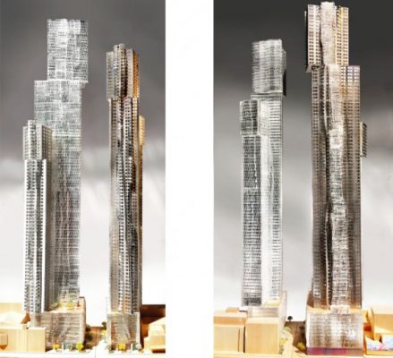
image courtesy of Projectcore Inc.
page updated 17 Oct 2016
Mirvish+Gehry Toronto Penthouse Views
Stunning 360 degree views from the top of the West Tower.
The West Tower is the tallest approved building in Canada, located in the heart of Toronto’s Entertainment District and is minutes away from the financial core.
“Frank Gehry’s distinctive style will create a once in a lifetime opportunity with extraordinary views of the city and beyond”.
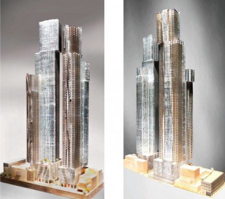
image courtesy of Projectcore Inc.
Website: Mirvish+Gehry Toronto development
previous link to http://mirvishandgehrytoronto.com not working when tested 29-30 March 2020
August 4, 2016
Mirvish+Gehry Toronto Towers
Mirvish+Gehry Toronto News Update
“Since our landmark project was approved in October 2014, our team has been actively working through the design of the two buildings, amenities and public spaces. Frank Gehry and his office have worked carefully to ensure that the iconic towers will put Toronto on the world stage. We are excited to continue this legacy project in Gehry’s hometown.
model photo : Gehry Partners LLP
In April we reached a major milestone in the planning process and we’re working towards finalizing the design. Currently, our project includes the tallest approved building in Toronto, and all of Canada. The predominant features of the design are in place and the team will continue to refine the architectural details and interiors with Gehry’s signature elements.
Our project will have unprecedented views of the lake and city, with the West Tower and East Tower standing at 92 storeys (1000’) and 82 storeys (900’) respectively. There will be multiple levels of underground parking, as well as a podium base, which will include flagship retail and commercial offices. We’re also honoured to have an extension of OCAD University’s campus in the East Tower’s podium. The residential amenities are located on the terrace level of the podiums with additional amenities and a terrace on the 61st and 67th floor of the West and East tower respectively.”
source: http://mirvishandgehrytoronto.com/mirvish-gehry-view-from-the-top/
Mirvish+Gehry Toronto
Article by Editor Adrian Welch, Architect:
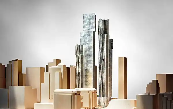
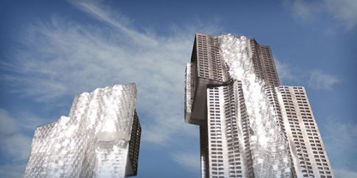
The scale of this design for three new towers Toronto’s downtown arts and entertainment district is far removed from the domestic scale of the architect’s own house in Santa Monica back in 1978. Each tower is slightly different from the next, using a flowing drapery style similar to his recent 8 Spruce Street tower (New York City) and designs for Ocean Drive in Los Angeles.
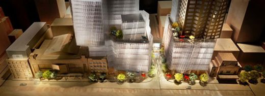
The model is sumptuous, with the towers formed from translucent drapes that flutter towards their base to reveal a braced structure at street level. The retail base is softened by a sprinkling of trees. All looks harmonious. But in reality will the drapes be translucent? I have today been advised that for Building 1 materials are glass/curtain wall, B2 a mix of some form of masonry or precast/stone and B3 metal and glass. The titanium cladding typically employed by this architecture studio can appear dazzlingly delightful in some works – such as the Walt Disney Concert Hall – or rather bleak in others – such as some of the more recent university buildings in the US.
I would argue that compared to a winery or a house the tower typology feels like it is not a perfect fit for Frank Gehry for this simple reason: his free flowing programme is too constrained leaving the architectural intervention on the surface. His organic form cannot penetrate the rectilinear office plate core because that is where the money is made. Thus the architecture becomes the clothes rather than the body clothed.
I do have an angle on this, having worked on interiors in the Fred and Ginger Building in Prague (whilst I worked for Eva Jiricna Architects): we tried to fit-out space for Andersen Consulting but each floor was different in plan and each had a curved perimeter and not only that each had sloping external walls. Fitting rectilinear office furniture into such a space is a challenge and a half.
In the insightful book ‘Gehry Draws’ (2004 – edited by Mark Rapoolt and Robert Violette) Rene Daalder explains that the public “appear to be most affected by those buildings that represent the biggest departure from the Modernist aesthetic, such as the Guggenheim Museum in Bilbao and Disney Concert Hall”: indeed, and tower buildings are indelibly associated in our minds with Modernism, think of Lever House or the Seagram Building, efficient rectilinear blocks that contain logical layouts of office space.
Recently skyscrapers have been twisted and turned across the world from Dubai to China, yet the basic typology is less forgiving than most due to issues around cores, wind loading and as mentioned above, efficiency of office floorplates. In ‘Gehry Draws’ Horst Bredekamp describes “Gehry’s principle of positioning the imagination in order to allow it to wander freely” and this desire for freedom is clear in most of his works: free forms, free plans. But the skyscraper type only allows a certain amount of freedom, so does this not create a negative tension between architect and the programme?
Mirvish & Gehry Condos Toronto:
In an article for e-architect by Douglas Klahr (31 May 2011) about 8 Spruce Street New York the writer discusses why the ‘New York by Gehry’ at 8 Spruce Street doesn’t have a crown, why it ends with a dull flat top (a good point, a lost opportunity). He says this: the architect reasons that a crown (or spire) is not needed because of “the simplistic, dichotomous mindset that has ruled architects since Modernism that one is either “innovative” or a hopeless practitioner of retrogressive, nostalgic kitsch”.
This is pertinent here because although the three Toronto towers are more flowing that 8 Spruce Street (ie fighting harded against the dull office block within) all three still end with a roughly flat top. Maybe the architect wishes neither to follow the International Style of say the Seagram Building (rectilinear body, no spire) nor the old-fashioned skyscraper style of say the Empire State Building (rectilinear body, spire) but instead blaze a trail for a third way: curvilinear body, no spire.
Post by Editor / Architect Adrian Welch
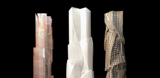
model photo : Gehry Partners LLP
Three Towers in Toronto
Statement from David Mirvish
I Am Tremendously Excited by the New and Evolved Design from Frank Gehry
Toronto, June 5, 2013 – “Since revealing our conceptual vision for a Frank Gehry designed, mixed-use development that would transform Toronto’s downtown arts and entertainment district last fall, we have been actively engaged in an ongoing dialogue with key stakeholders, including local residents, Toronto politicians and the city’s Planning Department.
This process of consultation has allowed us to better understand the objectives of the various stakeholders, and as such, allowed the conceptual design of the buildings to respond and evolve. When we launched the project, we knew that the forms as presented were conceptual and that both Frank Gehry’s design process and the input of local stakeholders would result in further interpretations.
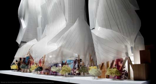
model photo : Gehry Partners LLP
The current iteration of Mirvish+Gehry Toronto: together with the design team at Gehry Partners LLP and our development and project manager Peter H. Kofman, of Projectcore Inc., we are confident that today’s vision for three towers rising from a cloud-like podium, will create a new, dramatic profile for Toronto’s arts and entertainment district and significantly add to the emerging John Street cultural corridor.
Mirvish + Gehry Rotating Model:
With a new podium design featuring exciting wood elements evoking the industrial warehouse heritage and distinctive towers towers above that will be both light and soft, we are making an iconic architectural statement for the City of Toronto. I am excited by the platform this project provides to allow us to develop and extend our cultural activities. With today’s design we are creating a project that will both acknowledge the city’s past, while moving boldly forward towards its future.
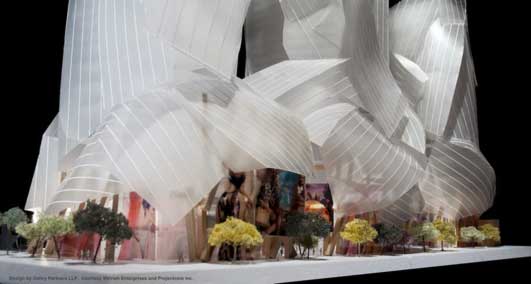
model photo : Gehry Partners LLP
We remain committed to the process; to the project and to continuing my family’s legacy in Toronto’s arts and entertainment district.”
Mirvish+Gehry Toronto images / information from Projectcore
Frank Gehry Architect
Location: 284 King St W, M5V 1J2, Toronto, Ontario, Canada
Toronto Architecture
Ontario Architecture Designs – chronological list
Toronto Building News on e-architect
Recent Toronto Tower Architecture
MISSONI SKY
Design: CORE Architect and II BY IV DESIGN

photo : Supergraphiq
MISSONI SKY Tower
One Bloor Tower
Design: Hariri Pontarini Architects
One Bloor Tower
Ryerson Student Learning Centre Building
Design: Snøhetta / Zeidler Partnership Architects
Ryerson Student Learning Centre
Toronto Architect : contact details
Canadian Architectural Designs
Canadian Building Designs – architectural selection below:
Comments / photos for the Mirvish+Gehry Toronto page welcome

