Munch Museum Oslo, Contemporary Norwegian Building Project News, Facade Design Photos
Munch Museum Norway Architecture
Waterfront architecture design by HerrerosArquitectos in Norway
22 Oct 2021
New photos and films of this interesting Norwegian building:
Design: HerrerosArquitectos
Munch’s Cliffhanger
Edvard Munch’s life and artwork made for the most spectacular stories in the world.
Munch Museum Oslo Building
When the architectural firms Estudio Herreros and LPO designed the new home for Edvard Munch’s art, it was important for the building to depict the peculiar style that was associated with Munch – that has peaked interest from all over the world.
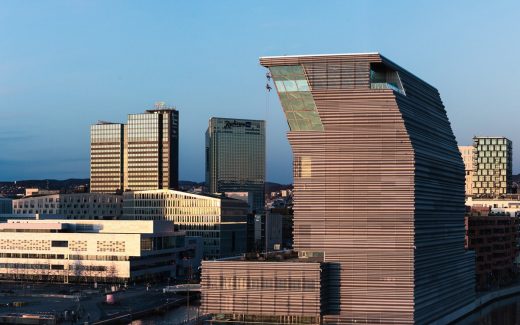
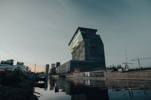
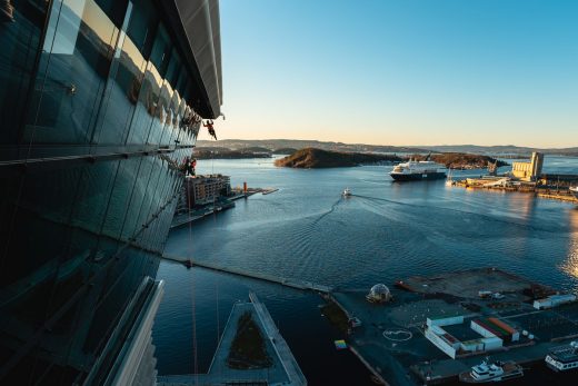
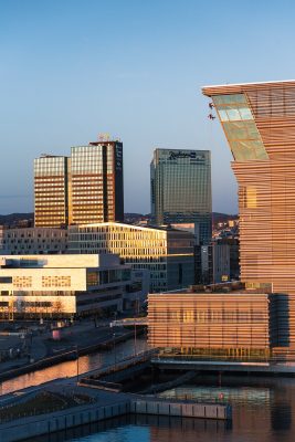
The building’s reverent “bow” to the west and towards the Castle a few kilometers away has become the trademark.
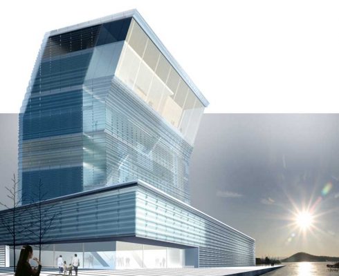
A 20-degree slope from 40 to 55 meters above the ground, symbolizes Munch’s challenging and experimental uniqueness in a contemporary, modern, and sensational manner. The Munch Museum will be noticed and remembered by all spectators as it greets all with respectful regard.
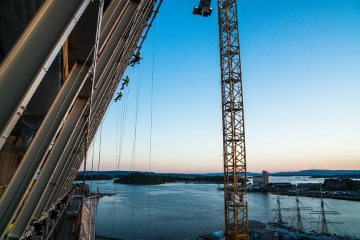
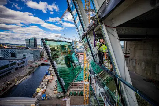
This vision did pose some challenges that left the architects wondering how to solve access to the façade during the construction period and after handover.
This was due to the scarcity of space restricting the use of traditional cranes and together with Norway’s high environmental aspirations, it was clear that an innovative solution was required.
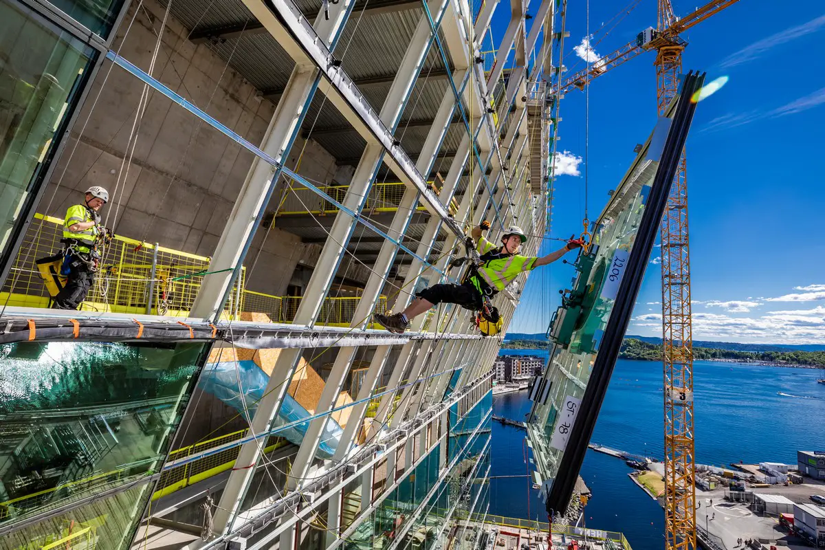
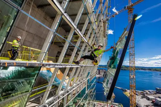
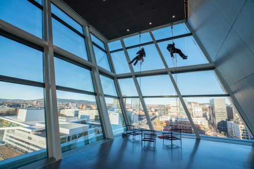
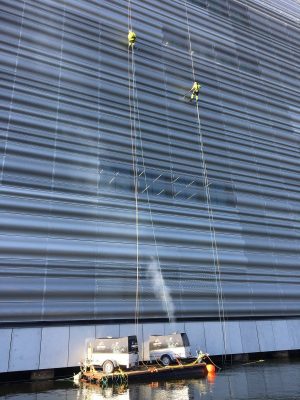
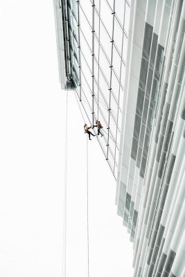
It was decided that in order to realize this project, professional mountain climbers were contacted in the preliminary project to use their expertise to solve the challenges in building Munch.
The engineers saw that they needed to merge mountaineering and engineering in order to build and maintain the building’s overhanging design and safely bring artwork through the world’s largest letter crack in the south wall of the museum.
Through the Munch project, Høyden AS has built up a façade access engineering department that specializes in collaborating with architects to assist with their expertise, systems, and hardware to create customized access systems which are aesthetically integrated into the building, agile in operation, and sustainable for the environment thus simplifying maintenance that can easily be done using a pair of climbers and ropes.
Finally “Skriket”, “Solen” and most of his art have moved into a spectacular new home. The brand new Munch museum at the shore of Oslo opens today and symbolically ends a long and dramatic journey for this artist, a unique building brought to life with innovative engineering and real mountain climbers to assemble it all together.
Oslo has got a real signal building for the future.
Previously on e-architect:
21 Apr 2009
Munch Museum Norway & Stenersen Museum Collections
Design: HerrerosArquitectos
CONCEPT
The future complex formed by the Munch Museum MM and the Stenersen Museum Collections is not only to safeguard and disseminate a basic heritage of the history and character of Norwegian culture; we find ourselves faced with a unique opportunity to develop a contemporary museum concept drawn from a transcendental urban role and a historical responsibility as a cohesive element for the community not only of Oslo but of all the nation.
The is conceived as an institution which is open to the city and highly visible, which must be visited many times in a lifetime because of its dynamic programs but also because of its power as a place of concentration, walks and daily relaxation in its terraces and cafes or even because of its shops.
POSITION AND POSTURE
The building is located “on the side” at the end of the Pauselkia peninsula, avoiding the cones of perception which ensure views over the fort from the surrounding mountains. With this position we aim to intensify the tension between the fjord and solid ground, but also to avoid the arrogant gesture of placing it frontally, in order to move respectfully to one side, letting the space and view flow towards the sea.
As can be seen, especially in the model, its dimensions express in an almost anthropomorphic manner its respect towards the historical city and its shared space with the Opera house, understanding that if the fjord is a beautiful landscape, where it wants to look on to is the coastline, where it meets the shore and where the most valuable exchanges occur for the city’s life.
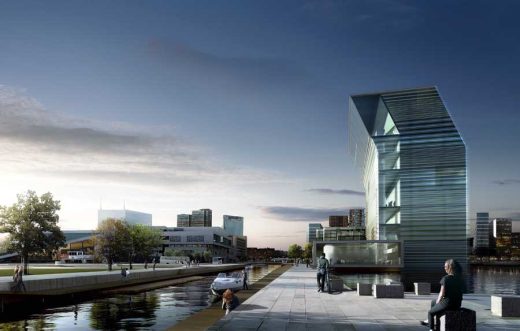
Its gesture of slightly inclining its top (without affecting the functionality of the rooms) proudly emphasizes the value of the public ground generated at its feet. This “figurative” condition is also an approach to Eduard Munch’s work and its exuberant language in which naturalism and abstraction find a unique expression for the times of transition during which he lived.
ORGANISATION
Once the position and posture are chosen, the next decision consists of very clearly separating two independent pieces which divide the programme into “dynamic” (spaces of free access, public uses and circulations) and “static” (the museum itself).
The fundamental pieces in the dynamic space are the lobby and the vertical public circulation system. The lobby continues the treatment of the open space making it enter the building as a portion of covered plaza.
This houses the reception, main restaurant, event hall, cinema, spaces for the sponsors, shops and the exhibition about the history of the artist Munch. Forming a right angle with the lobby, a vertical screen is laid out which accompanies the movement of people resolving accessibility to the rooms and other sections through platforms which also function as distributors, rest areas, viewpoints and small cafes.
rendering : Mir/HerrerosArquitectos
The distributor on the first floor also has a cafeteria in parallel with the arts deposit (which could remain partially on view for the public) which extends in a deck over the over the plinth cover surrounded by a sheet of sea water which will never freeze as it is part of the building’s energy system. Lobby and circulations involve a kinetic experience both for the users and for the image of the building through the transparencies of its West facade with its enigmatic materials.
The “static” space is made up of a succession of exhibition rooms and operational sections of the museum. The packet of plants with different heights is in turn divided by a vertical core which organises the whole in two room sizes (650m2 and 325m2) of maximum neutrality without it being necessary now to differentiate those dedicated to permanent or to temporary exhibitions.
Among these, physical spaces for the public are reserved which house the sections for restaurants, management, educational programme and library. The use of this room is reserved for the definiteive programming but it could be used for the largest works in the collection, a space reserved for special temporary exhibitions etc.
All the rooms have a versatile and universal lighting system as well as different services (data network, water, strength…) in order to be able to accept all exhibition formats and resources.
The general circulations system which runs along the West facade is completed with the transversal service and maintenance core, whose main piece is the large format tall lift for works of art (5x4x5m useful). All the floors have alternative emergency exits, installations room and public toilets.
The lower floors of the museum house the technical services, differentiated delivery for art and services, car park, installations, maintenance workshops, archives, offices for staff etc. All of this is resolved with the maximum operational level and rationality separating the works of art from the ground as indicated in the competition requirements.
In general, we consider the programme fulfilled and, more importantly, the special system activated for the project, according to which, other uses, heights of the rooms or locations of complementary services can be put forward without affecting the project’s essence.
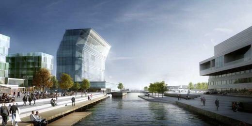
illustration : Mir/HerrerosArquitectos
STRUCTURE
The two parts into which the building is divided are resolved with differentiated structures: concrete for the “static” program of the museum, steel for the “dynamic” program of the public areas.
The museum is built as a vertical concrete box of 16 m of free light hermetically sealed except when the program requires opening of spaces. It is built with four 40 cm thick screens which form a prism whose long sides require buttresses
(60x30cm) every 6m which embrace lightly post-tensioned flagstones.
The gap resulting from leveling up the buttresses in order to have exhibition rooms with continuous walls generates an installations chamber which is highly versatile and which runs along the building and ensures exhaustive control of the networks in each room. The transversal core collaborates in the general inertia of the structure in the wind direction.
The necessary gaps for the museum’s operation, especially in the anterior screen are resolved without problems by substituting the buttresses for pillars of up to 100x30cm and bracing the edges with virtual beams.
The metallic structure which makes up the stack of circulations and the plinth offers the maximum open space and lightness in contrast with the tectonic presence of the museum’s volume. The platforms are resolved with a light framework supported on beams every 3 m which are supported on the concrete screen without transmitting momentum and on the substructure of the transparent closing. In the lobby, two lines of supports receive metallic beams supported on the screen and ending with a projection in the main façade.
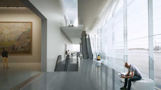
illustration : Mir/HerrerosArquitectos
CONSTRUCTION SYSTEMS
As a whole, the museum aims to be a construction event based on establishing few rules and scarce materials which resolve all possible situations. Once the concrete work has finished, the rest of the work will be dry, of great precision and with a clear purpose to renounce any superfluous element.
Plasterboard walls, easily substitutable continuous floors, subdivisions of high quality partitions for the complementary programs, exposed ceilings, installations with minimum presence etc. form a system of compatible equations in which space prevails over the construction and environmental quality over the material.
FAÇADES
The façades surrounding the building have the same geometry but two very different types. The basic plastic resource is an external protection based on an undulating translucent surface with three different wave passes which aim for an enigmatic and evanescent expression of volume stimulated by the variations in natural light, clouds and weather features in general as well as the building’s own artificial light.
In the concrete Museum, its vibrant surface is built in methacrylate and acts as the protection of the projected insulation which eliminates thermal bridges. In the lobby and circulations screen, it is built in frosted glass and behaves like the outer sheet of a double facade which offers a flat curtain wall on the inside with large size glass pieces, and between them the necessary steel structure.
In order to deliver this intrinsic aspect of our proposal, we have consulted and will continue to develop both the technical and performative aspects of the façade systems with the most competent consultants in the field of climate, material and structural optimization.
LIGHTING
All museums must pay careful attention to the lighting of their rooms, and this one will not be an exception. However, it is not appropriate now to speak about something which will be a reason for deep reflection. Nevertheless, we do want to highlight the lighting in the building itself as a high percentage of the time it will be perceived in the darkness with all the nuances that this has for the city of Oslo.
The buildings presence at the entrance of the fjord, its capacity to become a signal and beacon for the city, the lighting possibilities of its translucent facade, of the water sheet or the circulations system as a succession of vantage points must be fully exploited.
Munch Museum Competition : main page with images
Munch Museum Building : Energy and environment. sustainability strategy /
Mechanical systems / Housing / Financially viable solutions / Stages
MUNCH MUSEUM AND STENERSEN MUSEUM COLLECTIONS, OSLO 2009
International Competition by Invitation. First Prize. Gross Floor Area: 16,000 m2
THE MUNCH AREA, OSLO 2009
International Competition by Invitation. First Prize. Gross Floor Area: 50,200 m2
Client: HAV Eiendom AS, Oslo Kommune
Architecture: HerrerosArquitectos
Project Directors: Juan Herreros, Jens Richter y Paola Simone
Collaborators: Riccardo Robustini, Luís Berríos-Negrón, Carmen Antón, Verónica Meléndez, Ángela Ruiz, Joanna Socha, Paula Vega
General Consultant : IDOM International
Landscape Architect: Thorbjörn Andersson
Model / Model Photographs: Jorge Queipo / Federico López
Location: Oslo, Norway, northern Europe
Norwegian Architecture
Contemporary Norwegian Architecture
Norwegian Architecture Designs – chronological list
Norwegian Architecture – Selection
Powered by Ulsteinvik
Design: Kaleidoscope Nordic
image : KVANT-1 and Kaleidoscope Nordic
Powered by Ulsteinvik, West Norway
New Kristiansund Opera and Culture Centre
Design: C. F. Møller Architects
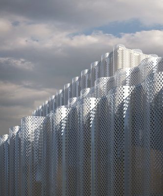
image : C.F. Møller Architects (skyfish.com)
Kristiansund Operahouse and Culture Centre
Petter Dass Museum, northern Norway
Design: Snøhetta
Bodø Nye Kulturhus – Norwegian Architecture Competition
Design: DRDH
Norwegian Architecture Offices
Comments / photos for the Munch Museum Norway Architecture design by Estudio Herreros and LPO page welcome

