MoMA Tower Alternative New York, Architect, Image, Design, Project, News
MoMA New York Architecture
MoMA Tower Proposal by Axis Mundi, Manhattan, USA
Aug 4, 2009
MoMA Tower Design
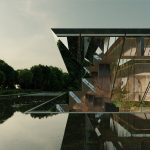
Axis Mundi unveils Conceptual Alternative Design for MoMA Tower at 53 West 53rd Street
A Vision Thing : The Uninvited Vertical Hood for MoMA
An interview with John Beckmann of Axis Mundi on their provocative Axis Mundi MoMA Tower design for 53 W. 53rd St.
By Jennifer Williams, New York-July 30, 2009
I recently spoke with John Beckmann at his design studio near the New York Times Building.
1. At the City Planning Commission on July 22 you stated that the current proposal by Jean Nouvel was “a glass spike driven into the heart of New York City.” What are your objections to Nouvel’s design?
First, let me say that I have no personal grudge with Mr. Nouvel. He’s an enormously talented architect. I do think, however, that his hand was forced to overreach on this one. It’s safe to say that the design was created in a period of what Alan Greenspan called “the era of irrational exuberance.”
Secondly, I think the “starchitect” infatuation has worn off, and the “more for me” period has hopefully passed. Perhaps we’ve all learned some important lessons. I think we’re entering a new era that’s going to be more about “us and we.”
But to answer your question directly: the scheme as currently planned has some prickly issues. The first of course is the enormous height, at 1250 feet. Mr. Nouvel declared (with a complete lack of irony) that he’d created the “missing piece” of the Manhattan skyline. He claims to be able to not only see what is lacking in the cityscape and iconography, but also simultaneously provide the solution. In his vision, I suspect there is no other solution.
The other issues are contextual-severe congestion problems for MoMA and the neighborhood residents, complicated air-rights transfers, zoning manipulations, a “cutting” shadow that will extend to the gates of Central Park… The opposition’s list is pretty lengthy, and their points are quite valid, especially when you put yourself in their position as neighbors to the construction and its aftermath. In-your-face architecture is an understatement here.
2. What possessed you to design an alternative tower for MoMA?
It seemed that there had to be other solutions for this site. We also felt that it would be challenging to come up with some alternatives using the same basic program, and look at options that could perhaps open up more of a public dialogue focused on broader cultural issues rather than merely aesthetic ones.
Our tower is not, strictly speaking, a tower; it is the first try at “growth design” and a forming of paradigms from within. I want it to open up the neighborhood. It’s actually the alter-ego to Mr. Nouvel’s design.
3. When did you start the design?
I wrote the text in early April, and we started the design in the middle of April. So we put it together in about three months. Different teams did different things, modeling and renderings. It was a little hurried because I wanted to release it on July 15, a week before the City Planning Commission review.
4. That’s interesting-so you wrote down the concept before you started designing?
Yes, I developed the design concept like a short story with all the ideas clearly defined, and gave it to everyone in the studio team along with some friends for comments.
5. What are the main principals behind this concept-driven design?
We wanted to create an opportunity for a community to grow and change in a semi-controlled way. It’s about creating the conditions for diversity to take place and thrive, incubate even. It’s an unstable condition like life itself. Our goal was to create a set of rules that welcomed difference, mutability, and inclusion, rather than shunning it.
Architects and planners rarely get it right-more often, people do, and that takes place over an extended period of time. All you have to do is look at all the failed planned housing developments in our urban communities as well as in the suburbs.
6. Did you expect people to react as strongly as they have to your proposal?
As James Brown once said, “If you can’t dance to this, you ain’t got hips.” The design isn’t slick; it’s not trying to be glamorous or pretty. It’s a rugged building that’s meant to reflect the very specific urban context of New York City, its unique pulse and dynamism.
It’s a hard building to not have strong feelings about. The design is ambiguous and political at the same time. It’s about power and place. All public architecture is political to a great extent.
7. The notion of community seems very important to you. How is that reflected in the overall design?
The design is open-it’s not one singular vision, but multiple ones, and it would change over the course of its development. The intent is to accommodate and encourage interaction and customization, and embed an enormous variety and richness into the surfaces. So, yes, it’s about creating a community, a stage to encourage positive things to happen.
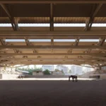
The building has gaps and articulations that allow light to penetrate to the street and into potential green spaces. It has an urban arcade with additional staircases that could alleviate some of the serious sidewalk congestion problems that exist at MoMA.
I’d like to think of this project as “user friendly”.
8. The lobby arcade solution seems clearly resolved. How did you arrive at that solution?
We wanted to connect the two streets, 53rd and 54th, which we felt would help ease some of the sidewalk congestion and create a link with the public walkway alongside the CBS building. It also enabled us to create two grand staircases on both sides to create a people-watching space, which MoMA has never had. Then we tied the lobby height to MoMA’s height on the 54th Street side, and used the same materials such as the anodized aluminum panels. The lobby arcade also created a base or plinth that allowed for a neutral street level building, and stacked the building above it.
9. You mention that you’ve spoken with engineers regarding the feasibility of the design. Can you tell me a little about those discussions?
Yes, I spoke with several prominent firms. I consulted with them during and after we designed the building and had models. I wanted to confirm that it could be built the way it was conceived, and that we were in the ballpark. Our idea was that the building could be made using a standard concrete construction with columns in a 24-foot grid, so that the “smart blocks” could be slid around in a variety of ways and also easily connected. The notion has always been a relatively cost-effective building. We discussed the possibilities of modularity and prefabrication. Those ideas would have to be further accessed.
10. Why the various modernist façade quotations? I see Richard Meier, Louis Kahn’s Salk Institute, Rio’s favelas, and Corbu’s Unité d’Habitation staircases-what’s that about?
They’re placeholders-simply a starting point. They’re there to spark people’s imaginations, spur creativity, and create a bodily connection to the building so you can actually imagine living or being there. They show possibilities, juxtapositions, and mutability. They show a building in flux, that’s not hierarchical, much like the city itself. Our design seeks to reveal the hidden life of a building and act as a receptacle of energy.
I just think that if you’re going to build a 1250-foot-tall tower, you’ve got to give something back to the public and the city. The question is, how do we move forward in the twenty-first century in a more humanistic way, and how does architecture aid in that transformation?
Ultimately, it’s a vision thing.
Jennifer Williams is a writer living in New York City.
MoMA Tower Alternative interview from Axis Mundi
MoMA Tower Manhattan
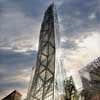
image © Ateliers Jean Nouvel
MoMA New York Museum of Modern Art
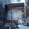
MoMA New York photo : Andrew McRae, 2007
Location: 11 W. 53rd St, New York City, USA
New York Architecture
Contemporary New York Buildings
NYC Architecture Designs – chronological list
NYC Architecture Tours by e-architect
Herzog & de Meuron
56 Leonard Street Manhattan
Freedom Tower skyscraper
Museum of Contemporary Art New York – Extension
MoMA New York architect : Yoshio Taniguchi
Comments / photos for the MoMA Tower Alternative New York Architecture page welcome
Website: www.moma.org

