National Energy Museum Spain, Ponferrada Building, Spanish Design
National Energy Museum, Spain : MNE
MNE: National Energy Museum building, Ponferrada – design by raichdelrio
2 Nov 2011
National Energy Museum Ponferrada
Architects: raichdelrio
estudi d’arquitectura. arichtecture & urbanism works. miquel del río & lluís raich
Location: Ponferrada, in the north-center of Spain
In August 2010 raichdelrio were invited by Feltrero to develop a competition for the permanent exhibition of National Energy Museum (MNE in Spanish). The competition was for 3 exhibitions of approx. 3.000 sqm each. Feltrero contacted with RdL arquitectos (http://www.rdlarquitectos.com/, we collaborated with them also in Dinopolis) to make 3 proposals with 3 teams, being RdR responsible of the exhibition explaining the consequences of the energy use. All museology was from Andres Clerici (http://www.this-is-public.com/aboutl)
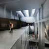
First thing we did was looking at the building: it’s an abandoned centre of energy supply and our exhibition was in the building hosting the coal storage, in the upper floors. Watching images like this we immediately fell in love with the building and tried to make the exhibition according to it and always on it, never adding elements or hiding the building. And of course the “tolva” will be our leitmotiv.
Regarding the kind of exhibition we wanted to do, it was an exhibition that could benefit from the values of a science centre (activity, scientific rigour, several topics) and the values of a temporary exhibition (clarity of message, quietness in museographical resources, hierarchy of topics…)
We wanted to make the tolva the personal character and so each of the floors created a different relation to the tolva: through it, as opposition to it and on it. This clear idea will guide the entire exhibition (giving importance to the building, different scenarios and clarity, as the purpose was).
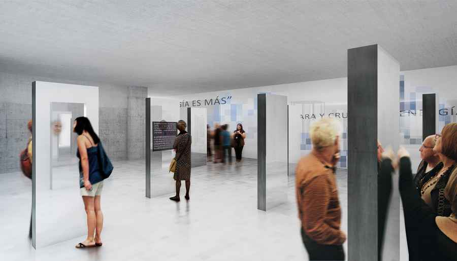
The next decision was to start from up to down: bringing people to the top and making them go down by gravity gave us a much more “natural” way of walking through the exhibition: first we would go through an immersion tunnel, then we would walk giving the back to it and concentrating in two new information walls and finally we would take advantage of the big space and lay in two stepped walls.
Looking at the sections we spotted different spaces and gave them importance with our structures: straight lines will show different highs in a very expressive way. Reading the content we spot 3 different topics: energy is more (from more advantage to more disadvantages), solutions to the problems (also in 3 subchapters) and the future solutions (a gallery of the future). So we put each of the topics with the relations and we got a very immersive entrance from more advantage to more disadvantages, then a two information bands for solutions and a chill-out agora for the discussion.
The upper floor, through the tolva: entrance at the lower right side with some totems where you can find your ecological footprint. At your left you would see the problems (climatic change and CO2 problems) and in the middle the immersion tunnel with the different topics, with individual projections in the left part and group projections in the right part.
The middle floor, against the tolva: two walls relate to the tolva (old-new; no information – with information; straight – kinked) and hierarchies the information. This walls have interior spaces where needed to give deeper information and create different experiences without competition with the others. The floor touches two times to the tolva, moment where an inside view is created and in this balcony we put a metaphorical installation to show the carbon.
The down floor, on the tolva: to explain the future we imagined two linear walls, with kinks but this time instead of being vertical they are stepped because the visitor will not read the information but create it. These spaces make small agoras for discussions with on the latest topics of energy and have built-in screens to self-navigate on several topics or watch them projected on the tolva. A bigger plaza is created to make the gallery of the future, with the last research on energy use.
Renderings by SBDA (http://sbda.cat/web/).
National Energy Museum building images / information from raichdelrio
Location: Ponferrada, Spain
Architecture in Spain
Spanish Architecture Designs – chronological list
Architecture Walking Tours by e-architect
Recent Spanish building designs by the studio:
Hall Entrada Ave Maria, Catalonia
OAC Girona, Catalonia
Spanish Architecture – Selection
Barcelona Pavilion building, Hill of Montjuic
Mies van der Rohe, Architect
Casa Mila Barcelona – La Pedrera, Eixample
Antoni Gaudi, Architect
Barcelona Forum Building, Diagonal Mar
Herzog & de Meuron Architects
Comments / photos for the National Energy Museum Spain page welcome

