Hall Entrada Ave Maria Barcelona interior, Catalan building, Spanish Office Design
Hall Pabellón Ave Maria, Barcelona: Entrada
Barcelona building interior : Catalan Health Service project, Spain design by raichdelrio, Catalunya
post updated 10 May 2024
Architects: raichdelrio
estudi d’arquitectura. arichtecture & urbanism works. miquel del río & lluís raich
Location: Maternitat, former hospital in Barcelona
Hall Pabellón Ave Maria Barcelona
English text (scroll down for Spanish):
9 Nov 2010
Hall Entrada Ave Maria
This is project happens in a public building in Barcelona, near Camp Nou. It belongs to the Catalan government and houses some of the offices of the Catalan Health Service (servei català de la salut). It belongs to a complex that was formerly the main maternity hospital in Barcelona, and now houses different departments (including a school and a radio station).
In one of this pavilions (called Ave Maria), we were asked to refurnish the access hall to solve some functional problems that were detected: the entrance was too narrow and there was a circulation conflict because couriers had to access the building (that means crossing the security line) to handle the documents, thus creating several functional problems and not allowing the “air” that a public building needs.
The first visit made the problem visible very fast, so the first decision was to create a bigger public space and to bring the register outside: giving this way an entrance space in the scale of the building and solving the circulation conflicts.
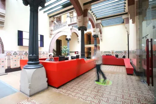
Once the idea was clear, the formal operations came quite easily: we imagined three desks for the three main functions (information, couriers and security) that would fold to create the space, and will grow or decrease to achieve the functions (attention for disabled people, seat, hiding the cameras…). The large reception desk would divide the public area from that reached through security checks, and would keep outside of the security line a desk and waiting area for couriers. A security desk would be just in front of the access point, which would be brought to one side, giving a layer of asymmetry to this modernist building.
Once the concept was approved we entered into the next question: how to bring those ideas to reality? First decision was to keep the color of the conceptual renders: the several visits to the building convinced us that a red would fit the interior, and then we started to bring it to the next step: it wouldn’t be a single red, but changes in color would give idea about the use. The two public desks were painted in two very similar shades of red, and the security desk in a much darker shade. At this stage, studying the use of the former desks gave us rules to shape the desks, fitting with this to the real state of the question: How high is a desk? How many monitors do you need in a security desk? How many printers? Is there a space for leaving a newspaper? Where do the people wait? Those were some of the questions that we hadn’t done and became crucial in the final design.
Once all this questions were clear, we had to achieve another problem: as it is a public building and it was the lobby refurbish, construction had to last as few as possible. We used 3d tools to design the desks and then developed them into plan surfaces. Those plans were then given to the builder, who made them in wood (in fact MDF, a wood conglomerated), in his workshop. Those big desks were cut into pieces (each piece about 3×2×1.4m), transported in a truck and then assembled on site, being on enormous help in this case the generous spaces that the modernist hospital had projected. This working system allowed that construction on site lasted only 1 day (in weekend), not interfering with the normal functioning of the building, and leaving most of the construction time to workshop, who lasted about 2 months.
The final spatial configuration is: just in front of the entrance the big reception desk gives the main arrival point, and extends to separate the public from the private part of the building. At your right there is the registration desk (the place where messengers leave their documents), and that desk gently slopes down to create a bench. At the other part there is the security desk, a more square and robust piece, making the entrance point and not interfering with the courier circulation.
This project gave us the opportunity to talk with a new language to an existing building. We wanted to bring it alive again, to show the potential of actuality that those spaces have nowadays, with all those crafts than seem as old as impossible to achieve.
We believed that an actual furniture intervention would be able to talk to the space, to make it say things he didn’t knew he could say, and with that intention we brought to the building the broken lines language, gave it a layer of asymmetry that was not so evident… But at the same time we believed that this furniture had to be able to understand this space and to play with its characteristics, and with that intention we moved around the columns that where already there, chose some colors that would play with the existing ones… And all those games, all those ideas, always having in mind that we were the last ones to arrive and will probably be first ones to leave, so all interventions are strictly temporary and removable, letting the building be as it is.
Spanish text:
Proyecto hall Pabellón Ave Maria
reordenación de espacios y usos
del hall de acceso al pabellón ave maria.
En el Hall de acceso al departamento de salud, se producía una entrada muy angosta que no daba margen a la espera de los ciudadanos. Se quería también incluir al personal de registro en el vestíbulo para así agilizar los movimientos internos y externos del edificio.
La propuesta realizada, busca con solo 3 muebles que se irán adaptando a las differentessfunciones a las que darán lugar. Su disposición permitió generar más espacio para la recibida y segregar las 3 funciones principales que se desarrollan en este vestíbulo.
1-Al entrar nos encontramos el mostrador de información.
2-A mano derecha se realizan los registros, y una pequeña espera.
3 A la izquierda la seguridad controlarà el paso del personal.
Los muebles se realizaron en DM lacados en differentes gamas de rojo, extraídas de los muros del edifico modernista, buscando 3 gamas de rojo que fueran de mas a menos llamativas en función de su prioridad de uso.
Fotografia: Santiago Garcés
Hall Entrada Ave Maria building images / information from raichdelrio
Location: Ave Maria, Barcelona, Catalunya, North East Spain, south western Europe
Barcelona Architectural Designs
Barcelona Architectural Designs – latest buildings
Barcelona Architecture Walking Tours
photo : Alejo Bagué
Recent design by the raichdelrio studio:
OAC Girona, Catalonia
photograph : Santiago Garcés
Catalan Buildings
Nou Camp stadium redevelopment
Nou Camp Stadium Competition
City of Justice, L’Hospitalet de Llobregat
Design: David Chipperfield Architects
City of Justice Barcelona Buildings
Torre Agbar
Design: Jean Nouvel Architects
Agbar Tower
Comments / photos for the Hall Entrada Ave Maria design by raichdelrio architects page welcome.
Barcelona, Catalunya


