Benicassim House, Valencia Building, Residential Development, Spanish Home, Architecture
Benicassim House in Valencia
Contemporary Spanish Residence Renovation in Spain design by Egue y Seta architects
27 Mar 2017
Benicassim House
Architects: Egue y Seta
Location: Chiva, Valencia, Spain
Benicassim House
Removing unnecessary partitions, annexing circulation spaces to premises with a practical function and pursuing a direct visual connection with the exterior, are altogether strategies commonly employed when achieving a feeling of spaciousness is required within confined spaces. This formal discourse, that seems to be commonplace ever since the “lofts” became overly popular, does not exhaust its potential benefits when applied within the context of larger homes. Proof to this is the latest comprehensive renovation project tackled by Spanish interior design studio Egue y Seta, on a house of 300 sqm in the town of Benicassim on the coast of the sunny province of Valencia.
Interior architects Daniel Pérez and Felipe Araujo tried this time to prove their theory in a less obvious context, one where the already spacious rooms were not exactly claiming for greater openness. The result, therefore, goes beyond allowing minimum space necessary for living, successfully achieving an overall feeling of wellbeing and visual comfort that is got more to do with integration of spaces, versatility, and freedom of movement than with centimeters.
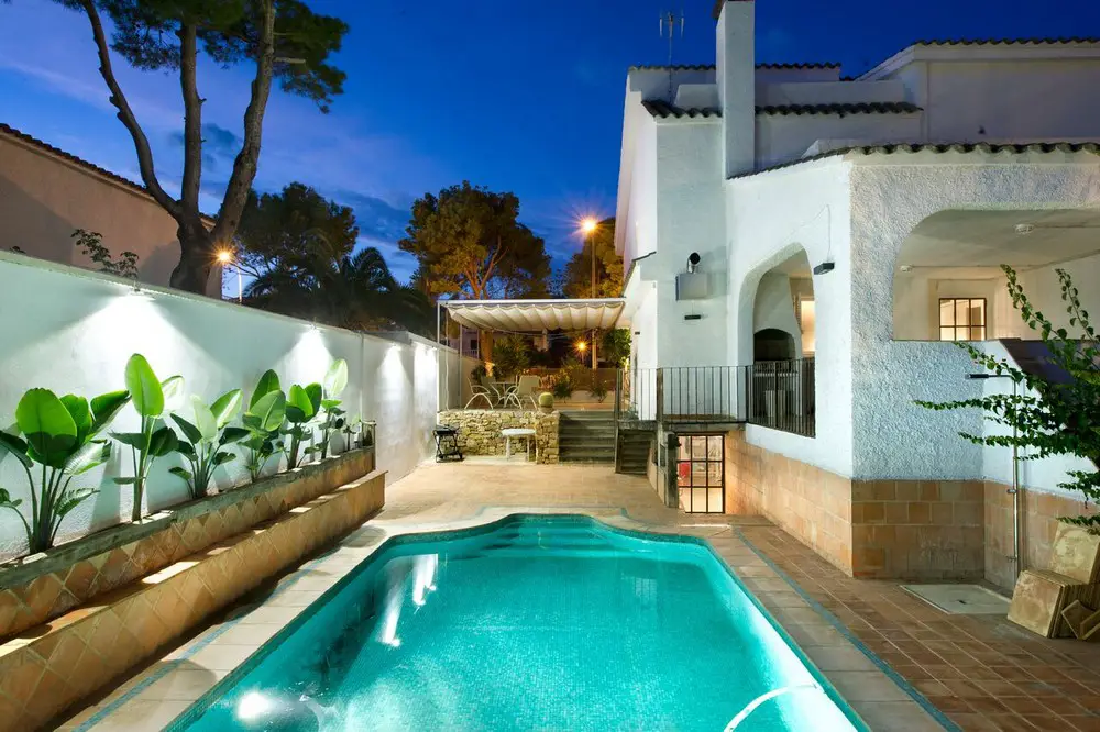
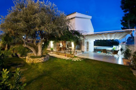
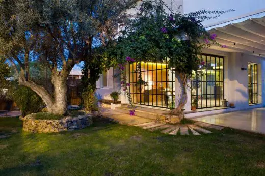
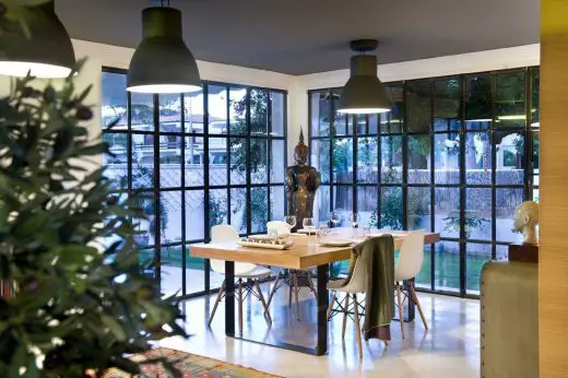
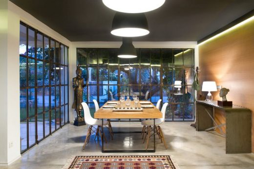
Entering the property like any other visitor through the main access we are welcomed by a lush perimeter garden. This “green belt” with its swimming pool and sun deck, and its recently upgraded landscaping and circulation schemes will permeate all the views that one can have from the interior of the home through their new iron framed enlarged windows. The dining room, set up on a former outdoor terrace currently enclosed by crystal walls; the kitchen immediately adjacent and without any dividing walls; as well as the living room: they all look directly over a profuse green foliage that makes it hard to believe the beach is actually just around the corner, if only the salty breeze that manages to slip through the windows would not give it away.
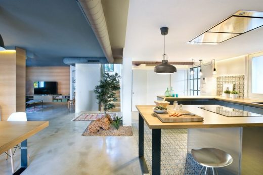
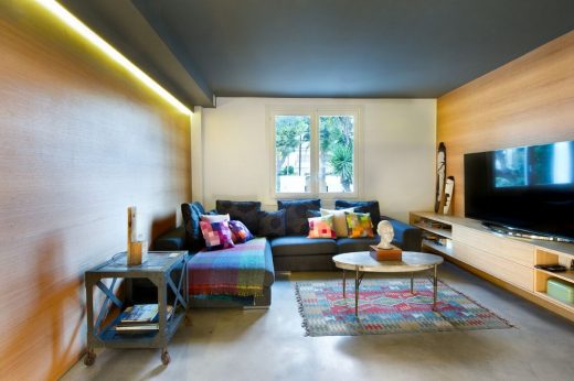
In between these areas hardly any vertical partition have been erected, and their visual boundaries are only perceivable through pavement and wall finishing changes, as well as alterations on ceiling height. In the living room, the earthy warmth of wood predominates dressing up most surrounding walls, that seem to embrace an “L” shaped sofa upholstered in deep hues of grey, along with a wall hung piece of furniture that serves at the same time as storage space, audiovisual console, and chimney.
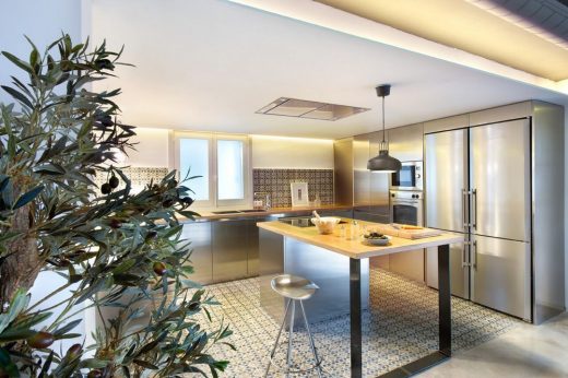
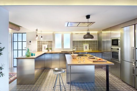
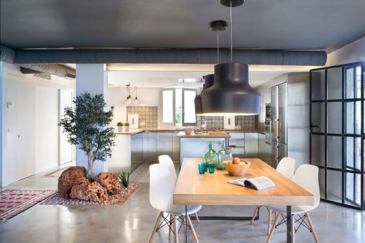
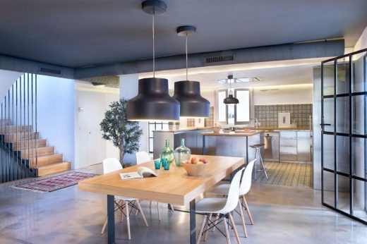
Here the concrete pavement and the serene grayness of the ceiling go beyond the realm of the living room and following them we´ll find ourselves in the dining room having gone under no doorways or thresholds. A solid natural oak wooden table is there to have us sit around its wrought iron legs and admire this expansive but welcoming area conveniently integrated to both garden and kitchen. Here, a drastic change in finishes was posed by the designers who decided instead to go for a bold combination of traditional Spanish ceramic tiles for the walls, shiny and industrial steel for the furniture while playing along with other domestic decorative accents.
The whole of the kitchen space feels like a complete different stylistic universe while in terms of space it is actually absolutely integrated. It is precisely this type of space integration what allows us to be in two rooms at the same time, to move from one to the other hardly noticing the change, and to access to the commodities each of them have to offer in a simultaneous way. All of these short, automatic and subconscious movements between different purpose areas take place around a small interior garden, that being the circulatory vertex of the house, manages to articulates the whole of the lower ground floor. To its right we find an auxiliary courtesy toilet, whose material “honesty” and visual economy turn it into an authentic serenity retreat; a couple of service and storage dependencies, and at last, the stairs case that takes us to the upper levels.
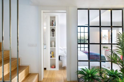
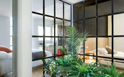
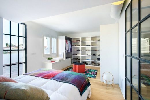
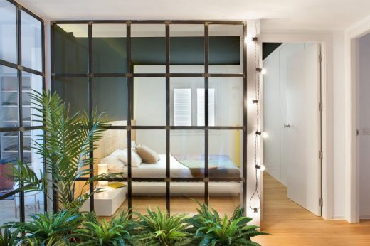
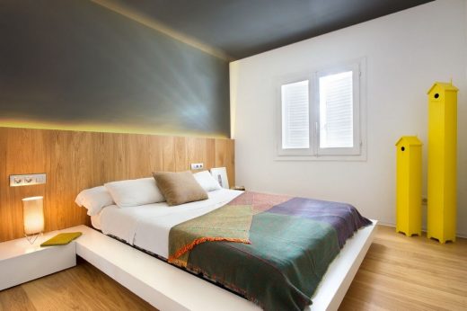
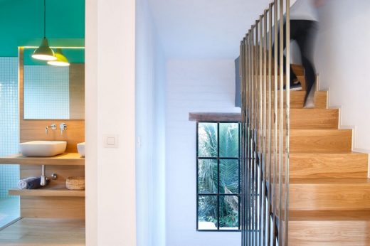
Again in the upper floors devoted to bedding and relax, an interior garden is posed as a circulatory axis and a lush decorative feature that can be enjoyed from all and each of the bedrooms through their clear partitions. The master´s suite poses a double bed in a central position leaning against a headboard of raw printed oak, that offers storage space, reading and decorative light and the necessary separation from the bathroom located immediately behind.
The oak wooden parquet on the floor runs from the bedroom to the bathroom area up until meets the wall tiling, that in this case and due to its whiteness, chose to reflect all the light coming from a pair of symmetrical windows placed on both side of a generously sized common shower tray, ventilating directly over separated areas of individual sets of sink and toilet. Facing the bed an open walk in closet with all the furnishing necessary to those who like dress well and undress themselves comfortably.
Such “en suite” bedroom is located in the same floor as two other double bedrooms with less generous proportions. These thus share a common bathroom that combines a bold color scheme, the warmth coming from wooden vanity tops, indirect lighting and the cleanliness of white beveled tiles. As the master´s suite, these additional bedrooms also have a privileged view over the surrounding gardens as well as the central indoor “patio”, they stand over the same natural oak pavement and they all pose the possibility of double occupancy. Nevertheless, for their decoration a single hue of gray was chosen to cover ceilings and headboard walls in order to emphasize a sense of continuity, spaciousness and the prominence of architectural planes all through chromatic accents and lighting.
All along our journey throughout the house, the strategies employed repeat themselves: Visual annexation of adjacent rooms, articulation of spaces around interior “green” elements; and at last, the choice of flooring, walls and ceiling finishes that when prolonged manage to “bridge” a gap between different realms, while when interrupted are meant to serve as a bland but perceivable barrier that promotes on the other hand freedom of movement. When it comes to style, the proposal is homologous: The industrial and the traditional as well as the contemporary and the vernacular seem to converse harmoniously, flowing continuously at times, or pausing right when visual cacophony is to be avoided.
This home renovation at Benicassim demonstrates that opposites do not always attract, that already spacious room do not necessarily demand space contention, and that every room, no matter how generous its proportion are, will always benefit when provided with great views, ample and easy access; versatile and functional furniture, and a mixture of styles and finishes that make the whole atmosphere timeless, universal and balanced.
Benicassim House – Building Information
Designers
Egue y Seta www.egueyseta.com
Daniel Pérez + Felipe Araujo
Client
Private
Location: C/ Gran Avenida de Benicassim, Valencia
Area
372,72 sqm
Completed date
2014
KITCHEN:
Coverings:
Porcelánico Neocerámica. www.neoceramica.es
Worktop: natural oak
Kitchen: stainless steel
Furniture:
Stool: BD Barcelona Design JAMAICA
Ceiling lamp: Copenhagen pendant – www.scandinavia-design.fr/copenhagen-pendant-andtradition_en.html
DININGROOM:
Furniture:
Table: natural Oak
Eames chair of Supestudio: www.superestudio.com/?gclid=CO-9ma6U68MCFebKtAodalkA3Q
Ceiling lamp: No information
BEDROOM:
Floorings:
Oak laminated floating floor
Studio Parquet http://www.studioparquet.com/
Atrezzo
Pillows and blankets
www.cristianzuzunaga.com/
LIVINGROOM:
Floorings: polished concrete
Wall: natural Oak
Pillows and blankets:
Cristian Zuzunaga
WHITE BATHROOM:
Coverings:mod. L’antic colonial Porcelanosa (www.porcelanosa.com)
Worktop: natural Oak
Toilets and taps:
tap: mod.3321 Drako of Ramón Soler (www.ramonsoler.net/series/)
toilet: Roca.(www.roca.es/)
Ceiling lamp: Ikea
TURQUOISE BATHROOM:
Coverings: Hisbalit (www.hisbalit.es/)
Worktop: natural Oak
Toiltes and taps:
Tap: mod.3321 Drako of Ramón Soler
Toilet: Roca
Ceiling lamp: Ikea
STAIRS:
Natural Oak
Photographer: VICUGO FOTO www.vicugo.com
Benicassim House in Valencia images / information received 270317
Location: Chiva, Valencia, Spain
Architecture in Spain
Spanish Architecture Designs – chronological list
Spanish Architectural News on e-architect
Valencia Architecture – selection:
Casa Patio, Loriguilla
Architects: Alberto Facundo
photograph : German Cabo
Casa Patio in Loriguilla, Valencia
Bvalve Office Building
Architects: Ramon Esteve Estudio

image : Ramon Esteve Estudio
Office Building in Valencia
Apartment Musico Iturbi
Design: Roberto Di Donato Architecture
photography: Joao Morgado
Apartment Musico Iturbi
Little Stories Concept Store, Calle Pintor Salvador Abril 30
Design: CLAP Studio
photo : Daniel Rueda
Little Stories Concept Store, Valencia Shoe Shop
Restaurante Kento, Calle San Vicente Mártir 36
Design: Masquespacio
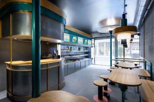
photography: Luis Beltran
Restaurante Kento in Valencia
New Houses – best contemporary properties from around the world
Ciudad de las Artes y de las Ciencias
Design: Santiago Calatrava Architects
City of Arts and Science Valencia
Casa El Portet in Moraira by Ramon Esteve
Comments / photos for the Benicassim House in Valencia – Spanish Property page welcome

