MORPH Shenzhen building, Nanshan District architecture photos, Modern Chinese cultural venue interior design
MORPH, Nanshan District
New social space for cultural, artistic & musical events, Southern China – design by Various Associates
21 Sep 2019
Architects: Various Associates
Location: Shenzhen City, Guangdong Province, Southern China
Photos by Shao Feng
MORPH, Nanshan District, Shenzhen
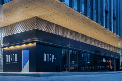
‘MORPH 模糊’位于深圳市南山区市中心区域,占据着整个建筑体的一角,是一个建筑面积1000平方米的综合性空间,景观上面朝着市政公园,地理位置上毗邻后海商圈区域,是一个在市中心难得的闹中取静的位置。MORPH的中文意思是变形、进化,业主希望在当地建立一个充满可能性的新社交空间,引进及承办不同的文化艺术音乐活动,带给这个城市新的活力。
Located in Nanshan District, Shenzhen, China and occupying a corner of a building, MORPH is a mixed-use space with a total construction area of 1,000 sqm. With an urban park and Houhai business circle nearby, it’s a rare tranquil place amidst the hustle and bustle of the downtown area. “MORPH” means transformation and evolution in Chinese. The client hopes to build a vigorous and brand new social space, to introduce and hold various cultural, artistic and musical events, with a view to bringing new vitality to the city.
在设计师的理解中,进化代表进步及变化。通过对深圳这个新城市背景的思考,希望可以引入中国传统的一些本土材料及元素与现代化的结构形态产生碰撞、以全新的方式将当代人们逐步遗忘掉的老元素与国际现代的设计及审美接轨,呈现真正意义上的设计“进化”。设计师的想法是通过一个充满材质变化及对比的室内景象以及所面临的多功能区间的分布,来促进这种碰撞的实现。
The project was approached by Various Associates, a local-based design studio. According to the project designers’ understanding, evolution indicates progress and variation. Taking account into the context of Shenzhen — a new city, they wanted to utilize some traditional and local materials to collide withthe modern interior structural forms, and fuse gradually-forgotten Chinese old elements with international modern designs and aesthetics in an innovative manner, thereby presenting the “evolution” of design. The designers’ idea is to realize collisions within the space through a diversified material palette, contrasting interior scenes as well as division of multiple functional areas.
进化|Morphing
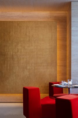
暖沙色的天然洞石作为墙面与天花的主要材料,为简洁温暖的体量赋予了微妙的质感,搭配金箔洞口反射的微微金光和黄铜连接件,呈现出现代而永恒的观感,与场地附近的商业建筑在视觉上形成鲜明的对比。轻盈而厚重、泰然而谨慎、透明而密闭——整个项目似乎充满了类似的对比元素。
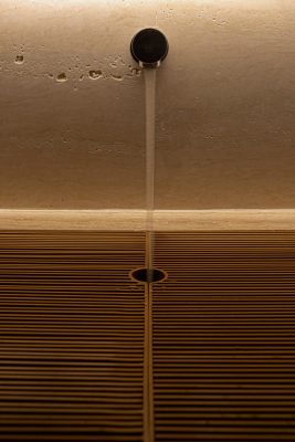
Walls and ceilings are mainly clad in sand-color natural travertine, which adds a subtle texture to the simple and warm volume as well as presents a visual impression of modernity and eternity in combination with brass connections and holes finished with gold foil, forming striking contrast with surrounding buildings visually. Lightweight yet massive, composed yet prudent, transparent yet closed, the space is awash with contrasting elements.
色系的灵感来源于紫禁城的传统配色,采用了极端且饱和度极高的配色:大红、正蓝(青)、哑黑、明黄、金;也正是所谓五行的颜色。如此具有中国代表的色系在空间中以全新的现代方式重组,诠释及转换,与结构相结合形成了视觉饱和度极高的一帧帧画面。
The color palette is inspired by the Forbidden City, consisting of red, blue, black, yellow and gold, which feature extremely high saturation and are consistent with the colors of Wu Xing (Wu Xing is also named as the Five Elements,which includes metal, wood, water, fire and earth. In traditional Chinese philosophy, Wu Xing is the foundation of everything in the universe and natural phenomena). The five hues with Chinese characteristics are reorganized, interpreted and transformed in a modern approach within the space, which well integrate with the interior structures, together producing visual highlights.
材料和纹理|Material and texture
而在材料纹理上,设计师采用了多种现代材料与中国独有的材料作为结合。
The designers combined diversified modern materials with traditional materials exclusive in China.
| 黑BLACK |
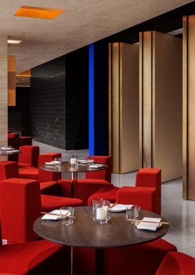
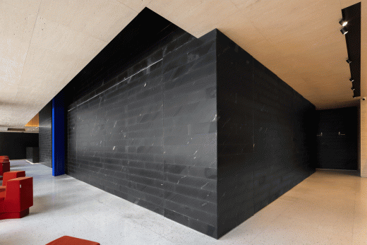
如黑色的墙面是由紫禁城的地面材料-金砖(用于紫禁城宫殿内的地砖,因价值与金子媲美故称之为“金砖”),通过现代的科技循环重组而生的一种新环保材料,不仅保留了此材料的材质特性,更是将四万每平方米的成本大大的降低。据研究分析,金砖这一结合了中国匠人智慧的材料将于20年后因原料的缺失而消失。
The matte black wallsare covered with a new environmentally-friendly material. It’s made from a kind of traditional black tiles which can be seen on the floor of Forbidden City’s palaces (Interior flooring tiles of the Forbidden City are also named as “gold tiles”, because they are as precious as gold.), via modern technology and a reorganization process. This new cladding not only maintains the texture and properties of “gold tiles”, but also greatly reduced the cost. According to researches, the traditional “gold tiles”, which crystallize ancient Chinese craftsmen’s wisdom, will disappear 20 decades later due to the lack of raw materials.
| 蓝(青) BLUE |
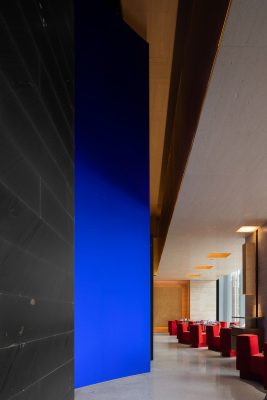
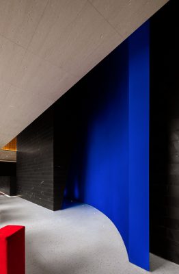
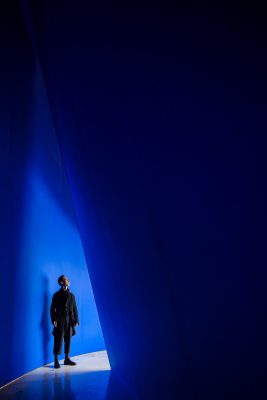
蓝色弧形门的材料使用了中国传统工艺-绢布-通过匠人手工染制而成,颜色饱和度极高,每一批次颜色都不尽相同。极其霸道的正蓝色高墙在空间中心处伫立,以不可退让的姿态宣誓这自身材料的“纯正血统”。
The blue curved doors are wrapped in a kind of traditional Chinese fabric hand-dyed by experienced craftsmen, which is characterized by high chroma. Hand-dyeing is a traditional craft, and different batches of cloth dyed manually have different shades. At the center of the space erects a high wall, which features an “orthodox” blue color, seeming to declare the fabric covering’s unadulterated quality in an uncompromising way.
| 金 GOLD |
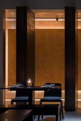
而空间多处的金色质感温润自然,则是由金箔一片片手工贴至而成,如同佛寺金佛的工艺一样。如薄纱般的金箔层层叠叠出来后的纹理与质感,通过室内光的反射,形成空间里缕缕金光的来源。
Gold is dotted throughout the space, which is rendered by gold foil, with a warm and natural texture. Each piece of foil was stuckby hand, similar to the way of how gold buddha statues in temples are clad. Layer upon layer, the gauze-resembling gold foil showcases unique grains and textures, and becomes more shiny through the reflection of light.
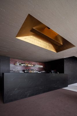
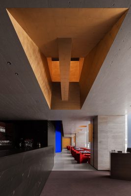
一楼天花上的金色洞口将一二楼区域微妙的联系在一起,微微的灯光照射在金箔再反射在周围,使空间多了些许禅意跟仪式感。
Gold openings on 1F’s ceiling subtly connect the two storeys. Gleaming light shines onto the gold foil and then generates reflection, endowing the interior with a Zen ambience and a sense of ritual.
| 红 RED |
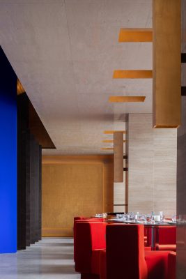
大红的丝绒沙发独特的形状为庄重感的空间增加更多的现代感跟趣味性。与空间中蓝色的弧墙-色泽上相同的强烈与极端的两大色系;彼此竞争着在空间中形成鲜明有趣的个性。同时也是VA与国内优秀品牌Fresh合作的首款沙发系列。
Red velvet sofas feature special shapes, which add a sense of modernity and playfulness to the solemn space. The bright red collides with the strong blue of the curved walls, forming interesting contrast. It’s the first sofa series that Various Associates created in collaboration with Fresh, an excellent domestic furniture brand.
| 土 EARTH|
意大利的大地色天然洞石,颜色温和质感自然,与哑黑色的石墙及真金金箔贴制而成的墙形成有趣的对比。
With a warm hue and natural textures, the earth-toned Italian travertine generates appealing contrast with the matte black walls and walls finished with gold foil.
灵活性|Flexibility
设计干预措施主要针对室内的夹层设计。通过精密的结构测算在原始通高达7米的空间内横跨增加了二楼的面积,以整体循环灵活的动线连接所有的功能区域,结构语言搭配有限极致的色调材料— 空间在扩张的同时保持着整体画面的平衡及统一。
The key design intervention of the project is the creation of a mezzanine. Through precise structural calculation, the designers added a mezzanine to the original 7-metre-high space, which is regarded as 2F. A circular and flexible circulation connects all functional areas, and structural languages well match with materials featuring strong hues, hence maintaining balance and unity in an expanded space.
另一项激进的措施是在原本几何空间中插入另一个略微错位的斜面弧墙通高的结构,连接、分隔和限定空间,同时增添空间的标示性与明亮感。外廊与黑色石墙的活动场所之间隔着一个通高的结构语言,材质与结构碰撞出的几何美感,在此处表露无遗。从一楼往上看,则增加了空间的通透性,以微妙的方式将一二楼连为一体,同时打破了一楼高度的压抑感及局限性。
Another bold intervention is to insert a slightly oblique and curved double-height structure into the geometric space, which can not only link, partition and define the space, but also highlight spatial identity and increase brightness. The structure is set between the lounge and the activity area with black walls in a unique manner, perfectly presenting a geometric aesthetic via the collision between materials and structures. Looking up from 1F, it enhances spatial transparency, establishes a visual connection between two floors, and breaks the limitation of 1F’s storey height as well as eliminates its oppressive feeling.
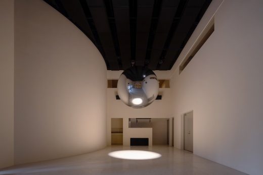
除此之外,MORPH具有三重身份:酒吧,活动举办场,可变换空间;有效地承担文化语境中的“人城互动”。功能区域围绕着空间中央7米高的活动空间展开-可容纳100人的场地,剧院级别的音响,及不定时更换的空间装置搭配各式的活动形态,给予了本地人们一个新社交场所的选择。
MORPH is a bar, an event venue and a transformable space, available for facilitating “interaction between human and city” in cultural context. Functional areas are set around a 7-meter-high activity space at the center. With capacity for 100 people, theatre acoustics, and spatial installations which can be replaced irregularly, it’s adaptive to various types of activities and provides local people with a fantastic place to socialize.
click on this gif to see the rotating image sequence:
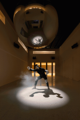
活动空间的两侧设计的是可以灵活转动的门,满足现场适应举办不同性质的活动展览。关闭时内场成为一个独立的纯净空间,打开时内场与外廊区域相联,丰富了整个空间的互动及层次感,人们与表演者可穿梭其中,形成有趣的互动跟景象。
Flexible rotating doors on both sides of the activity space can meet the needs of different events and exhibitions. When doors close, a separate inner activity space is created, while it connects the lounge as doors open, which enriches the interaction and sense of layering within the overall space. People including performers can go through the doors casually, thereby resulting in interesting interactions and scenes.
从外廊看过去的,连续性的空间及多扇可旋转开放的门,带给了空间举办不同活动的可能性及灵活度。多扇移动的门如同一个会呼吸膨胀的心脏,赋予同一个空间不同的层次与变换,如这里的名称MORPH(变化)的意思一样。
Viewing from the lounge, continuous spaces and revolving doors bring the space more possibilities and flexibility to have different activities. Like a beating heart that expands, those doors endow the space with different layers and variations, just echoing its name — MORPH.
click on this gif to see the rotating image sequence:
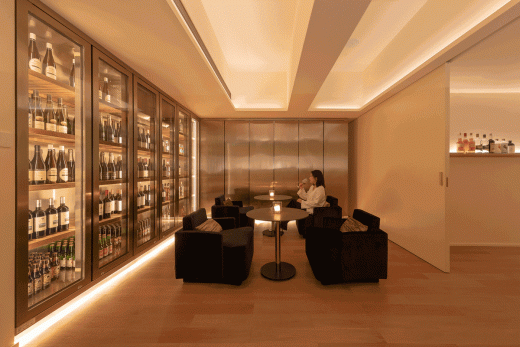
吧台、Lounge、贵宾间,酒品研发厨房等功能区围绕着活动空间分布,形成趣味性的环绕型动线,可根据不一样的活动需求组合及拆分。
Functional areas such as bar counter, lounge, VIP room and cocktail kitchen are arranged around the activity space, forming an interesting ring-like circulation that can be segmented and reorganized flexibly for various events.
click on this gif to see the rotating image sequence:
二楼功能区内均有独特的窗口可供客人欣赏一楼活动空间的活动及表演,以另外一种视角穿梭在不同的场景中。
Special windows were designed at the functional areas on the mezzanine for guests to enjoy activities and performances held at the activity space downstairs, which provides another view to varying scenes.
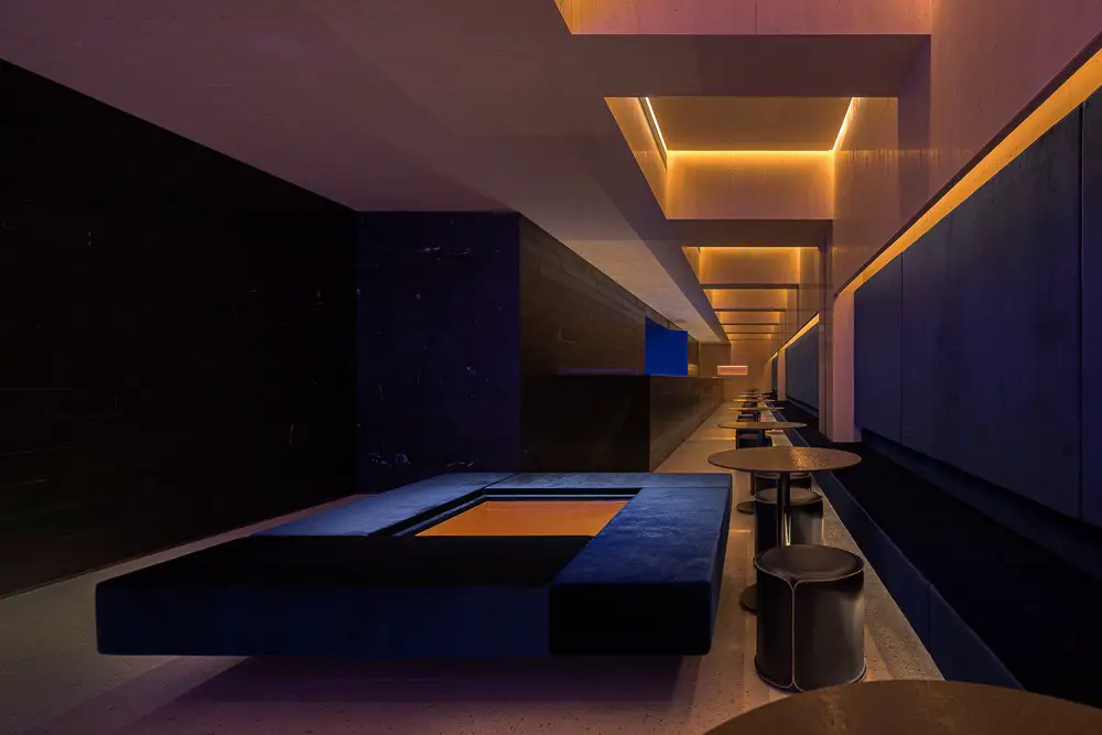
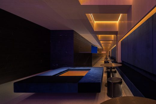
二楼幽深的外廊区域,靛蓝色的丝绒卡座结合着天花重复性的结构,使空间充满建筑感及几何美感。
At the deep and tranquil lounge area on the mezzanine, indigo velvet booths are perfectly combined with repetitive ceiling structures, which fills the space with a sense of architecture and a geometric aesthetic.
楼梯间的粉红色几何形状装置灯光,为如此冷静跟结构强势的氛围添加了不少的热闹跟活泼。
The geometric installation in the stairwell glows pink, adding liveliness and vividness to the calm and structure-predominant space.
粉色玻璃装置
Pink glass installation
洗手间内的“镜中镜”,通过空间的方式重新定义镜子的展示方式,以交错的视觉效果凸显出人与镜子微妙的呼应关系。
The designers created a scene of “mirror in mirror” in the bathroom. It redefines the way of displaying mirrors by taking advantage of the space, and highlights subtle interactions between people and mirrors with interpenetrating visual effects.
融合&转化 | Fuse & Transfer
面对着中国传统材料的被遗忘及消失,万社基于作品给出了探索与解答-通过自身的设计手法去革新大家对传统材料使用方式的印象,重新定义一个传统材料在现代社会及设计上的运用;将中国特有的材料与现代技术材料及设计结合,突破人们对传统材料上使用的限制,以另一个方式继续传统材料的沿用 :“re-design with old material” .
Through this project, Various Associates explored and worked out a solution to tackle with the oblivion and disappearing of traditional Chinese materials: on the one hand, adopting unique design approaches to innovate the way of using traditional materials and redefine them in modern designs; on the other hand, integrating China-specific materials with modern technologies, materials and designs, so as to break through the limits of traditional materials utilization and realize “re-design with old material”.
各式材料的结合:
Fusion of materials:
在繁荣夜景的环绕中,此处以另一种姿态展示着自己对这个城市的期许跟盼望。如MORPH自身的名字一样,进化并变化着,面对着不同的挑战也充满着无限可能。
Amidst the prosperous and charming urban night view, MORPH shows its expectation and hope for the city with a unique posture. Just as its name indicates, it keeps evolving and transforming to face different challenges and bring infinite possibilities.
项目资料
客户:MORPH 模糊
地址:中国,深圳,南山,海信南方大厦
状态:完成于2019.07
设计团队:Various Associates | 万社设计(https://various-associates.com/)
项目负责人:林倩怡
主设计师:杨东子
设计师:杨东子、唐静静
建筑面积: 1000平方米
摄影师:邵峰
Project info
Client : MORPH
Location: Hisense Southern Building, Nanshan District, Shenzhen, China
Status: Completed in July 2019
Design team: Various Associates (https://various-associates.com/)
Project leader: Qianyi Lin
Chief designer: Dongzi Yang
Designers: Dongzi Yang, Jingjing Tang
Area: 1000 sqm
Photographs: Shao Feng
MORPH, Nanshan District, Shenzhen images / information received 190919 from Various Associates
Location: Shenzhen, southern China
Architecture in China
China Architecture Designs – chronological list
Shanghai Architecture Walking Tours by e-architect
New Architecture in Shenzhen
Design: Fumihiko Maki Architects
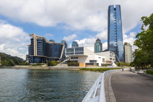
photograph © Design Society
Design Society Shenzhen Building
Design: Co-Direction Design
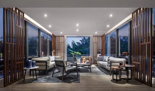
photographs : B+M studio, Zhao Hongfei, Wei Yidong
Shenzhen Oriental Garden Villa Chamber
Design: Aedas, Architects
image from architect
Gmond International Building in Shenzhen
Design: HASSELL
image : HASSELL
Qianhai Mawan Mile in Shenzhen
Chinese Architecture Offices – Design Practice Listings
Comments / photos for the MORPH, Nanshan District, Shenzhen in Guangdong Province, southern China, page welcome

