House 4×30, São Paulo Building, New Brazilian Property, Modern SP Residence Images
House 4×30, São Paulo
New Property in Brasil design by CR2 + FGMF, South America
18 Oct 2011
Design: Clara Reynaldo (CR2) and Lourenço Gimenes (FGMF)
Location: São Paulo, SP, Brazil
House 4 x 30
Photos by Fran Parente
House 4×30 São Paulo
Encrusted in a row of narrow geminate houses, the story began more as a challenge rather than as an architectural project. How make the entire program of a house fit in that 4x30m lot, relying on a few illuminated surfaces? Even though the object is deceptively simple, the answer came across a lot of research.
From the tiny Japanese and Dutch houses, we have borrowed more than the certainty that it would be possible to take advantage of the little space in a creative manner: some examples would also induce certain implosion of the program of the small-bourgeois house. The architectonic proposal ends a logic a bit aligned to the conventional space for the stereotype of a middle-class family in São Paulo and turns to integrated spaces and eliminates others considered “mandatory.”
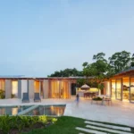
The occupation of the lot was one of the major factors for the development of the project. The search for natural illumination and ventilation conditioned the emphasis on the central garden, cut in the constructed volume in order to create three façades generously bathed in light. United by a footbridge around the garden, two blocks of different sizes organize the functions of the house and require residents to enjoy the green on all displacements. The larger block focuses the living room and kitchen on the ground floor and the bedrooms upstairs; the smaller one contains supporting environments such as service area, office and vertical circulation of the house.
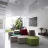
That choice has followed the intention of perverting the limits of the garden with retractable glass doors in order to fully integrate the living room with the external space. At this point, a conceptual crossroad: if the living room is opened onto the garden, the only option for the kitchen was facing the façade.
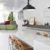
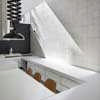
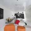
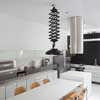
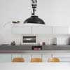
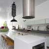
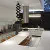
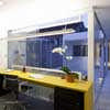
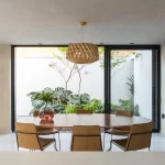
The width of the lot and the garden-living room relationship implied, therefore, that the entrance of the house should be through a service space, and the solution found was going against the initial impulse of hiding it. Highlighting it in its form and, integrating it spatially passed from an obstacle to a project opportunity. The lowering of its floor in 75cm, besides increasing the headroom, has brought two important consequences. The first was the creation of an “elevated” passage, so that the entrance of the house would not exactly be through the kitchen, but through a circulation axis which extends throughout the house, setting it into an immediately identifiable logic. The second was the strange continuity between the level of the living room and the dining table, built on the island with built-in oven. Lowered, the kitchen offers itself to the visitor by an unused perspective. Integrated into the living room by the table-floor, by the bench that overflows from an environment to another, by the materials and details, the kitchen becomes part of the same space, but the lowering of the level highlights the differences between the programs.
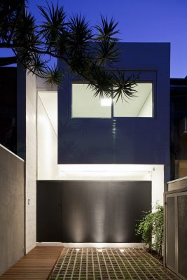
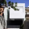
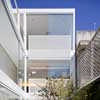
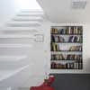
Hovering over the gaps of the different heights of the living room and the kitchen, a large white object floats. Highlighted from the circulation axis, the cobblestone covered in aluminum wainscot transgresses the limits of the front façade and moves away from the left gable, allowing the visualization of a hydraulic tiling panel. The volume accommodates two suites, accessible by the expanded mesh footbridge that stops to create generous headroom over the entrance passage. In this linear ‘atrium’ and through the expanded mesh footbridge, there is the notion of continuity of the art panel signed by the artist Fabio Flaks. It occupies the entire gable, escorting the horizontal circulation on each floor, and refers to the large panels that were a characteristic feature of good modern architecture in Brazil. With an intentional prolongation, this panel is presented to the street and defines the entrance of the house, while a discrete glass slab allows the external observer to catch a glimpse of the continuity of the piece of art, which is offered as part of the urban landscape. Fully open, the permeable floor garage is also an exercise of generosity with the landscape of the city, often attacked by high walls reflecting the security paranoia and delusions of privacy that negates the very urbanity.
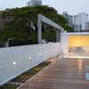
On the box of the bedrooms, a large deck occupies the top floor and creates a new area of enjoyment, framed by a strip of green roof. The solarium provides access for maintenance of air-conditioning and water heating equipment, but is primarily a recreational space that complements the garden on the ground floor. For the couple who lived in an apartment, every square inch outdoors corresponds to a great achievement.
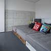
In spite of being distant from the usual armed concrete, the metallic structure used is extremely simple. Slender metallic beams cross the space and rely on pillars built into the side gables. The concept of dry construction is also suitable in other employed systems, such as drywall and cementitious boards, wood panel flagstones, metallic passageways, large casements and floors made of rubber, resin or floating deck floors. Overall, this is an efficient building house, fast and accurate, with no waste and reworks. The materials used are as recyclable as the house itself, which can easily be adapted over time or simply disassembled when needed.
The tiling panel, of simple design, composes together with the polyurethane resin floor and the aluminum of the box a scenario of great simplicity and whiteness, only broken by the exuberance of the garden, on the one hand, and by the force of the black gable, on the other hand, which protects the interior from being seen from the street, on the opposite side. The obsession for the white color is not purely form, although the search for a simple space was a premise of the start-up: it is, above all, a strategy to reflect light internally, leading it to all points of the house.
The garden also plays a role in the efficiency of the house. In addition to allowing a permeable area superior to the required by law, the grassy area has a Surinam cherry tree and a bright green wall which cool naturally and create a low pressure zone. The air, cooled, crosses the living room toward the kitchen window, renewing the air and assuring appropriate thermal conditions for most of the year. In the winter, the external screen, which protects the façade from the sunset, can be collected so that the sunlight helps to warm the environment.
In addition to the retractable screen, other elements such as expanded mesh brises, the green roof, the top floor deck which shades the metallic roof tile, the use of thermal-acoustic insulation on the seals and double-glazed windows in the bedrooms ensure a thermal performance which is above the average. The result, in the end, is a small house in size but large for the integration and continuity of its spaces, for the use of light and the flexibility of a less rigid program than a conventional house.
House 4×30 São Paulo : Building Information
CR2ARCHITECTURE + FGMF ARCHITECTS
Authors: Clara Reynaldo (CR2) and Lourenço Gimenes (FGMF)
Collaborators: Fernando Forte, Rodrigo Marcondes Ferraz, Ana Luíza Galvão, Bruno Araújo, Marcela Aleotti and Marília Caetano (architects), Mirela Caetano, Rafaela Arantes and Wilson Barcellone (interns)
Structural project; OPPEA Engenharia
Landscaping project: Studio Ilex
Installation project: Ramoska & Castellani
Art panel: Fabio Flaks
Site: São Paulo, SP, Brasil
Project: 2008-09
Work: 2010-11
Photos: Fran Parente
House 4×30 São Paulo images / information from CR2 + FGMF
Location: São Paulo, SP, Brasil
São Paulo Architecture
São Paulo Architectural Projects
São Paulo Architecture Designs – chronological list
by e-architect
Edificio POD, Rebouças, district of Pinheiros, SP
Design: FGMF Arquitetos
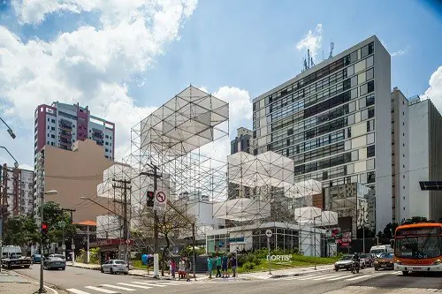
photography : Rafaela Netto
Edificio POD
Design: Königsberger Vannucchi Architects
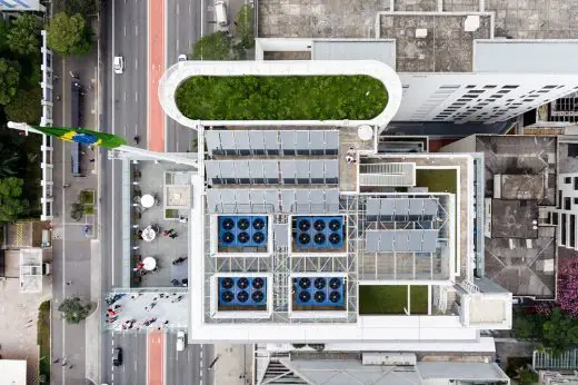
photography : Pedro Vannucchi
SESC Avenida Paulista Building
Marcio Kogan Arquitetos
Casa Panamá
Coser House
Marcio Kogan Arquitetos
Coser House
Comments / photos for the House 4×30 São Paulo property design by CR2 + FGMF page welcome


