New Erasmus MC Building Rotterdam News, Netherlands Architecture, Dutch Hospital Photos
New Erasmus MC Building
Architectural Development in Holland design by EGM architects, The Netherlands
20 May 2019
Award for the Erasmus MC Rotterdam
9 + 7 Sep 2018
New Erasmus MC Building in Rotterdam by EGM
Design: EGM architects
The Erasmus University Medical Center, Doctor Molewaterplein 40, Rotterdam, South Holland, Netherlands
New Erasmus MC Building
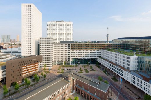
King Willem-Alexander of the Netherlands opens the new Erasmus MC: the university medical centre of the 21st century, designed by EGM architects.
Photos above & below © Rob van Esch
Erasmus MC
University Medical Centre, Rotterdam
INTRODUCTION
After 12 years of preparations and 8 years of construction, the biggest university medical centre in the Netherlands has opened in the centre of Rotterdam: the Erasmus MC. The new building transforms the university medical centre from a cluster of separate buildings into a small medical city that is home every day to 13,500 staff, 4,500 students and thousands of patients. EGM is responsible for both the architecture and the interior design of the new Erasmus MC.
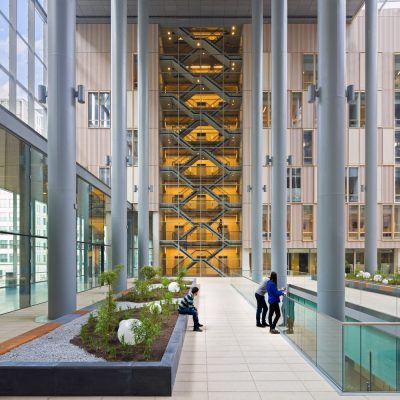
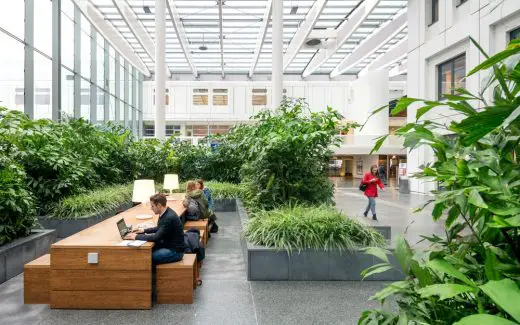
Everything in the new 207,000 m² university medical centre revolves around creating a Healing Environment that lowers stress levels during hospital visits, quickens the recovery of patients, and provides a pleasant working environment for staff. Spacious circulation areas, various atriums, large expanses of fenestration, sunken patios and plenty of greenery lend the medical centre its identity and create the desired connection with the city.
The result is a wonderful and especially healthy building: a clearly organized, safe and agreeable environment for patients, staff, students and visitors.
The new Erasmus MC
The new Erasmus MC is the result of a strong ambition to unite care, education and research. Built in 1961, the old hospital had become too cramped and lacked the internal organization and architectural quality of a state-of-the-art medical centre.
The new hospital is well-thought-out and is characterized by high level of spatial quality, maximum user flexibility and a prominent role for the human scale. The complex has been elaborated at all scales with plenty of attention for details, from its urban integration right down to the design of curtains in the patient rooms: a veritable Gesamtkunstwerk.
Concept
The overarching architectural concept resulted from the new hospital processes devised within the Erasmus MC. These processes integrate the required care within patient-focused themes such as oncology, cardiovascular care or emergency treatment. The concept groups these themes in one comprehensive building block, arranged around atriums that are smartly and effectively designed in terms of positioning, form and size. The grouping inside one building also optimizes collaboration and sharing of knowledge among the themes.
Design principles
Effective layout
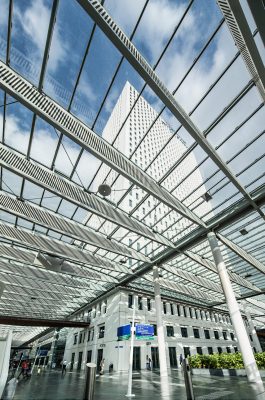
The basic layout of the Erasmus MC is as simple as it is efficient: a central connecting axis forms the spine of the complex and links existing and new buildings for care, education and research in a logical manner. Entrances from all sides lead to this publicly accessible U-shaped axis. From here, the various functional zones of the hospital can be accessed. A daylight-flooded interior street along which patients, visitors, staff and students move, the axis forms a gradual transition between the city and the hospital and is an important line of orientation within the complex.
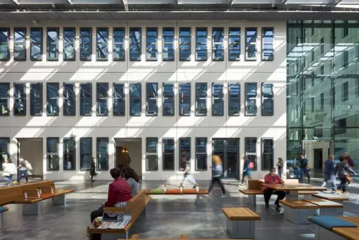
Adjoining the central axis are atriums that are as large as town squares, which are functionally and aesthetically important elements of the design. Contributing to the creation of a healing environment, the atriums constitute special public areas and feature high-quality finishes, with a timber interior facade, bamboo seating, lighting fixtures set in the greenery, and a glazed roof.
Smart and sustainable building
The design involved separating the shell from the interior design. In view of the duration of the project, this choice was of vital importance for the development of the state-of-the-art medical centre. This two-track approach offered the possibility to take decisions as late as possible during the process concerning the integration of the latest care concepts and the location of the newest medical equipment.
With a high level of flexibility in layout and use, the new Erasmus MC is sustainably prepared for future spatial needs. The floors, which can be freely arranged, have a grid of 9.60 metres, a ceiling height of 4 metres and supporting facades for the 31-floor office tower. A total of 6,000 m² of roof gardens and moss-sedum roofs create natural heat insulation, reduce the volume of rainwater, and improve health by absorbing particulate matter and producing oxygen.
A remarkable element is the waste-purification installation in the souterrain of the complex. Waste flows from kitchens, sanitary units and even operation units come together here, where water-purification and fermentation plants convert them into clean water and biogas to serve the centre’s energy needs.
Differentiated facade
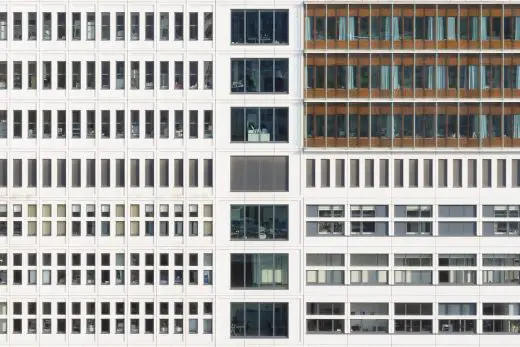
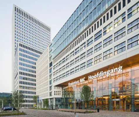
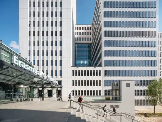
The main entrance is clearly recognizable by its inviting plinth, which is four floors tall here. Next to the main entrance is a two-floor-tall glazed plinth, behind which are offices, a fitness area, café and retail areas. The resulting vibrancy blends directly with the urban surroundings. Located above the plinth is a varied facade composition that features angled volumes, alternating horizontal and vertical fenestration, a variety of deep reveals and bay windows, elements with various concrete finishes, and timber elements to the patient rooms.
This composition breaks up the facade into clear elements, creating the impression of a row of individually coherent buildings arranged along a lively street. Larger building volumes are also broken up into smaller building volumes and blend seamlessly with the surrounding small-scale buildings for educational and residential use.
Architectural qualities
Entrance area and central axis
Visitors to the new Erasmus MC will be pleasantly surprised by the inviting entrance area where nothing suggests a hospital atmosphere. The Healing Environment even starts outdoors on the entrance forecourt, with its friendly brickwork, benches and greenery, and continues throughout the architecture, interior and garden design.
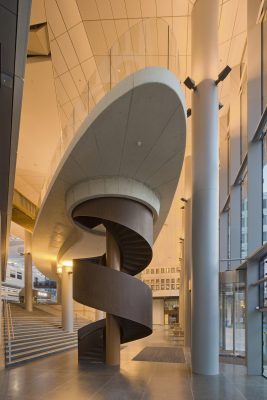
Located just inside the main entrance is the strikingly designed mezzanine with a grand café. The irregular floating form welcomes visitors in what is otherwise an orthogonal complex. Positioned perpendicular to the main entrance is the ‘passage’, the 300-metre-long central axis of the complex. Visually prominent trusses in the glazed roof above the interior street filter daylight and ensure an agreeable indoor climate. Shops, coffee areas and plenty of seating elements create a variety of spatial qualities, from dynamic to quiet and intimate.
Human scale
The Erasmus MC is like a small city. To introduce a human scale, the public area is divided into streets and squares marked by nameplates. Circulation routes in the building always receive daylight, evoking a calming and welcoming feeling. Anchor points such as the large reception desks with rounded forms and timber finishes, monumental art objects and grouped seating areas that are clearly recognizable and easy to find. The seating areas are intensively used for waiting, watching, working, studying and celebrating a birthday, also of patients.
The various functional zones such as policlinics, outpatients, diagnostics and nursing units are accessed from the public areas. Footbridges, archways and stairs positioned behind a glazed wall help patients and staff find their way to the various units. Sturdy materials that reflect the spirit of Rotterdam, such as stone and weathering steel, have been used.
Deeper into the building, the designers have opted for rounded shapes, softer materials and stronger colour accents. The applied colours and materials create a fresh, natural and calming atmosphere. The dozens of reception desks throughout the hospital, all designed by EGM, have a similar design language. They are instantly recognizable, even in stressful situations, thanks to their rounded corners, light colours and bamboo covering.
Focus on the patient
Patient theme
The new Erasmus MC distinguishes itself from the traditional hospital in the way care is organized around the needs of the patient. Facilities for syndromes, such as oncology and brains & senses, are vertically clustered in a number of patient themes. Within these clusters, patients can find everything they require for their specific care need.
This thematic organization is layered horizontally according to functions. On the ground level is the logistical area, and above it is the entrance area with public amenities and policlinics. Above them are calmer areas such as outpatients, diagnostics, intensive care and operation theatres. The higher you go in the building, the intensity of the circulation lessens. Located on the top floors, also the calmest, are the nursing departments.
Due to the fact that rooms with similar functions, such as operating theatres, are situated on the same floor, these rooms can be used one day for brain surgery and the next day for breast surgery, thus changing to another vertically organized patient them. This harmonica principle makes it possible to use spaces as optimal and flexible as possible, facilitating growth, shrinkage or future developments.
Operation theatres, nursing units, policlinics, consultation rooms and research rooms are as similar as possible in layout, ensuring easy recognition for both patients and medical staff, and for flexible use, and therefore efficiency. The layout is aimed at reducing stress and eliminating mistakes.
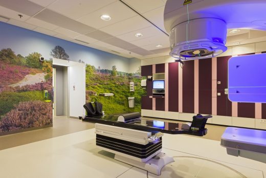
Waiting areas, outpatients’ clinic and patient lounges are enhanced with specially commissioned wall-filling photographs. Together with the so-called SkyCeilings and SkyLights – images of nature with daylight simulation – in radiotherapy rooms, emergency care, intensive care and other areas, they have a demonstrably calming and stress-reducing effect. It is one of the examples of the use of Evidence-Based Design in the project.
Policlinics
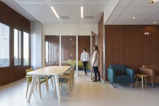
The policlinics on the first three floors of the hospital each have a local reception desk and waiting area with benches, tables and chairs. Here, too, plenty of daylight, pleasant colours and recognizable friendly materials generate a mood of calm.
Individual items of furniture in the waiting room are arranged in such a way that patients can look outside while keeping an eye on the interior street from where their doctor or nurse will emerge to pick them up. Various patterns in the floor subtly distinguish the waiting area from the circulation routes.
Nursing units
The nursing units are located on the 8th to the 12th floor. A well-considered choice, far away from the bustle of the public areas and the city. Here, too, timbers, colour and organic shapes ensure a pleasant, stress-reducing environment. If desired, patients can opt for greater privacy in their own rooms or for contact with other patients in the lounge.
For each eight patient rooms, there is small area in the corridor where staff can carry out minor administrative tasks. Enabling these to be done close to the rooms ensures that patients and medical staff are in direct contact with each other. Further along the corridor, seating areas with man-sized benches provide a calm area where staff can work and meet informally while remaining available for patients and visitors. The feeling that care is always close at hand is a stress-reducing thought for patients and those close to them.
A notable feature is the bed-accessible 3000 m2 roof garden, which connects with the nursing units and creates a second ground plane at a great height. The adjacent nursing units provide for a scale that reminds of a residential housing area. The roof garden provides an oasis of calm, relaxation and diversion for patients who sometimes remain in hospital for extended periods of time.
Single patient rooms
The healing environment concept is a prominent aspect in the design of patient rooms. Besides daylight, greenery and diversion, the privacy and autonomy of the patient are very important ingredients in this. It is partly for that reason that Erasmus MC has opted exclusively for single-person rooms for patients in the new hospital. That means that each patient has their own place where they can be alone or with family. Conversations with family and doctors can take place here in privacy.
All rooms have their own sanitary area and direct daylight. This offers views out of the building, allowing occupants to experience the daily rhythm. The outer frames and door are made of wood and, together with the carefully chosen colour palette and specially designed window covering, they generate a warm domestic atmosphere. Glass cladding reduces the impact of wind, noise and pollution.
To create a feeling of spaciousness, all fixed and free-standing elements in the room are kept low, and the view from the bed to the outside and to the door remains uninterrupted. In addition, there is plenty of attention for self-sufficiency. For the most part, the patient has control of what happens in the room and can decide whether to turn on the television, draw the curtains or open a window. Patients can even adjust the illumination, solar shading and temperature using a personal tablet.
Rooming in furniture
Each patient room contains a ‘rooming in’ object specially designed by EGM interiors. This innovative bed-sofa element can be changed in no time and allows relatives to relax in the room during the daytime, to enjoy lunch, and to sleep comfortably at night. This also contributes significantly to improving the care and welfare of patients.
photograph © Ossip van Duivenbode
EGM
EGM is one of the most innovative and knowledge-intensive offices for architecture, consultancy and research in the Netherlands. For over forty years, the office has played a pioneering role for clients with its sustainable and proactive approach to architecture.
That has resulted in a rich portfolio made up of a wide range of distinctive buildings in the fields of health care, government, education, research and commerce at home and abroad. From small-scale to very large, from commercial to social, and always accomplished with the same passion for creating healthy buildings for people. Moreover, a building does not exist in isolation, but always forms part of its surroundings and society.
EGM presents itself to the market with five closely linked labels: EGM architects, EGM interior, Powered by EGM, EGM consultants and EGM R&D. The specialist knowledge contained within each unit ensures that the office remains a leader and continues to offer its clients the best possible innovative and sustainable solutions.
New Erasmus MC Building in Rotterdam images / information from EGM architects
New Erasmus MC Rotterdam Building – 3D views
Address: Doctor Molewaterplein 40, 3015 GD Rotterdam, The Netherlands
Province: South Holland
Architecture in Rotterdam
Rotterdam Architecture Designs – chronological list
Rotterdam Architecture Walking Tours
Erasmus Campus
Design: Mecanoo architecten
image from architecture office
Erasmus Campus Building Rotterdam
CityHub, Witte de Withstraat
Design: Studio Modijefsky Architects
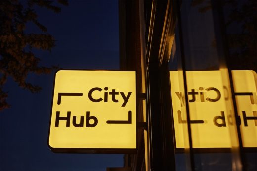
photograph : Maarten Willemstein
CityHub Rotterdam
Design: MVRDV Architects
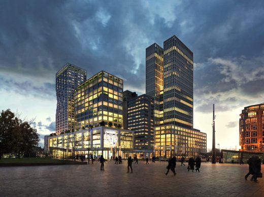
images : MVRDV and Mozses
Weenapoint complex
Design: Simone Drost ARCHITECTURE, Architects
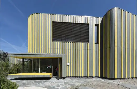
photo : www.roosaldershoff.nl
Project Maximaal, Rotterdam Childcare Centre
Rotterdam Architecture Studios – design firm listings on e-architect
Dutch Buildings
Dutch architect – Rem Koolhaas
Website: New Erasmus MC Rotterdam
UNStudio architects – fomerly Van Berkel & Bos Architectuurbureau
Dutch architect studio – Mecanoo, NL
Comments / photos for New Erasmus MC Building in Rotterdam page welcome
Visit Rotterdam, Netherlands


