Project Maximaal Rotterdam, Dutch Childcare Centre Photos, Netherlands Mental Disability Building Design
Project Maximaal, Rotterdam Childcare Centre
Gemeente Rotterdam Building Development design by Simone Drost ARCHITECTURE
20 + 17 Feb 2018
Design: Simone Drost ARCHITECTURE, Architects
Project Maximaal Rotterdam Childcare Centre
Winner of a German Design Award 2018
Simone Drost Architecture is winner in the category Architecture with the project Maximaal.
Photos by www.roosaldershoff.nl
Project Maximaal Rotterdam
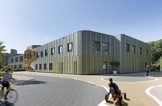
A Childcare centre for children with mental disabilities in the ages of 0 to 20 years. The centre offers a nursery, a primary school and a high school and is located in Rotterdam, The Netherlands.
Nature as inspiration
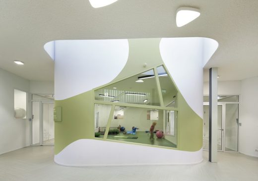
A sensory building for children with a mental impairment
Photos: www.roosaldershoff.nl
MAXIMAL – A centre where learning, care and childcare collaborate closely at a natural location in the middle of a district in Rotterdam.
“We wanted a building where we would feel at home, a safe place with character, more than just a school. A place where children can develop optimally, where their senses are be stimulated and they are inspired by nature. This specific group of children need that”, says school director Geert Jan Reinalda.
The child as starting point for the design
The guiding principle for the design was the child’s sensory experience (feeling, colour, sound,
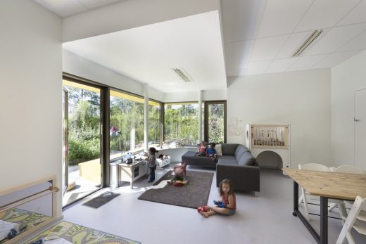
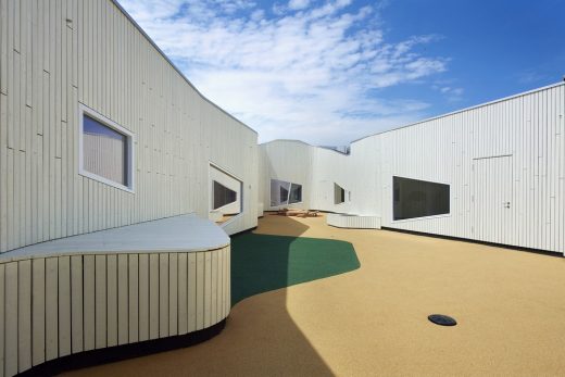
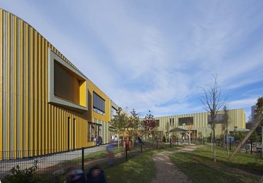
atmosphere). The building was designed from the inside out. The ground plan design resembles a 3-lobed leaf. Three lobes extend from the centre of the building, around deeply-penetrating gardens. All the classrooms and care areas are on the outer facade to allow direct contact with the big garden. These children need this relationship with nature to allow them to ground, and the environment is deeply healing.
Clear-cut structure
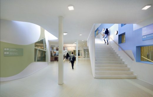
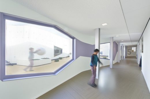
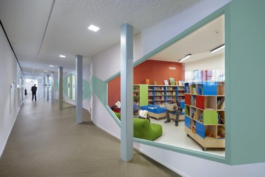
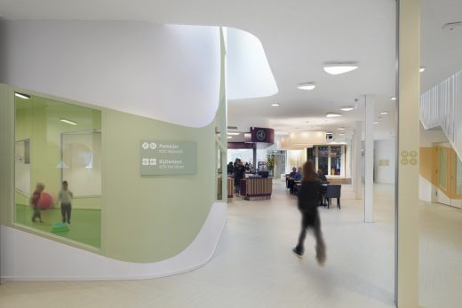
The types of children who come here need a building with a clear-cut structure. This gives them clarity and by extension safety. The structure arose based on form, rhythm and colour. There is a clear route from the entrance to the domains. The columns in the corridor form an imaginary line which children follow to their classroom. They often do this by letting their hands slide over the column. Each lobe has a continuing route so you can’t get lost, as you always come back to start.
The inside areas on the other side of the corridor have spaces where the children can spend time
temporarily such as cuddle spaces, kitchen classrooms, play areas, time-out spaces and therapy spaces.
These inside areas have their own organic, form language and this provides the children with clarity. The ‘moving’ coloured shape on the walls of these inner areas encourages the children to follow it. Each inner area of each lobe has its own colour and shape, making the various domains recognizable.
The building’s centre is within the three lobes. It is an open spot which was created to facilitate gatherings, but also coincidental meetings. The brasserie, the practical centre where the young people following special-needs secondary education serve the meals they have prepared, is at the centre of the ground floor.
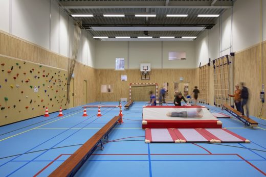
The centre also contains the music room with a stage for performances, the play areas and the sports hall, all with their large windows. The centre on the 1st floor has a real “mall”, with practical spaces where the young people learn to work: a shop, a laundry, a library, a sports club, a metal workplace and kitchen classrooms, all with a large ‘shop front’. These activities, too, serve the entire building; linen is washed, meals are prepared and bicycles are repaired.
Alders and autumn colours as inspiration for the front
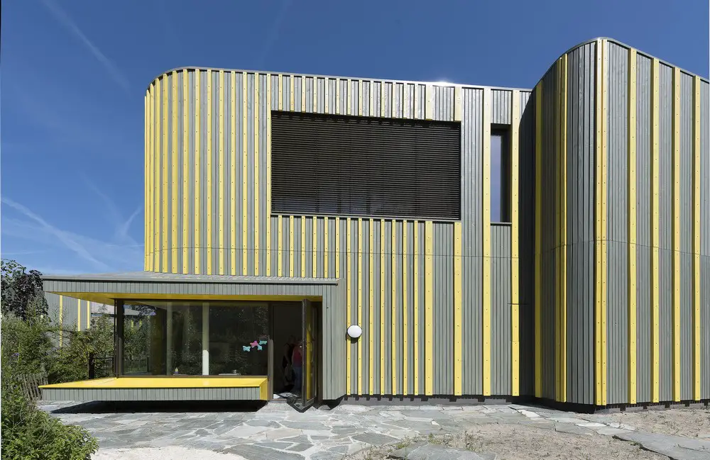
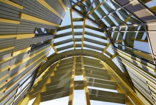
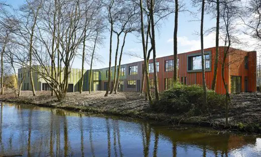
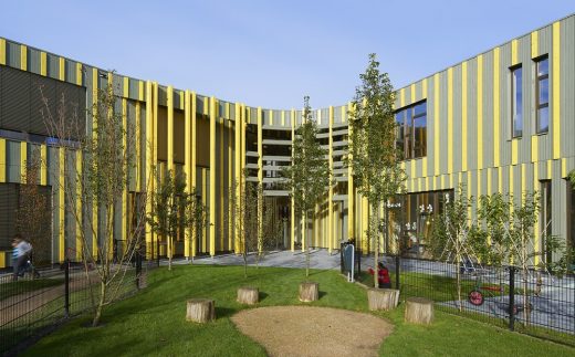
The building folds around the natural environment by a series of existing trees. Their rhythm, grey trunks and autumn leaves are the inspiration for the tactile wooden front. The front is designed to give the children a sensory experience, its grey-green base blending with the tree trunks. But it also has a rhythmic relief in different autumn colours, which the children touch as they walk past.
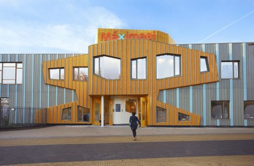
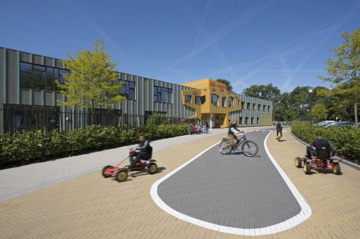
At first, lots of children stay very close to the building, thus perceiving the autumn colours of the relief as the main colours and in this way recognizing their domain. But from a distance the children perceive the building as grey-green with the autumn colours forming an accent they can use for orientation. The building has an explicit pictorial mark, the main entrance, which shouts out the message ‘We’re here to stay!’
“In practice the building works really well, and exudes a strong sense of calm”, says Marian Schenk director of the child care facility “I see how the children respond. Their behaviour is calmer than at former locations.
The fact that the building has a logical route is wonderful. We were worried we might lose children as the building is so big, but that’s not happening at all”.
Project Maximaal Rotterdam – Building Information
Category: Education, Care, Children
Client: Gemeente Rotterdam, Stadsontwikkeling – Leon Wielaard
Architects: Simone Drost ARCHITECTURE – www.simonedrost.com
Gross Floor Area (GVO): 7.000 m2
Project Maximaal Rotterdam building image / information received 150218
Photographer: www.roosaldershoff.nl
Website of the centre: www.maximaal-koz.nl
Location: Aleyda van Raephorstlaan 243, Rotterdam, The Netherlands
Rotterdam Architecture
Contemporary Architecture in Rotterdam
Rotterdam Architecture Designs – chronological list
Rotterdam Architecture – Selection
MVRDV House Rotterdam
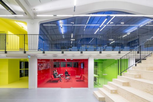
photograph © Ossip van Duivenbode
MVRDV House Rotterdam
Museum Boijmans Van Beuningen Exhibition, Rotterdam – Mad About Surrealism
Design: MAXWAN architects + urbanists
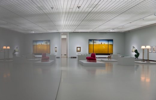
photograph © Artur Borejszo
Museum Boijmans Van Beuningen Exhibition
CityHub, Witte de Withstraat
Design: Studio Modijefsky Architects
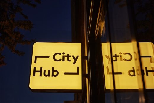
photograph : Maarten Willemstein
CityHub Rotterdam
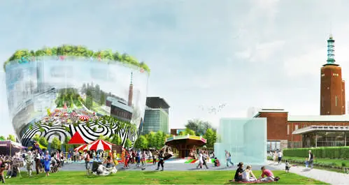
Collection Building Museum Boijmans Van Beuningen
Design: MVRDV
picture from architects
Museum Boijmans Van Beuningen
Comments / photos for Project Maximaal, Rotterdam Childcare CentreV design by Simone Drost ARCHITECTURE page welcome

