Claude Bernard School, Architects, Modern Paris Building, Picture, France Design
Claude Bernard School: Paris Building
Education Architecture in France – design by Atelier d’Architecture Brenac & Gonzalez
29 Oct 2012
Claude Bernard School
Design: Atelier d’Architecture Brenac & Gonzalez
Quai du Lot, Paris, France
Location
The lot forms part of the Claude Bernard priority development zone (ZAC), between the Paris ring road and the Boulevard MacDonald.
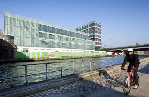
Despite the surface area of the lot, its location near the canal provides very interesting poetic potential. So that the children can benefit fully from the location and enjoy the views, we have created two frontages, one north-facing, and the other south-facing.
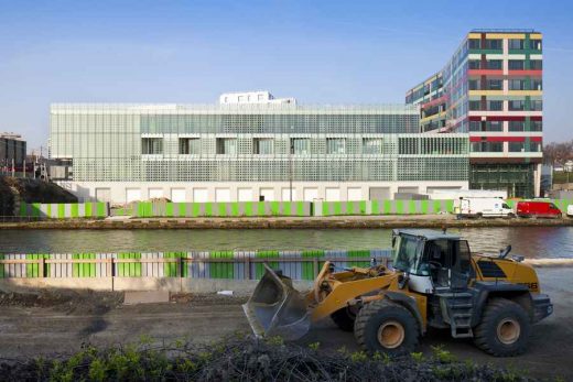
Along the Boulevard Mac Donald, a three-storey block forms a screen that protects the playground, reduces noise pollution, and provides a sense of depth when you stand on the front courtyard and look through the foyer to the playground. On the south side there is a lower block adjoining the offices that looks inwards. Between the two is a raised, transparent bridging structure overlooking the canal that leads the eye from the playground to the other side of the canal and filters the traffic noise from the ring road.
How it works: continuity and discontinuity
To provide the best response possible to the question of cohabitation between the primary school and the nursery, we thought it was appropriate to separate them into two streams beginning in the foyer; the junior pupils go straight into the playground or the surrounding covered gallery, while the infants are taken into their section by their parents.
The classrooms, all in the east wing, form a kind of suspended block: nursery pupils are on the first floor, primary pupils on the second.
The younger pupils have direct access to the playground via a stairway on the north side; this avoids having to cross the older children’s play area. This arrangement has made it possible to create two playgrounds making maximum use of the available surface area, and two covered galleries under the «bridge»; this creates a sense of openness and transparency, with views of the planted esplanade to the west and a framed canal overlook to the east.
Communal areas such as the restaurant, offices and playrooms have been placed at either end. Despite the outward similarity of the classroom floors, our proposal was to symbolically underline the transition from nursery to primary, not only via a change of story but by clearly differentiating and identifying the two levels and the way the different pupils move through the building.
The nursery school classrooms face the canal in order to reduce noise from the playground; movement is directed towards the interior. The reverse is true for the primary pupils: not only do they change floors, their view changes as well.
Architectural and environmental aspects
To reinforce the sense of unity and avoid the question of the ‘composition’, we have opted for a unity of design that brings together all the building’s functions and sections.
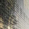
The overall outline features a single continuous translucent glass skin printed with a repeating pattern of circles reminiscent of canal barge window, Jean Prouvé or Pierre Chareau (La Maison de Verre). This translucent envelope wraps the entire building like a sweet wrapper, screening the covered balconies and erasing the slightest suggestion of windows. Sometimes printed on both sides, this breathable or ventilated curtain wall reveals, suggests or conceals the colours and light behind it.
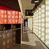
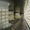
In the circulation areas, the entrance foyer and the covered gallery around the playground, the translucent surface filters the sunlight and creates a pattern of projected circles on the floor and walls that moves with the sun.
This glass envelope, so sensitive to the varying light, captures every moving reflection, every nuance, every sparkle; its outline constantly changes and sometimes even vanishes. The diaphanous whiteness of the building’s exterior is in sharp contrast to the colorful treatment of the inside areas.
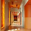
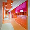
Circulation areas are treated as micro urbanities on clearly differentiated scales; each particular atmos-phere is created thanks to colorful undulations and dripping effects all over the walls and ceilings. This kinetic system plays with our perception and has a disorienting effect.
The choice of contrasting materials completes the effect: glass, Plexiglas, poured rubber floors, gloss paint, laminated wood and anodized metal play with variations in the light, and their reflections create an increased sense of space.
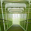
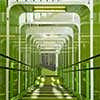
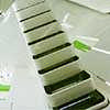
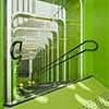
Suspended lighting reminiscent of hanging fruit or blossoms breaks up the horizontality of the ceilings. The entrance hall is treated as a flow interchange that highlights the oddly shaped stairways that occupy and cross the empty space. The three storey atrium clarifies the way the building functions as a whole and shows how the different sections have been superimposed.
The monumentality of the entrance hall contrasts with the other areas; it emphasizes movement and creates crisscross perspectives that lend the design a playful narrative force. The use of gloss painted laminate and the way color is used to differentiate the inside and outside faces of the stair tubes reinforce the magical, extraordinary feel of the space.
The shiny, reflective materials used challenge our perception of outlines and shapes. The perforated walls serve as giant acoustic screens that absorb the noise made by boisterous youngsters. The landings have further surprises in store: the moving circles of light projected on the floor and ceilings transform the space and give it a constantly changing appearance.
Walking around, going up, passing through… movement becomes the medium for a narrative, part of a visual setting that allows our imagination to run free.
Claude Bernard School Paris – Building Information
Project: Primary School & Nursery in the “Claude Bernard” ZAC
Address: Boulevard MacDonald / Quai du Lot, 75019 Paris, France
Architect: Atelier d’Architecture Brenac & Gonzalez
Project Team: Jean-Pierre Leveque, Stefan Tuchila
Engineering: Iratome (Engineering), Tohier & Associés (Economy), Arcora (Façade engineering), RFRgo (Structure), RFRé (Sustainability), AVLS (Acoustics)
Client: City of Paris
Contractor: Eiffage Construction Saint-Denis
Architecture contest: Apr 2007
Built: Jan 2012
Project Area: 4,432 sqm
Cost: 12,26 M€ without tax
Photographs: Sergio Grazia, Stefan Tuchila
Claude Bernard School images / information from Atelier d’Architecture Brenac & Gonzalez
Location: Boulevard MacDonald, 75019 Paris, France
New Paris Architecture
Contemporary Paris Architecture
Paris Architecture Design – chronological list
Architecture Tours Paris by e-architect
Paris School Buildings – Selection
Crèche rue Pierre Budin
Design: ecdm
Crèche rue Pierre Budin Paris
Eva Samuel architecte urbaniste et associés
Ecole Maternelle Paris
Ateliers Jean Nouvel
Duo Towers Paris
LIN ARCHITECTS URBANISTS in collaboration with MARS ARCHITEKTEN
ZAC Pajol Paris
ZAC Seguin Boulogne Billancourt
Comments / photos for the Claude Bernard – Paris School Building page welcome


