Marchesini, France Office Building, Saint Mesmes Design Property Image
Marchesini France HQ : Saint Mesmes Building
Company Headquarters Development in Saint Mesmes, France design by LAN Architecture
Company HQ, Saint Mesmes
Location: Seine-et-Marne département, northeast of Paris, northern France
Design: LAN Architecture
4 Mar 2009
Marchesini Offices
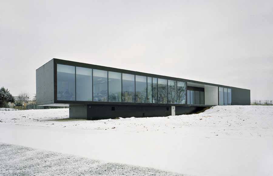
The primary intention of the programme was to explore the relationship between the building and its surroundings and between the building users and the landscape. One of the main design concerns was the building’s environmental adaptation and appropriation. The site slopes down three metres towards the west, offering attractive views over the neighbouring hills.
LAN Architecture wanted an office environment opens to the outdoor green spaces, a project which benefits from the natural, lights and colours, and respects the landscape while inserting a new constructed “object” within it.
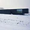
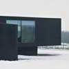
Thus we imagined the building as a sort of line that simultaneously follows the skyline and the ground.
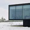
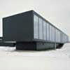
LAN Architecture separate the space into two distinct volumes: offices in the upper area and the workshop volume anchored to the ground. This separation also corresponded to the different needs of the two areas in terms of lights, spatial capacities, finishing qualities, etc.
One of the volumes contains flexible work spaces while the other encloses a showroom, maintenance space and storage areas. The offices occupy the upper area of the site and are raised above ground level to provide an impression of lightness. The workshop volume is located at a lower level and gives the appearance of being solidly anchored to the ground. The intersection of the two volumes serves as the entrance, with a sloped ramp rising up into the building.
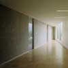
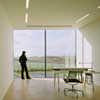
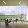
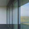
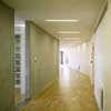
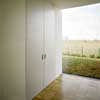
Interiors have some kind of formal clarity due to the use of concrete and white walls, transparent doors for the offices and an overall industrial wooden floor and regular artificial lights that accentuate the space. The openings towards the outside are used as elements which participate in the spatial composition of the interior, which are maintained voluntarily intentionally.
Structure
The building has a simple structure using a mixed steel/concrete technique. The cantilever for example, is suspended by a steel beam, while a central concrete wall balance all the construction.
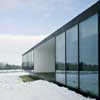
From a construction point of view the most interesting architectural details are those allowing the volumes drawing: connection between elevations and the roof, the large areas of glass in the work spaces facades and the concrete treatment (the elevations and roof are completely constructed from black painted concrete. The roof finish allow it be read as the building’s fifth elevation).
Functioning
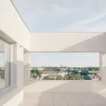
The flexible areas of the project are the showroom and the open space where the reception, administration and logistic desks are placed, in between the showroom and the office-place, and in the axis of the main entrance of the building. This space connects all offices, workshop, meeting room, canteen, an open terrace and services spaces.
Offices
Working spaces open toward the landscape; their dimensions are not standard for office environments, the high ceilings and natural light heighten pleasure and comfort at work. We designed 3.5 square meters ceiling heights as well as spacious surface areas for each office: 1 place office measures 24 square meters (instead of 13.5 square meters for a classical one); 2 places office measures 30 square meters, and 3 places 34 square meters.
Transitions area
By playing on both geometrical volumes, a triangular space results and connects all the offices. This generous transition area is more than a corridor and becomes a space for informal meetings.
Light is mastered by a square window (4×4 m) offering a privileged sight onto the most relevant architectural element in the landscape: the village church.
Transition areas are places where peoples could spend some time, informal meeting spaces, agreeable atmospheres with interesting views on the outdoor and on the building itself.
Showroom
The showroom develops itself in length; its height changes to have a low part for maintenance space and a high part for the machines exhibition. Materials used for this area tends to erase the space: everything was painted in white with a concrete ground, to concentrate the whole attention on the exposed machines.
Canteen and services spaces
The canteen, is in the south, and conceived with a domestic dimension. A kitchen defined space, and a door allows people to access the outside garden. This room is connected to the wardrobe and toilets.
Client
Marchesini Group is an international group designing and producing machines for packaging pharmaceutical and para pharmaceutical products. The production facilities are located in Italy, and the role of French headquarters is to sell and displays the machines.
Each machine is conceived as a chain (a line) where products are introduced at one end and emerge packed at the other end. These machines can measure 25 m long – dictating the dimensions of the showroom. The machines arrive in France to be shown to potential customers and are removed from the site after the sale.
Marchesini HQ – Building Information
PROGRAMME: Design and construction of a company headquarters
CLIENT: Marchesini France
LOCATION: rue Royale, Saint Mesmes, France
NET PLAN AREA: 1000 m²
COMPLETION: 2008
PHOTOS: Jean Marie Monthiers
Marchesini HQ Saint Mesmes images / information from LAN Architecture
Location: Saint Mesmes, France
New Buildings in France
French Architectural Projects
French Architecture Offices – design firm listings
Paris Architecture Walking Tours by e-architect
Parisian architect studios contact details
French Architecture – Selection
Zenith Saint-Etienne Building
Foster + Partners
Zenith Music Hall Strasbourg
Massimiliano Fuksas Architecture
The Phare
Morphosis
Comments / photos for the Marchesini Headquarters Saint Mesmes building – France HQ Architecture page welcome

