Shenzhen Retail Building in South China, Chinese transportation hub architecture, SPARK architect images
Prince’s Building Shenzhen
Contemporary Chinese Retail Building design by SPARK Architects
post updated 3 May 2026
Design: SPARK Architects
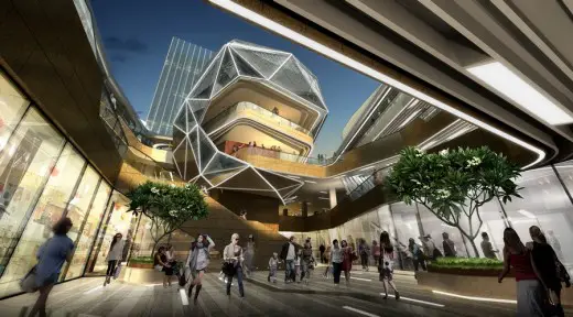
12 Aug 2014
Prince’s Building in Shenzhen
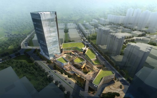
SPARK has completed the design of Prince’s Building a 71,600-square-metre mixed-use development and transportation hub for China Merchants. Located in Shenzhen South China the 110-metre-high, 27-storey office tower and five retail pavilions are connected by landscaped terraces that combine to create a unique naturally ventilated retail and business destination for the lively Skekou district of the city. The buildings sit over and adjacent to a new transportion hub that includes a bus terminal and the Seaworld subway station.
Prince’s Building is located at the southern tip of Shenzhen on the Nantou Peninsula, in an area of outstanding natural beauty. Surrounded by water on three sides, Shekou wraps around the verdant Danan and Xiaonan mountains. It is this relationship between dramatic subtropical oceanfront scenery and rich human activity that generated the inspiration for SPARK’s design.
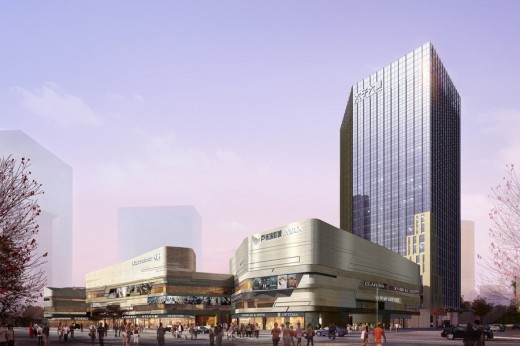
The architecture, landscape and interiors of Prince’s Building Development all designed by SPARK work in harmony to provide its distinctive urban-garden identity.
Architectural Concept: Layered Hillscape
On a broad urban scale, the office tower will be the project’s most distinctive component. Located on the corner of Taizi and Gongye third roads the office tower rises from a new verdant public square to a height of 27 levels marking the location of the most important commercial and leisure destination in Shekou. The tower has been designed to provide 1100m2 of column free flexible floorplates with full digital connectivity to meet the demands of 21st century office users. Each office floor has full height glazing with spectacular ocean views over Shenzhen bay with mountain views to the North.
In order to enhance the elegance of the tower’s proportions the glazed façade of the upper levels is accentuated by slender aluminium louvres designed to catch the sun and lend a layered shifting quality to the top of the towers. The tower’s base is connected to the adjacent retail pavilions both physically and materially at level three where the horizontal stone façade of the pavilions merges with the tower façade grid anchoring the tower and bringing visual
continuity to the entire development. The uppermost terrace is connected directly to the office tower at level three to allow office users direct year round weather protected access.
The architecture, landscape and Interiors all work in harmony to provide Prince’s Building Development with its richly layered, distinctive identity. More than just a commercial building the office suites are Shekou’s premier address for business and lifestyle.
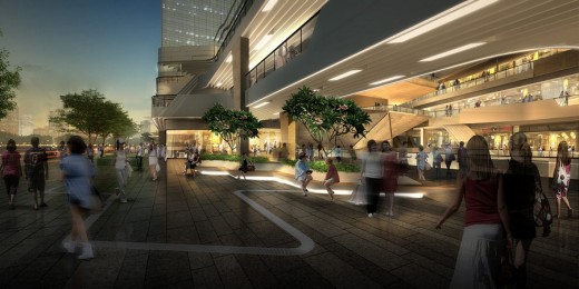
At the scale of the individual urban block, one’s experience will be dominated by the five conjoined retail pavilions. Four pavilions will be clustered around the central courtyard and the fifth pavilion – a lantern pavilion – which sits at the heart of the triangular site. “We have created spaces between the perimeter pavilions to connect the development directly to the city,” explains SPARK Director Stephen Pimbley. “These will provide routes into and through the urban retail gardens and fully integrate the project with the wider urban fabric,” he says.
The four-storey pavilions will be clad in horizontally layered strips of stone inspired by the rock strata of the adjacent mountains. These will lend the project a human scale while allowing full integration of retail and advertising signage in synergy with the architecture. The corners of the pavilions will be curved to soften the architecture and encourage pedestrian flow. All the pavilions will have continuous glazed shop fronts at ground-floor level facing out into the city and maximising retail frontage.
“With the retail environment flowing seamlessly into the interior courtyard at street level, the internal scale of the retail garden will provide a much more intimate experience,” says Stephen Pimbley. The upper-level terraces will wrap around the central lantern pavilion, which opens onto an upper level terraced dining deck. This will create an intimate dining destination, helping the building to remain vibrant outside key retail hours. “It’s a layered, open urban retail concept,” says Stephen Pimbley “that will create a unique environment in which to shop, work and play.”
Landscape Concept: Flowing Hillscape
Inspiration for the landscape design was drawn from the human-oriented scale of Shekou and the rich natural landscape surrounding the town itself – including the rich layers of rock in the surrounding mountains. The distinctive synergy between indoor and outdoor spaces offered the opportunity to create a seamless integration of interior and landscape design in and around the retail components.
The landscape will weave through the development in physical and conceptual synergy with the horizontally layered architecture. It will be composed of banded stone layers punctuated by elegant metallic accent strips, which will glow at night. The accent strips were inspired by the seams of precious elements found in naturally occurring rock formations.
As the tower approaches street level, the perimeter landscaping will soften the base of the building. Explains Peter Morris, Project Associate. “The plant selection as well as the paving layout and texture will draw people into the development through the spaces between the retail pavilions. The selection of paving and plants that are complementary in texture, material and tone will enhance this effect, bringing people through a sequence of textured landscape layers.” These layers will begin with the perimeter planting facing the street, progress to a sunken arrival garden, and then rise to the lantern terrace crowned by the green roofs of the retail pavilions.
Interior Concept: Intimate Hillscape
The idea of layers of rock also influenced the interior design scheme. The unique outdoor mall design allows the layered façade to continue into the interiors in the form of banded stone layers punctuated by key feature spaces. Here, one will find a high-quality metallic palette. The wayfinding and graphic design options draw from the same metallic colour palette to complement and enhance the warm natural tones of the façade and interiors.
Prince’s Building in Shenzhen – Building Information
Total GFA (sqm): 71,600sqm (Office: 47,200sqm, Retail: 20,400sqm, Bus Terminal: 4000sqm)
Master Plan and Architecture: SPARK
Project Director: Stephen Pimbley, Lim Wenhui
Project Associates: Carlo Joson, Peter Morris
Team: Cynthia Liau, Rafal Kapusta, Lintang Wuriantari, Darmaganda, Mark Mancenido, Olivia
Wong, Fabian Ong, Paula Zheng, Arnold Galang, Natasha Hill
Client: China Merchants
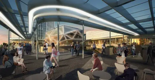
Prince’s Building in Shenzhen images / information from SPARK Architects
Gateway One Shekou in Shenzhen by Spark Architects
Location: Shenzhen, China
Architecture in China
China Architecture Designs – chronological list
Chinese Architect – Design Practice Listings
Shanghai Architecture Walking Tours
Comments / photos for the Prince’s Building in Shenzhen – New Chinese Retail development design by Spark Architects page welcome.
