Flemington Racecourse Melbourne, Marquee Building Victoria, Architect, Property Photos
Flemington Racecourse, Melbourne
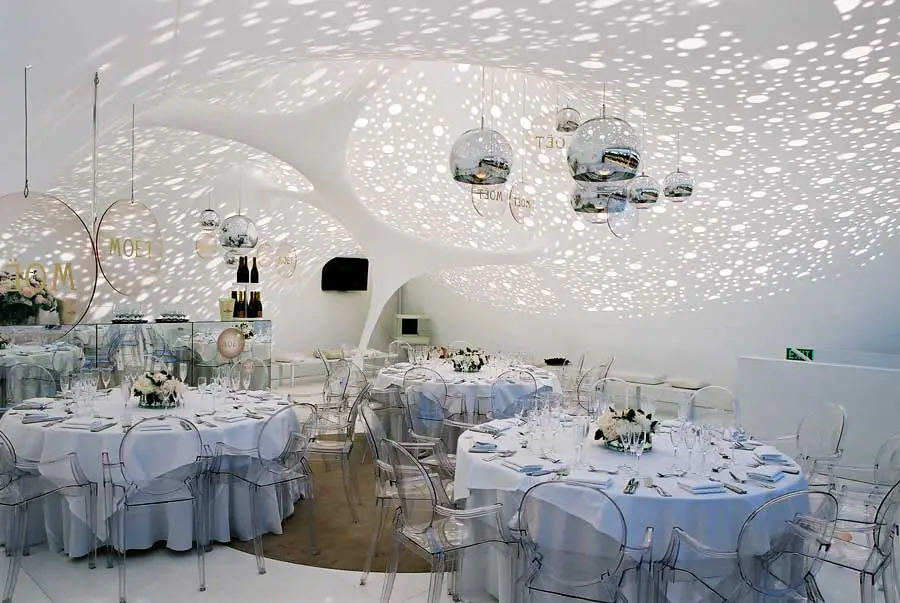
Moët & Chandon Marquee Interior in Victoria design by PTW Architects, Australia
5 Dec 2008
Date built: 2005
Design: PTW Architects – Chris Bosse [associate architect at PTW] and Amanda Henderson [Gloss Creative]
Location: Flemington Racecourse, Melbourne, Australia

image courtesy of architects practice
Photos by Dianna Snape and others
Flemington Racecourse Melbourne
Client: Moët & Chandon
PTW Architects has designed the Moët & Chandon Marquee for the Melbourne Cup Carnival in 2005. Again PTW has used the latest digital technologies from concept to realisation of the design, to create a sparkling and surreal atmosphere in the name of the “bubble-ism”.
Through the use of daylight and a tensioned Lycra material that is digitally patterned and custom-tailored for the space, a 10 by 10 off-the-shelf marquee is transformed into a space that the press describes as an “avant-garde environment not of this earth”.
Moët & Chandon Marquee images : PTW Architects
Melbourne Building photos + information from PTW
Espace Lumiere, Space made out of Light
Introduction
Chris Bosse designed the MOET Chandon Marquee for the Melbourne Cup 2005, the biggest annual horse racing event in Australia, together with Amanda Henderson from Gloss Creative.
The Architects used latest digital technologies from concept-sketch to realization, to create a sparkling and surreal atmosphere in the name of the “Bubble-ism”.
Through the use of daylight and a tensioned Taiyo-Lycra material that is digitally patterned and custom-tailored for the space, a 10×10 “off the shelf” marquee was transformed into a space that the press describes as an “avant-garde environment not of this earth”

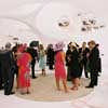
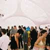
Moët & Chandon Marquee images from LAVA, architects
Structure and Space
The project renounces on the application of a structure in the traditional sense. Instead, the space is filled with a 3-dimensional lightweight-sculpture, solely based on minimal surface tension, freely stretching between wall and ceiling and floor.
Building Materials
Specially treated Lycra and daylight
Innovation and Digital Workflow
The product shows a new way of digital workflow, enabling the generation of space out of a lightweight material in an extremely short time. The computer-model, based on the simulation of complexity in naturally evolving systems, feeds directly into a production-line of sail-making-software and digital manufacturing.
Transport and Sustainability
The pavilion (weight: 35 kg) is transportable in a sports-bag to any place in the world; can be assembled in less than one hour, and is fully reusable.
While appearing solid, the structure is soft and flexible and creates highly unusual spaces which come to life with projection and lighting. Projects of any scale and purpose can be realized in a short amount of time.
Minimal Surfaces
(-any surface that has a mean curvature of zero. – for a given boundary a minimal surface cannot be changed without increasing the area of the surface-) .
The lightweight-fabric-construction of the pavilion follows the lines and surface-tension of soap films, stretching between ground and sky.
These natural curves of bubbles are translated into an organic 3-dimensional space.
Since the early seventies, with Frei Otto`s soap-bubble experiments for the Munich Olympic Stadium, naturally evolving systems haven’t lost their fascination in the field of new building typologies and structures.
Derived from Nature / Design by Optimization
The shape of the pavilion is not explicitly “designed”, it is rather the result of the most efficient subdivision of three-dimensional space, found in nature, such as organic cells, mineral crystals and the natural formation of soap bubbles . This concept was achieved with a flexible material that follows the forces of gravity, tension and growth, similar to a spider web or a coral reef.
Light
By partially letting sunlight penetrate “through” the fabric structure, the pavilion comes to life as a ephemeral and surreal bubble experience.
The perforated ceiling filters natural light and directs it onto and through the Lycra fabric, creating the depth and translucency of the space, the ephemeral quality.
The light changes constantly during the day with moving clouds and changing atmospheric conditions.
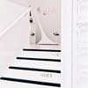
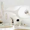
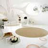
Moët & Chandon Marquee images : PTW Architects
Flemington Racecourse Melbourne Marquee – Building Information
Project title : MOËT Marquee / Espace lumiere
Client: Moët & Chandon Australia
Location: Spring racing Carnival, VRC, Melbourne, Australia
Completion: Nov 2005
Project architect: Chris Bosse
Styling + project management: Amanda Henderson / creative director Gloss Creative, Melbourne, Australia
Soft furnishings: Cameron Comer / Comer & King, Melbourne, Australia
Image and concept graphics: Round, Melbourne, Australia
Membrane, engineering and patterning: Taiyo Membrane Corporation, a division of the Taiyo Kogyo Group
Photographs: Dianna Snape and others
Flemington Racecourse Marquee Melbourne design : PTW
Location: Flemington Racecourse, Melbourne, Victoria, Australia
Melbourne Architectural Designs
Buildings in Melbourne
New Melbourne Buildings : current, chronological list
Contemporary Melbourne Architecture Designs – architectural selection below:
Ocean 12
Architects: Cox Architecture
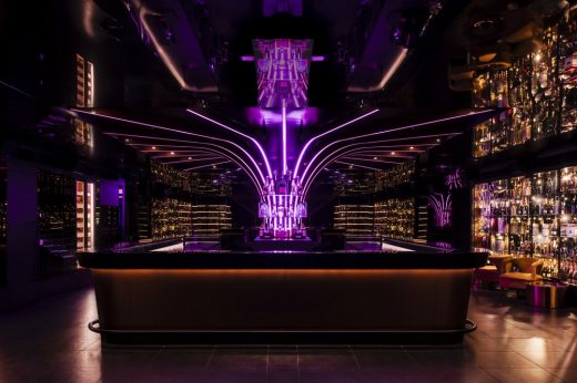
photograph © Tom Blachford
Ocean 12 Melbourne
Design: Plus Architecture
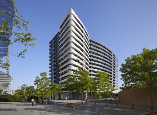
image : Tom Roe
Galleria Apartment Tower
Melbourne Architect : Studio Listings
Melbourne Architecture
Architecture in Australia
Contemporary Architecture in Australia
Klein Bottle House nr Melbourne
Buildings / photos for the Flemington Racecourse – Melbourne Marquee design by PTW Architects page welcome

