Architectural Discussion Article, Building Project News, Design Property
Architectural Discussion
Architecture Debate – article by Chris Romer-Lee
19 Oct 2010
Architecture Discussion
Global Buildings Debate
Architecture is an ongoing process of dialogue – with the client, the immediate context and the wider world. One of my practice’s favourite projects, RIBA Award winning Park Avenue South, both exploited the site’s unique make up and employed traditional craftsmanship in a contemporary manner. I’m delighted to have been given the opportunity by Isabelle and Adrian – who, incidentally, deserve hearty congratulations for last week’s record of 1 million hits in a single day – to review some of the latest building conversations taking place.
Towers are markers of change. Renzo Piano’s The Shard is now under construction and erupts out of London Bridge Station. As you look up, its diminishing form creates an exaggerated perspective which is stunning. It has already changed London’s skyline, competing for eyespace with The Strata Tower wherever you turn.
In contrast, tall buildings are currently a contentious issue in St Petersburg, with citizens recently taking to the streets to protest against RMJM Architects’s proposed 396m Gazprom Tower. The new headquarters of Russian’s largest company, state-owned energy giant Gazprom, are to be situated in the historic centre of the city. The scheme has been dogged with controversy from the outset. In 2006 Norman Foster, Kisho Kurokawa and Rafael Vinoly all resigned from the competition jury following sight of the shortlisted entries. UNESCO has even threatened to exclude St Petersburg from its list of world heritage sites. When the scheme finally received a building permit from the state on Saturday, an estimated 3,000 people demonstrated against it. Arguably the protests are as much to do with an overbearing state as the design and location of the building. Nevertheless, it is fascinating to see an architectural scheme cause such public anger.

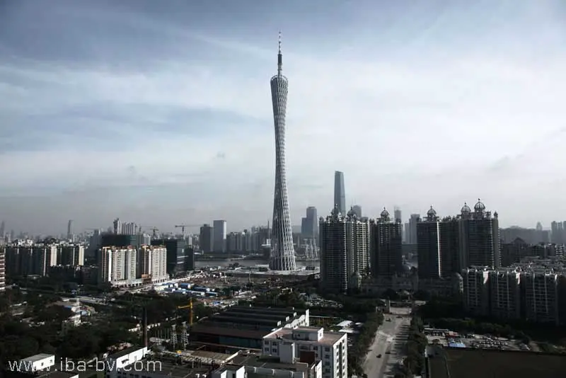
image courtesy of Information Based Architecture
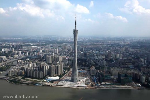
Without any such worries to impede its progress, the complex webbed Guangzhou Tower in China has just been completed. 200m taller than the Gazprom Tower, the seductive, twisted web distorts and lessens its 610m height. The flexing geometries determine the experiential journey from the public park at its base to the observation terrace at its top. The programme couldn’t be more different to the Gazprom Tower scheme. The opportunity to include an open air staircase between +170m and +350m, allowing visitors to investigate the structure from close by, must have been irresistible to the architects. The delightful thing about this tower is that once inside a sense of exploration, playfulness and joy is experienced. This tower feels like a cross between the Eiffel Tower and a helter-skelter.
The enormity of WROAD’s proposals for the ‘Bigger is Better House’ is reflected in a structure of bulk and mass. Programmatically driven, WROAD’s intriguing illustrations set out a complex interplay of spaces and activities which they claim are not apparent in a typical American home. It may be simplistic to suggest that this rich social interplay is not ordinarily found in American homes, but as a conceptual technique the results are engaging. The square donut plans are described as evolving from a Chinese courtyard house typology but to my mind the resulting forms and scale are more akin to Chinese retail centres! The heavy massing of the manipulated blocks feels cumbersome for a domestic environment. The project is only at schematic design, but I would hope to see the design further engage with the client’s Taiwanese roots in the context of American domestic architecture.
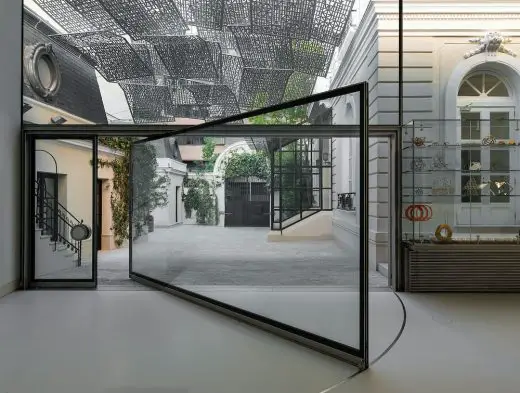
From the gregarious to the restrained, The Yogi Berra Museum and Learning Center is a polite transformation of a museum that previously affronted the street. The images provided are of a glazed extension, providing a simple solution which unlocks the museum’s collection for passersby. This glass vitrine combines exhibition area, collaborative teaching space and reception hall. It implies a joyously animated cinematic reel of activities played out from behind the glazing. It may be budgetary constraints or simply limitations imposed by the multi-functionary nature of the building, but the various elements of the extension appear to be at odds with each other, with a lack of cohesion between the various built elements. The head of the glazing rises above the ceiling line successfully but at its base, the glazing frame and low-level heater provide an awkward relationship with the external pavement level. I like this building for its straightforward and honest approach but feel some of the detailing lacks the lucidity required for this scale of building.
The Monolith is another mixed-use building which has just opened in Lyon city centre, but this scheme has many authors. Situated within an enormous three lot development collectively called Lyon Confluence, Lot C was further divided into five sections, each of which was worked on by a separate architect. The complexities involved in masterminding such a project must have been enormous, requiring a brave (and wealthy) client!
The various sections are combined as one lot with various penetrations into this 32,000 sq m superblock. Heights are consistent across the block, so although the facade treatments vary, there’s a consistency across the contrasting elevations. Designated the entrance, the formal articulation of the entrance steps and bridge is intriguing. Reminiscent of The Economist Building by The Smithsons, a grand staircase ascends to a raised public space. However Erick van Egeraat’s glass and timber elevation is less than inspiring. Yet again, the abstracted barcode theme rears its head. Disregarding the project’s mixed use function, the alternating of materials predominantly in a vertical manner fails to give any distinction to the elevations.
It’s unclear as to how the elevational treatment changes in respect to the mixed use but this is a disappointing exploration of materials. Egeraat’s collage elevation and formal approach reminds me of Make’s The Cube in Birmingham which also completed this week. From the limited images of The Cube made available, the game of block party that forms the elevation and screen to the courtyard are interesting but what’s with the glass gargoyle fragments peering over the top!?
Chris Romer-Lee
Chris studied architecture at the University of Plymouth and The Bartlett School of Architecture, London. Before starting studio octopi Chris worked on a broad range of public and private projects including RIBA award-winning exhibitions within the Millennium Dome, a 25,000sq ft school, a restaurant and an adult education college.
Chris co-founded studio octopi in 2005 with James.
International Architectural Designs
Architecture Context : article by Trevor Tucker. 21 Sep 2010
Architecture Narrative : article by Trevor Tucker. 24 Aug 2010
Nature Architecture : article by Trevor Tucker. 15 Sep 2009
Design Narrative : article by Lee Miles – 7 Sep 2010
Sustainable Buildings – Building Issues : article by Adrian Welch
Property Articles
The Norman Foster Foundation presents its annual Digital X Workshop

photo © Luis Asín © Norman Foster Foundation
Norman Foster Foundation Madrid
Comments / photos for the Architectural Discussion Article page welcome


