Siskiyou House in Alameda-Beaumont, Oregon residential architecture, OR property images
Siskiyou House in Alameda-Beaumont, Portland
Contemporary Portland Residence design by Beebe Skidmore Architects, USA
Oct 7, 2016
Design: Beebe Skidmore Architects
Location: Alameda-Beaumont, Portland, Oregon, USA
Photos by Bruce Wolf Studio
Siskiyou House in Portland
Beebe Skidmore recently completed , a new 4000 SF house in the Alameda-Beaumont neighborhood of Northeast Portland. The studio worked with the owners, who wish to remain anonymous, on a process characterized by discerning design standards, a commitment to their vision, and a desire to have a finished home that would prove — especially to neighbors — that new construction could fit into an historic district.
The new house, on the site of a house previously occupied by the owners, who relocated to Portland from Chicago, demonstrates Beebe Skidmore’s position that challenging parameters lead to unique design character and unexpected solutions. The studio aimed to offset bold gestures with subtle details, balance openness and privacy, and to capture natural light to create a sense of surprising interior expansiveness within the parameters of a city infill lot.
The aesthetic of Siskiyou House is influenced by the owners’ attraction to spare, clean lines, and judicious use of color and material punches. Following are additional details:
Exterior
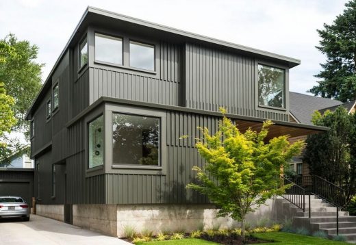
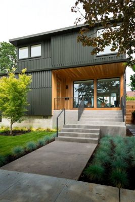
The project is full two-story house, with basement, in the vein of a classic Northwest foursquare or boxy craftsman, typical of Portland’s 50- by 100-foot lots. Shifted facade planes and projecting bays are used to break down size and bulk.
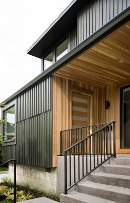
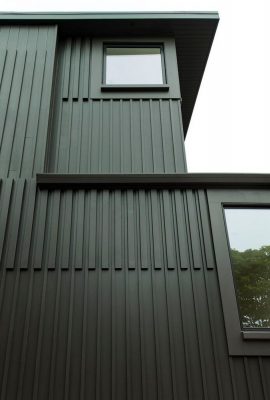
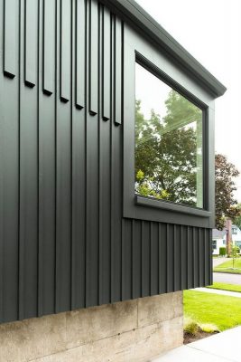
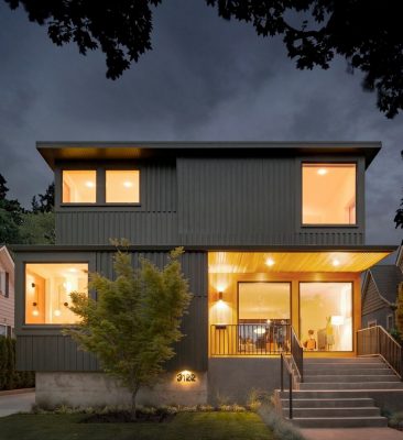
The house is unified by an exterior cladding design – a major feature of the house – that uses a variety of board and batten sizes and patterns. The objective of the exterior cladding was to use materials that are congruent with the neighborhood, yet elevated to a new type of clean, crisp appearance.
Beebe Skidmore wanted the siding patterns to be unique to the house, as opposed to, for example, a vendor system with pre-determined shapes and sizes, such as metal. The design uses readily available lumberyard milled sizes, including 1×8 v-groove cedar siding, and 1×2 and 2×4’s as battens. Different combinations of these repeating components create zones of varying density and pattern. Clean end cuts on battens and clear starting and stopping points for each pattern field add sharpness.
The skin emphasizes the bold massing of the house but also riffs on the house’s context and connects with the natural and historically used materials of the surrounding painted wood houses. The siding patterns turn corners, and draw the eye across and up the facades. A rich, dark green, single-color paint scheme further holds the composition together with emphasis on the overall form.
The entry is marked by a clear cedar lining that contrasts with the green facade. The front porch is recessed, elevated above street level, captured under a cantilevered roof plane. Two floor-to-ceiling windows face the street, but the front door is tucked around a corner, facing the porch.
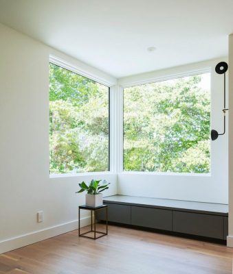
Windows placed at the corners bring equality to all four corners of the square facade, and allow additional diagonal views through the facade to further lighten the overall massing of the house.
Entry Foyer
The recurring pattern of corner windows begins in the entry foyer — where huge windows are placed to bring in multi-directional natural light, but also to draw the eye diagonally, enhancing a sense of spaciousness and continuity between inside and out. The entry, which is a brightly lit and spacious square room, is continuous with the main living space, but offset for privacy and to allow the sequence of spaces to unfold gradually after entering.
Living Room
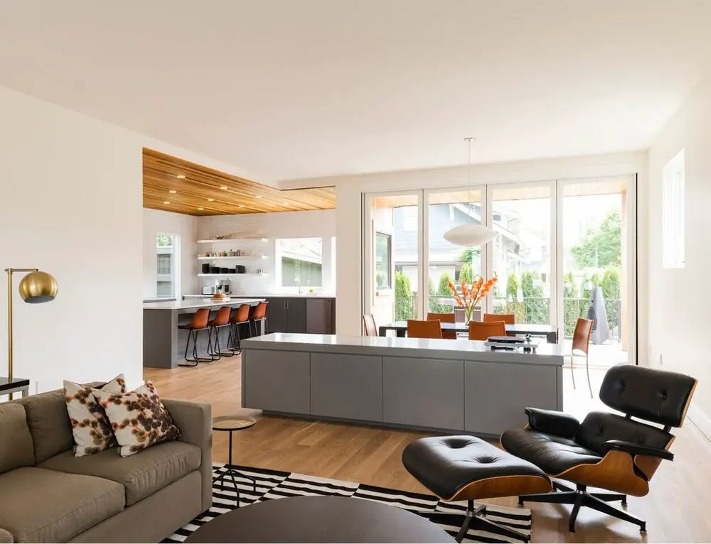
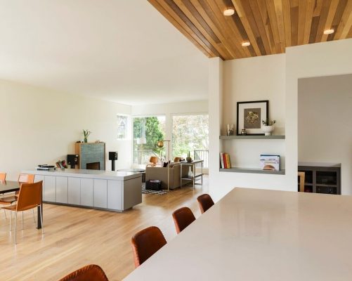
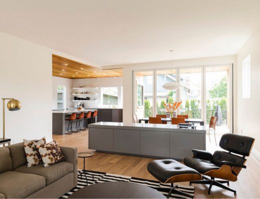
The porch, foyer, living-dining room, and kitchen form a zigzag of open space, a single gallery-like volume that runs from the front of the house to the back yard. The ceilings of both the front and back porches align with interior ceilings, visually extending the volume of interior space to the outside through room-wide walls of glass.
Eight-foot twin windows are big, welcoming eyes into the house, while smaller operable corner windows bring ventilation and multi-directional natural light into the room, even when the window treatments are drawn for privacy.
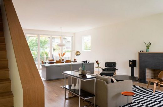
A 9-foot long custom cabinet subtly defines the living room vs. dining room zone. One can imagine this low cabinet as a buffet, art pedestal, or DJ booth. A no frills, slim-bricked fireplace centers the living space on the only long straight wall on the first floor.
Dining
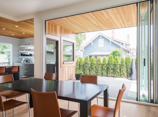
The pattern of corner windows repeats at back of the house, drawing light into the dining room. From the head of the dining room table, there is natural light filling every corner of the main, open living area. You can see the raking line of the stairwell to the 2nd floor and diagonally beyond to the entry foyer, which now looks like a pocket theater.
The back porch which connects to both kitchen and dining room functions as an outdoor dining room for 10. The indoor dining area accommodates 16. The accordion glass wall also allows the back porch to be continuous with the interior whether or open or closed.
Kitchen
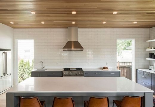
The kitchen continues the balance and symmetry seen elsewhere in the house. The range and hood is centered on the north wall, bounded by two 8 foot tall windows spaced 15’ apart. Above the sink, wrapping to the corner are three square, Instagram-like windows overlooking the backyard and outdoor dining area.
Flush finishing throughout with stainless steel hardware. The kitchen has no upper cabinets. Wall tile runs from top of counter to the ceiling.
Master Bedroom
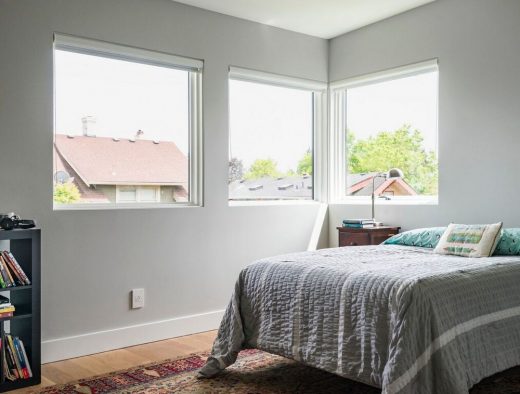
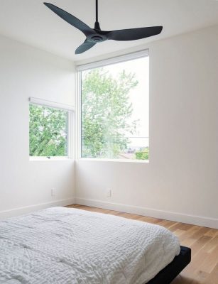
Placement of the master bedroom in the front corner of the house allows for another corner window, and a previously un-captured view of Portland’s downtown skyline and West Hills. A huge window facing the sunset with glass sets clear up to the plane of the ceiling.
A dual entry room behind the master headboard leads to a private office, ready for conversion into a fifth bedroom accessible from the hallway in the future.
Stairway
A small reveal between the stair tread and wall to gives depth and detail to an otherwise flush appearance.
Floors
Custom white oak sanded and smooth, but not-overly-slick.
Mudroom
A split-level side entrance, with family storage cubbies for coming and going, makes for an easy connection from the driveway, garage, or sidewalk, directly to the kitchen or basement. It also keeps coats and shoes 6 steps below eye-level.
Siskiyou House in Alameda-Beaumont – Property Information
Architecture: Beebe Skidmore
Structural Engineering: Madden & Baughman Engineering Inc.
Construction: Jim Arnal Design Build
Photography: Bruce Wolf Studio
Siskiyou House in Alameda-Beaumont information / images received 071016 from Beebe Skidmore Architects USA
Location: Skyline Boulevard, Portland, Oregon, United States of America
Oregon Architecture
Contemporary Buildings in Oregon
Trout Lily Vineyard, Newberg, Yamhill County, Oregon
Design: beebe skidmore architects
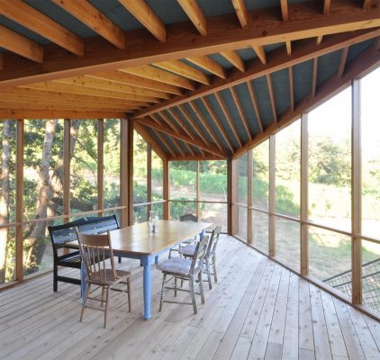
photo from architects
Trout Lily Screen Porch
Architecture in USA
Contemporary Architecture in USA
American Houses – Selection
Holley House, Garrison, New York
Bradley Residence, Arizona
Claremont House, Illinois
Comments / photos for the Siskiyou House in Alameda-Beaumont design by Beebe Skidmore Architects USA page welcome.

