Bjarke Ingels, BIG Venice Architecture Biennale, Danish Architect
Bjarke Ingels (at) Venice Biennale 2010 : the BIG Interview
Architect in discussion with Adrian Welch Architect, e-architect Editor
31 Aug 2010
Bjarke Ingels Venice Biennale – BIG Interview
BIG Interview 28 Aug 2010, Danish Pavilion, Giardini
Bjarke Ingels in discussion with e-architect editor Adrian Welch
Q. What do you think of the Venice Biennale concept?
A. Great, I like the coming together and the professional and social engagement.
Q. What is the current focus at BIG?
A. The last year is all about buildings. In 2009 we had a lucky streak with many competitions having success and now turning into built work. The office swelled from 65 to 100 staff. Currently we are beginning the Danish Maritime Museum, completed the Kazakhstan National Library basement and the Shenzhen International Energy Mansion has started.
Q. What is the key direction in the office, is it the loop city (Denmark/Sweden)?
A. Urbanism has been traumatic recently. It has been a very practical discipline because big ideas were frightened off after the problems of the Modernist masterplan. But it is now more positive to have big ideas. The Loop City is politically well grounded.
Q. But densification is not new – Corb had underground transport in the Ville Radieuse and blocks above. London has densification strategy at transport nodes, especially at the main railway stations such as London Bridge or Liverpool Street.
A. Yes, a classic concept, but the Loop City proposes infrastructure as the backbone to the city life and also proposes solutions for energy and water usage etc. Copenhagen in a way has a ‘split brain’, and needs more of an overall urban vision.
Q. Has the bridge between Copenhagen and Malmo galvanised this cross-border integration?
A. The bridge has accelerated the process (it is now 10 years old), but BIG plan to take it further, a masterplan for the region. Swedes are good at some things Danes aren’t good at, also that area of Sweden is wealthy, the T-Top Park and IKEA empires are run from this part.
Q. Densification often brings problems with shading, I noticed in the Loop City film there were a range of buildings proposed, but also a double row of tower blocks in close proximity.
A. Correct, but the proposals are just suggestions. The Battery (project by BIG) is more developed and demonstrates how density can work. Plans for The Battery were approved just two days ago.
Q. Many of your buildings exhibit a ziggurat-like form, repetition of angular slopes, is this an influenced form, Latin America, Herman Hertzberger or somewhere else?
A. VM Mountain dwellings was a slope, therefore a mountain. The Battery’s form is driven by setback rules, the mapping of relationship between blocks and adjacent properties generates the form. The core is hollow – for retail etc., the project is mixed-use with residential covering the exterior looking outwards.
Q. Charles Jencks has stated iconic architecture will keep expanding because it is driven by the market where iconic works hand in hand with corporate branding. Your designs aren’t from either end of the iconic to rationalist spectrum, but somewhere between: how do you arrive at so many simple forms, forms that tend to be striking, iconic?
A. Our buildings are idea driven. Key issues are the tenants and good spaces, the forms evolve from thorough investigations. It is the architectural investigation of the potential of the idea. When you do it constantly you edit out the noise. The result is clear, edited, distilled and can be iconic in character. A combination of logics can create iconic buildings, it is not a given though. If you look at the Shanghai Expo Danish Pavilion (by BIG) the centre is not just a reflection it is a pool, the ramp is not just to look at but for use too.
Q. Your buildings such as VM Mountain Dwellings and 8 House are easily recognisable and visually striking in form. What would your response be if you had a rectilinear urban block and a Client with strict desire for maximum space?
A. Haha, ok, we do have one such project, were we are literally thinking inside the box, but still under design.
Q. Finally, the 12th Venice Biennale theme focuses on people – ‘People meet in architecture’ is the title given by Sejima – in today’s lecture by SANAA, Eliasson, etc. the principal discussion was about engagement with the occupant. How do you focus on the occupant, I read that the 8 House design was generated by your concern for the tenants’ well-being?
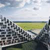
A. All our work starts with engagement with who are the occupants going to be, understanding how the building will be used. The 8 House is set out to maximise sunlight and views, this is what makes distinction of the blocks. The figure-of-eight plan also allows cross routes through the building and site.
Venice Architecture Biennale Danish Pavilion 2010
Comments on this BIG Interview by Architect Adrian Welch with Bjarke Ingels at Venice Biennale 2010 are welcome
BIG Venice Biennale
Venice Architecture Biennale Danish Pavilion 2010 – Summary
1947-2047: From Fingerplan to Loop City
Presentation developed by BIG + Kollision + CAVI
Loop City Vision by BIG + Tom Nielsen + ReD Associates + ARUP
Presentation sponsored by Realdania
Catwalk
3XN, AART Architects, Arkitema Architects, Ateliers Jean Nouvel, BIG, COBE + Transform, Dorte Mandrup Architects, Foster + Partners, Henning Larsen Architects, Lundgaard & Tranberg Architects, Rem Koolhaas / OMA, schmidt/hammer/lassen architects, Steven Holl Architects, Studio Daniel Libeskind, White architects, Zaha Hadid Architects.
BIG House, Ørestad, Copenhagen, Denmark
BIG architects

picture : Ty Stange
BIG House
Location: Venice, Italy, southern Europe
Venice Architecture
Venice Architecture Designs – chronological list
Venice Architecture Walking Tours by e-architect
Venice Biennale – Exhibitions, Designs, Images

photo : Neale Smith Photography
Venice Biennale Croatia Pavilion
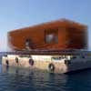
The Ship : Floating Pavilion

picture : Zelimir Grzancic
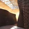
Venice Biennale Brick Wall
Gramazio & Kohler, Architektur und Digitale Fabrikation, ETH Zürich mit Reto Geiser

photograph © Alessandra Bello
Venice Biennale Installation : Dune Formations images by Zaha Hadid
Website: La Biennale di Venezia
Comments / photos for the Bjarke Ingels Venice Biennale 2010 BIG Interview page welcome

