Venice Architecture Biennale Exhibitions Architects, Italy Pavilions News 2010
Venice Architecture Biennale News
Italian Architectural Show Pavilions – Reviews – Photos – Architects.
16 January 2009
Venice Biennale Architecture
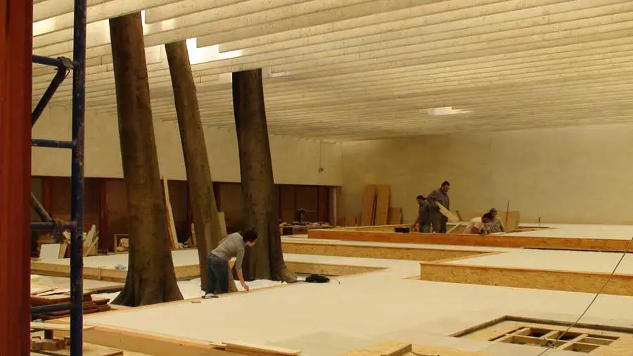
Nordic Pavilion, Biennale di Venezia, Italy
Dates built: 1958-62
Design: Sverre Fehn architect
interior:
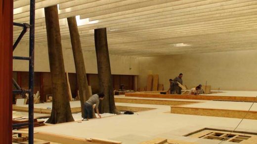
photograph © David Lawson
exterior:
photo © David Lawson
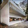
photos : Neale Smith Photography
Venice Biennale shelter architect
+++
Venice Biennale 2004
Architecture Review of Venice Architecture Biennale by architect Rebecca Wober
“Metamorphoses”
Nordic Pavilion: Venice Biennale
Mostre (to show, exhibit)
For a century or so, a biannual exhibition has been held in Venice, where visitors can stroll around the gardens to the east of the island, viewing an outpouring of international contemporary art. Recently, the same venues have been host to exhibitions of Architecture, making use of the same national pavilions that are animated every other year by the contemporary art world.
This year sees the 9th Venice Architecture Biennale, where a wealth of work from around the world has been collated by Kurt Forster, the “dirretore” for 2004. Forster is an art historian and architect from Zurich, and professor at Universities in America and Europe. The title “Metamorphoses” for this year’s Venice Architecture Biennale show provides a protective cloak for the changing face of architecture today.
Nordic Pavilion: Venice Biennale
Padiglioni (pavilion)
The architecture exhibition presents an overwhelming spread of work across miles of exhibition space. To comprehend the scope of the work on show, the visitor is guided to the Giardini and the Arsenale, two distinct realms.
Whereas the Venice Biennale architecture pavilions showcase work by nation, the Arsenale arranges work by theme. The Venice Architecture Biennale pavilions appear to have been constructed starting from late 19th century in a time when nationalism was just invented and everybody was hammering on about the distinction of national traits.
Today it seems increasingly irrelevant to divide up work and represent achievement according to these boundaries. Therefore, the arrangement of these spaces by nation seems to be increasingly outdated. For example, the British pavilion showcases work by 8 architects from diverse countries, two of whom are Scottish, one Czech, and one hailing from Israel.
In contrast to the Venice Biennale pavilions, the curating of the Arsenale goes some way to break the barriers of nation by grouping work by theme. However in spite of the subtitling there does not appear to be a perceivable thread. For example, Barcelona’s EMBT office is represented by about 5 current projects. These include a library, the canopy to a Barcelonan market, and a commercial centre for Leeds and they can be encountered dotted around different areas of the long processional space.
Giardini (gardens)
The theatricality of Venice cannot be denied; the exquisite stone city floating on a lagoon is a phenomenon. Venice can either feel like the set of an 80s pop movie (stimulated by the sight of red cushioned gondolas floating past), or like your own back yard when for example you notice a temporary playground animating a public square or a granny going home with the shopping in tow. Similarly, there is a great contrast between Biennale exhibitions which present work as if prepared for the pages of a magazine and those which cause an event.
France, Britain, Spain all followed the “showcase your semi-famous architectural stars” format, neatly divided and generally smartly presented. However, only Biennale pavilions such as Belgium and Poland took the step out of the didactic stance to present a sculpted experience where the architectural produce can be viewed in relation to the given space.
Gran Bretagna (Britain)
(no larger images, apologies)
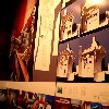
Scottish Architecture in UK pavilion
“same-old-same-old”, plus Sean Connery filmhouse for Lothian Road, Edinburgh. The model for this prominent project formed the centrepiece of this busy Venice Architecture Biennale exhibit, which clustered together as much of Murphy’s oeuvre as can be viewed in 10 metres squared.

Richard Murphy Architects: Filmhouse Plan
This spread could be viewed as a sumptuous offering in homage to the well admired Carlo Scarpa. In this way, perhaps RM can share a seat with the master in his own land.

Richard Murphy : Filmhouse – Scottish Architecture
CJ Lim
So cutting edge it will slit your throat. Wonder how many students had been harnessed to their desks to cut out ever diminutive paper bicycle seats and general exquisite origami
Caruso St John
Sober, no impact
Peter Cook
Do the students take the lead from him or is he running to catch up? Exciting cross references from number templates to key.
Kathryn Findlay
Her work invites references to the beauty of Hepworth’s shells and Gabo’s constructions. She exhibits at the Venice Architecture Biennale an “egg inspired” house for sheikh someone, with a gargantuan approx 1:25 model with note not to touch, impossible as with all the exhibits, complete with pool, lifts, and a “snug”. Also on show are healthily heavily thumbed A1 drawings available to leaf through
John Pawson
This is a quiet space in comparison with Murphy, Lim and Cook. Pawson has opted to show one project only, a monastery in France. This representation is of course in stark contrast to a show such as Richard Murphy’s whose collection has not resisted the urge to show almost every piece of work ever built. Rather, Pawson showed a small modest plan/model out of thick brown board and has thrown this into the shade with vast photos across 5 panels close by, the edge ones presenting merely a mute background for the cloister. Pawson also showed photos of consultation and construction which added the grit to the cleanliness of the collection.
Future Systems (Jan Kaplicky and Amanda Levete)
A blue carpet, small retrospective. The most prominent feature was a tall colourful plasticky model of their skyscraper for the Alexanderplatz in Berlin.
Ron Arad
An extravagant beautiful light fitting heralded the entrance to a corridor of curvy walls with cut outs to allow views through to work behind. Unfortunately this arrangement appeared to be overly clever as there was not enough light to permit viewing. This was the only Venice Biennale exhibit in the British pavilion that attempted to create more of the theatre of viewing.
The British pavilion showed no evidence of heavy handed curating plastering the same requirements on each individual ego. In this way perhaps a typical British trait of laissez faire did shine through. There was however a unity given by the audio track played local to each one’s exhibit, recording an interview of each architect.
Francia (France)
Paradoxically, the French pavilion at the Venice Architecture Biennale presented a disappointingly monotype show, more typical of some sort of old-school Chinese stereotyped format. It was plastered with brown paper and each star was given the same treatment of display, with a nasty smell of glue pervading the space. With hundreds of displays to view a turn-off like this produces a swift exit, even if the talented Francoise Jourda was curating.
Venezuela
Venezuela’s Venice Biennale pavilion building itself is daring in design inviting the viewer in, but it turned out to be a coat store only.
Danimarka (Denmark)
Could not resist showing their typically famous trademark canon of 20th century furniture designs at entrance. Rest of work in the Denmark’s Venice Biennale pavilion was “eco-cool”, including a captivating moving visual diagram projected onto a wall demonstrating the cycles of energy consumption.
Israele (Israel)
Has no rigour but is sexy.
One theme of the work in this pavilion involved projects to build artificial islands in the Mediterranean. These islands could be planned as utopian models of existence. A local consultation process was exhibited. This took the form of a series of interviews, questioning people on their wish lists for a modern island life. The result showed a telling range of desires for peace.
These mostly involved attributes of European cultural centres such as cafes, and far eastern bliss such as wooden houses on stilts. One woman stipulated that there should be no use of “Jerusalem stone” and that there should be ample opportunity to ride horses. Whilst one woman said that the island should be open to all, including Jew and Arab, another was not so balanced and would allow Arabs but not in her part of the island. Having recorded this, I believe that this Venice Biennale show had the virtue of being frank and was striking in its aspirations for public consultation to find the ingredients of an ideal dwelling.
The initiative to start afresh with offshore creations is hardly surprising given Israel’s sweaty and confined tangle. However, the creation of artificial islands is more akin to the profligate expansion of a place such as Dubai rather than the respectable conscience exemplified in the Danish or Dutch pavilions. As there are no parallels to the “40 acres and a mule” or “Frontier” mentality of bygone U.S. days, the quest for lebensraum in the sea seems to be a logical one.
Olanda (Netherlands)
Have fun with the pull-out colourful drawers. Statistics on various elements of the Dutch environment are collated. This Venice Biennale show reached the summit of logical analysis. When you view this show, you can recognise why their town planning is such a joy to experience and can have such a positive environmental impact.
Egitto (Egypt)
The show attempted to build a life size lean to structure but succeeded only in looking amateur and derivative.
Brasile (Brazil)
A stunning pavilion for this Venice Biennale, but built 1964, entered from a bridge and forming a magical entrance to the peripheral area of the gardens. Who designed the Brazilian pavilion building?
Belgio (Belgium)
This pavilion won this year’s formal Venice Architecture Biennale prize with its show centring on life in Kinshasha, Zaire (ex-Belgian Congo, independence won in 1960). The curating seems to be so politically correct that it would be incorrect to criticise its complete lack of architectural hypothesis or analysis. Instead you can watch film of African people dancing in the street in a manner that seems incongruous to Leith Walk culture for example, to the British viewer.
Polonia (Poland)
A cut above. The magnificent doors to this Venice Biennale pavilion were inhabited by an intriguing construction within the opening which invites viewers to cross the threshold.
This sculpts the viewer’s entrance within superstructure. At this preliminary portal, a shadowy image of the viewer is captured and shown with a few second’s delay on a partially hidden screen as the viewer enters the building. A glimpse of oneself is all that is possible. It retains the eye enough to catch a shadowy repetition of the footage reduced into the background. With a twist, the viewer is into the main space where the exhibit fluidly shows video, sculpture and evidence of built form. We know that we have been recorded and resonate in the surfaces, like the big rubber ball in the water further into the space.
This Venice Biennale pavilion is distinguished by the curating by Adam Budak, which takes several steps beyond the field. Architect Zvi Hecker and the practice of partners Diller and Scofido were amongst those involved. Elizabeth Diller moved from Poland to NYC as a child and Richard Scofidio is himself a New Yorker.
Whilst Murphy and the France’s Venice Biennale pavilion present the same kind of architecture spread that they would for the AJ, Pawson and the Dutch went a step further but the Polish pavilion goes all the way.
Corderie dell’Arsenale
(rope making warehouse of the arsenal)
If the Venice Architecture Biennale pavilions presented an overwhelming spread of work, the Arsenale is even more staggering. This is partly owing to the theatre of the vast space the show inhabits, the redundant workshops for the engine of Venetian power, shipbuilding, commerce, command of the waves.
In one long volume, many gondola-like stands hold models of diverse work somehow grouped by theme, “Transformation”, “Topography”, “Morphing Lights, Floating Shadows, the nature of artifice”, “Surfaces”, “Atmosphere”, “Hyper-Projects”, Episodes”. (Blobology???). One finds it hard to ascertain what would make Zaha Hadid’s latest model a Morphing Light rather than an Atmosphere, but no complaints, the viewer must rise to the challenge of absorbing at least some of the expertise on show.
Strangely, at the end of the Arsenale, an appendix of work is stumbled upon, another Venetian pile hosting more work, once again back to arrangement by country. Anyone who treks this far is in for a reward from the Estonian show which presents exclusively outdoor toilets. These are of the oaky nook in the snowy forest type and by all accounts seem to be fondly constructed one-offs by maverick individuals, a fascinating compilation. One structure has even been mocked up in the exhibition, complete with ladder. A proud Estonian was undergoing a photo-shoot and was keen to tell any passer by which one was his own toilet.
Scotland is represented in the last of the last spaces, unheralded by any name on the free map or any signage. The placing in the exhibition intensifies its content, a show prepared by Glasgow’s Lighthouse. Although many works located in Scotland are showcased, all are given the same weighting whether Scottish Parliament, Dance Studio or Cancer Centre.
Additionally, not all are recent, for example Munkenbeck and Marshall’s pleasing timber-clad visitor centre on the Isle of Bute is surely not the work of 2003/4. However, having spoken to some Spaniards, word is that their Venice Biennale pavilion did not showcase new work or work from up and coming talent either, and in this way played safe. However, to an uninformed foreigner, the Spanish pavilion was impressive enough to be striking and seemed to be representative of an affluent and courageous nation. Perhaps the Scottish show could seem so to a less critical eye.
Finally, I wonder who did the model for the Jinling Tower in Nanjing? it looks just like the Daniel Libeskind freedom tower, but which came first?
Venice Biennale 2004 © Rebecca Wober, architect
Venice Biennale : main page with current pavilions + images
Location: Venice, Italy.
+++
Venice Buildings
Venice Buildings
Venice Biennale Architecture Links
Venice Biennale Croatian Pavilion
Venice Architecture Biennale Danish Pavilion
Venice Architecture Biennale Irish Pavilion
Venice Architecture Biennale 2010
Venice Biennale OMA Installation
Venice Biennale Arsenale Installation
Roses Design Awards 2005 – Landforms wins for Exhibition Design: Silver
Venice Biennale Installation : Dune Formations images by Zaha Hadid
T-B A21 Olafur Eliasson Pavilion – Art Installation
Date: 2005
Adjaye/Associates
Comments / photos for the Venice Biennale Architecture page welcome.

