Ji Pin Restaurant, Taipei, Modern Taiwan Interior Design, Taipei Architecture Images
Ji Pin Restaurant in Taipei
22 Feb 2021
Architects: Jmarvel Interior Design
Location: 4F, No. 107, Section 4, Zhongxiao East Road, Da’an District, Taipei City, Taiwan 106
Literary Giant of Song Dynasty and Ancient Mythological Creatures
Photos by Hey! Cheese
In the history of Chinese culture of five thousand years, there was an extraordinary man, who had majestic vision, was gifted with unique taste in aesthetics and foods, and could discover the delicacies from simple food. He proudly called himself the “gourmet”, and his dream was to try all delicious foods on earth.
Ji Pin Restaurant
His name was Su Dongpo (蘇軾), one of the Eight Giants of Tang and Song Prose. He was also the first gourmet historically known.
The gourmet spirit of Su Dongpo (蘇軾), the literary giant in Song Dynasty, is infused into the new brand of creative Cantonese cuisine of Ji Pin (吉品). We associate Su’s characteristics as a gourmet with generosity, boldness, and gracefulness. This is foundation of the brand in the field of delicacies.
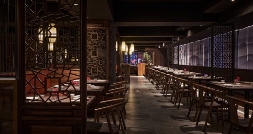
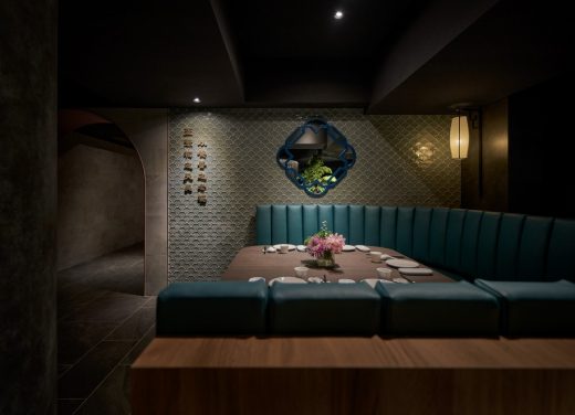
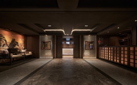
The lobby is decorated with statues of mythological creatures (Taotie, Dragon, Tiger and Pixiu) which symbolize an ancient reference of gourmet. They also represent the mystery and prestige of royal power on Taotie pattern of bronze ware in Shang and Zhou Dynasties. Deriving from the mythological creatures, the scales of dragons are used for wall decoration. The classical sentences of Su Dongpo (蘇軾) are presented at the end of the corridor and besides the seats of the clients. This is a special position as it is an intersection. The guests would be watching the bustling traffic by their feet, appreciating the classical proses and poems on the wall, and tasting the best Chinese delicacies, which together present a unique experience.
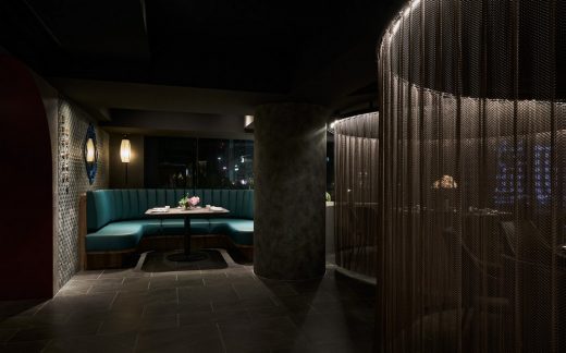
The columns set in the space are in indigo color to simulate the oxidized and archaic Chinese bronze, so as to be viewed as the installation art in the space. Such design echoes with the time of Taotie pattern, and highlights the significance of the enlightenment of bronze civilization.
Circulation and Arrangement of Chinese Garden Layout
Since ancient time, literati have been obsessed in Chinese gardens. The interior design is based on the essence of the structures and landscape of Chinese gardens, which characteristics reflect the characters of Chinese literati.
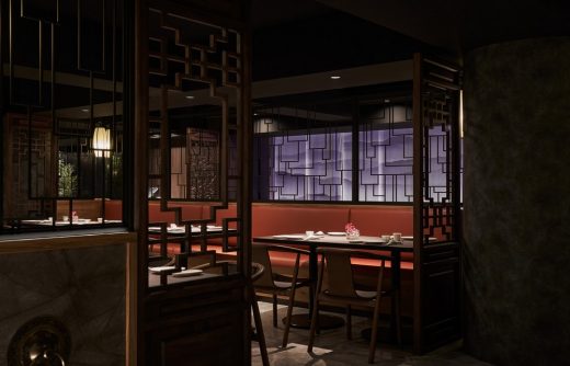
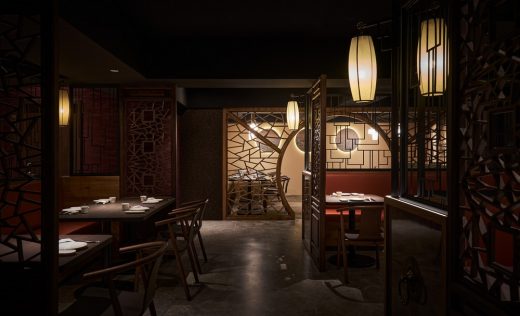
The spatial layout is outlined with garden design. The architectural technique of changing scenery of Chinese garden design is incorporated on the winding corridors to showcase the sense of tranquility in Chinese splash-ink paintings. The route of the corridor is based on the design of “block, lead and reveal”. The second glass wall of the two-door entrance is moderately blocked, so as to create a sense of anticipation towards the following views. Presenting a scenic, winding, and reasonable path, the corridor takes the guests to appreciate the landscaped wall, patterned doorways and windows, and pavilions, which bring feelings of elegance and peacefulness as if they were in a Chinese garden.
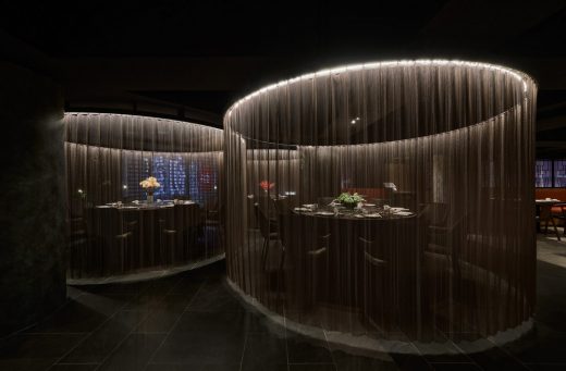
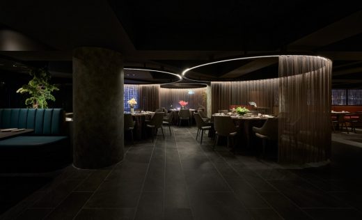
The division of the seating corresponds to of the garden layout. The booths, sofas, and blocked seats turn each seating section into a landscape scene. The pavilion and corridor, edge view, plants at the corners, paper cut on windows divide and connect the corridors at the same time. With the depth of the field, between solids and voids, sparsity and density, hidden and revealed objects, the combination of landscape and objects creates endless possibilities.
Vitality of the New Brand
Based on the authentic Cantonese cuisine of the old brand, the new brand focuses on creative Cantonese cuisine. The brand value is to combine old and new characteristics. By manifesting traditional Eastern images with new materials and method statement on construction, we attempt to highlight the brand characteristic of “innovation in tradition and continuity in innovation”.
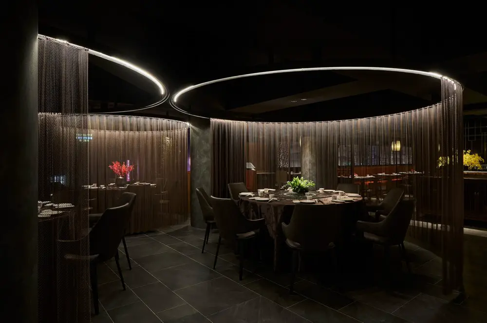
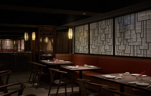
Replacing the traditional thick red-brick wall with translucent and bright glass wall, and using geometric and linear black iron screen to reflect water flow. Changing the lace curtains to metal mesh curtains, and incorporating window grilles which are decorated with cracked ice patterns on traditional wooden doors and windows, we continue to convey the innovative concept of the brand through new materials and techniques.
The lobby is the starting point of the dining process. We construct the emblem of traditional thick wall and yellow tile by glass material. The grand gate of the ancient mansion is accompanied by mineral yellow color to present the tranquility. The glass bricks soften the light, giving the light a golden hue and creating elegance vibes. The glass brick for the second reception shows the purity and symbolizes the white walls and dark tiles of Suzhou (蘇州) courtyards.
Su Dongpo (蘇軾) also fascinated wine tasting. From commercial perspective, the bar takes a pivot position. The design inspiration comes from herbal shop, which adds some creative idea to the presentation of Chinese cocktail and herbal tea. In this place, we particularly simulate traditional Chinese furnishings at an independent corner. It is also a perfect place for social media check-in.
Old-Fashioned Space with Tranquility and Elegant
The colors reveal the young characteristic of the new brand. We use light, gray and low-key hues instead of traditional high colors, so that the guests would feel like being in an ancient ink painting, and being surrounded old-fashioned and classical elegancy.
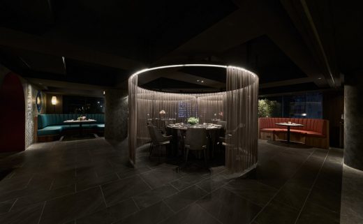
From Chinese traditional colors, we find the ones that can properly interpret Chinese features. Chinese blue, peacock blue and carmine is decorated into the space. Carmine is used to make a strong impression; peacock blue on the column imitates the mottled bronze, and brings a sense of mystery and elegance; Chinese blue refines the Eastern culture and bring gracefulness and profoundness to the space.
The overall design is based on the first gourmet Su Dongpo (蘇軾) in the Chinese history. It traces back to ancient mythological creatures and associates with Chinese taste. The Chinese garden architecture reveals the elegance of literati, the use of tranquil color reflects the luxurious classical atmosphere. We wish all the guests can enjoy refined Chinese aesthetics in each visit at every corner.
Ji Pin Restaurant, Taipei, Taiwan – Building Information
Design firm: Jmarvel Interior Design
Designer: Jeff Yu (Chieh Teng Yu) + Mini Hsu + Elaine Lin
Client: Ji Pin Restaurant
Type: Restaurant
Location: 4F, No. 107, Section 4, Zhongxiao East Road, Da’an District, Taipei City, Taiwan 106
Area: 572㎡
Layout: greeting arriving area. reception area. bar. sofa seats area. car seats area. semi-open booths. booths. office area. locker room. toilet. cooking area
Material: hardware window grills. CNC window grills. wood. wallpaper. porcelain tile. metal curtain. melamine board. veneer. tawny glasses. leather. glass block
Period: 2020.9 – 2020. 11
Photographer: Hey! Cheese
Ji Pin Restaurant, Taipei images / information received 220221
Location: Taipei, Taiwan
map: https://www.google.com/maps/place/%E5%90%89%E5%93%81%E5%88%9D%E7%AD%B5/(at)25.041752,121.548309,16z/data=!4m5!3m4!1s0x0:0xea50f823b24127f5!8m2!3d25.0417523!4d121.5483089?hl=en
World Architecture Festival Award 2016 – Shortlisted, Future Projects and Commercial Projects
Location: Taipei, Taiwan, eastern Asia
Architecture in Taiwan
Taiwan Architecture Designs – chronological list
New Taiwan Residence
Design: Create + Think Design Studio, architects
image from architect
Comments / photos for the Ji Pin Restaurant, Taipei building by Jmarvel Interior Design page welcome

