Pewter Store Gandía, Valencia retail building images, Spanish shop architecture design photos
Pewter Store in Gandía
New Retail Building in Eastern Spain design by CuldeSac
post updated 4 April 2026
Architect: CuldeSac
Location: Valencia, Spain
Pewter Store in Gandía, Valencia
(at)PewterStore, a mobile friendly concept By CuldeSacTM Custom
15 Jan 2019
Pewter Store in Gandía, Valencia Shop Design
Urban and technological sensations merge in the latest retail work designed by CuldeSacTM Custom. Pewter Store opens its doors in the heart of Gandía (Valencia) to respond to the high demand of generations Y and Z.
Provocative, irreverent and transgressor. This is the character of this new retail concept, which materializes with the firm’s first flagship store. A space with a very marked identity, communicable and photographable. Pewter is much more than a store; it is born as a meeting point and potential scenario in social networks.
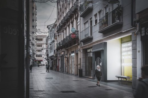
It intends to be an extension of the road, extolling public space and provoking the pedestrian. It intends to be the confluence where speed, light and escape interact. Sensations of today’s life transferred to the sales space.
To this end, CuldeSacTM Custom’s creative team has developed a comprehensive strategy that encompasses concept creation, design, execution, branding and communication. Pewter is a 360º brand and that’s how it presents itself to the world.
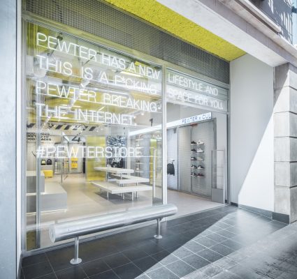
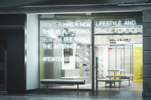
PEWTER HAS A NEW LIFESTYLE AND THIS IS A F*CKING SPACE FOR YOU TO TAKE #PICS AND BREAK THE INTERNET #PEWTERSTORE
The showcase works as a first claim. A direct and daring message, which speaks the same language as its target and incites them to go into its universe. Stores are no longer stores; they are literally a message that the brand emits to burst onto the scene.
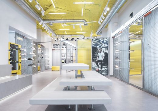
Once inside, there’s an explosion of stimuli and sensations. The orthogonality of space disappears in order to connect with the language and the ephemeral of these generations’ lifestyle.
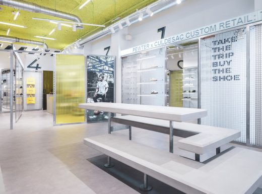
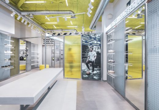
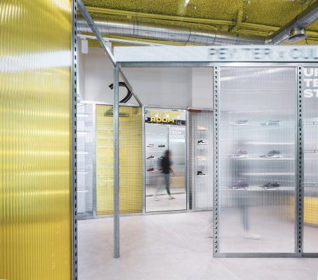
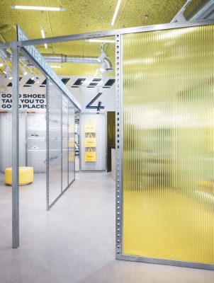
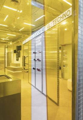
Metallic latticework act as an exhibitor and become the loudspeaker for launching messages and locating campaigns. Ticker LEDS with moving texts wrap and accompany the customers throughout their tour in the store. The floor simulates large prefabricated concrete slabs placed in parallel and the exhibition system is designed specifically as a versatile system prepared to give support to the dynamism that the space needs. It is a system that fences the perimeter and generates the interior route. That fence can be completed with flat metallic tramex plates, with transparent or yellow polycarbonate, with translucent PVC slats, with campaign or communication.
It isn’t just a shop, Pewter has gone further. With this new space, the foundations have been laid for the expansion of its business model.
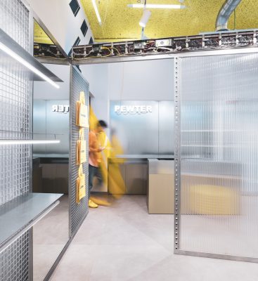
The space rests under a roof of yellow rock wool (corporate colour) enhanced through a grid of LED tubes that illuminate 360 º, a differentiating element to position itself as ‘the shop of the yellow roof’. The graphic identity invades every corner and reaches up to the design of the Pewter bag, which stands as an icon of the store.
Naturalness promotes space and exposes what is normally hidden. For this reason, strips and sockets play a leading role in the space, leaving the cables as part of the interior design. Each detail defines its personality: Pewter is spontaneous and real. It naturally exhibits what others hide. Nude technology.
Pewter’s flagship store has been designed to be portrayed and spread on social networks, so the urban bench appears as an icon on the façade. The inner grandstand is made available to visitors to be used as a place of work and meeting or as a perfect stage for the most viral photographs.
It is a space for one to be at, a point of connection with the brand, which has been built from spontaneity and irreverence. A concept that understands the keys of current consumption and that worships the selfie and the power of social media.
“Giving visibility to everything that has up till now been hidden, is part of the brand’s identity. Not everything has to be integrated, embedded, measured. We prefer the spontaneous, the natural. We shed these complexes and reflect it in all the aspects of the brand: interior design, graphic identity and communication. Borja Berna, Creative Director at CuldeSacTM Custom.
CuldeSac is currently one of the most versatile studios on the Spanish creative scene.
Pewter Store in Gandía, Valencia images / information received from CuldeSac
Location: Gandía, Valencia, Spain.
Valencia Architecture
Another Spanish building design by architects CuldeSac on e-architect:
B&B hotel in Getafe, Madrid metropolitan area, Spain
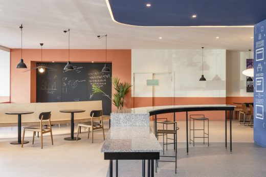
photo : David Zarzoso
B&B hotel in Getafe by CuldeSac
More contemporary Valencia architecture projects on e-architect:
Bombas Gens: Fundació Per Amor a L’Art, Valencia, Spain
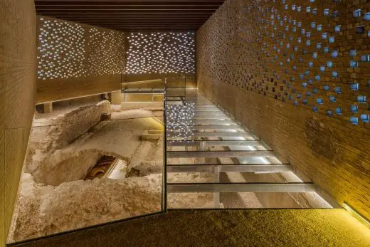
image © Frank Gomez
Bombas Gens Centre in Valencia
++
Architecture in Spain
Contemporary Architecture in Spain
Spanish Architecture Designs – chronological list
Spanish Architectural News on e-architect
Valencia Architecture – selection:
Casa Patio, Loriguilla
Architects: Alberto Facundo
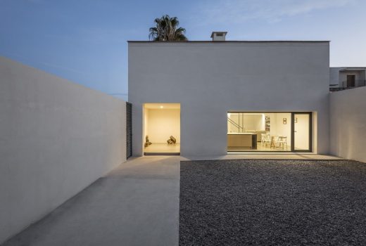
photograph : German Cabo
Casa Patio in Loriguilla, Valencia
Bvalve Office Building
Architects: Ramon Esteve Estudio
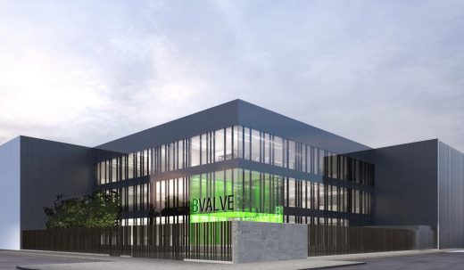
image : Ramon Esteve Estudio
Office Building in Valencia
Comments / photos for the Pewter Store in Gandía, Valencia architecture design by CuldeSac page welcome.


