Hillside House in Stellenbosch, South Africa Residential Building, Helderberg Mountains Architecture
Hillside House Western Cape
Western Cape Residence: New Luxury Home in Stellenbosch – design by GASS Architecture Studios
11 Nov 2015
Western Cape Hillside Residence
Design: GASS Architecture Studios
Location: Stellenbosch, Western Cape, South Africa
ON ARRIVAL…
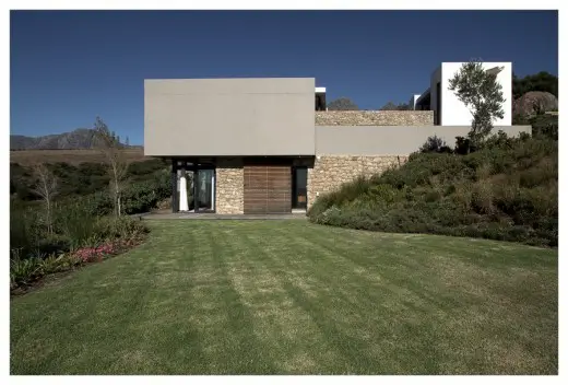
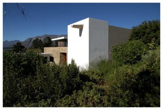
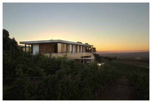
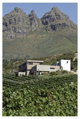
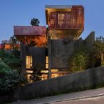
Situated on the slopes of the Helderberg Mountains in Stellenbosch and nestled between rolling vineyards, a koppie (small granite hill) and a river below, Hillside House is simultaneously arresting and juxtaposed and fits flawlessly into its surroundings.
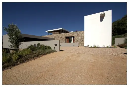
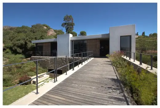
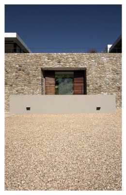
You approach Hillside House up a steep driveway meandering through the vineyards. The driveway and the forecourt are a modern interpretation of a traditional farmhouse. This is characterised overall by the planning of the house’s location but also more specifically by the gravel driveway, expansive forecourt, drive-in open garaging reminiscent of a barn and water feature evocative of an animal’s drinking trough. This modern drinking trough is then fed by a modernist architectural waterspout from the roof of the house.
These farmhouse characteristics are not just visual either. Other senses are also stimulated: your scent is stimulated by the smells of the farmlands and rural surrounding as is your auditory sense when you hear the gravel beneath the car’s tires.
There is a genuine sense of arrival every time you visit Hillside House.
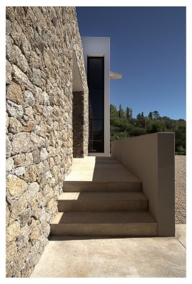
Access to the front door is gained from a double-sided staircase from left or right of the gravel arrivals courtyard. This short stairway is a nod to the Colonial influence of traditional Cape vernacular typical to architecture seen in the Cape (many buildings in and around Cape Town like The Castle of Good Hope, the City Hall and Tokai Manor House, for example, boast this kind of double-sided arrival staircase).
As visitor – and homeowner – you are fully aware of the amazing setting but on arriving within the farm yard style forecourt the scale of the house changes from a 3-story to a double volume dwelling – so you don’t really get a sense of all the floors and levels.
Beyond this point it is by no means farmhouse, well not in the traditional sense of the word anyway.
Before walking up the steps to the solid timber double front doors you also have the choice of going downstairs to the guest suites (that are currently being used by the home owner’s older children when they’re not at university).
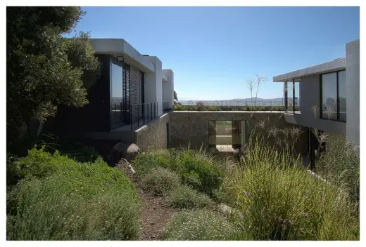
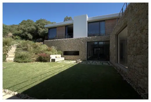
A repetitive architectural feature of the house is the many stacked granite stone walls. Most of the stones for these have been harvested from the site. The front door at Hillside House is also situated within one of these granite feature walls. Before entering the house one has no idea what to expect on the other side – it’s a kind of tardis with unexpected treasures beyond! As you walk through the threshold you are immediately greeted by a giant picture window showcasing the inner courtyard around which the home is designed and the koppie (small granite hill) to the rear of the house. The koppie (small granite hill), as with the rest of the garden, boasts local fynbos and indigenous flora and a kitchen garden to the side.
From the home owners:
We wanted a home that merged the inside and the outside and that gave us beautiful changing visual cameos wherever you looked. Our architect managed to masterfully capture our need for simplicity, nature and a very serene ambience that is then offset by our somewhat mad and effusive large family.
THE SITE
The main challenge for the architects was the site itself. It slopes toward the Northwest with the koppie (granite outcrop) behind it in the Southeastern corner.
One usually works with or parallel to the contours but here GASS Architecture Studios had to work against the contours.
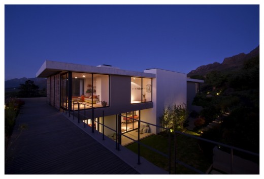
GASS Principal Architect Georg van Gass also had to allow for all three levels to connect with natural ground and obviously interconnect with each other (so each level has access to ground level).
THE STUDIO/ HOME OFFICE & LINK
From the entrance hall you are again faced with a choice of direction – right leads to a powder room and gym and then up stairs to a separate studio and office space. The studio is a long narrow space with bookshelves and storage on one wall and sliding doors on the other. A central fireplace and grand piano also feature.
The studio/ office space opens up completely exposing the space to the koppie on the same level, the inner courtyard below and the mountains beyond as well as the upstairs bedroom wing also on the same level.
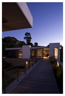
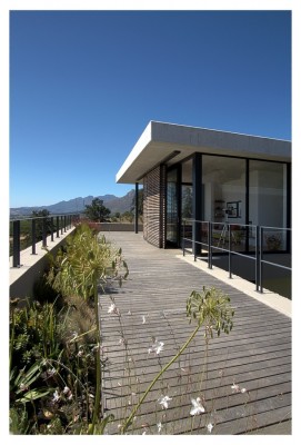
A decked link or walkway joins the studio/ office space with the family’s upstairs bedroom wing. The link serves to link private space with public space but is also a day-to-day connection. The link has the open courtyard on one side and a plant-bed with indigenous grasses on the other.
Although the link is present on both the top and bottom levels of the house, it serves two purposes: the bottom link, as the entrance hall, makes you aware of the internal space of the house (the internal courtyard and the two distinct wings of the house) whilst the top link makes you aware of your surroundings and the locale.
LIVING AREA
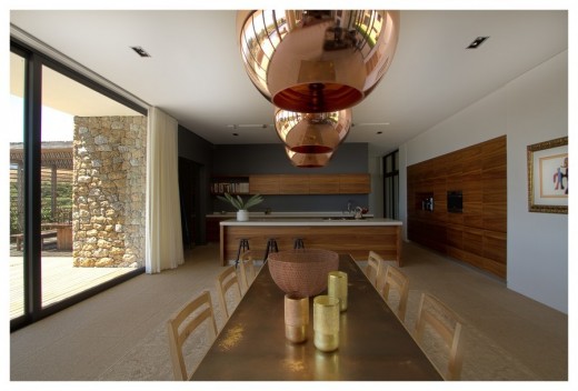
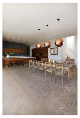
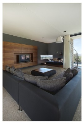
On turning left at the front door you arrive into a large living space that boasts expansive TV/ family room, a more formal sitting room, dining room and kitchen.
The family room includes a snug that whilst forming part of this open plan room also has a sense of isolation: it can be a solitary space or even a romantic space. Here you can read a book or play on your tablet. This area is fully equipped with plug points for charging computers, phones etc. The window in the snug area is a contemporary play on the traditional bay window so you can also take in the amazing views of the vineyards below.
The built-in TV unit was designed to take all the usual AV and audio equipment but completely integrated so no wires or unsightly equipment is visible.
The more formal sitting room is arranged around a feature fireplace with sliding doors either side accessing the inner courtyard.
This then flows onto the dining room and open plan kitchen.
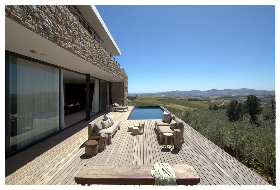
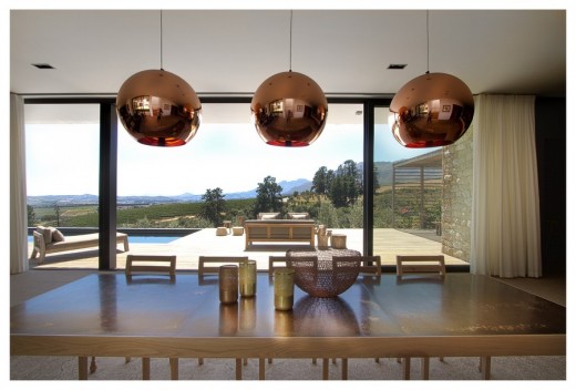
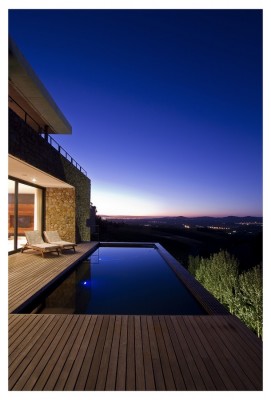
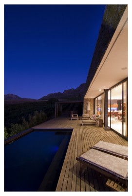
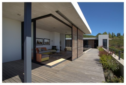
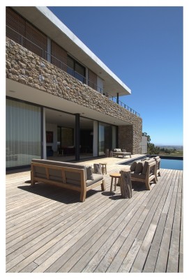
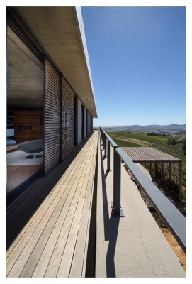
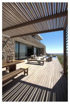
The living room boasts slide-away doors measuring 14,5 meters long that totally open this space to the pool and patio deck making it a completely integrated space. In terms of your choice of living spaces this house serves up numerous options both indoors and outdoors.
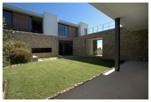
Your outdoor choices are the micro-climated inner courtyard with built-in braai (barbeque) and views of the koppie (small granite hill) or the expansive views of the vineyards, the mountain and the valley from the pool deck.
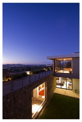
This living room and kitchen level form the “ground floor” and is actually the plinth of the house. Externally this level is further grounded to the site with the use of a further granite wall feature.
KITCHEN
The kitchen forms a real part of the living space and has been ergonomically designed to have everything without having to see everything. The “visible” kitchen is linked to the scullery beyond where all larger appliances like fridges and dishwasher are located. For convenience a smaller fridge for everyday use has been integrated into the cabinetry of the “visible kitchen” for things like milk for teas and coffees.
The kitchen also links to a further storeroom and wine cellar with tasting area and shelves for the owners wine collection.
INNER COURTYARD
The inner courtyard links seamlessly with the ground floor entertainment area/lounge, dining and kitchen spaces.
The Cape is renowned for its Southeaster winds that are deflected by the koppie (granite outcrop). The recessed setting of the inner courtyard and the surrounding architecture further adds to the protection of the courtyard allowing for seamless braaing (barbequing) and entertaining.
What strikes you about this house is that despite the huge expanse of space there are also many smaller and more intimate spaces that are quite lovely surprises.
POOL DECK
The seamless flow between indoors and outdoors means the pool and deck literally become part of the living room and vice versa.
With South Africa’s alfresco lifestyle GASS Architecture Studios feels it is important that your living room space should be like an “indoor patio”. This almost anti-flow mantra revolves around the principal that we are traditionally conditioned to ensure there is flow between indoors to outdoors whereas GASS’s Principal Architect Georg van Gass believes indoor spaces should become a home’s covered outdoor space.
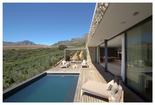
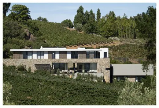
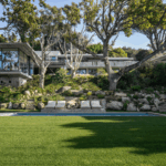
The line of the pool deck is unimpeded and connects itself to the vineyards seamlessly in an almost floating effect.
The pool deck also features an outdoor dining area with slatted pergola creating lovely mottled light ideal for outdoor dining.
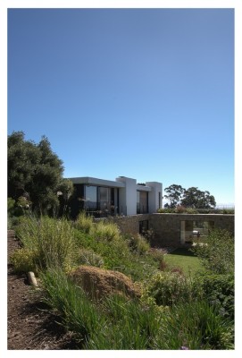
Looking from the vineyards towards the pool and deck you notice that GASS Architecture Studios have taken the plinth of the granite wall beyond the building envelope of the house so it runs seamlessly into the elevated land.
UPSTAIRS BEDROOM WING
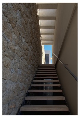
From the kitchen and dining area there is a staircase to the private spaces/ bedrooms. Access to the staircase is somewhat unassuming but then as you ascend the drama of the staircase is revealed.
“The best thing I learnt from my dad was to try to avoid passage ways – he always felt they were a waste of space – so if faced with no other option they do need to be friendly and airy spaces. Without a choice he encouraged me to turn them into a feature.” says Georg van Gass.
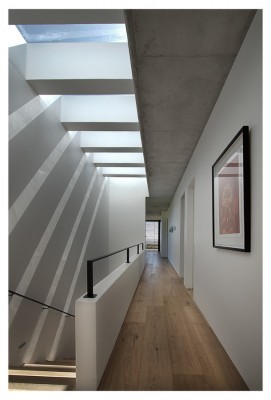
That is just what Georg has done here. The main feature is the inclusion of a skylight with crossing concrete beams. These provide both structural support plus play with the light beautifully casting amazing shadows. You are constantly aware of what time of day it is as the shadows move across the space. This skylight adds texture to a space that would ordinarily be rather bland.
The second part of the passage way features floor to ceiling windows bringing the inner courtyard indoors.
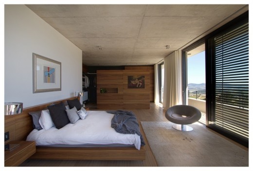
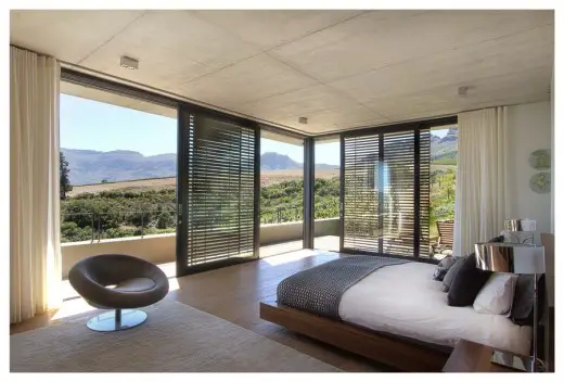
The main suite is an open space to take in the beautiful views. Timber shutters serve a double purpose of defusing harsh sunlight and also act as a security measure.
The customised open plan dressing area features a dressing table area and feature wall that acts as a divider to provide demarcation and privacy, the wall doesn’t touch the soffit (ceiling) adding to the openness and flow of the room.
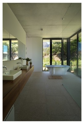
The main en-suite has sliding doors that open the entire bathroom to the elements.
Flamed-granite floors run seamlessly through the space whilst high quality finishes feature throughout.
Traditional skirting is a pet hate for the GASS team. They have created skirting the same thickness as the plaster walls so they run seamlessly in line with the plaster of the walls. They do include a top and bottom shadowline and are painted the same colour as the walls.
Separating the main suite from the younger daughter Isabella’s bedroom is a full family bathroom. Isabella’s room is a double sized room with play area to one side and bedroom to the other, each with their own doors. This was designed to enable easy conversion into two separate bedrooms at a later stage if necessary.
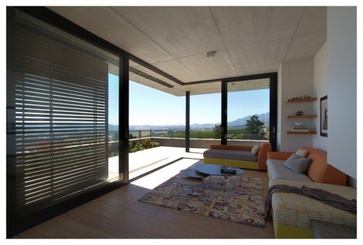
The Western side of this bedroom wing features an upstairs sitting/ reading room with views of Table Mountain, the vineyards and the most spectacular sunsets. Like the rest of the house this area also includes the sliding timber sunscreens but also a fireplace for chilly winters so the room can be enjoyed in all seasons.
GUEST SUITES ON LOWER LEVEL
Below the open garaging and gravel forecourt are the two guest bedrooms with their own en-suite bathrooms. These bedroom suites face into the vineyards but the rooms are removed from main part of the house. Despite the proximity to the main house these wing does allow for a feeling of privacy.
From the home owners:
The house is a pleasure to live in as it accommodates us all, our different generations, our different needs and uses for it. We manage to cohabit peacefully and continue with our personal interests, hobbies and work. Its versatility and the positioning of spaces have really worked well.
THE GARDEN
The indigenous garden blends seamlessly into the fynbos (local flora unique to the Cape) on the hillside. Designed and landscaped by Plantculture’s Scott Hogg, it recently won the 2014 South African Landscapers’ Institute trophy for use of colour, as well as gold for landscape garden design, and silver for water wise plants.
Hillside Residence
Architects: GASS Architecture Studios [Georg van Gass & Chris Bakker]
Main Contractor/ Builder: Christo Kaufmann of PR Homes
Quantity surveyors: QEAS Quantity Surveyors
Engineers: GOBA Consulting Engineers
Landscaping: Plant Culture
Joinery: GASSNER
Doors and Windows: Status Aluminium
Timber floors: Oggie Flooring
Location: Stellenbosch, Western Cape, South Africa
Home Owners: Kay and Rupert and children: Alex, 23, Charlotte, 22 and Isobella, 8
Text by: Jean-Pierre de la Chaumette
Photos by: Kate Del Fante Scott
South African Properties – latest first
Website: www.gass.co.za
Hillside House images / information received from Gavin Maddock Design Studio
Location: Stellenbosch, Western Cape, South Africa
Architecture in South Africa
South Africa Architectural Designs – chronological list
South African Architecture News
Beachyhead, Plettenberg Bay, Bitou Local Municipality, Western Cape Province
Design: SAOTA
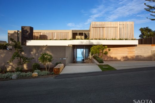
photo : Adam Letch
Luxury House in Plettenberg Bay
Hillside View House, Cape Town
Design: ARRCC Interior Design
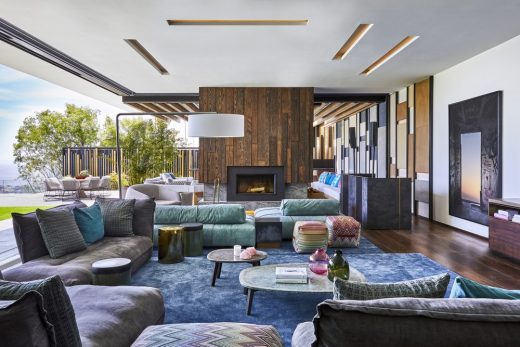
photo : Greg Cox
Hillside View House in Cape Town
Comments / photos for the Hillside House in South Africa page welcome
Website: GASS Architecture Studios

