Zhuyeqing Greentea flagship store, X+LIVING Design, Architecture Images
Meland Club flagship store Shenzhen
15 Oct 2020
Meland Club flagship store in Shenzhen
Architects: X+LIVING
Location: 3F, Shenzhen Uniwalk shopping mall, Shenzhen, China
Meland Club flagship store, Star Legend video game hall
Imagination is a gift from God. However, the same and stereotyped buildings and increasingly similar cities make it impossible for us to see the dream in the square frame of the glass window. I have completed so many works in the field of parent-child business and I am pursuing to create fairy tale kingdom for children and open a door to the unimaginable world.
I want to turn that hazy bubble you dream of but beyond description into a reality that can be touched. Let the unrestrained imagination explode in your heart and set off a bunch of amazing fireworks. I want you to get a touch, which is not only from the throbbing of dreamlike space challenging the daily norms, but also from the existence of space itself, which is a refuge for innocence in this deserted world. The simplest curiosity and innocence of life we once have or have already lost, will all come back to life again in here.
Follow the light, and dream big together.
——Li Xiang
The Meland Club family’s park is located on the second and third floor of Shenzhen Uniwalk Shopping Mall. Instead of using large-scale structures to coordinate conceptual aesthetics and functional blocks, the designer reorganized the logic of space composition with a brand-new internal construction scheme. A whimsical and remarkable ‘garden’ based on the concept of Four Seasons was built, with abundant geometric figures and different materials adding rich texture and imparting vitality and energy to the space.
Through the overall planning calculation and accurate measurement of panoramic modeling, hierarchy balance of sight was achieved so that consumers can not only sense the grand feeling of the overall theme, but also enjoy different viewing angles from a multi-dimensional perspective under the macro scale, and taste the micro shock brought by the totally unpredictable surprising details.
In the huge space of 6000m², the designer built a three-layer platform in the double-height space, which effectively improves the utilization rate of vertical space and at the same time, virtually magnifies the experience feeling of internal space and enhances the interest of exploration. The artificially made atriums with stairs built around them guide the customers moving with a clear direction and lead them to their destinations.
The entrance of the park is located on the third floor of the shopping mall. Given the fact that the original depth and width of the site are insufficient and large-scale installations will largely limit the openness of the view, making customers feel a sense of crowding, we therefore demolished the wall and released a display window in order to ensure the comfort of customers. The display window just provides more viewing space for customers and at the same time, attracts the attention of passers-by. Also, concept of the main atrium “spring” is extended to the reception area and a unique reception desk was developed and customized integrating with its necessary functional attributes.
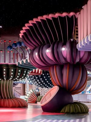
Get ready in the shoes changing area which is full of sense of ritual, and step down to the main atrium viewing platform. You will be encountered by a prosperous spring scene. The spring elements of flower ball, plant stem, butterfly, bee, ladybird are collected in the deconstructive design, and then reorganized into an unexpected natural landscape, rendering deep-seated mysterious hints and stimulating wild imagination.
As the central hub of the whole park, the main atrium with a height of nearly 10 meters is integrated with eye-catching signs on different elevations, which provide customers with the most convenient guide. Stepping down any of the two paths along the atrium, your vision is widened and the space is stacked layer by layer. Customers can always appreciate the vivid scenery during the walking with ever-changing depth of field and perspective effect. The scene change at all times, but you can’t see all of it nor to even predict it. It continuously arouses people’s interest and creates more intimacy between people and the venue.
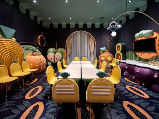
The stitching of seemingly irregular geometry and the accumulation of bright colors are not disordered and chaotic, on the contrary, it’s a harmonious relationship between internal elements and the overall theme after careful planning. Every detail has practical functional significance. For example, the cabinets and shelves well camouflaged as plants can be used for storage, the seats shaped like flowers are leisure sofa for resting, and the bulbs hanging in the air actually hide lighting and sound equipment in them. The functional value and aesthetic value of design are perfectly mixed here.
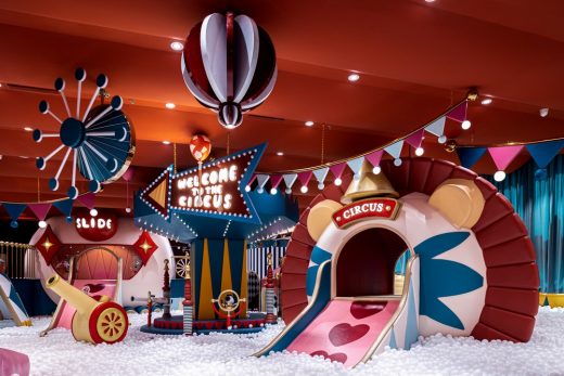
The circus carnival makes up the inspiration of the ball pool area. Breaking the arrangement of the single axis, the designer enlivens the customer feeling of space with multiple perspectives and makes interest as the core gene, turning the play experience into a three-dimensional one. Children are introduced into the maze through door holes and climbing stairs, etc. Their innate sense of free exploration is greatly stimulated.
The intangible interconnection between the space blocks brings more adventure fun. In the second atrium, the designer skillfully uses the floor height to set up exciting entertainment facilities such as rotating slide and climbing rope, which enriches the traffic entrance to the maze, echoes the sporting attributes of the second floor, and greatly increasing the fun and interesting. Most of the recreational experiences on the third floor are non-violent leisure activities such as dress-up game, simulation game, DIY classroom, etc. Since it not only takes care of the experience of young kids through shortest path, but also avoids the mutual interference between dynamic and static play areas and ensures the comfort and rationality of play to the greatest extent.
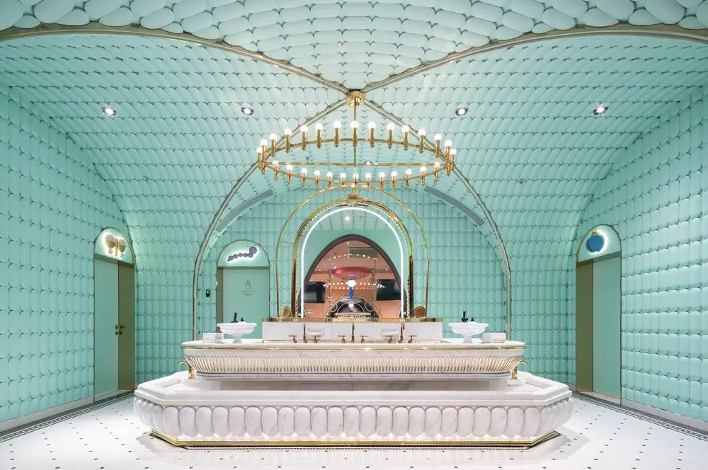
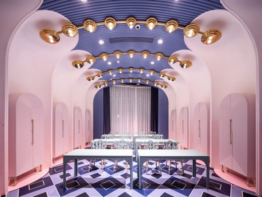
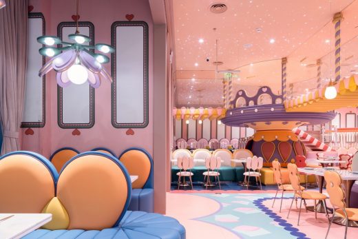
The restaurant adopts subtraction design. In the autumn-themed exquisite place, the incorporation of life scenes creates a friendly and warm atmosphere. The restroom design has broken through the traditional fixed paradigm. The hand sink built like a fountain art installation is highly ornamental, while also meets the needs of adults and children. The blue-green wall and the champagne gold color outline the texture, which is in line with the beauty of detail and the service level pursued by Meland Club. The water play area adopts main colors of blue and white. Under the designer’s consistent design method, the natural texture activates the vitality of the space.
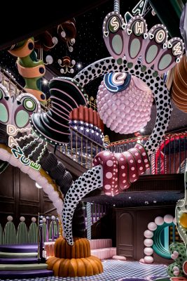
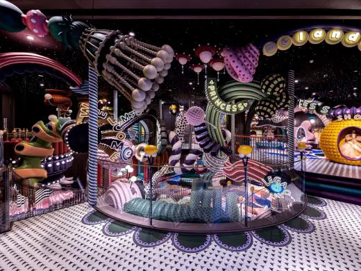
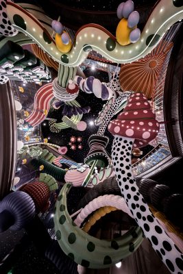
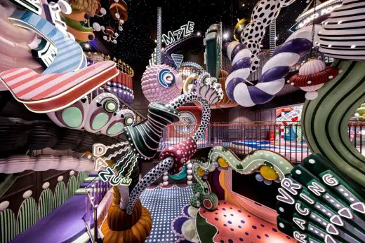
Not like the other Meland club family’s park, this one has a video game hall as attraction for young population. Designer built a innovative gaming paradise on the theme of cyberpunk palace, using colors to construct the fantasy site and highlighting the entertainment attribute with animation characters.
The cyberpunk palace and cool video game style burst out a strong contrast in the Star Legends. The neon lights of different shapes and colors form visual linkage, and the humor neon paintings after famous painters create perfect interaction points for young people. The perspective means strengthens the spatial relationship between different-sized square machines and the scene, highlighting the rich spatial composition. The beauty of order becomes more distinct while you wondering in the space.
epilogue
The combination and grafting of functions in the macro concept and the fineness degree of details make the whole aesthetics contain perfect functionality. The miscellaneous but not disordered picture presents a rigorous axis relationship and precise structure and layering, which gives a sense of breath to the bustling space landscape. The innovative space layout weakens the transitional displacement sense of individuals and the occluding relation present a free world for exploration in this space.
The design pursues the ultimate creation of space experience, atmosphere and impact, and brings the surreal fairy tale beyond imagination to the ground, making the project not only a great effort to upgrade the space vision of the brand Meland club, but also a big breakthrough in the parent-child playground business. It is not only another subversive creation of designer Li Xiang after her classic works of parent-child playground in 2017, but also will become an amazing masterpiece which will set off a new cognition in this industry.
Meland Club in Shenzhen – Building Information
Project name: Meland Club flagship store, Star Legend video game hall
Location: 3F, Shenzhen Uniwalk shopping mall, Shenzhen, China
Project area: 6000㎡
Completion time: 2020.10
Design Company: X+LIVING
Creative Designer: LI XIANG
Project Director: Fan Chen
Project Supervisor: Chen Xue, Xu Feng
Customized Furniture: X+LIVING Product Developing Department
Product Director: Justin Chow
Photographer: Shao Feng
Meland Club Shenzhen images / information received 271020
Location: Shenzhen, China
New Buildings in Shenzhen
Contemporary Architecture in China
Shenzhen Architecture Designs – chronological list
Another Chinese interior design by X+LIVING on e-architect:
Beijing Zhongshuge Lafayette store design
Contemporary Shenzhen Architecture
Shenzhen Bay Square Waterfront by MAD
Design: MAD Architects
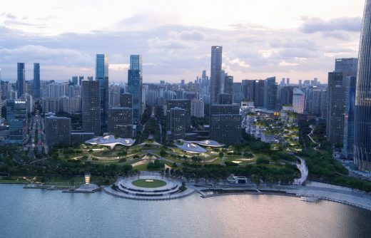
image courtesy of architects
Shenzhen Bay Square Masterplan
C Future City Experience Center, Shangsha
Architects: CCD/ Cheng Chung Design (HK)
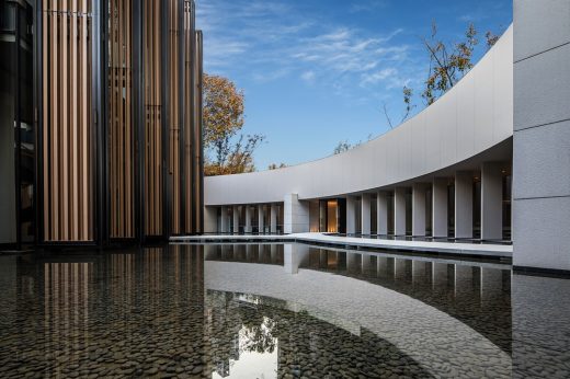
image courtesy of architects office
C Future City Experience Center
Shenzhen Energy Company Office Skyscraper
Architects: BIG-Bjarke Ingels Group
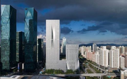
image : Chao Zhang
Shenzhen Energy Company Office Skyscraper Building
Design: OPEN Architecture
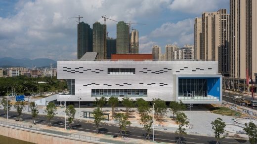
photograph : Zhang Chao
Pingshan Performing Arts Center Building
Comments / photos for the Meland Club Shenzhen flagship store page welcome

