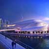
Busan Opera House Contest, BOH Korea, Korean Operahouse Building, Design
Busan Opera House, Korea Building Proposal
Korean Opera House building – various designs, including by Matteo Cainer Architects
22 Nov 2011
Busan Opera House Building by Matteo Cainer Architects
Busan, South Korea
Design: Matteo Cainer Architects Ltd
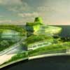
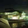
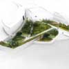
pictures : Matteo Cainer Architects Ltd
Busan Camellian Opera House
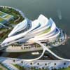
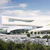
The Busan Camellian Opera House provides a harmonious connection between the existing dense urban fabric of the city and the port with its myriad of waterfront activities. Camouflaged beneath its contoured envelope, it erupts from the landscape in the form of densely planted tectonic petals that connect city and sea, urbanity and landscape, providing a major cultural hub, not only extending Busan’s influence as the gateway to Eurasia, but establishing it as an international maritime city of culture.
Conceived as a cultural link, the project has been carefully designed as an attractive and serene venue for opera and other performing arts. As a hub it will foster and attract a variety of social groups of differing ages, encouraging contact between art forms and the world of music. The project reflects on how music, nature and architecture can coexist and interact, with often unexpected results and insights.
The project itself responds to the city and its cultural background through the camellia flower and its lush, deep green leaves, symbolising the citizens of Busan. It reinterprets the qualities of the camellia through a series of transformations, an evolving floral plan where the densely planted fragmented petals will result in a lush green landscape. This interpretation was developed for its symbolic meaning and its versatility as an urban and cultural form.
The project comes to life as an island bloom nourished by the city that engages in a dialogue with the site. It connects with the sea through the lush green landscape that reaches the water, and the dramatic cantilevered high level restaurants with their spectacular vistas. It has a dialogue with the maritime park nearby through the magnificent north facing rehearsal halls that overlook the island, and reinforced by the high level promenade that presents an integrated landscape that traverses at a variety of levels, with commanding views along its length. Connections with the city instead are established in two ways: through a number of strategically located large digital screens that display current and future events, and live open air concerts, where the multi-functional theatre opens up to face the city.
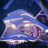
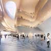
The centre expresses a human scale with an extensive number of accessible roofs at varying levels, creating shaded outdoor spaces for impromptu gatherings and events. The use of glass illuminates external surfaces and dapples light through the lush green landscape. This sensation will be particularly effective in the Grand Foyer where lush internal planting and a huge interactive light installation is inspired by flock behaviour. This flexible space allows for multiple functions and is linked to both the lyric and the multiform theatres, and as a large open space, becomes an event space where audiences pour from the halls into a densely vegetated space. To reinforce accessibility and monumentality, the roof-scape is openly accessible to the general public, with planted landscapes laid out on horizontal and sloping roofs. The proposal will achieve a low-carbon impact using green technologies which will enhance eco-efficiency, minimizing any adverse environmental impacts.
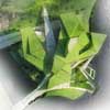
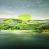
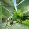
pictures : Matteo Cainer Architects Ltd
The highly visible fly tower of the main opera will define the entire complex as a point of arrival. As a beacon overlooking the city and the ocean, glazed elements within the tower walls expose to view the mechanical workings of its interior, displaying the hidden secrets of the theatre. The resulting architectural solution is a seamless ensemble of architecture and landscape, with open air activities immersed between the sea and greenery and that of music opera and recreational activities like open air theatre and event spaces. The project through light sinuous architectural forms, expresses both balance and vitality, reflecting the strength and character of Busan.
Matteo Cainer Architects Ltd
Principal: Matteo Cainer
Location: Busan, Korea
Use: Opera House and Multiform theatre
Seats: Opera: 2180 seats, MT: 1360 – 2220 seats
Site: Marine cultural region, North Port, Jung─gu, Busan, S. Korea
Site Area: 34,928 sqm
Total floor area: 56,600 sqm
Busan Opera House Building images / information from Matteo Cainer Architects Ltd
28 Sep 2011
Busan Opera House Building by Delisabatini architetti
Location: Busan, South Korea
Design: Delisabatini architetti
The artificial island, with the undefined amoebic form, is the site in which will rise the new Opera House.
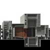
The project stands alone in the new urban landscape rising high in the skyline of the new skyscrapers, as a huge solid stereo metric and mono-scale mass which even a great distance shows a distinctive feature, the engraving in the huge building.
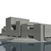
pictures : Delisabatini architetti
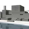
The project fits in this contest, gathering the entire huge volume of building, within a recognizable definable geometric figure, a rectangle of 198 x 79 meters, completely covered with stone Italian slabs (Travertino Romano). The project is rigorous and conceived with parallel functional and structural bands; it is articulated by alternated rhythm of the structural place of the hollow septum, inhabited bands, which encompass all the minor functions, offices, services, vertical connections, allowing to the major functions to fill the wider space in-between.
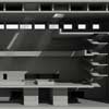
It has its origins in the concept of the Section. Our project is conceived trough the Section, which describes the succession of spaces in their proportional scales underlining the alternation of narrow and wide, small and big spaces, which ensures surprise and huge spatial experiences. This type of suggestion is typical of the ancient theaters like Paris Opera House.
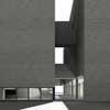
The main entrance of the opera house is signed by the clear opening, a narrow passage, running deep through its flank from side to side; it is aligned to the second pedestrian bridge, allowing a reconnection with the surrounding. It frames the sea and the sky.
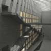
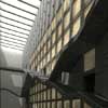
The engraving represents a physical but not a spatial interruption of the system. This void distinguishes the two different types of theater, the historical space of the opera and flexible space of the gemini theater. The user, filtering from the outside to the inside under the huge and massive wall, discovers the colossal and surprising space of the atrium, within which the paths cross and climb the wall through the empty space with prospective views in the direction of the foyer of the two theaters, visually connected by common views, but functionally independent.
pictures : Delisabatini architetti
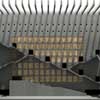
The foyer of the Opera is spread over three higher levels, which are linked by an easy staircase, all facing the same space, accessible through the hall, with stairs and walkways. The ground floor is the atrium of the second theater; here the twin theater foyer is characterized by three big plinths, empty inside, that host the tickets office and the bar.
The foyer and the atrium are connected with the tunnels at different heights. The views are countless and wholly unexpected.
The Atrium is a huge absolute space, thirteen meters height; it opens to the user with an impressive height showing the monumental frontal wall, which is so height that cannot be seen entirety. On this wall there is the great solid stair which leads to the auditorium.
The wall is ornate by the translucent alabaster elements that sign the succession of the floors, and give an idea of the dimension of the auditorium, that however remains hidden. A comfortable solid stair on the right side grants separated access to the conference hall. The spatial relevance of this stair, which without any doubt is the most impressive space of the project, finds its origin in the evolution that has seen growing from the seven hundred to the eight hundred, the importance of the role of the stair in the old theatre, to the point of it reaching dimension superior of the auditorium itself.
At the end of the building there is the museum who represent the monumental heading of the system that faces the water, on which is reflected. The staircase, which goes through the sea, arrives under the fresh portico of the museum floor. It collects and presents all the material including historical objects from small to monumental scenic elements.
The auditorium
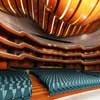
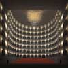
The big auditorium, hidden in the mass of the building, reveals itself unexpectedly to the user whom reaches it through the impressive experience of the atrium and the following compressed spaces. It reproduces, in size and the characteristic horseshoe shape the most ancient Italian theater still in activity: the San Carlo of Naples. It has been chosen to reproduce the system of the boxes, disposed on six floors, and a gallery, around the huge void of the auditorium, which gives the unforgettable perceptive spatial and acoustic experience that the Italian opera represents. It expresses a more urban spatial character, where around a big unitary void, as around a square, takes place the representation of the city of the audit that becomes itself part of the show.
The Opera has a maximum capacity of 2376 seats (736 seats in the auditorium and 1640 in the boxes and gallery).
Theatre Gemini: twin hall
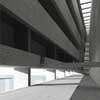
The theater occupies the entire band, 21 meters wide, between the museum and the volume of the foyer.
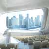
It’ composed of two smaller theaters to create a very versatile theater (auditorium, performance, traditional or experimental theater, etc.), functioning as two separate and distinct theaters with different and variables capacities (1233 and 493 seats) or as a single place of spectacle (1726 seats). It is possible thanks to the mechanical system that allows vertical movement of the stage floor. Above the theater is located a luxury restaurant with a wonderful view toward the open sea.
pictures : Delisabatini architetti
Planners: Team Leader – Delisabatini architetti
Collaborators: Arch. Pizzuto, Coppola, Ominetti
Project: International Ideas Competition for Busan Opera House, Busan
Project Area: 34.928 sqm
Year: 2011
Client: Municipality of Busan
Busan Opera House Building images / information from Delisabatini architetti
22 Sep 2011
Busan Opera House Building by Charles Rose Architects
Busan, South Korea
Design: Charles Rose Architects, MA, USA
Busan Opera House – Project Description
picture : Charles Rose Architects
BUSAN OPERA HOUSE SCALE AND SYMBOL
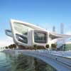
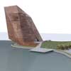
Our proposal creates an urban gesture that is grand in scale, embracing Busan’s international status, at the edge of a large open space, a gateway to the city at the scale of this large urban harbor. Charles Rose Architects have consolidated the program into a single structure, creating a monumental crystalline form. This monumentality is not arbitrary but appropriate to the city, the surrounding mountainous landscape, and the harbor. It is a counterbalance to the colossal ships and infrastructure which frame this maritime location.
The program’s consolidation allows for the creation of a sizeable public space: a landscape at the water’s edge which is oriented to the harbor with a gently sloping lawn to the east. Like the scenic rocks that punctuate the seascape around Busan, especially the Orykudo Islands, the building emerges from the landscape and the harbor—a faceted landmark that not only energizes the surrounding environment but celebrates Busan’s rise. Formally, the building and landscape pay homage to Korea’s garden history. Rocks and their placement in the landscape are an essential element of Korean garden design. By placing this “rock” in the landscape we hope to create a public space for the city with symbolic significance.
picture : Charles Rose Architects
SITE
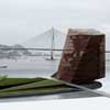
Social and recreational gathering is fostered by the design: a flexible expanse of lawn placed at the heart of the Marine Cultural District, flanked by the building and an allée of trees. The introduction of the landscape expanse allows for a diversity of experience. Its visibility from many parts of the city as well as its striking views of the Busan area will draw both visitors and residents alike, generating the activity which is so vital to this project.
Emerging from the ocean, it will be a verdant beacon to ships in the harbor: a threshold to the city. The sloping east plane and performance pier form an amphitheater that can seat thousands. At the top of the slope, above the vehicular access roads, a level area will serve as the location of art fairs and other gatherings. A bicycle rental shop at the north side of the sloped plane—in the allée of trees—allows visitors to navigate the island’s path system and the surrounding parks using an alternative mode of transportation.
The transition to the adjacent site on the island is considered; the allée of trees and the return of the topography to the island’s original grade accommodates future development to the north. Our proposal accommodates the future promenade around the island and is fully integrated with the transportation and circulation plans for the Marine Cultural District.
picture : Charles Rose Architects
ARCHITECTURE AND PROGRAM
Our intent is to create a lively urban cultural center that increases artistic activity in the city. We have consolidated the program into one structure to create relationships between the venues, the artists, the visitors, and the city, that are new and unexpected. We believe the spaces’ dynamism will be accessible to everyone. The building is as much an experience as a destination.
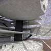
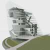
In section, the two theaters are stacked above the opera house, and all three are visible simultaneously from the grand atrium: a soaring, cathedral-like space facing the harbor. We envision the grand atrium as a critical part of the public realm, an extension of the landscape into the structure. The theaters, opera café, gallery atrium, and other building destinations are accessible directly by elevator or more scenically by escalator—an allusion to the emerging and familiar cinema typology in Korea, where multiplexes are located at the top of shopping malls and accessed through atriums by escalators.
A diagonal slot of space links the grand atrium, the gallery atrium, and the pool; this “slot” creates connectivity between the activities and venues of the building. In addition to accommodating all the necessary program elements for the Opera, we have provided other venues and amenities which will enhance the project as an urban destination:
Galleries: We have included a gallery atrium/sculpture courtyard, flanked by galleries on five levels above the back of house for the opera.
Diagonal slot of space linking the grand atrium, the gallery atrium, and the pool.
Exhibition Space: We have provided four levels of exhibition space, each with the potential for stunning views of the city;
Observatory: The top level of the building is an observatory/event space with views in all directions. One route to this space is by a scenic escalator which runs along the east, north and west sides of the building, offering dramatic views as one ascends.
Restaurants and Cafes: Restaurants and cafes will enliven the site and the building and will provide additional reasons to visit the site. We have provided restaurant and cafe at the 4.5m above sea level adjacent to a large outdoor terrace overlooking the harbor, sheltered by the cantilever of the building. This area is accessible from the building and from the pedestrian path that encircles the island. A second group of restaurants is located just below the observation level. These restaurants overlook a pool—which has a glass bottom that filters light to the gallery atrium below—and have great views in all directions. Reception and cafe is located above the Opera house and has views into the grand atrium.
picture : Charles Rose Architects
ZERO ENERGY BUILDING
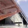
Our design team has completed several Zero Energy structures which have no carbon footprint and achieve a LEED Platinum standard of design. Carbon neutrality is the design intent for this project.
picture : Charles Rose Architects
WEATHERING: A TEMPORAL SKIN
The project celebrates the ancient relationship between land and sea: this juncture is a place of tides, erosion and evidence of the passage of time. We propose to clad our building in a skin of copper and to allow the copper to weather naturally. The aging process will take about 25 years, and the exposure to sea-air and seawater will create copper chloride, a stable compound that is blue-green in color. We embrace the weathering of the material as critical to the design and as an important connection to the water’s edge. It will be a structure as much determined by the natural environment as by man.
The porosity of the perforated copper skin both veils and reveals the interior volumes and spaces of the program. We are interested in making opera and the arts accessible to as large a segment of the community as possible, and the visibility of the interior is critical to this mission. At night and at certain times of day the skin increases in its transparency, allowing the interior spaces and volumes to be perceived. From the interior, the perforated skin offers views in all directions and in its detailing will provide ambient light throughout the structure.
picture : Charles Rose Architects
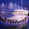
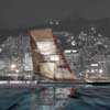
At night the building will take on the characteristics of a glowing Korean lantern as the light from the interior spills out through the porous enclosure.
Busan Opera House images / information from Charles Rose Architects
Another Busan Opera House design on e-architect:
19 Sep 2011
Busan Opera House Building by Solus4
Busan, South Korea
Design: Solus4
“The Orchid”
Busan Opera House – Project Description
ELEGANT MOTION IN A BUILDING FORM – THE BUSAN METROPOLITAN CITY OPERA HOUSE PROPOSED DESIGN BY solus4
Solus4 of Kittery Maine and Jamestown Rhode Island proposed a design solution for the Busan Opera House that flows with the elements of culture and history of Korea.
Alfonso Lopez, lead designer for Solus4 describes the origins of their design: “A very special characteristic of Korean heritage is the linked uniformity of the art, history, culture and language. Much of this is based on the beauty and the pleasure that each element of culture gives to the individual and the community”.
The team chose to incorporate the grace and elegance of the brush and ink paintings of the Fourth Era of the Joseon Period. In these paintings the Korean artists chose elements according to an aesthetic sensibility. Integral with this experience is the concept of sohwa when painting and calligraphy are joined. Emerging from these concepts comes a simple expression of nature and peacefulness. The conceptualization of the opera house forms as can be seen in the following illustration.
The free flowing lines that characterize the paintings of this type take on a very lyrical almost musical quality in the abstraction of the images above. We took the two dimensional basis and can expand upon this into the third dimension of building volume without a loss of the original element. Lopez goes on: “This to us was the emerging of the sohwa principle that we wanted to express in this building.”
“Our early concepts then worked to tie the sohwa of these shapes and elements into volumes that would not detract from the original intent and allow the incorporation of a state-of-the-art voice performance facility coupled with the ancillary uses proscribed in the program. To accomplish this we proceeded through these conceptual diagrams, always staying close to the overall symbolic integration or sohwa. Staying within the traditional parameters, we first placed the conceptual diagram on the site. Then, we diagramed the graphic element of the building shapes and its essential volumes.
We used the original ink brush strokes to freely become building elements. By varying the connections to the earth and varying the edges and heights of roof shapes we found that we are able to provide strong volumetric edges that reinforce the strokes of the original art.
It is also important to note the integration of sustainable systems for this project. We have integrated technology into this building which includes roof based solar collectors, sea water temperature differential cooling, tidal current generators and geothermal mass storage.
As one of the “gracious plants,” the orchid represents “refinement” in Confucian philosophy. As one of the symbols of the four seasons the orchid represents summer and the dissemination of its fragrance far and wide. The Busan City Opera House then symbolizes the hospitality and welcoming of the peoples who extend the unique flower in greeting. The preceding conversation has described the project and its conceptual base in the cultural symbology of Korean history – in this case most specifically music, voice performance and art.
Busan Opera House images / information from Tangram 3DS
Design / Concept: www.solus4.com
3D Visualization
Tangram 3DS LLC
svittori(at)tangram3ds.com
www.tangram3ds.com
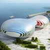
Busan Opera, Republic of Korea
Peter Ruge Architekten
picture from architect
Busan Opera House
Kubota & Bachmann Architects

picture from architects
Busan Opera House Competition : Korean Ideas Contest. 25 Apr 2011

picture from organiser
Location: Busan, South Korea, East Asia
South Korea Architecture
Contemporary South Korean Architectural Selection
South Korean Architecture Designs – chronological list
South Korean Architecture News
Busan Architecture
Busan Cinema Center
Coop Himmelb(l)au Architects
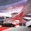
image © ISOCHROM.com, Vienna
Busan Cinema Center : Architecture contest
Busan World Business Centre
UNStudio Architects
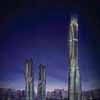
image : UNStudio 2007
Korean building
Korean Architecture – Selection
National Museum of World Writing in Incheon
Design: Mirage Architects Studio
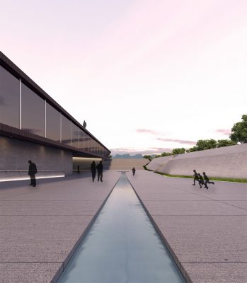
image courtesy of architects office
National Museum of World Writing
South Korean Design Competition
South Korean Architecture Competition
Comments / photos for the Busan Opera House page welcome

