Nagoya city Building, Japan Architecture, Japanese Property Images
Little one-room house with a curve, Nagoya city, Japan
Nagoya city property design by studio velocity architects
2 May 2011
Nagoya City Building
Design: studio velocity, architects
Little one-room house with a curve
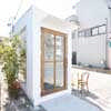
Little shop of 41㎡ in Nagoya city.
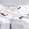
The site has an elongated shape with a width of about 9m and a depth of 20m. While the front road is relatively wide, with a sidewalk, one might get a feeling of oppression due to the small size of the site surrounded as it by shops and houses of from 2 to 3 stories.
The required elements were spaces for parking 2 cars, a space for drying laundry, and a space for the shop.
The building has to stand at the back of the site since the frontage is not of sufficient width to permit a K-turn and the front portion is occupied by the parking area.
One can seldom escape from such approaches when the building is a shop with parking spaces.
A good example of this would be the convenience store two lots from the site.
I was afraid that the shop would disappear in the area because the small area of 41㎡ is too small when compared with the neighboring houses.
That is why I started thinking of how to make it an eye catching building for passersby and drivers.
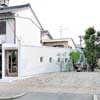
I placed the main space at the most remote part of the site, while the entrance was on the opposite, street-facing side.
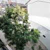
The building transverses the site in a gentle manner and so residual exterior spaces are created.
These residual spaces became a garden, the drying space, and the parking area, and all of them complete the beauty shop as a whole.
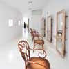
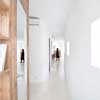
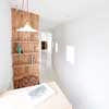
The shop has the continuous style of a studio apartment and you can see the totality of the interior from the entrance.
Yet one is able to see some spaces not visible from the entrance, as you walk into the back, because of the building’s curve.
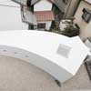
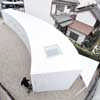
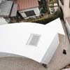
The shape of the building is something like the volume of the entrance door stretched, and the section at the entrance is only the size of the door. However, the section becomes larger both vertically and horizontally, as one walks into the back, and becomes subtly smaller again at the end. The volume of the curve was determined by a study to maintain the overall balance of the continuous interior space on its very edge.
I analyzed the degree of curvature to balance two factors: the ability to see throughout all of the continuous space; and the sequence of gradual changes as one walks in.
At the same time, I tried to create 3 distinctive zones out of one room by changing the density of the openings.
The first is the entrance space. With the largest opening on the wall, one can feel the openness and the proximity to the outside regardless of its small space, almost the same size as that of the door.
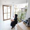
The second is the cutting space in the middle.
The light rhythmically streams into the space from the 5 small side windows with a view of the garden.
The third is the shampoo space in the back.
This space is the one most filled with natural light from the building’s skylight.
You can look up at the sky from the shampoo basin. You will be attracted by and would like to walk in when you see the brightest, innermost curving space from the entrance.
I am thinking of how I can create something like a new environment by layering the various degrees of light in this gently connected space.
Little one-room house with a curve information from studio velocity architects
Location: Nagoya City, Japan, East Asia
Japan Architecture Designs
Contemporary Japan Architectural Selection
Japanese Architecture Design – chronological list
Japanese Architecture – Selection
Casa Wakasa, Osaka
Design: wHY Architecture
image : Koji Nagasawa
Casa Wakasa
Architect: Jun Murata / JAM
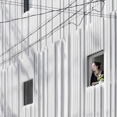
photograph : Jun Murata / JAM
N strips Residence Osaka
AYA House in Osaka
Architect: Yoshihiro Yamamoto
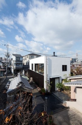
photo : Yohei Sasakura / Yoshihiro Yamamoto
AYA House in Osaka
Contemporary Houses : Designs + Images from around the world
Comments / photos for the Little one-room house with a curve page welcome

