Zeilgalerie Shopping Centre, Frankfurt Retail Center Photos, Building News
Zeilgalerie Shopping Centre Frankfurt
Retail Development Hesse, Germany design by 3deluxe in/exterior
11 Aug 2011
Zeilgalerie Frankfurt News
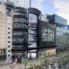
Zeilgalerie façade
Awards: red dot award: communication design
Category: Information Design / Public Space
15 Dec 2010
Zeilgalerie shopping centre
Design: 3deluxe in/exterior
ZEILGALERIE’S REDESIGN
Concept
The redesign of the Zeilgalerie shopping centre, which opened in 1992 and is renowned far beyond Frankfurt’s city limits, includes a completely new look for the façade and a full makeover of the public areas inside the complex. Due to the paramount significance of the front of the building in terms of typology and how it fits into the urban setting, 3deluxe’s design concept focuses closely on the architectural surface and its deepening in content, structure and materials.
As it is the only exterior view of the complex that is enclosed on three sides, the façade facing out onto the Zeil shopping mall is therefore representative of the entire architecture – the perception of shape gets reduced to the perception of space. The building’s use as a self-enclosed and experience-oriented consumer world means that the façade can be completely disconnected from the building’s interior, thus permitting the creation of an independent design concept for this section.
In its function as brand architecture, the Zeilgalerie’s appearance must be able to reflect lifestyle and design trends alike. Here, architecture, which in principle tends to focus on constancy, approximates the dynamic processes of change in fashion and product design. Lighting effects based on complex computer programming help change Zeilgalerie’s look and with the ambiguity involved allows for personal interpretation and identification. Several façade levels of varying designs create intriguing layered effects as well as a visual impression of depth.
Façade design
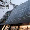
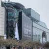
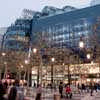
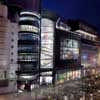
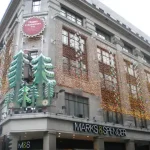
The new façade design gives Zeilgalerie a modern and unique appearance that stands out decisively from the architecture of the surrounding department stores. The façade’s unusual black and white colours, its filigree ornamentation and the integrative interaction of architecture, graphic design and light orchestration will create a distinctive character for the building on Zeil.
As a reference point to the existing architecture – designed by Darmstadt-based architects Kramm & Strigl as a stylistic mix of constructive modernity and post-modernity – the building’s characteristic tripartite structure has been preserved. However, an overarching colour scheme and connective architectural elements now combine the three single structures into one visual unit. The façade now features a more uniform look compared to the many parts from which it was formerly composed, thus communicates spaciousness and prestige, corresponding to the building’s use as an exclusive shopping centre.
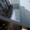
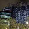
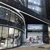
The existing glass façade of the semi-cylindrical structure on the left is clad with horizontally arranged strips of curved matt-black aluminium panels. Viewed as a whole, they form an aesthetically appealing pattern of lines that, thanks to its irregular layout and the different strip widths, conceals the distances between floor levels. This creates a striking appearance, which is furthermore intensified by the use of dynamic lighting. Moreover, filigree metal ornaments and Alucobond panels screen printed with white dots enhance the design’s complexity.
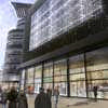
The glass front of the central structure, which houses the shopping centre’s vertical development, is coated with a transparent printed film. The subtly visible motif is a graphic artwork depicting the location’s urban feel. It turns the glass surface into an imaginary space that evokes inspirational discoveries. The daylight penetrating the film projects the latter’s colours onto the interior, thereby painting interesting light patterns in the lounge areas adjacent to the façade.
The existing façade of the structure on the right, which is composed of multiply folded perforated sheet metal that originally concealed a kinetic light sculpture, will be replaced with smooth cladding made of matt-black aluminium panels and varnished glass. Here, the Alucobond sheets, which equally feature in the left structure of the complex, are not printed but laser-perforated in the same pattern as well as backlit. The renovation concept takes up the original idea of an interactive computer-controlled façade by providing a technologically and artistically innovative media installation at this point.
Light orchestration of the façade
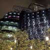
Made up of several levels, the media installation envelops the right structure’s entire façade with a softly pulsating system of ornamental light. A rectangular surface made of doubleglazed glass and measuring approx 260 sq. m. is mounted flush with the Alucobond panels. Behind it, there is a rhombus-shaped grid composed of 310 LED strips. Each of the overall 13,700 light diodes can be controlled separately, thus allowing for a large variety of aesthetic light images: Clear-cut, geometrical patterns flow into the seemingly organic interplay of light and shadow; delicate linear accents alternate with striking, large-scale effects. The LED grid is omitted in the black finish of the rear glass pane, allowing light in the form of sharp-edged lines to emerge.
These light diagonals are in turn superimposed by an orthogonal graphic that is printed onto the transparent film between the glass panes. Moreover, from time to time on the surrounding façade areas the dot screen flashes up, providing a visual continuation of the convex structure on the left. On the right-hand side of the building, this pattern has been laser-cut into the cladding sheets, enabling the light from the approx. 2,500 LED modules installed behind it to shine through. The varying interplay of the different design levels makes for a fascinating complexity and atmospheric intensity.
Correspondingly, the cylindrical tower is also illuminated with light: Horizontal lines of light flow softly along the façade strip’s lower edges. In darkness, the building’s tripartite structure is more pronounced – its ensemble character is deliberately emphasized by the illumination. The Zeilgalerie’s light orchestration is to be understood as an artistic and abstract realisation of illuminated advertising, which has long been an inherent part of the architecture of commercial buildings. However, rather than concrete advertising slogans it conveys the urban vibrancy of the location and translates it into atmospheric light images.
Interior design
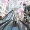
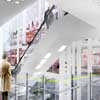
The interior design concept takes up the original idea of a vertical urban structure and realises it in a contemporary visual design idiom. Upon entering the building, visitors are captivated by the sight of the 10-storey high atrium – a fascinating cosmos of intersecting elevators and galleries, supports and structures as well as countless light sources, whose shape and layout are reminiscent of illuminated building façades.
The first impression is one of vitality and urban diversity, however, without compromising clarity thanks to the fact that the previous mix of different materials, colours and shapes has been considerably downscaled. The flat cladding of the openly exposed load-bearing and supply structures located underneath all the galleries helps calm the overall picture and shifts the visual focus away from the structural architectural elements in favour of the access paths.
It clearly accentuates the design metaphor of the vertical shopping street. Mainly kept in white, the interior starkly contrasts with the black façade and creates a pleasant and bright atmosphere. Composed of over 20 LED flags that can be synchronized with one another, the light installation cut across all the floor levels and makes for a particular eye-catcher. Its dynamically flowing program sends a veritable waterfall of light through the atrium.
The new flooring in the entrée, which has now been extended as far as the shop front and an information display with a multi-touch interface installed outside, enhance the appeal of the main entrance and connect interior and exterior in terms of both design and content. The large light-gray tiles now run as far as the end of the first ramp, expanding the visual feel of the foyer. Moreover, the unusual pattern in which the tiles have been laid, with their curved, freely crossing lines, opens up the geometric space formed by the existing architecture.
The new flooring will also feature on the first basement floor; therefore the view from the basement to the atrium’s floor area will reveal a coherent overall picture. The design for the information desk in the foyer is another example of the project’s claim to ultra-modernity: The innovative multi-media installation in the form of a virtual assistant provides entertaining information to visitors as regards shopping and leisure facilities at Zeilgalerie.
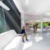
The integration of rest and lounge areas that are open to the public forms an essential part of the extended facilities on offer: Comfortable seats have been installed on the ramp that winds around the atrium on all platforms located next to the glass façade. The plan is to equip the second basement floor with a lounge and an indoor play area for kids.
Moreover, the redesign of the restroom facilities on this floor will enhance the quality for users. Its distinctive features include an unconventional floor plan and extreme mix of colours and patterns. The viewing platform and the roof terrace are likewise included in the makeover. Light orchestration of the interior The central open space of the atrium is fitted with a light installation made of approx. 20 large-scale LED flags that are dispersed across all floor levels.
Each of the light sculptures measuring 70 x 350 cm consists of two translucent gauze layers among which a 540 light pixel LED matrix has been placed that emits light on both sides. For one, it can reflect the names of the surrounding shops, for another, it can also become part of an all-flag light show that runs down the entire height of the atrium like a waterfall.
The galleries are lit by ceiling recessed down-lights which, thanks to their irregular formation in varying clusters, open up the view of the ramp system and escalator from below.
Information and signposting system
Alongside the architectural accentuation of the galleries, which assist the intuitive orientation within the building, a colour-coded signposting system considerably helps differentiate between the 11 floor levels so that shops and other infrastructure are found quickly. In addition to the interactive information facilities at the main entrance and in the foyer, the plan is to include a glass display providing an overview of all floor levels and the options on a particular level at the entrance to each elevator.
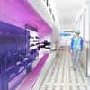
On the bridges, visitor flow is divided to the left and right by signposting the quickest route to the shops. The colourcoding on each floor level is visibly marked as a permanent line that runs along the glass parapets of ramps, platforms and bridges. On the floors accessing the lifts, the graphic design on the walls subtly continues the respective floor level’s colour scheme.
Zeilgalerie shopping centre Frankfurt images / information from 3deluxe in/exterior
Zeilgalerie Frankfurt design : 3deluxe
Location: Zeilgalerie Frankfurt, Germany
Frankfurt Buildings
Contemporary Frankfurt Architectural Projects
Frankfurt Architecture Walking Tours by e-architect
Shopping Centres – retail buildings around the world
Another Frankfurt Shopping Centre on e-architect:
KOMM Shopping Centre Offenbach/Main-Mitte
photo from architects
KOMM Shopping Centre Offenbach/Main-Mitte
Retail Building by ATP Architects and Engineers
West Gate – shopping centre, Zagreb, Croatia
photo : Shopping City Zagreb
Zagreb Shopping Centre Building
Frankfurt Architecture – Selection
Commerzbank Tower
Foster + Partners, Architects
photo © Adrian Welch
Commerzbank Tower Frankfurt
Grand Hyatt Hotel
UNStudio
picture from architects
Grand Hyatt Tower Frankfurt
Frankfurt Museum of Modern Art
Frankfurt Architect : Studio Listings
Comments / photos for the Zeilgalerie Shopping Centre Frankfurt page welcome

