Lille Metropole museum, France Building, Project, Photo, News, Design, Property, Image
Lille Metropole museum Building
Villeneuve d’Ascq Architecture Information + Images – design by Manuelle Gautrand
4 Oct 2010
Lille Metropole museum
LaM : Lille Metropole museum of contemporary modern and outsider art – Villeneuve d’Ascq – France
Architect: Manuelle Gautrand
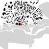
Location: east side of Lille on city perimeter
The Lille Métropole museum of modern art opened a quarter of a century ago, has built by the architect Roland Simounet in verdant surroundings.
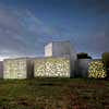
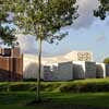
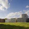
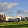
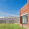
Manuelle Gautrand, who won the competition launched in 2002 to renovate and extend the museum, has created a building which wraps around the existing arrangement in a fan-splay of long, fluid and organic volumes.
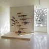
After over four years’ renovation and extension work, the museum has opened its doors to the public on September 25th. The museum is dedicated to contemporary and modern art, and houses also one of the most beautiful collection of outsider art in Europe in the new extension, especially built on that occasion.
THE VIEWPOINT OF THE DESIGNER
Comments by Manuelle Gautrand
Architect for the operation
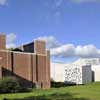
The programme for this job was to restructure and extend the Musée d’Art Moderne of Lille, which stands in a magnificent park at Villeneuve d’Ascq. Designed by Roland Simounet and inaugurated in 1983, the existing buildings have already acquired historic landmark status.
The main aim of the brief was to reconstitute a continuous and fluid museum space, this while adding new galleries in a travelling progression to the existing galleries, to house a superb collection of Art brut works. It also entailed a thorough restructuring of the existing buildings, certain parts of which needed to be redefined.
In spite of the heritage monument status of Simounet’s construction, rather than set up at a distance, we immediately opted to seek contact by which the extension would embrace the existing buildings in a supporting movement.
I tried to take my cue from Roland Simounet’s architecture, ‘to learn to understand’, so as to be able to develop a project that does not mark aloofness, an attitude that might have been seen as indifference.
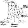
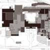
The architecture of the extension wraps around the north and east sides of the existing arrangement in a fan-splay of long, fluid and organic volumes. On one side, the fan ribs stretch in close folds to shelter a café-restaurant that opens to the central patio; on the other, the ribs are more widely spaced to form the five galleries for the Art brut collection.
Our intention was never to compete with Simounet’s design, but to attempt to extend it to achieve our objectives with our own sensitivity. Our project keeps to the same scales in volumes, and uses the same principles to hug the ground line, but we interpret them freely.
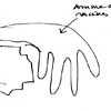
Thanks to the space available, while working with the programme constraints we were able to create ‘a small world apart’ in the extension. Its outline, which reminds you of a fan or an open hand, enables careful insertion in the contour lines of the site, so the buildings seem to emerge from the topography. (In this respect, Simounet himself was in the habit of talking about ‘staying close to the ground line’).
On the café-restaurant side, the close folds of the extension enable us to redefine the patio, to loosen up links from the entrance hall towards the restructured spaces: café-restaurant, bookshop and auditorium. The idea was of course to increase the museum’s floor-space, but also to re-balance its functions and to instil new life into certain areas that had become dysfunctional or ill-used in the course of time.
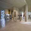
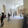
On the other side, the broader folds of the extension house the Art brut galleries. In this part, which is to the east of the existing buildings, all the museum’s galleries are now inter-linked, starting with modern art, passing on to contemporary art, and then on to Art brut, with interspersed theme galleries and temporary show spaces articulated to the others.
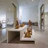
The Art brut galleries maintain a strong link with the surrounding scenery, but they are also purpose-designed to suit the works that they house: atypical pieces, powerful works that you can’t just glance at in passing. The folds in these galleries make the space less rigid and more organic, so that visitors discover art works in a gradual movement. The architecture is partly introverted, to protect art works that are often fragile and that demand toned down half-light.
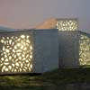
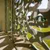
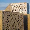
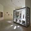
At the extremity of the folds – meaning the galleries – a large bay opens magnificent views onto the surrounding parkland, adding breathing space to the visit itinerary. These views compensate the half-light in the galleries: the openwork screens in front of the bays mediate with strong light and parkland scenery, a feature that recalls Simounet’s generous arrangements in the galleries that he designed. Envelopes are sober: smooth untreated concrete, with mouldings and openwork screens to protect the bays from too much daylight. The surface concrete has a slight colour tint that varies according to intensity of light.
Lille Metropole museum images / information from Manuelle Gautrand
Manuelle Gautrand

photo : Philippe Ruault
Location: Lille, France
New Buildings in France
French Architectural Projects
French Architecture Offices – design firm listings
Paris Architecture Walking Tours by e-architect
Parisian architect studios contact details
French Architecture – Selection
Zenith Saint-Etienne Building
Foster + Partners
photo : Nigel Young
Zenith Music Hall Strasbourg
Massimiliano Fuksas Architecture
photo : Moreno Maggi
The Phare
Morphosis
image from architect
C42, Citroën display building, Champs Elysées, Paris, France
Manuelle Gautrand
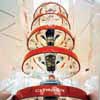
photo : Philippe Ruault
Citroën building Paris
Comments / photos for the Lille Metropole museum France Architecture page welcome
Website: Lille Métropole Museum of Modern, Contemporary and Outsider Art

