Lafayette Department Store, Metz Shopping, France Retail Architecture Images, Architect
Lafayette Department Store
Metz Retail Facade, France – design by Manuelle Gautrand Architecture
22 Sep 2014
Lafayette Department Store, France
Design: Manuelle Gautrand Architecture
Location: Metz, France
The renewal of a department store in the heart of Metz
Located in Place de la République, the building has undergone a real transformation, a symbol of the city centre’s metamorphosis in Metz and realized by architect Manuelle Gautrand.
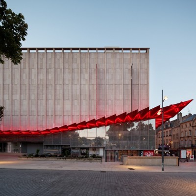
Les Galeries Lafayette Metz
Reflecting the economic and social changes of the 19th century, the Department Stores, through their commercial and architectural boldness, are a part of the history of a city. In Metz, the Galeries Lafayette have then been a vector of the city’s image, contributing to its touristic and commercial dynamic and successively reflecting its different times.
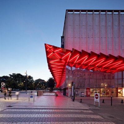
Built in the 1980’s, the building – a true landmark in Metz – had to evolve in order to adapt to the new values of the Galeries Lafayette and to become a reference, both on the commercial and on the architectural level. Singular and remarkable element in the urban landscape of the city, the architect has focused on this urban scale of the building and referred to the symbolic aspect of Department Stores to give it a new image and identity.
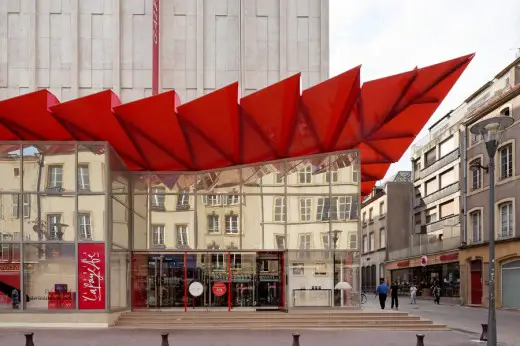
Clothed in a stone facade, relatively cold and without any window or opening – except in its lower part – the existing building had entrances and vitrines that were not very generous. In order to transform the image of this building, visible from the other side of the square and to turn it into a signal or landmark for passersby, the architect decided to preserve the stone façade, with interesting classical ornamental features and to concentrate on its lower part, space where the public circulates.
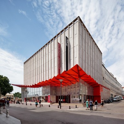
A canopy revisited like an origami
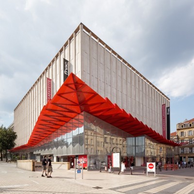
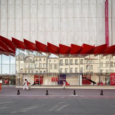
With the objective to reconnect with the history of the Galeries Lafayette, Manuelle Gautrand chose to create a canopy as a reference to the exceptional glassworks that were built in the early 20th century. The project has been organized around this overhanging façade that revisits in a contemporary manner a strong symbol of the Department Stores. In a large ethereal movement of pleated glass, the canopy runs along the three facades of the building, on a total length of 120 meters. To echo the stone that it enhances and to refer to the Galeries Lafayette, the architect chose a red colored canopy which width varies from 2.30 meters to 5.30 meters, using a cantelever of 7.40 meters at the angle of the building; the height from the ground varies from 3.50 meters at its lowest point, to 11 meters at its highest.
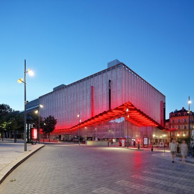
Made of two tempered and laminated glass, in between which are enclosed four layers of red film – necessary to obtain the intensity of red desired – the canopy, 22 millimeters thick overall, finds a rhythm through a series of folds that are assembled with one another in a large wave-like movement. This long flight of glass starts at one side of the store, on Winston Churchill Street, then rises gradually up to the angle and main entrances of the building, to lower down along Clercs Street, and rise up again when approaching the following entrance on Poncelet Street.
Technical achievement, the concept on of the canopy was realized by TESS Ingénierie. The canopy is held by a metal structure made of triangular brackets that accompany each fold on its length and diagonal, in an almost chiseled manner.
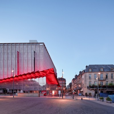
The large folding of this canopy, which gives more height and breathing to the lower facades, allows balancing the general proportions of the building. The stone is now displayed in more reasonable proportions. The more the glass folds approach the angle of the building, the more they expand, as if they were trying to reach passersby on the Republic Square. The stone is now seen through the glass filter, becoming the setting of a new modernity.
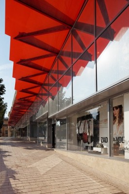
Larger and more generous vitrines
The building now exists on two scales: that of the square, off ering a landmark from afar, and that of the passersby, off ering now visible and generous entrance gates.
The whole lower part of the building, situated under the canopy, is reconstructed in glass alternating between large vitrines and entrance gates.
The vertical windows are screenprinted with a white pointillism pattern that comes to highlight them a delicate frame. In this way, they are displayed next to each other along the facades, like frames or pictures that are exposed to the public on the square. The architect wanted the windows to refl ect and multiply the red color of the canopy, so as to give the impression that the canopy would extend endlessly into the lower façade of the building. These windows also refl ect the surroundings made of Jaumont stone. Whereas the upper facades of the Galeries Lafayette are made of a matt stone, the lower facades refl ect the golden stones of the surrounding buildings.
A lighting enhancing the new canopy
A project of lighting and illumination on of the façade was specifi cally developed with the light concept on agency ON. At night, the light design reinforces the red color of the canopy that assures its nocturnal presence in the landscape of Metz and goes far beyond a simple “staging”. The light continues the architectural gesture when the night falls. Completely intertwined with the structure, it offers new interpretations of it:
– radiant, it shows the opalescence of the suspended glass under different angles;
– graphic, it underlines the folds that are refl ected in the lower windows, emphasizing the eff ect of a suspended veil;
– dynamic, it seems to make the canopy breathe in a slow beat. This quietness is at times disturbed by a vibration of the light that comes to deconstruct the original drawing of the canopy.
The technology used is inspired from that of the neon that has been representative, for many years, of the “commercial and adverting nights” in large cities and metropolis. The neon celebrated its centenary in 2010. About 500 meters of electroluminescent tube were installed on the canopy. A specific coloring has made it possible to find a perfect combination between the shade of the glass and that of the neon. Equipped with transformers and used at slightly under 30% of their capacity, the energy consumption is completely controlled.
Lafayette Department Store, France – Building Information
Project Name: Galeries Lafayette Department Store in Metz – France
Client: Citynove for the Gajeries Lafayette Group
Architect: Manuelle Gautrand Architecture
Dates:
Studies: 2011-13
Construction: 2013-14
Delivery: Jun 2014
Inauguration: Sep 2014
Photographs: Vincent Fillon
Lafayette Department Store, France images / information from Manuelle Gautrand Architecture
Manuelle Gautrand Architecture
Location: Galeries Lafayette Department Store, Metz, France
New Buildings in France
French Architectural Projects
French Architect – design firm listings
Paris Architecture Tours by e-architect
4 Jun 2019
Galeries Lafayette concept store, Avenue des Champs-Élysées, Paris, France
Design: BIG-Bjarke Ingels Group
photo by Delfino Sisto Legnani and Marco Cappelletti
Galeries Lafayette concept store by BIG
Lafayette Department Store, Berlin
French Architecture
Zenith Saint-Etienne Building
Foster + Partners
Zenith Music Hall Strasbourg
Massimiliano Fuksas Architecture
New General Building of Council of Europe
Art & Build Architect
KaDeWe department store – renewal by OMA, Jan 2016
Comments / photos for the Lafayette Department Store, France – Metz Retail page welcome
Website : Les Galeries Lafayette
