Qianhai Exchange Plaza Master Plan in Shenzhen, New Buildings, China Architecture Images, Architect
Qianhai Exchange Plaza Master Plan
Contemporary Chinese Development: Equity, Insurance & Financial Assets Institutions design by AMArchitects
16 Nov 2016
Qianhai Exchange Plaza Master Plan in Shenzhen
Design: AMArchitects
Qianhai Shenzhen-Hong Kong Modern Service Industry Cooperation Zone is a commercial development in Shenzhen, China.
Located at the west of Shekou Peninsula and encircled by Shuangjie River, Moon Bay Avenue, Mawan Avenue and Qianhai Bay, Qianhai covers an area of approximately 15 square kilometres (5.8 sq mi). With a total construction area of 26-30 million m², Qianhai is expected to create 650,000 jobs and house 150,000 residents by 2020.
The project regards the design of the Qianhai Exchange Plaza, that will include the Qianhai equity Exchange center, the Qianhai insurance exchange center, the Qianhai financial assets exchange, and many other institutions.
The six lots forming part of the project area are part of a dense urban mesh, very regular and uniform that is characterized by square or rectangular blocks.
The uniformity and large geometric regularity of the area, has led the architects to try to design a real focus point, an important urbanist element, with its own identity, able to become a cardinal point for the entire district of Qianhai. The goal of the project was not only to achieve a certain number of buildings with a certain volume that can satisfy the client’s demands, but was also to create a pulsating center for the whole new district, able to become an icon and a reference point.
The central position of the project area in the Gui Bay gave the architects additional confirmation about the need for an element able to create an identity to the entire district. The architectural element capable of assuming this important role is designed not only to become a simple landmark, but also to be a functional element for all the blocks that are part of the project area.
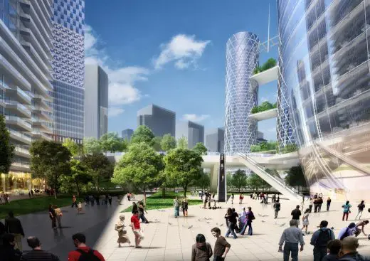
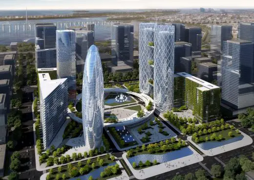
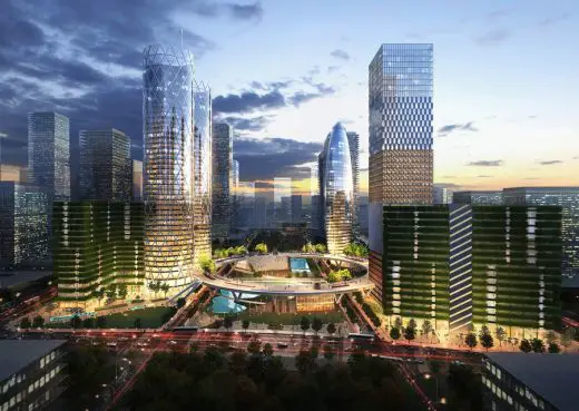
The need for areas dedicated the community has led the architects to design an elevated circle square able to connect all the lots of the project area becoming a functional element able to make quick and safe pedestrian crossings and connections between buildings and a meeting place common to all buildings.
The circular shape of this raised plaza thanks to the large central hole allows everyone to take a look on the large urban park with lakes and paved pathways. All the major buildings of the project area are connected by this raised plaza. The first floors of these buildings are reserved for commercial activities. This therefore create a real “outdoor mall” which will let the square to be always busy and crowded, even on non-working days.
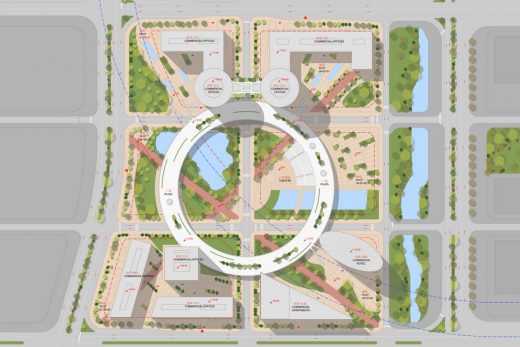
The goal of the project was not to create a series of buildings unrelated to each other, but a real organism that can operate synchronously, serving as best as possible the city of Shenzhen. The target was to organize the project according to four distinct levels, placed at different elevations:
• A + 0.00 meters, a large park was created, a green lung available not only for the employees, but also for citizens and visitors. Also in this altitude is located the first level of the commercial function as well as the accesses to the offices and other functions on the upper floors.
• The second level is located at an altitude + 12.00m, and it is the real square for Qianhai, an architectural element that can give an identity to the site, which is the focus of the entire district, connecting the various functions.
• The third level is that of mid-rise office buildings, with a height of 70 meters. This type of building is housed externally to the blocks, and performs the task of designing an urban front ordered but still characterized by a vegetation that enlivens the facades.
• The last level is the one of the skyscrapers which are located in the central part of the project area and that as already pointed out are inserted on the raised plaza becoming a single organism cooperative.
Each of these buildings has its own language and its own identity, because in this way it was possible to give the district a more vibrant and dynamic mood.
As already described, the choice to raise the level of urban square at an altitude of 12 meters, has allowed the possibility of designing a large park usable both by the large number of workers who will attend the district, both by visitors and citizens. The design of the green is characterized by flowing organic forms that are integrated with the forms more geometric and precise paths.
They have identified two main axes, which connect the lot to lot 01-05-01 04-07-03, 04-07-01 and lot to lot 01-05-03. The intersection of these two axes creates a large paved area that is connected to the raised plaza by an amphitheater, which holds almost 2000 people. This large space will be used for the organization of events such as concerts and shows, that will further contribute to making this park and square elevated the focal point of the entire district. The park also has two large pools, one characterized by an organic form and one rectangular.
The pavement design is characterized by a radial geometry, which directs to the center of the park, and that recalls the shape of the circular plaza raised. Some portions of flooring have been replaced with large pots that become green benches, and with small water pools, in order to further liven up the space.
Commercial functions have been placed on the ground floor, occupying, as mentioned previously, the first levels of the towers and two buildings that arise in the shape of raised plaza, located in lot 01-05-02 and 04-07-02 on the lot. These commercial buildings are characterized by two floors each, they have glass partitions on all sides, and are equipped with stairs and elevators that lead users reach the quota of 12 meters.
Regarding the system of pedestrian paths, and links with public transport and private, this has been decided to focus on the lines that cross diagonally the project area, organizing a large square in their intersection, and realizing at the same time in batch 04-07-01 another large square to accommodate workers and visitors from out of the subway line that lie to the east.
The square is located at a height of 12 meters compared to the quota of the road, and turns out to be a real connection between skyscrapers, as well as being a convenient crossing of the road network.
This square has a circular shape, with a radius of 90 meters, and has a central circular hole, with a radius of 70 meters. In this way, the square becomes a large lane connection, elevated above the street level of 12 meters, so as to allow for smooth circulation of urban traffic. This square is supported by a series of structural elements punctual, placed at distances between 20 and 30 meters between them.
Regularly there are long escalators that allow visitors to easily reach the raised portion.
The flooring is always based on the design of concentric circles, which characterizes the entire project area. Also in this case they have been obtained of the flowerbeds with trees, which also serve as seats.
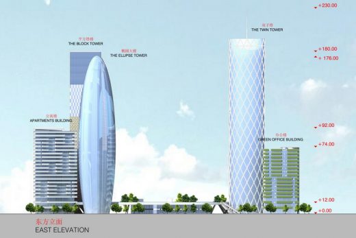
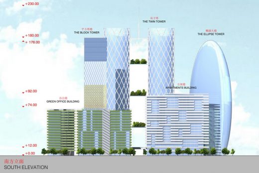
The office buildings are characterized by a medium height of the elevation, 74 meters for the ones on plot 01-05-01 and 04-07-01, and 71 meters for the one on plot 01-05-03.
The plan is defined by a regular structure, that allows a great interior flexibility for the usage of the spaces. Due to the baricentric position of the cores, a large open space could be organized by the tenant, following the necessities of his activities.
The continuous balconies also allow a homogeneous light in several inland areas. The facades are characterized by parapets made of mirrored glass on which, due to a system of vessels, grow climbing plants to reduce solar radiation during the hot season, while on the roof a large terrace allows users to enjoy the view of the sea and skyscrapers all around.
The irregular vertical cuts on the continuous balconies and those that define stairs volume, give the buildings a remarkable dynamism, creating different levels of composition and different spatial directions.
The residential building is placed on block 04-07-03 and occupies the entire available area, developing itself in a triangular layout. For this building was chosen to reach an intermediate height, to differentiate it from the hotel tower, which is located in the immediate vicinity. The maximum height of this building is 92 meters for 22 floors.
The corners of the triangle were occupied by large terraces for housing, overlooking the large urban park. The design of the terraces in the facade, with a succession of solids and voids, allows to give the building more depth appearance.
The four skyscrapers were designed with different techniques and languages, just to enrich and liven up the whole neighborhood.
The twin towers
The first skyscrapers that are encountered coming from the north are those in the blocks 01-05-01 and 04-07-01, the twin towers 180 meters high, with a circular plan.
The radius of the circle which determines the plan is 20 meters length, and the positioning of the circular core in the centre of the plan, has allowed to obtain a free space for offices and commercial of about 950 square meters per floor.
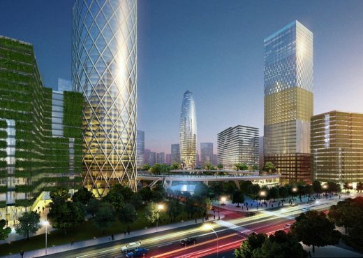
The structure of the building assumes helical shape, and is carried in front, becoming the distinguishing feature of the two buildings. The facade is made of glass modules, cold bended, that constitute the large diamond pattern spaced from the main structure. This type of facade extension beyond the limit of 180 meters, giving an idea of an endless tower.
One of the elements most characteristic these buildings is the dialogue of these with the urban park on the ground floor. In fact there are 3 panoramic large terraces, which are the “extensions” in vertical direction of the urban park. These terraces, are characterized by dense vegetation, becoming the privileged points of view to the project area and to the sea.
Another formal element that characterizes these towers is the antenna suspended from a structure that links the two buildings, which became a landmark for the entire project area.
The square block tower
By proceeding from north to south, in lot 01-05-03 there is another office tower, also 180 meters high, that is characterized by a very different architectural language.
In this case the plan square shaped, and the dimensions of the 4 sides are equal to 34.5 meters. The central core is always square with the side equal to 16 meters. The available free area is equal to 930 square meters per floor.
The facade cladding is characterized by 5 different types, so as to show a tower composed by different stacked blocks, which are added in height. The height of the blocks is reported to be 36 meters each. This represents the idea of urban overlapping of different styles of buildings. It’s the stratification of the urban complexity of the city.
Starting from the ground floor, the first type of facade is a coating of red stone, with rectangular windows. This block more is “material” than the others, and becomes the “solid” base of the tower. The second facade cladding is characterized by vertical louvers, colored in white, placed in front of the glass. These profiles act as sunscreens, significantly improving the energy performance of the building, reducing energy consumption.
The third type of facade has a shield in painted sheet steel, characterized by square panels with a geometric design, which thanks to the alternation of solids and voids, reduces radiation during the hottest hours of the day.
The bright color chosen for these panels helps to give dynamism to the building.
The fourth type of facade instead provides a checkerboard of reflective glass alternating with opaque panels, that generate a geometric repetition that stands in contrast with the more decomposed aesthetic motif of the facade number 3.
The last block of the building consists of a glass facade, high performance in terms of energy performance, which lightens the building, that seems to dissolve reflecting the sky.
The ellipse tower
On lot 04-07-03 instead were placed the hotel tower and the residential building, characterized by different heights.
The 5 star hotel is housed in an ellipsoidal building, 176 meters high, and will be able, as required in the Call of Tender, to offer up to 300 beds.
The design of the tower is characterized in plan and in elevation by the organic matrix of the ellipse which, in plan, sports a 2/5 ratio between major and minor axes and is so quite stretched. This aspect defines multiple relations among the three spatial dimensions with respect to the different positions of the observer, opening to a remarkable architectural tension; this centripetal approach creates an instantly recognizable landmark which defines and sets a high architectural quality for the future implementation of the City.
The bigger plan of the building is 31×71 meter wide. In this case the core is rectangular and very elongated, and elevators that connect the various levels are reduced in the higher planes, which are significantly narrower.
The top floor will have a glass dome to contain a green level. This will be an inner garden with special function to make common event for the hotel. It will be very panoramic towards the city of Shenzhen. This green space on top will become a very special attraction for free time and special events.
Qianhai Exchange Plaza Master Plan in Shenzhen – Building Information
Location: Shenzhen, China
Program: Qianhai Exchange Plaza
Client: Authority of Qianhai Shenzhen-Hongkong Modern Service Industry, Cooperation Zone of Shenzhen
Competition Time: November 2014
Project Leader: Andrea Maffei
Design team: Stefano Bergagna, Davide Cazzaniga, Giuliano Godoli, Yijie Wu, Andrea Maffei Architects s.r.l. Milano
Total area: 392,410 sqm
Covered area: 18,850 sqm
Maximum Height: 180 m
Materials: Concrete, Steel, Glass
Qianhai Exchange Plaza Master Plan in Shenzhen images / information from AMArchitects
Location: Shenzhen, China
Architecture in China
China Architecture Designs – chronological list
Chinese Architect – Design Practice Listings
Shanghai Architecture Walking Tours
Shanghai Sanctum
Architects: Wutopia Lab
photo : CreatAR Images
Sinan Bookshop in Shanghai
Comments / photos for the Qianhai Exchange Plaza Master Plan in Shenzhenpage welcome
Website: AMArchitects


