Stirling Prize 2007 Shortlist + Betting Odds, British Architecture Award
RIBA Stirling Prize 2007 – UK Architecture
British Architecture Award Winners – Buildings + Architects
Stirling Prize 2007
Stirling Prize 2007 Shortlist – Summary
Winner: Museum of Modern Literature, Marbach am Neckar, Germany
David Chipperfield Architects
christian_richters_riba250907tb.jpg)
Museum of Modern Literature, Marbach am Neckar, Germany by David Chipperfield Architects © Christian Richters
Stirling Prize Winner in 2007
Stirling Prize 2007 Building Citations
America’s Cup Building, Valencia, Spain: David Chipperfield Architects
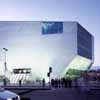
Casa da Musica, Porto, Portugal: Office for Metropolitan Architecture with Arup-AFA
Dresden Station Redevelopment, Dresden, Germany: Foster + Partners
Modern Literature Museum, Marbach am Neckar, Germany: David Chipperfield Architects
The Savill Building, Windsor, England: Glenn Howells Architects
Young Vic Theatre, London SE1, England: Haworth Tompkins
America’s Cup Building ‘Veles e Vents’
Valencia, Spain
richardwalch_riba250907tb.jpg)
America’s Cup Building, Valencia, Spain by David Chipperfield Architects © Richard Walch
Architect: David Chipperfield Architects
Associate architect: b720 Arquitectos
Client: Consorcio Valencia 2007
Contractor: Ute Foredeck
Structural engineer: Boma
Services engineer: Grupotec
Landscape consultants: Wirtz International
Contract Value: 36 m euro
Date of completion: May 2006
Gross internal area: 10,000 sq m
dca_riba250907tb.jpg)
America’s Cup Building, Valencia, Spain by David Chipperfield Architects © DCA
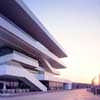
‘Veles e Vents’ (‘sails and winds’), the central base for all America’s Cup teams and sponsors in Valencia, opened May 2006 within a remarkable eleven months of the architects’ receiving the commission to design it. This 10,000 square metre shifting stack of wide trays or decks has an immediate appeal, combining the formal tension of its scale and asymmetry with the sheer modernist simplicity of white concrete, expanses of timber decking and white painted steel trim. The shaded floor slabs create 360 degree views from its improbable cantilevered viewing deck of the industrial port, the new park and the offshore racing courses.
The building and park were the social focal point for the world’s premier offshore racing competition in 2007, staged in Europe for the first time in over 150 years. It is the centrepiece of the re-organised old industrial port of Valencia. Its upper floors contain deluxe interiors for America’s Cup management, for sponsor Louis Vuitton and for VIP corporate entertainment – a club, a restaurant, a boardroom, a wellness centre, a shop and lounges; while there is public access to a busy viewing deck, canal-side restaurant and trophy exhibition on the raised ground floor. It is a cleverly planned building which manages to have no back or front and to feel open and easy, while providing all the necessary enclosures for services and circulation.
dca_riba250907tb.jpg)
America’s Cup Building, Valencia, Spain by David Chipperfield Architects © DCA
The building is a concrete structure with white painted steel trim; the ceiling is constructed of white metal panels incorporating linear recessed lighting, the external floors are solid timber decking, and the internal floors are white resin. The predominant whiteness of the building is offset by simple, brightly coloured furniture.
Its simplicity induces you to admire the overall sense of form and light rather than the details and junctions. The challenge will be to find new uses for the building when the America’s Cup circus has moved out of town, but it has an inherent flexibility that would make it an excellent exhibition centre or even a hotel. For the meantime we can enjoy it for what it is: a sporty and nautical building; very light on its feet and thoroughly appropriate to its function.
Casa da Musica
Porto, Portugal
Architect: Office for Metropolitan Architecture with Arup-AFA
Client: Porto 2001 SA / Casa de Musica
Contractor: Somague / Mesquita
Structural engineer: Arup London / AFA Lda
Services engineer: Arup London / AFA Lda / RGA
Fire Consultancy: Ohm / Gerisco
Acoustics: Dorsser Blesgraaf
Contract Value: 100 m euro
Date of completion: April 2005
Gross internal area: 22,000 dssq m

Casa da Musica, Porto, Portugal by Office for Metropolitan Architecture © Phillipe Ruault
The Casa da Musica was the result of an invited architectural competition, and the finished building is very close to the competition design. An orthogonal shoe-box auditorium hides in a dramatically irregular concrete shell.
Narrow at its base, it feels like it has been hammered into the ground, creating eruptions and ripples in the stone ground plane providing a three dimensional landscape for skate-boarding, promenading and performance. By sloping inwards at its base, the form initially repels efforts to get inside, but a wide staircase emerges through a canted slot and draws us upwards and into this magic box of tricks.
philipperualt_riba250907tb.jpg)
Casa da Musica, Porto, Portugal by Office for Metropolitan Architecture © Phillipe Ruault
It is a building full of scenographic moments and ironic gestures. A series of spaces, sequences and staircases negotiate their way around the rectangular auditorium which extends the full length of the building. It is only in the two main stair / circulation spaces that the form of the building is experienced on the inside. Here aluminium clad steps rise and turn following the beautifully made concrete shell – the space sometimes soaring up to the roof, crossed by the forms of smaller rooms above.
Below ground is a different world; many levels of orthogonally planned service and backstage spaces, mainly artificially lit, ensure efficient running of the public areas above. The highlight of this underworld is the rehearsal area; a series of high, flexible rooms with wonderful acoustic curtains.
courtesyofoma_riba250907tb.jpg)
Casa da Musica, Porto, Portugal by Office for Metropolitan Architecture. Courtesy the practice
The auditorium is a fixed-rake rectangular box with very long straight rows of seats. The form is generated by acoustic considerations, and the ends are defined by double skin walls of sinuous corrugated glass. They provide acoustic enclosure and dramatically distorted views to the outside. The side walls are punctuated by more large windows of rippling glass giving views into and from other key spaces in the building.
This is a well-made building which is intriguing, disquieting and dynamic. It provides acoustically excellent spaces for the performance of all kinds of music, and fulfils another contemporary role as a strange, enigmatic and compelling object in the urban form of the city of Porto.
Dresden Station Redevelopment
Dresden, Germany
Architect: Foster + Partners
Client: Deutsche Bahn AG
Contractor: Station & Service AG
Structural engineer: Buro Happold, Schmitt Stumpf Frühauf & Partner
Mechanical and electrical engineers: Schmidt Reuter & Partner, Zibell Willner & Partner
QS: BAL GmbH, Schmitt Stumpf Frühauf & Partner
Project management: AYH Homola GmbH & Co. KG, Kaiser Baucontroll
Historic buildings advisor: adb
Lighting consultant: Speirs and Major Associates
Contract Value: £99m
Date of completion: November 2006
Gross internal area: 30,000 sq m
nigelyoung_riba250907tb.jpg)
Dresden Station Redevelopment, Dresden, Germany by Foster + Partners © Nigel Young
Foster + Partners are masters of the one-liner. With some of the practice’s buildings you are left wanting some greater complexity or richness, but in the case of the restoration of the Dresden Hauptbahnhof, one of the most impressive late nineteenth century railway stations, the key move is of an apparent simplicity one which belies a complexity that is both surprising and highly effective.
nigelyoung_riba250907tb.jpg)
Dresden Station Redevelopment, Dresden, Germany by Foster + Partners © Nigel Young
Although not totally destroyed by allied bombing during the infamous Dresden Raids, the station was badly damaged and suffered further from unsympathetic repair and alterations. It is symbolically appropriate that the new work should have been designed by a British practice. Foster + Partners won the competition on the strength of their proposal to re-roof the damaged late nineteenth century train shed with a lightweight fabric roof instead of reproducing the heavy timber and glass roof that had existed previously.
This allowed a light touch to the repair of the steelwork, as well as providing 13% more natural light. However, it is the aesthetic effect that is chiefly remarkable, both for the fine quality of the diffused light through the white fabric roof and for its formal qualities. Instead of the parallel linear roofs and gutters of the original roof, the new fabric roof is pulled tightly down into the springing points of the arches in alternate bays, forming a fan vault somewhat reminiscent of that of King’s College Chapel. From above the roof is even more extraordinary, like a tent or a hilly landscape pierced with funnels down which the rainwater disappears.
nigelyoung_riba250907tb.jpg)
Dresden Station Redevelopment, Dresden, Germany by Foster + Partners © Nigel Young
The treatment of the flanking courts, which have been re-glazed and stripped of plaster to reveal the texture of the brick walls are successful. The decisions about the removal of some of the later alterations to the front elevation have also been nicely judged, restoring the essential architectural elements of the masonry to the windows and turrets while omitting the highly ornamental adornments that can be seen on pre-war photographs of the station. The people of Dresden are highly appreciative of the work that has been carried out.
Museum of Modern Literature – Winner 2007
Marbach am Neckar, Germany
christian_richters_riba250907tb.jpg)
Museum of Modern Literature, Marbach am Neckar, Germany design by David Chipperfield Architects © Christian Richters
Architect: David Chipperfield Architects
Client: Deutsches Literaturarchiv Marbach
Site supervision: Wenzel + Wenzel
Project management: Drees + Sommer
Structural engineer: Ingenieurgruppe Bauen
Services engineer: Jaeger, Mornhinweg + Partner
Ingenieurgesellschaft / Ingenieurbüro Burrer + Deuring
Contract Value: 11.8m euro
Date of completion: June 2006
Gross internal area: 3,800 sq m
jorgvonbruchhausen_riba250907tb.jpg)
Museum of Modern Literature, Marbach am Neckar, Germany designed by David Chipperfield Architects © Jorg Von Bruchhausen
Following re-unification, texts of various well-known German authors which had previously been dispersed to east and west have now been brought together in this new museum. In a suitably commemorative manner the building forms a small Acropolis attached to the National Schiller Museum on a ridge overlooking the valley of the River Neckar. The entrance sequence is brilliant.
The visitor crosses an open terrace overlooking the valley, then negotiates a series of shallow steps to enter the generous portal formed in the colonnade, then enters through giant hardwood doors. A staircase descends to the collections with their required diminishing lighting levels. It is at this moment of descent that the building shows its pedigree – a sense of a progression to somewhere beyond, combined with a rich but selective palette of materials and illuminated with subdued top lighting.
The route concludes in the permanent collection. Here glass cases containing original manuscripts form a magical flickering landscape. There is a particular theatricality about this space, as though the reflections, refractions and multiple shadows from the small intense lights collectively represent the soul of the German imagination.
There are many things to praise about this building – the architect’s control and discrimination in the choice of materials has by now become a signature but above all it is in the handling of the ‘difficult whole’ that the building excels. The external pre-cast concrete arcading (or is it a screen or even a cage?) forming the entrance pavilion is also applied to the plinth on the east side.
This unexpectedly produces a monumental elevation cut into the hillside, which simultaneously democratises the acropolis giving equal status to pavilion and plinth. The same measure and interval of the vertical structure is then to be found forming the soffit to the beams to the galleries inside…. Truly a tour de force.
Since the end of the war Germany has been sensitive to matters concerning the neo-classical in architecture. Had it been submitted a decade or two earlier it would surely have been eliminated for its formal manner. It is encouraging that with time, more even-handed attitudes have prevailed.
The Savill Building
Windsor Great Park, England
Architect: Glenn Howells Architects
Client: The Crown Estate
Structural Engineer: Buro Happold / Engineers HRW
Joinery Company: The Green Oak Carpentry Company Ltd
M&E Engineer: Ateiler Ten
Quantity Surveyor: DBK Back
Contractor: William Verry Limited
Contract Value: £5 million
Date of occupation: June 2006
Gross internal area: 2,000 sq m
gareth_gardne_riba250907tb.jpg)
The Savill Building, Windsor, by Glenn Howells Architects © Gareth Gardner
This project is a good modern interpretation of that great British traditional form: the ‘pavilion in the park’. The Savill Building, a visitor centre that creates a gateway to the listed gardens, takes the form of a dramatic gridshell structure made of timber from Windsor Park in which it sits. This innovative use of traditional materials means that it harmonises well with a skyline of mature trees, as well as being an object of great beauty and grace in its own right.
It sits in a site of Special Scientific Interest (SSI), which is a grade I listed garden in the green belt. Great care has been taken in placing the building at a particular high spot in the landscape and in relation to the famous Rhododendron Drive, so as to capitalise on the views out and to marry the building most appropriately with the forms of the existing landscape. The client wanted a landmark.
What they have got is an appropriate response, in a modern idiom, and they are delighted. The roof is a distinctive undulating form which appears from a distance to float above the planting on the sloping green roofs that run along the entrance side of the building. As one draws nearer, red brick retaining walls become apparent and these fold in to form the main entrance into the building.
warwicksweeney_riba250907tb.jpg)
The Savill Building, Windsor, by Glenn Howells Architects © Warwick Sweeney
Within the public area one perceives three main forms: the roof, which ripples over everything, the timber gridshell twisting and turning like bones beneath an animal’s skin; a curving brick wall to the south which runs through the building and extends beyond it to slope neatly into the adjoining folds in the landscape; and a glazed screen on the north face, giving uninterrupted views out towards the gardens. It seems wholly appropriate as the housing for a nursery and restaurant. Other facilities, such as a lecture theatre, lavatories and back of house servicing sit behind the brick wall, more or less concealed beneath a grassy bank.
warwicksweeney_riba250907tb.jpg)
The Savill Building, Windsor, by Glenn Howells Architects © Warwick Sweeney
Considerable efforts have been made to make this building as sustainable as possible. Most notably all the timbers used in the building are locally sourced from the Crown Estate and are from a renewable source.
Young Vic Theatre
66 The Cut, London SE1, England
Architect: Haworth Tompkins
Client: The Young Vic Theatre Company
Contractor: Verry Construction
Structural Engineer: Jane Wernick Associates
Services Engineer: Max Fordham LLP
Contract Value: £6.925 million
Date of completion: September 2006
Gross internal area: 3,155 sq m
philipvile_riba250907tb.jpg)
Young Vic Theatre, London SE1 by Haworth Tompkins © Philip Vile
The Cut is a cheerfully scruffy part of south London into which in the 1970s architect Bill Howell introduced the Young Vic at a cost of a mere £60,000. Times and prices change, but Haworth Tomkins (who did such a good job with the makeover of that other seminal mid 20th century theatre, The Royal Court), have (again) remained true to the original while radically expanding opportunities for actors to make theatre and audiences to enjoy it. The ad-hoc aesthetic very much remains in the re-design and so does the affection in which it is held by local people. This is their theatre.
philipvile_riba250907tb.jpg)
Young Vic Theatre, London SE1 by Haworth Tompkins © Philip Vile
Clearly the architects and their many clients (both front and back of house) had a very successful working relationship: each listened carefully to the other’s concerns and this quiet interest has produced a building strong in the particular haphazard character which gave the original ‘temporary’ venue such a long and successful life.
The key result of this fruitful collaboration is that the audiences as well as the staff continue to revere the singular intimacy of this famous venue. The existing auditorium has been painstakingly reconstructed to satisfy new technical requirements yet retain the audience/performer relationship that distinguished its predecessor.
philipvile_riba250907tb.jpg)
Young Vic Theatre, London SE1 by Haworth Tompkins © Philip Vile
Externally this artful collage of carefully contrived pieces marks the venue out as a critique of much that preoccupies architects today. Nevertheless its carefully collected ‘found’ components have already become a point of reference for many peers. The RIBA Awards judges debated whether at times the deliberate tendency to prematurely age the form as well as the detail had drifted into whimsy; rhetoric even. Ultimately however they concluded that this project’s merit, demonstrated by its very detailed and careful response to the challenge of remaking somewhere that so far as its audience was concerned had never been broken, was an achievement that demanded recognition.
Stirling Prize 2007 Shortlist info from RIBA 2007
Location: UK
Stirling Prize 2007 Shortlist
America’s Cup Building, Valencia, Spain
David Chipperfield Architects
Casa da Musica, Porto, Portugal
Rem Koolhaas
Dresden Station Redevelopment, Dresden, Germany
Foster and Partners
The Museum of Modern Literature, Marbach am Neckar, Germany
David Chipperfield Architects
Savill Building, Windsor, England
Glenn Howells Architects
Young Vic, London, England
Haworth Tomkins
RIBA Stirling Prize Dinner 2007
Venue: Roundhouse, London
Date: 6 Oct
Tickets £180 + VAT
Tables of 12 guests per table
Tickets : Sarah Davey, RIBA Events Manager 0207 7307 3778 / events(at)inst.riba.org
RIBA Awards – Stirling Prize contenders
Stirling Prize News : main page
Pritzker Prize architects – Architect Winners
Stirling Prize 2006 – incl. Shortlist buildings / architects / favourite
Comments on Stirling Prize Shortlist 2007 welcome


christian_richters_riba250907tb.jpg)
