Atrio Villach Austria, Retail Building Project Photos, Design News, Property Images
Atrio Villach : Austrian Shopping Center
Austrian Retail Development design by ATP, Europe
10 Jun 2009
Atrio Villach
Shopping Centre Villach, Austria
Design: ATP Architects and Engineers, Innsbruck
Atrio Shopping Centre Villach
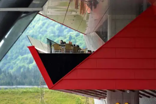
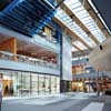
Atrio is in many respects – conceptually as well as architecturally – no conventional shopping centre. On the one hand one is simply overwhelmed by the scale of the over 100,000m2 stand-alone building which graces the southern access to the city of Villach. The partly raised building greets the visitor like a red and silver sculpture.
“A:Trio” is on the other hand the architectural programme of the building – a shopping centre which seeks to draw together three regions – Carinthia, Slovenia and Friaul – which were until recently separated by borders. The focus of these three cultures is the huge central plaza of the Atrio which is dominated by a large aerial photograph. This 3-region idea comes into play even before one enters the building in the form of the fluid entrance zone which replaces any clear border between outside and inside.
1. Theme:
“Senza Confini…” Originally the motto of the bid for the Winter Olympics which Carinthia made together with neighbouring regions, this idea was taken up and further developed in the design of the Atrio. The disappearance of borders and the increasing political integration of the people in the triangle where Slovenia, Austria and Italy meet are becoming even more apparent on both cultural and economic levels.
With its location on the crucial transport hub where the Tauern motorway (the A10 towards Deutschland) meets the Karawanken motorway (the A11 towards Slovenia) and Austria’s southern motorway (the A2 towards Italy) Villach, with approximately 60,000 inhabitants is Carinthia’s second largest city and somehow destined to become the commercial centre of the Alpen/Adriatic Region. Which explains how Atrio, the newest shopping centre of the Austrian SPAR Group, was bestowed with the theme of “Shopping senza Confini” (Shopping without borders).
Name and Logo: Atrio is Italian for Atrium – an open central space from which all the key adjacent rooms of the house can be reached. Since Roman times, the word atrium has – in the Alpen/Adriatic Region – referred to a place for meeting or relaxing in houses or church courtyards.
In Atrio in Villach this traditional use of the atrium informs the design concept behind the plaza and enriches the 3-region idea. The logo of the centre refers to this triple theme as well as being an abstract interpretation of the powerful red entrance figure.
2. Concept
The architecture develops the theme of “borders and the crossing of borders” on many levels.
• Landscape Architecture
The world of Atrio begins outside the building. The landscape architecture is already a challenge to the expectations of the customers, with the customary grass lawn being replaced by limestone, gravel, tall grasses, water and alpine and Mediterranean flora – a landscape which combines the Alps and the Mediterranean as it firmly situates the building – like a huge ship – into its surroundings.
• The three “Colour Zones”
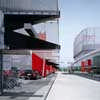
In reference to the colours of the three regions – green (Italy), blue (Slovenia) and red (Austria) – each of three main vertical circulation core of the project has its own colour. In view of the size of the building this makes a major contribution to customer orientation.
The domination of the colour blue on the tower in the central square can be seen as a mark of respect to the mountains and lakes of Carinthia. This colour project begins with the interplay between the three colours in the parking garage and is then continued in the lift cores before ending in the colours chosen for the parking deck on
the roof of the complex.
• Water
As was the case in Roman times – when a basin of water was always used to catch the rain – the Alpen/Adriatic Water Column (a multi-storey water column with a diameter of 80cm) is used as an integrating element in Atrio.
3. Description
3.1. Main Entrance
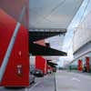
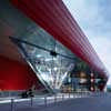
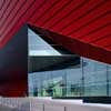
The over-dimensioned red entrance frame dominates virtually the entire south façade; it highlights both main façade and entrance like an original piece of origami while creating a covered forecourt which is conceived as an open stage for events. The red 15m wide canopy sculpture is formed out of steel trusswork. The entrances flow.
The Atrio can be entered from three circulation cores and on three levels:
• “The open-air stage of the three regions” at the main entrance acts as a forum and open communications-platform during the day. The notion of the three regions is also symbolised by a glass pyramid, a crystal which draws daylight deep down into the parking levels.
• The underground car park is continually in contact with the centre: the views afforded by openings in the slab give clients the feeling of standing in the plaza before they have left the parking. The feeling of being underground is also reduced by the lifting of the main building and the very gentle access to the basement parking.
• Clients who park on the parking deck at second floor level are oriented by a series of coloured aluminium poles. The flat volume of the Atrio (H=13m) is divided into a classic INTERSPAR supermarket (the first phase) and a Shopping Mile focussed
on the central square with the blue tower in its midst.
3.2. The Central Square
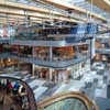
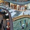
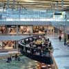
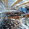
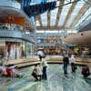
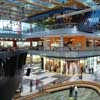
Due to its scale the Plaza cannot be compared with such spaces in conventional malls. In an area of 50m x 60m an almost square glazed Atrium was created which houses all those activities – buying, eating, playing, communicating and loitering – which combine to create a new urban square for Villach.
In order to intensify this “street-like” feeling, the architect used various granites as floor finishes at ground floor level whereas the upper floor is finished in an elegant Gailtaler marble.
Features of the Plaza:
• The Blue Tower: The tower rises from the ground like the backbone of the centre before shooting through the roof to create a new southern watchtower on Villach’s southern edge. At ground floor level the tower houses shops, at first floor level three restaurants and at second floor level a 600m2 children and family world with playground equipment, party-rooms and café.
• The roof: Trussed laminated timber beams with a 33m span create the particularly filigree structure which supports the overscaled glass skin. This glazing has a special structured foil which offers both solar and UV protection while guaranteeing a perfect view towards the heavens.
• Furniture: Specially designed “seating blocks” with red and oak planting elements snake their way like worms across the floor of the plaza.
• Aerial photograph: Both the centre point and the main attraction of the plaza is a aerial photograph – in the form of a triangle with sides measuring 17m – which is set into the ground and shows the area where the three countries come together at a scale of 1:6,000 (a scale at which individual houses and cars can be clearly recognised).
Benches are arranged around the photograph which can also be clearly seen from a cantilevered first floor balcony.
• The theatre: The mall – with all its levels, cantilevers and tower – is accessible from all sides and (in keeping with the project theme) can be used as a theatre (loudspeaker system, projection screens)
3.3. Light
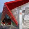
• The façade operates as a thermal skin. Black metal panels clad the building and in front of these is a second skin consisting of highly polished perforated aluminium, which varies in darkness depending on the intensity of the perforations.
At night the external skin of the centre becomes an illuminated cloak of chain-mail. A three dimensional effect of depth is created by the use of vertical red and blue neon tubes which are laid behind parts of the perforated metal skin. Various light programmes can be selected and controlled via a bus-bar system.
• Open parking areas: The large open parking area is evenly illuminated by just 4 floodlights.
• Underground parking: The centre has a parking place indication system to enable the customer speedy and problem-free parking.
• Mall: Lighting features include LED floodlights of various colours which switch the mood in the mall.
3.4. Construction
• Pile foundations: The building is supported on 800 plies which descend between 20 and 70m below ground level.
• Ecology: 652 of these piles act as “energy piles”. The water which circulates within them (they piles contain a total of 162,000m of piping!) uses the constant earth temperature for heat exchange purposes. The resulting temperature differences are used to heat and cool the centre.
• Canopy: The 15m wide cantilevered canopy is created as a steel trusswork.
• Roof: 12 plant boxes for building services clad with perforated aluminium float above the roof like dolls houses and help structure the volume.
Atrio Villach – Building Information
Project description: Atrio
Address: Kärntner Straße 34
A-9500 Villach
Client: SES Spar European Shopping Centers GmbH
Address: Europastraße 3
A-5015 Salzburg
Sales area 38,700 m2
Site area 58,500 m2
Total built area 107,000 m2
Total built volume 420,000 m3
Number of shops: approx. 82
Total number of parking places 2,000
Total investment: approx. 94 Million Euro
Construction start: 09/2004
Opening of phase 1: 11/2005
Completion: 03/2007
Architecture and Full Service Design: ATP Architects and Engineers, Innsbruck
Process-leading architect: W.-Dieter Leschinger, Andrei Florian
Architecture: Andrei Florian, Bernhard Eimannsberger, Bernd Ebner, Uta Kürzel, Philip Pfister, Maren Saitner
Tender documentation: Hannes Fritsche, Bruno Alf, Andreas Rieser
Site supervision: Raimund Nowak, Johann Gerhold, Lothar Mayer, Stefan Zoller
Structural engineering: Alois Salzburger, Martin Abentung, Demir Talet, Hansjörg Töchterle
Services engineering: Peter Oberhuber, Johann Knoll, Norbert Leuthner, Simon Motschiunigg, Dorit Nötzoldt, Carina Sagerschnig
Electrical engineering: Rainer Stiller, Harald Entner, Roland Lener, Alexander Wilhelm
Atrio Villach Text: © ATP Architects & Engineers
Atrio Villach Plans, Visualisations: © ATP Architects & Engineers
Atrio Villach Photos: © Thomas Jantscher
Location: Villach, Austria, central Europe
Austrian Building Designs
Austrian Architecture Designs – architectural selection below:
Vienna Architecture Walking Tours by e-architect
Austrian Architect Studios : Office Listings
Swarovski Manufaktur, Wattens, Tyrol
Architects: Snøhetta
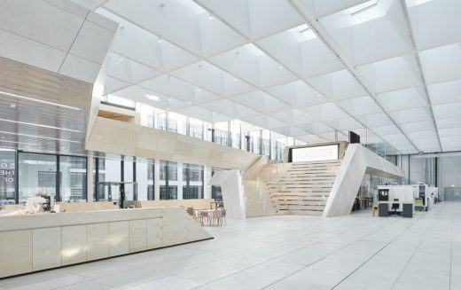
photography © David Schreyer
Swarovski Manufaktur in Wattens, Tyrol
Loft Panzerhalle, Salzburg
Design: smartvoll Architekten ZT KG
photography: Tobias Colz/smartvoll
Loft Panzerhalle in Salzburg
Nordpark Cable Railway Stations
Comments / photos for the Atrio Villach Austria Architecture design by ATP page welcome


