Space by Thynk, NSW Showroom, Australian Commercial Building Project, Retail Interior, Architecture Images
Space by Thynk Showroom in NSW
18 Feb 2022
Design: X+O
Location: New South Wales, Australia
Space by Thynk, NSW Showroom
A premium showroom space with the largest range of trusted brands for home interiors and exteriors. Created for home builders, architects and designers to select every finish and fixture for the home.
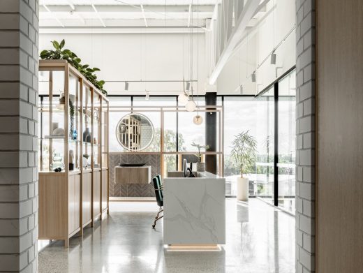
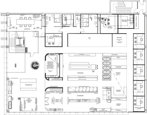
X+O’s response to the brief was to create an easy to navigate space that feels premium yet approachable. The main concept was that the architecture was to create zones that reflect the layout of the home, in order to create a relatable and inspiring context for clients to make their selections from. The zones created by X+O reflect a house but also mimic the construction phases of a home.
The zones break down the customer journey into segments to reduce the overwhelming experience of selecting fixtures and fittings for one’s home. The zones are strategically located to guide customers through the products that they need to select first – starting from exterior followed by interior. Customers are guided through each zone by a highly trained designer, equipped with digital tools to help select, visualise and record their selections.
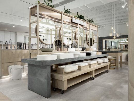
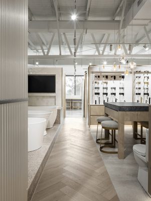
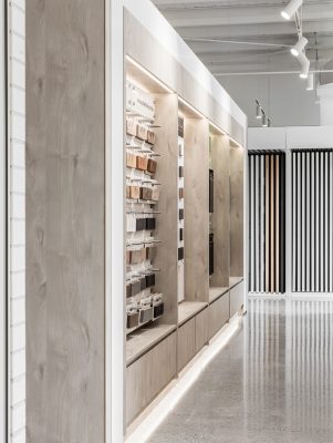
Fitting in the large range of varying categories and product range was one of the largest challenges with this project. X+O’s response was to design efficient floor fixtures which maximise capacity with pull out drawers containing products such as sinks, doors and cooktops. The displays were tiered to enable good sight-lines throughout, and create a dense multilayered effect. Wall modules were designed as a uniform system incorporating signage, display and storage space, for easy customer navigation and efficient display. This enabled brands to show a large range of their product whilst highlighting hero product. Each module was designed to be flexible for easy change out for future-proofing.
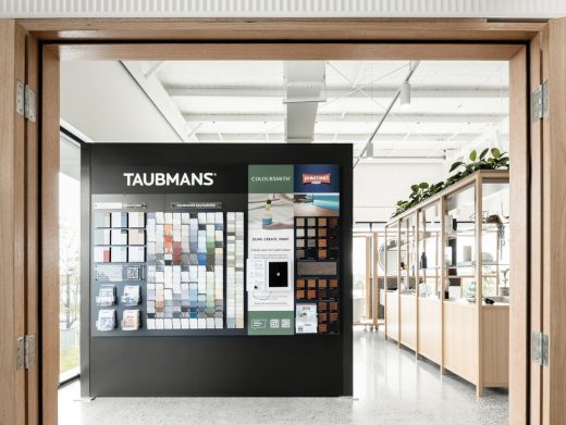
Digital tools were incorporated to enhance the customer journey such as the Taubmans digital visualiser, and an ‘endless aisles’ strategy for an extended product range will be incorporated in phase 2.
Prior to launching, Space by Thynk secured commitments from the most well known and loved premium brands in Australia for display and tenanted space. Numerous trusted project home builders have engaged Space by Thynk exclusively for the selection processes to their clients.
This new experience is located in the same building, one level above the Gold Winner of the Driven x Design 2020 ‘showrooms and flagships’ finishes experience centre by Thynk and designed by X+O.
What was the brief?
The client’s vision for Space by Thynk was to create a premium one stop shop with the largest range of trusted brands for home builders, architects and designers to select every finish and fitting for the home that they were creating. Showcasing the most well known brands in the industry, the environment was to become part showroom, part consultation and part workspace. The 700m2 space was to include: exterior building finishes, interior finishes / fittings including bathroom, kitchen, fire place and air conditioning and an outdoor lifestyle area. The space needed to attract high calibre brands to display and potentially become tenants with the available workspaces on site, in order to maximise the client’s return on investment.
What were the solutions?
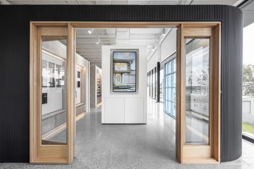
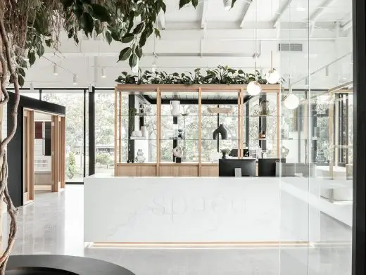
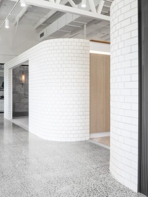
X+O’s response to the brief was to create an easy to navigate space that feels premium yet approachable. The main concept was that the architecture was to create zones that reflect the layout of the home, in order to create a relatable context for clients. Structures inside each zone were designed to act as a blank canvas allowing a variety of different brands to showcase and ‘hero’ their products. Each area was designed with consistent structure and signage, like a department store. This strategy was employed to declutter the space and create an easy to navigate environment.
Selection and specification of finishes for an entire home both inside and out can be very daunting – even for the most experienced. It was imperative that the customer journey was broken down into bite sized chunks, through the architecture and expert customer service, so that customers feel confident, not overwhelmed when making their selections. The zones created by X+O reflect a house but also mimic the construction phases of a home. Thus guiding customers through the items that they need to select first. Starting with the exterior, followed by the interior structures (i.e. walls, floor finishes etc), interior fittings (i.e. bathroom and kitchen) finishing off with the outdoor lifestyle area (i.e. pergolas). The zones created were named: exterior world, interior world and outdoor world. Customers are guided through each zone by a highly trained designer, equipped with digital tools to help select, visualise and record their selections.
Within each ‘world’ a matrix of zones were developed to facilitate different product displays, for example some products required walls, others shelves or tables. These were allocated based on site lines with tables at the front, and built up taller with walls in the back so that sight lines were not obstructed. With careful space planning, brands requiring a tenanted office were placed on the outer perimeter with consultation areas / work spaces directly opposite their displays.
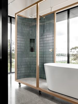
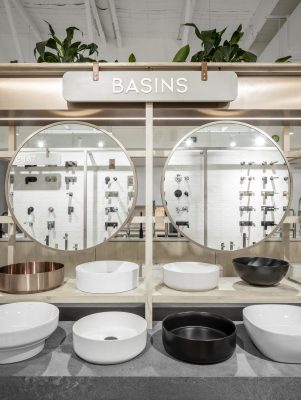
Each display took cues from a real life element in the home – some of which include hero basins with a small bathroom display, hero bricks and doors on the façade for up-sell. The fixtures on the floor were cleverly designed to maximise capacity with pull out drawers and displays to create a dense multilayered effect. This enabled brands to show a large range of their product whilst highlighting hero product. Additional items were available digitally vis the allocated design consultants via an ‘endless aisles’ strategy. Capacity was one of the largest challenges with this project – where the client wanted Space by Thynk to showcase one of the largest ranges of brand and products available under one roof.
What were the key challenges?
Capacity and navigation were the largest challenges with this project.
The client wanted Space by Thynk to showcase one of the largest ranges of brand and products available under one roof. The fixtures on the floor were cleverly designed to maximise capacity with pull out drawers and displays to create a dense multilayered effect. This enabled brands to show a large range of their product whilst highlighting hero product. Additional items were available digitally vis the allocated design consultants via an ‘endless aisles’ strategy.
Navigation was addressed through clever zoning and very thoughtful space planning. Utilising fixtures signage, floor finishes to define zones and a layout that reflected the construction stages of a house, starting from outside to inside, made it easier and more understandable for customers to navigate the journey and space. The zones made the journey feel less overwhelming as the selections were provided in segments – blocking out the remaining areas allowing customers to focus on one area at a time.
What are the sustainability features?
X+O approached this design solution by focusing on reducing waste by designing a flexible space for longevity.
By utilising the actual products on display in order to create the display where possible, over usage of un-necessary materials was enabled. This included using hero brick, façade claddings, windows etc to create walls and areas of display. Where possible, fixtures were designed to be moveable so that the showroom could be easily reconfigured rather than demolished each time a new product was incorporated. Similarly the display walls were all designed to be ‘neutral’ sand interchangeable so that categories could easily move around if needed without the need to embark on a full new construction, hence reducing future waste. All existing ceiling and flooring was left exposed, and new finishes applies only to aid navigation. Energy efficient lighting and low VOC and recycled materials were used used throughout.
Space by Thynk in NSW, Australia – Building Information
Design: X+O – http://www.xpluso.co/
Project size: 700 sqm
Completion date: 2022
Building levels: 3
Photography: Felix Mooneeram
Space by Thynk, NSW Showroom images / information received 180222
Location: New South Wales Australia
New Sydney Architecture
Contemporary Sydney Property
Sydney Architectural Designs – chronological list
Architecture Walking Tours in Sydney by e-architect
Bellevue Hill House
Architecture: Geoform Design Architects
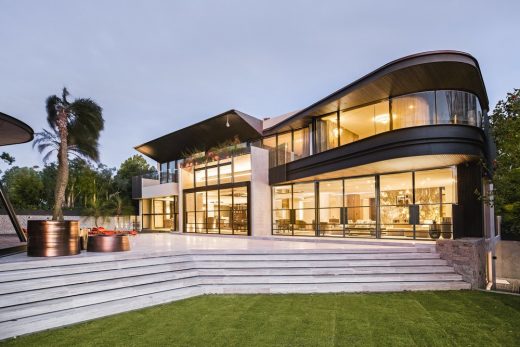
photograph : Kate Stanley
Bellevue Hill House
Design: SAOTA and TKD Architects
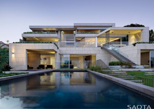
photograph : Justin Alexander
Mosman House
Architecture in Australia
Architects: anthrosite
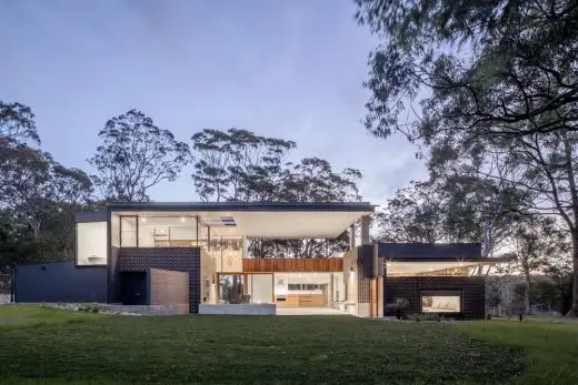
photo : Jon Reid
Contemporary House in Newcastle, NSW
Australian Architect Offices : Studio Listings
Comments for the Space by Thynk, NSW Showroom designed by X+O page welcome


