Rubinsztein House, South Coogee Property, Australian Architecture, NSW Home
Rubinsztein House, Australia
New South Wales Residence Development in South Coogee by Rolf Ockert Design
post updated with new photos 1 Jun 2020 ; 6 Mar 2014
South Coogee Residence
Location: South Coogee, NSW, Australia
Design: Rolf Ockert Design
Domestic Residence in Australia
The client had just purchased the site, a small but stunningly located oceanfront property with panoramic views of the Pacific, when they were introduced to me. As I had just gone out on my own after many years as Associate Director at a successful mid-size firm I didn’t have much to show that I could prove as “my own”.
After a detailed selection process the client chose to engage me for the design of their new house, probably based on a lot of trust in my ability and the fact that we got on very well on a personal level.
Throughout the project this good personal rapport proved to be a very important factor in the successful shaping of the final product, the process being characterised by constructive criticism, unquestioned support and trust where it was needed.
Designing on small site in this wonderful location brought with it major challenges: Provision of views from as many points in the house as possible; A natural and self-evident path of movement throughout the house and a strong connection between the spaces and levels despite the almost terrace-house-like configuration; and the bringing in of lots of natural light despite the fact that the house was east facing and had no direct northern solar access.
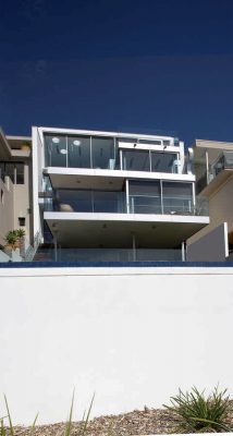
Despite the potential impact on views from properties in the second and third row we managed to get a three level house approved, taking advantage of the steep sloping site.
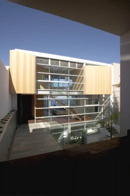
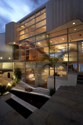
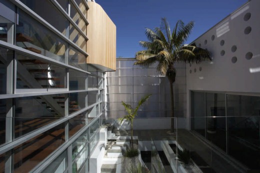
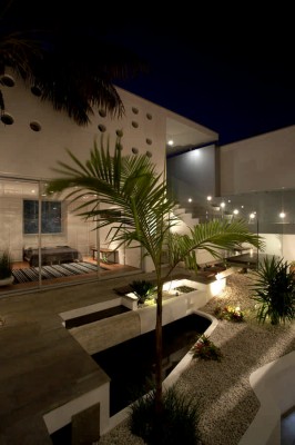
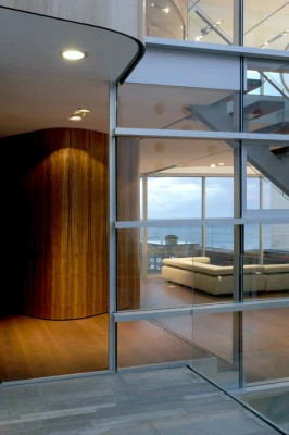
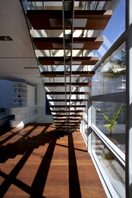
The house is designed around an internal courtyard, providing light and cross ventilation to all levels.
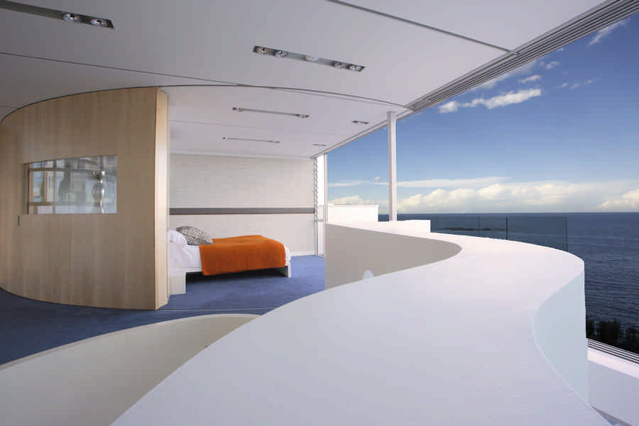
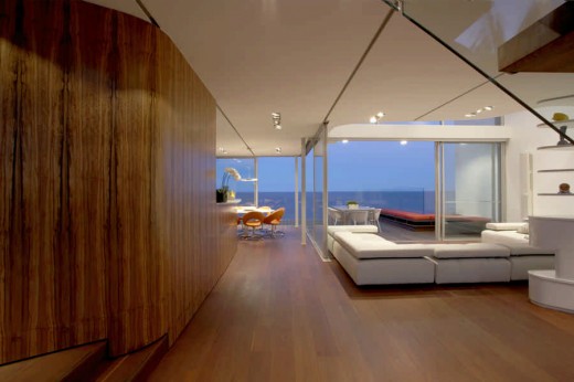
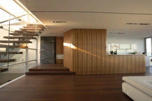
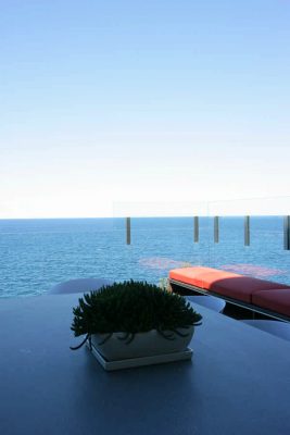
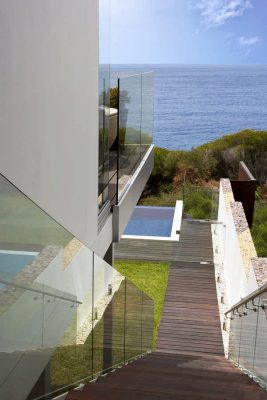
To the east (the view and breeze) the house opens up almost completely to large decks, with the sliding doors designed to allow many different configurations for the internal-external connection of spaces. A generous open plan living/Dining/Kitchen area at entry level is the central focus of the family’s life, with the children’s areas located below and the parent’s Master bedroom above.
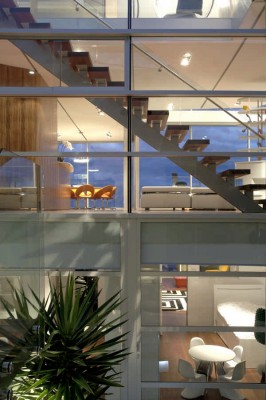
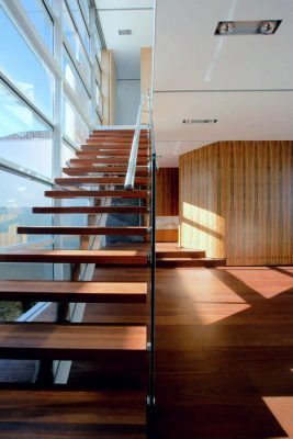
A series of stairs, including the open, light main stairs running across the short length of the site, connect all levels effortlessly.
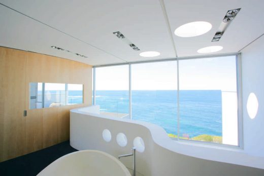
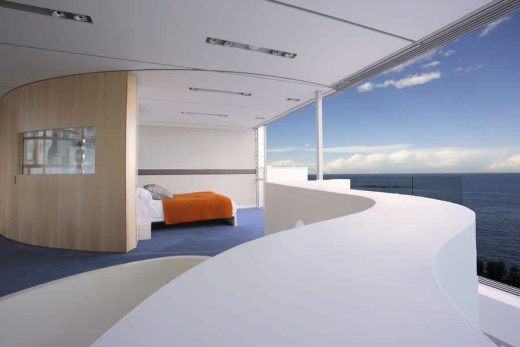
Centerpiece on the upper level is the freestanding bath tub in the middle of the room, allowing arguably the best views from any bathtub anywhere. A large, curved sliding door closes off the otherwise open Bedroom area for acoustic and visual privacy.
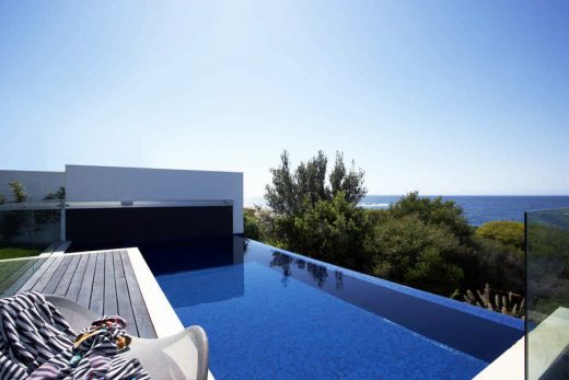
The lower floor is the kid’s realm, accommodating three large bedrooms and a large play area with direct access to the lower garden and pool.
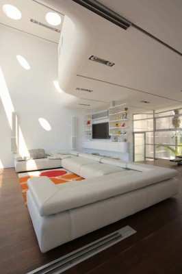
The main, middle level has a large kitchen, designed to not look too much like a kitchen if not in use, a dining area in its own protruding pocket and the main seating area under a large, curved void. Having been handed very strict height limitations by Council the Void creates a generosity in spatial experience that lifts and enlarges the entire house.
Some design decisions, made on site after, for instance, experiencing the play of light through holes in the roof formwork as it was laid, resulted in design features that now pretty much define the house, such as the 3 skylights over the void and the “holey” wall to the garage.
The client’s original brief asked for an open plan house with a (quote) “wow”-factor and modern lines and materials. The house was to be suitable for kids as well as parent’s entertaining, maximising light, natural airflow and, of course, views. Looking at the original client’s brief now it feels surprising how this original intent already contains all key elements of the final product even though we went, as always, through so many sessions of discussions, changes, re-adjustments.
The client gladly states that they “got exactly the house they wanted and better”.
Provision of light and airflow throughout the house became absolute priority even if it resulted in glass areas that were larger than energy wise construction would have suggested. In daily use – the clients had a winter and a summer there already – the extensive glazing to the courtyard (W) results in a comfortable warmth in Winter (glazing closed) and a good natural draught in Summer (windows open). Use of the in-built ceiling heating as well as spot airconditioning is very limited in Winter as in Summer, helped by the very solid masonry/concrete construction of all walls and slabs, including roof.
A tight budget resulted in sophisticated simplicity wherever possible (our preferred style anyway) with a few splash-out features.
Council’s very limiting height restrictions (due to view impact on properties behind) resulted in a very close collaboration with the structural engineer to slim all elements as much as possible as well as creative solutions as, for example, the design of a new light fitting in conjunction with a local light manufacturer, allowing large adjustable lights within a depth of 60mm where the marketplace could only offer 140mm.
The house pretty much bares it’s soul straight away. All levels and their connection is legible as soon as one walks into the courtyard. The amazing view is visible from the moment one walks in and stays in view from wherever you are in the house. Large glazed areas, required to allow light in and views out, have been designed to be distinct. The western, mainly fixed, facade having a strong horizontal emphasis and strength while the eastern, operable facade is more playful and ever changing.
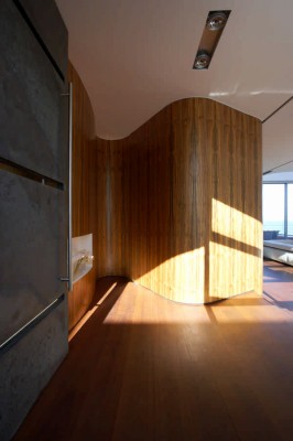
Having been tightly restricted by the small site, the immediately adjoining, terrace-like neighbours and the height restrictions the house is a box. Inside the box, though, are elements such as the curved void, the flowing timber veneer walls, the large curved sliding wall, the big oceanview bath, the dotted skylights, that express an attitude of fun, of not taking yourself too seriously, matching the clients’ personalities.
Most of the free flowing elements have been set apart from the outer box by the use of warm, rich timber veneers. Where the box couldn’t contain the shapes any more these shapes penetrate the box and show themselves proudly and prominently to anyone entering. (these custom-made, curved, external timber veneer panels were the most difficult part of the house. As no proprietary item was found on the market these had to be researched, sourced, constructed, curved and coated by ourselves to get the desired effect).
In many ways the key to designing a house in that kind of location appears to be to “not stuff it up”. In terms of designing for the genius loci we might have just pulled it off.
Though being, as mentioned, tightly restricted, the user and visitor progress through a series of spaces, each with their own character and quality. The deeply recessed front door provides a very private area even before the front door is opened. The courtyard is a true oasis with pond and all, inviting a read on the bench in the shade on a hot afternoon as well as providing a refreshing view from anywhere in the house. Inside the house the sitting area are under the Void, the Dining in the “eyrie”, the Master Bed where one is alone with the Pacific, the Shower and WC with the best views in town all have their own focal quality.
The structure has been purposely reduced to the point where, as integrated in the facade, one of the few walls or a joinery unit, it disappears almost completely, thus allowing the scenery to play first fiddle.
Every little detail has been designed, in scale 1:2 if necessary to ensure it’s appropriateness as part of the whole. The free shape of the Void re-appears in the courtyard and pond, some joinery and the study plan. The junction between walls and ceiling has been rounded to soften the box, provide interest. The east and west facade mullions/columns are connected by recessed aluminium channels in the ceiling. These provide structure and scale and also serve as control joint to prevent cracking of the ceiling. The custom designed lights run with the same theme in material and detail.
Finishes to the masonry/concrete elements of the box have been left deliberately simple, ie rendered and painted white. These serve as the frame not only of the ever changing ocean and horizon but for the play of the more unruly elements of the interior. The oh so dominant Void with its almost baroque 3-dimensional curve has been finished also in white render so not to become too much of an over-focus.
This ever-present white has been complemented with a reduced, nevertheless rich palette of materials. Irregularly laid slate-like stone tiles, Chocolate-Brown ironbark flooring, carefully selected timber veneers. The darker of the veneers, only applied to a smaller area, features dramatic spear-like grain patterns in a rich colour selection, almost reflecting the owner’s african origin. The upper level veneer, covering most of the internal walls, is lighter, friendlier, also appropriate for the external facade where it pierces the box.
Originally billed as an ‘Addition and Alteration’ for Council purposes only part of the boundary walls and a 3m wide strip of slab spanning between were left after demolition. To achieve minimal-slab-thickness/maximum-internal-room-height the slabs were optimised in reinforced concrete as was the roof, with the added benefit of becoming a heavy mass shielding from the sun.
Only a few very slim steel columns, most of them integrated in facade or joinery, were needed to support the slabs above open-plan spaces.
With (almost) no height available above the ceiling all (wet) services were carefully planned to run vertically in some of the few walls. Downpipes run within the 100×100 steel columns, thus requiring a high level of accuracy during construction.
Cost Efficiency was achieved by maintaining simplicity in construction, layout and finishing wherever sensible. Steepness of the site and sandy ground made more money disappear into non-visible areas, ie underground than desirable, thus making above mentioned simplicity a must. The overall result compared, per m2, very favorably with similar buildings in the vicinity.
A, site and vista related, orientation to true East in combination with a solid boundary wall to the North made from the start a traditional approach to solar access/protection impossible. Instead the glazed areas were maximised East and West to optimise solar gain (for energy as well as feelgood reasons).
The resulting sun access angles cut out the hottest part of the sun’s path, allowing only the weaker morning and afternoon sun in. Over-heating is efficiently dealt with with lots of operable facade elements, allowing egress of hot air, assisted by the almost constant breeze in this oceanfront location. The heavy roof slab, strongly insulated on top, and the masonry walls and RC slabs provide a lot of mass, helping efficiently to regulate temperature fluctuations.
The ceiling heating, a European development consisting of a thin film with integrated electrical heating elements, only heats to approx 27°C while using the mass of the plasterboard as an effective radiator, proving to be very energy efficient.
Two large rainwater tanks, in courtyard and garden, add up to approx 7000l, sufficient to feed garden and pool.
Rubinsztein House images / information from Rolf Ockert Design, architects
Location: South Coogee, NSW, Australia
Another Rolf Ockert Design Property on e-architect:
Architecture in Australia
Australian Architect Offices : Studio Listings
Wave Rider House : Bondi Beach
Klein Bottle House nr Melbourne
Comments for the Rubinsztein House, Australia page welcome

