Canberra Suburb House, ACT Property, Australian Residence Design, Architect, Home Photos
Narrabundah House in Canberra
ACT Suburban Property design by Adam Dettrick Architects, Australia
26 May 2014
Narrabundah House in Canberra, ACT
Design: Adam Dettrick Architects
Location: Narrabundah, an inner suburb of Canberra, Australian Capital Territory, Australia
Who lives there?
A young family of four.
How big is it?
3 bedrooms plus guest/music room. 2 bathrooms. Area 190sq.m/2045 sq.ft.
How were you approached by the homeowners?
They met a colleague of mine when they were living and working in Vietnam – he referred them to me when he heard they were looking for an architect. When they returned home they got in contact and we started designing almost straight away.
What was their main motivations for redesign?
Their old house was not very liveable, and their brief was to replace it with a modern, sustainable home that suited the needs of their young family.
How did you match their brief?
The client’s brief was to provide a home where the family can interact, seek privacy, entertain, play and grow. Sustainability and affordability were other key drivers, as well as a desire to maintain and enhance the beauty of the site.
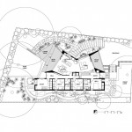
To start with, we split the house into separate sleeping and living zones, linked by a shared hallway. The hallway is not completely closed off, ensuring a dialogue is maintained between each zone, but supporting different uses of spaces as the family grows.
High levels of sustainability are a feature of all Adam Dettrick Architects projects, and this particular project has a focus on getting the passive design principles right to ensure energy efficiency and liability in the most economical way possible. The house is heavily insulated, well orientated and designed to offer great natural ventilation. Windows are thermally broken aluminium with low-e double glazing to optimise thermal performance.
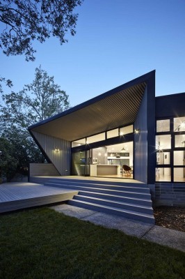
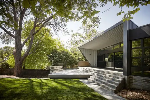
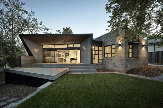
The site is addressed with the living areas open to the north at the rear, harnessing the winter sun and addressing an elegant eucalypt. At the front they twist dramatically to the south east, catching beautiful views over Scott St and across rolling country towards the distant Cuumbuen Nature Reserve. Walls and roof extend beyond the living areas at each end of the house to shelter outdoor space and offer privacy to both occupants and neighbours.
What are your favourite features and why?
I love the way the living areas look north to harness the winter sun and address an elegant eucalypt at the rear, but then curve around to face south east capturing views over the street. I also like the way the bedroom roofs pop up above the main house to catch winter sun through their highlight windows.
What was your biggest challenge?
The diagonally sloping site was a challenge – ensuring the house connected with the back yard, and providing some usable outdoor spaces to facilitate indoor/outdoor living. We had a tight budget too, but often a tight budget brings out the best in client, architect and builder, and it certainly did in this project. I think the result speaks for itself.
How did you overcome it?
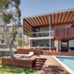
I dealt with the sloping site by using split level decks to connect the living areas with the rear. The lower deck was set to just high enough to connect with a new terraced lawn area. The result was a flat lawn for the kids to play, and two good sized decks connecting with the house and looking over the lawn.
How did the homeowners react to their new home?
They love it! I always enjoy hearing how clients discover things about their house that they weren’t expecting or hadn’t thought would be so uplifting, like a particular view, or how much winter sun they get in their living room. Even though we talk about many of these features in the design phase, experiencing the real thing is often much more powerful than trying to imagine it.
Talk me through each rooms and your favourite elements/products?
The bedroom wing has a master bedroom with ensuite, together with 2nd and third bedrooms, a main bathroom, and a multi-purpose music room/study/guest room.
The cabinets are designed to be as simple as possible, with factory painted finishes in white, and no handles to clutter the clean lines. The Blum Tipon ‘push to open’ system is used throughout for dawers and doors.
All the bedrooms have raked ceilings to allow north facing highlight windows to allow winter sun penetration. The highlight windows also combine with lower level windows on the opposite wall to encourage natural air flow through the ‘stack effect’.
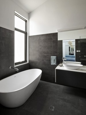
The ensuite benefits from the sculptural qualities of the Fienza Bahama stone bath and basin, along with the Caroma Cube wall hung toilet suite. Tiles are from Rockson in Sydney.
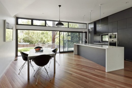
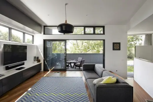
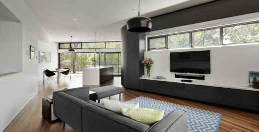
The living areas are all about capturing winter sun at the rear, and views across rolling hills to the south east. The living areas open to the outside via large sliding stacker doors from AWS Vantage. These doors are thermally broken aluminium, with low-e double glazing to optimise energy efficiency and comfort.
Internally, the kitchen and wall unit are Laminex Charcoal, with Quantum Quartz Bianco Venato Quartz benchtops. There are no handles on the cabinets in these spaces either, being push-to-open just like the bedrooms.
Further information on the house
Summary
Form follows function in this new home in Narrabundah, with different activities within the house uniquely expressed on the exterior. Spatially the home is defined by the separation of living areas from sleeping areas with a central hallway. The living areas open to the north at the rear, harnessing the winter sun and addressing an elegant eucalypt. At the front they twist dramatically to the south east, catching beautiful views over Scott St and across rolling country towards the distant Cuumbuen Nature Reserve.
Walls and roof telescope beyond the living areas at each end of the house to shelter outdoor space and offer privacy to both occupants and neighbours. Sustainability principles and simple passive design techniques underpin the environmental performance of this home, with good orientation, sun shading, double glazing, heavy insulation and non-toxic materials combining to provide year round comfort and liveability. Exterior materials are utilitarian – chosen for their robustness, character and economy.
Concepts: Key concepts that underpin this house are optimising orientation and views on a sloping site, spatial planning to support modern family needs, and sustainability through good passive design techniques. Form is determined first through delinealiation of sleeping and living areas, then the expression of each wing specific to its purpose. Exterior materials are utilitarian – chosen for their robustness, economy and beauty.
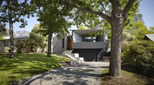
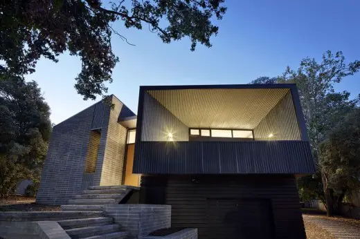
Public and cultural benefits: The design seeks to engage with the street with prominent front steps up to the entry, and a balcony overlooking the street. The steps are conceived as a semi-public space, where the daily comings and goings of the family are visible, engaging the house and its occupants with the street life in the local area. The balcony also engages the house with the street, but with privacy preserved by its colorbond balustrade. Secluded private open space is provided at the rear of the home without expense to the public realm, which benefits from the open front yard the windows addressing the street.
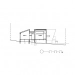
Built Form and Context: Form is defined by the separation of living areas and sleeping areas by a central hallway. The sleeping areas are located to the south, with their pitched roof rising above the lower hallway roof to provide north facing clerestory windows to the bedrooms. The bow shaped living areas face north at the rear, catching winter sun and addressing an elegant eucalypt. At the front the plan rotates towards the south east, catching beautiful views over Scott St and across rolling country towards the distant Cuumbuen Nature Reserve. Walls and roof telescope beyond the living areas at each end of the house to shelter outdoor space and offer privacy to both occupants and neighbours.
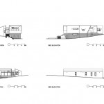
The steep falling site allows the garage to be located under the house at the front, saving space and providing elevated views to the living areas above. At the rear, the house returns to single storey, and living areas flow smoothly into the back yard.
The building sits well within its context – building height is kept low near the south boundary, minimising overshadowing on the adjoining property. On the other side the bow shaped plan creates a courtyard facing the neighbour, minimising any impact on that property.
Materials have been chosen for their economy, durability and character. Plain concrete blocks enclose the bedroom wing, stack bonded to contain and control their coarseness. The heavy masonry helps tie down the light weight clad living areas. Colorbond cladding in has been used for the living areas as a counterpoint to the bedroom wing.
Program: The client’s brief was to provide a home where the family can interact, seek privacy, entertain, play and grow. Sustainability and affordability were other key drivers. Separate bedroom and living wings are connected by a shared hallway. The hallway is not closed off completely to the living areas, so the sleeping areas are not removed, but not isolated.
Environmental value: Good passive design principles underpin this 6.7 star energy efficient home. Careful siting optimises north orientation of living areas and private open space. Natural ventilation is maximised, with all rooms having multiple windows to encourage crossflow ventilation and catch prevailing breezes. Thermal insulation is optimised with thermally broken aluminium windows frames and low-e double glazing throughout, and high density bulk insulation to walls, floors and roof. Appropriate levels of glazing are used throughout the house to provide natural light without unwanted heat gain/heat loss caused by over glazing. Planning ensures the house will have a ‘long life and loose fit’ with flexible, adaptable and multi-use spaces suited to changing living patterns and family sizes.
Social value: The design seeks to engage with the public realm by capitalising on its prominent hillside location. Scott St is addressed in open and social ways. Open steps up to the house engage the house and its occupants with the street life in the local area. The balcony looking over the street also provides a connection with public realm. The balcony has a solid balustrade to encourage the use of the balcony, and therefore an engagement with the street (transparent balustrades are socially negative due to people feeling too exposed to occupy them, with balconies unused).
Photographs: Michael Downes, UA Creative
Narrabundah House, Canberra, Australian Capital Territory, images / information from Adam Dettrick Architects
Location: Narrabundah, Canberra, Australian Capital Territory, Australia
Canberra Architecture Designs
Canberra Buildings – architectural selection below:
The AB House, Hackett, ACT
Design: Ben Walker Architects
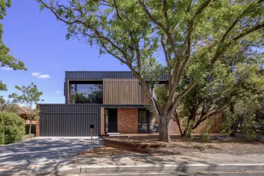
photograph : Ben Guthrie
AB House
The house espouses a playful engagement with the clients’ desire to demonstrate their interest in bespoke and whimsical design strategies. The sense of playfulness is most evident in the cantilevered rear balconies, in the powder room, and in hidden doorways that are “dressed” as joinery elements.
Little National Hotel, Barton, Canberra, ACT
Design: Mathieson Architects
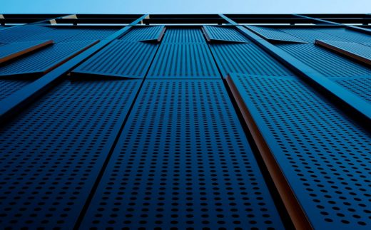
photograph : Romello Pereira
Little National Hotel
Little National Hotel is located a short distance from Parliament House. The 120 room hotel, with architecture and interior design by Mathieson Architects, embraces the concept of ‘affordable luxury’, and is located on top of a four-level carpark.
Architecture in Australia
Australian Architecture Designs – architectural selection below:
Australian Architect Offices : Studio Listings
Design: Woods Bagot Architects
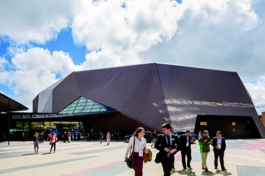
photo : Trevor Mein
Adelaide Convention Centre Building
Comments for the Canberra House – Australian Capital Territory Residence page welcome


