Miesian Design, Orthogonal Architecture, Rectilinear Building, Global Projects
Miesian Architecture
Architectural Article by James Khamsi for e-architect
16 Oct 2013
UP / DOWN / POSITIVE / NEGATIVE
Miesian Architecture Design
James Khamsi
“Miesian” is a term that architectural critics trot out when presented with a project that involves strict orthogonality, grids and rectangular form. In its proper usage, it connotes the mystical transformation of the generic and efficient into the beautiful and transcendent.
To be “Miesian” is to be serious and seriously architectural. It should be a badge that is awarded sparingly to certain projects that ascribe to and excel at a certain mode of rigor; but unfortunately, this is often not the case. These days, “Miesian” gets tossed about too liberally in relation to any old boxy and gridded building.
OMA’s Shenzhen Stock Exchange, Lifschutz Davidson Sandilands’s JW3 community center and Lahdelma & Mahlamäki Architects’ Museum of the History of the Polish Jews are three projects that could, to varying degrees, be deemed Miesian. And certainly, in the case of OMA’s project, it’s a comparison the architects seem to beg. But I’d like to put the discussion of right angles and grids aside and discuss another possible kind of Miesianism that these projects invoke.
This other kind is not about formal tropes, it’s about urban tactics.
Recall Mies Van der Rohe’s later North American developments such as the Chicago Federal Center, the Toronto Dominion Center or Montreal’s Westmont square.
A pair of drawings of Mies van der Rohe’s TD Center in Toronto:

drawing from James Khamsi
There, dark volumes sit atop a clean and clear gridded ground surfaces. They were – and still are – stunning in the way they brought lucid and abstract open space to the core of the city. To achieve this effect, Mies took all the messy podium functions such as cafes and dry cleaners, and pushed them underground in to a new genre of basement shopping center.
The lesson to be learned from these projects is that although the form open space is legible in plan, the tactics that lead to its creation are revealed in section.
In the intervening decades, this approach to urbanism has drawn its fair share of critics. From the 70’s onward, various “new urbanist” movements have advocated for the return of the podium, for the continuity of street elevations and for the activation of the street-scape though commencial brands. These dictums have been adopted by the design and policy communities as urban best practice.
Strikingly, the three projects under consideration here wave aside this classically derived urbanism of good streets. They all play a game of pushing and pulling programs and datum lines, but they deliberately break Mies’ the orthodox rules. In doing so, they create novel ways to open space within the city.
JW3 Jewish Community Centre, London, England
Design: Lifschutz Davidson Sandilands

photo © Hufton+Crow
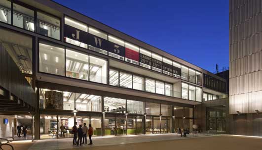
In designing the JW3 Community center, Lifschutz Davidson Sandilands sought to provide their building with a communal outdoor space. They must have quickly realized that Finchley Road, a busy thoroughfare in North London, is not the most hospitable site for such a space.
To resolve this dichotomy, they take advantage of their site’s slope, excavate and push the community plaza down one level. In a tricky reversal of Mies’ submersion of his podium to gain open space, Lifschutz Davidson Sandilands, submerge their open space to gain calm and quiet. A set of taught archi-tectonic volumes frame the space in three dimensions: the horizontal bar of the community center defines its back; a narrow, vertically oriented tower of apartments holds its side, and a generously proportioned bridge, which links the centre’s entrance to the sidewalk, implies its top. The architects revel in the language and tactics of Modernist plasticity, but produce a novel urban space for contemporary London.
Museum of the History of the Polish Jews, Warsaw
Design: Lahdelma & Mahlamäki Architects

photo : Juha Salminent
Of the three projects, Lahdelma & Mahlamäki Architects’ Museum of the History of the Polish Jews takes strongest formal steps away from Miesian orthodoxy, as curvaceous concrete walls frame a public passage through the project’s rectilinear glass volume. If anything, this project uses linearity and rectangularity as a foil to offset a collection of more expressively shaped openings and passages.
In section, though, this project might be the most faithful to the Miesian urban tactics. The project’s sections reveal how the architects take advantage of the site’s topography to smuggle some unruly program in underground. The sleight of hand allows the project to maintain a geometrically balanced composition of a square shaped solid next to a square shaped void.
Shenzhen Stock Exchange Headquarters, China
Design: OMA

image courtesy of OMA ; photography by Philippe Ruault
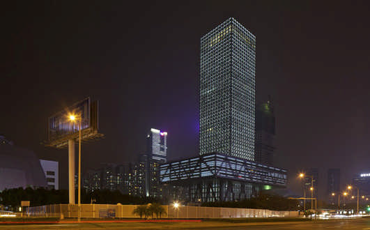
OMA’s Shenzen Stock Exchange is a bodacious take on Miesian precedent.
Throughout his career, Rem Koolhaas’ has had a playful reverence for Mies, and this project signals that his Mieschievous spirit is still alive. Here, OMA found that that if you play Mies’ game backwards, you get double the results. Whereas Mies submerged the podium to create one open space in the city, OMA lift the base and produce two. At the ground level, the elevated podium shades a hard-scaped plaza that surrounds the tower, while its roof is home to a landscaped garden.
The gesture of elevating the podium gives the project three distinct volumes. Though they all are square in plan, they have different widths, vertical proportions and programs. To restore a sense of unity to the project and damp the obvious differences between the volumes, all three are clad in a restrained pallet of dark metals and shaded glazing – perhaps a subtle nod to their Miesian precedents. This coordination of tones and finishes allows the tower to read like a Brancusi totem rather than a pile of boxes.
As a discipline, urbanism relies heavily on the plan. I suppose there’s a reason they call it planning. These three projects demonstrate how innovative open spaces can be brought to the city when urbanism is considered in three dimensions.
James Khamsi
James Khamsi is an architect and principle of FIRM. He practices in New York and Toronto.
Location: Toronto, Ontario, Canada
Architectural Articles
Orthogonal Architecture by Richard Weston
Heroic Architecture by Douglas Klahr
Modernist Architecture by François Lévy
Globalisation Architecture by Trevor Tucker
Barclays Center Brooklyn by Dimple Soni
Comments / photos for the Miesian Architecture Design article page welcome

