How Furniture Can Complement Amazing Architectural Designs, Living Rooms, Property
How Furniture Can Complement Amazing Architectural Designs
2 Aug 2019
There is a big difference in the design functions which are required in architecture and interior designing. People think of architecture as the driving shaft in this world and they view furniture as a minor subject.
These assumptions are very wrong. Furniture is a very important and overlooked factor that can make or break your design. The leaders in the interior design and architecture industries have reached some clever ways to combine furnishing and architecture.
A successful project must treat furniture as an integrated part of the design by studying the building’s atmosphere to execute the desired outcome. The designer must understand the client’s taste, needs, preferred style, requirements, and preferences to be able to turn the house into a home. A house is like a mannequin, and the interior details such as the furniture, décor, lighting, and colors are like the clothes you choose to dress the mannequin in. For all of them to come together, you need to learn how your furniture can complement your design. Why not check out Retro Furniture.
There are a few ways that furniture is used to complement the architectural design which we have collected some of them right here, for you to get a full grasp on this subject.
Complement and contrast
Picking your furniture options and styles while considering the architectural design of your house is the best method to execute a good design. After studying the design, you can either choose furniture the complement it or items that contrast. For example, for a Victorian house, it would only make sense to go with Victorian furniture and accessories to match the design. This is one way of complimenting the design. But that’s not the only available option.
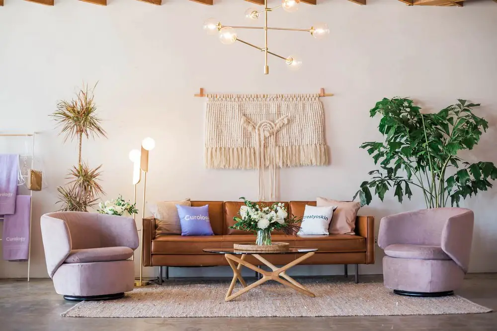
Choosing items that will contrast with this design such as deciding on decorating your house with modern furniture items will add to your design so much. This way of decorating is often overlooked, even though it’s very unique and interesting. Combining these two different styles will create a cohesive design that will stand out from the normal way of decorating.
There is also a different technique that you can follow in this case. You can mix between French furniture and modern furniture in adjacent rooms. In the same house, you can choose to go for the best furniture items that complement the design in one room, and items that will contrast with the design style in another room. This technique will create a unique and cohesive interior design scheme. The concept of complementing or contrasting goes way beyond the style of design and furniture.
You can apply the same concepts to colors and fabrics. There is an important color theory that states that two opposite colors on the color wheel make one another standout. You can apply this theory when you are choosing the furniture style for your house. If the walls are painted in one color, choose a contrasting color for your furniture. You can also mix and match by choosing some of the color tones that match the walls and other items that contrast with them. You can play with your design however you want to be able to end up with a satisfying outcome.
You can embrace low ceilings or high ceilings with your furniture
Rooms with low ceilings might feel squashed without the right lighting and furniture items. You can create an illusion that the room isn’t squashed by choosing low slung furniture. It’s also better to match the color of the furniture with the paint color of the room and pushing the furniture to the corners. The low furniture will give a sense of height to the room. Steer away from layering vertically any items of furniture or accessories in these rooms.
Speaking of the accessories, installing ceiling-height glass doors in low ceiling rooms will create a feeling of space. You can either leave them without any curtains to allow natural light in the room or you can choose to install curtains. These glass doors will provide natural lighting, which will make a huge difference in any small room; it will make it feel bright, light, and larger. But if you have decided to add some curtains, they are better to be hung higher and close to the ceiling to add up vertically to the room.
You can also add elegance to your home with an antique French Mirror. They come in a variety of styles, shapes and sizes to suit any room.
Rooms with high ceilings are not as challenging as the other rooms. You can decide to create a minimal look with large empty spaces. Or you can choose to fill the space with large pieces of furniture. The choice is yours. But the main benefit that you get with high ceilings is the availability to add any large pieces of artwork or furniture.
You can choose one statement piece as the centerpiece that your design can revolve around or multiple pieces. You can use the concept of contract in scale as well to play with how the room feels. For example, you can choose large pieces of furniture to match with a small table that have a large floral. Layering accessories and items of furniture here vertically will help you design.
Achieve a timeless design with your furniture
A Victorian house can still look timeless with the right set of choices that complement it. Instead of creating a design that will look tired and outdated in a few years, we have collected some tips and tricks to create the ultimate timeless house that will still look fresh and current even after a long period.
- Steer away from trends – A timeless design won’t be outdated in a couple of years. Unlike temporary and trendy designs, it has a staying power to stay current. If you want to create something relevant either yesterday, today or tomorrow, you will want to seek classic designs, styles, and colors. The classic design is enduring. The design itself can be inspired by the Greek architecture with the long strong columns and stripes.That’s for the architectural design itself. For the interior details, it’s better to go for natural resources such as wood, stones, bricks, and cotton. Trendy houses are all about following the soon-to-be-ended craze, they are avant-garde and fussy. While a timeless house is subtle, simple, and sophisticated. But you can still incorporate some trendy elements in your design like using adding two beanbags to the outdoor area or placing an antique piece of furniture against a wall that you are hanging a large piece of contemporary artwork on. In the overall sense, the design has to be balanced.
- It has to be functional yet interesting – You should focus that the main pieces of furniture in the house you are trying to put together are functional. A classic couch or a chair that is comfortable is better than picking something uncomfortable to go with the trend like choosing an oversized puffy couch. While the pieces of furniture that help create the timeless look might appear boring on their own, once they are incorporated into your design with all the accessories and your touch, they will end up creating the perfect design that you are aiming for.
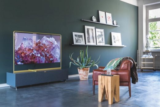
- Neutrals and traditional colors – You should avoid patterns, bold colors, and overly decorated spaces. But if you want to add these types of statements, choose to apply them only to small pieces and not the whole design. You could add pieces of contemporary artwork, antiques, and some accent pieces to make the room more colorful and interesting.However, the paint that you are going to use for the walls and the pieces of furniture should be colored in neutral colors. Different tones of white, beige, brown, and grays make the perfect color palette for the timeless look. Or you can go for darker tones such as blues, blacks, and dark greens.
A few tips to consider and some mistakes to avoid while decorating
Even with all the articles, magazines, and TV shows about decorating your house, some of us still end up doing some typical mistakes that we could easily avoid. To make our lives easier, we have collected some of the do’s and don’ts that you need to apply when you are choosing the right furniture that will complement your house design and add to it.
Color schemes should be limited
Even if you are not after the timeless look we have talked about, it’s still better to limit your color palette with a few colors of your choice. It’s better if you choose three or four colors, maximum, to build your design with. And it’s even better if you could select two out of these color options to be neutrals. For example, you can mix black and white and make them pop by adding some reds, or dark greens.
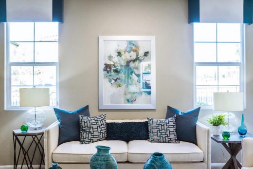
If you have decided to build your design with pieces of wood furniture, you need to bear your color palette in mind when you are choosing the shades for your furniture. For example, if your wall is painted in green, it would be ideal if you choose your pieces to be warm honey-toned pine wood. If you have an interesting wall painted in bright blue, you can add a piece of furniture in any orange tone to complement and highlight both of them.
Paint after you finish your layout
Have you ever faced this problem with one of your old houses where you paint the rooms and end up with furniture that you don’t know where to place? Or a lot of designs that you wish you could apply, but you are limited by the colors you paint your walls with? That’s why it’s always better to imagine how you want your house to look like, choose all the furniture pieces, and arrange them, then choose the colors.
Take a sample with you so you can get the perfect match before going to the paint store. If you want to test how a color looks before painting the entire wall, you can paint a small piece of cardboard and tape it on the wall to be able to see and imagine the outcome. Don’t forget to research and read about the psychology of color before you decide on the paint colors you want to go for.
Scaling is everything
Like we have mentioned before, you can manipulate how rooms look and feel just by playing with the scale of objects. Other than that, you can highlight something by placing it with other objects that have different scales. For example, if you want to highlight a small antique, you can play with the scales by placing it on a regular-sized table next to a large and tall lamp and exactly the opposite if you want to highlight a large piece of art or furniture.
Contrast doesn’t mean random pattern
Repetition is the key to execute a polished design. Adding a contemporary piece of furniture in a classic-designed room will create contrast which will add a stylish and unique twist to your rooms. But following random patterns and adding opposite pieces aimlessly will only look messy and uneasy on the eyes. Plan your pattern and follow it for your furniture to complement your design. Choosing a focal point in the room also helps a lot in creating the perfect design. It can be a tall mirror, a piece of artwork, an interesting piece of furniture, and so on. Build your design around the focal point to highlight it to make the room seem more interesting and unique.
The importance of furniture in interior design shouldn’t be overlooked. We all know how important our furniture is when it comes to functionality. However, we need to understand how crucial it is for making or breaking any architectural design.
It plays a great role in setting the tone, vibes, and the overall design of your house. You need to study this field and apply its rules to create a stylish design. But furniture is your chance to add your personal touch. Play around and try new things. Mix and match to add some twists that will make your home more personalized and unique.
Furniture Design
Furniture Posts
Vital rules of bedroom furniture placements
Ideas for arranging a living room with corner sofas
Bauhaus inspired architecture and furniture
Building Articles
Comments / photos for the How Furniture Can Complement Amazing Architectural Designs page welcome


