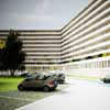
Kleiburg Bijlmermeer apartment building, Amsterdam housing design images, Netherlands architecture
Kleiburg, Bijlmermeer : Amsterdam Apartment Building
New Housing in Holland: Dutch Residential Property design by NL Architects
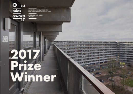
DEFLAT KLEIBURG in Amsterdam by NL architects and XVW architectuur Wins Mies van der Rohe 2017 Awards
DeFlat Kleiburg in Amsterdam is the 2017 Winner of Prize. The architects are NL Architects and XVW architectuur and the client Kondor WesselsVastgoed.
12 May 2017
NL Architects – Latest Designs
DeFlat is an innovative renovation of one of the biggest apartment buildings in The Netherlands called Kleiburg, a bend slab with 500 apartments in Amsterdam’s Bijlmermeer neighbourhood. Consortium DeFlat rescued the building from the wrecking ball by turning it into a “Klusflat”, meaning that the inhabitants renovate their apartments by themselves.
Mies van der Rohe Awards: European Union Prize Winner in 2017
With these two awards the Jury of the Prize highlights the quality and relevance of the collective housing program.
For the first time the main Award goes to a project of renovation of an existing building.
On May 26 the Awards Ceremony will take place at the Mies van der Rohe Pavilion in Barcelona.
Photos: Marcel van der Burg
NL11
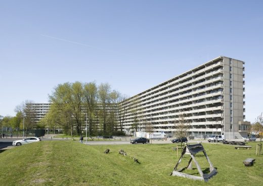
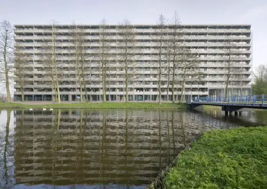
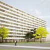
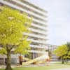
De Flat is an innovative renovation of one of the biggest apartment buildings in the NL called Kleiburg, a bent slab with 500 apartments, 400 meter long, 10 + 1 stories high.
Consortium De FLAT rescued the building from the wracking ball by turning it into a Klusflat meaning that the inhabitants renovate their apartments by themselves.
Kleiburg is located in the Bijlmermeer, a CIAM inspired residential expansion of Amsterdam.
A renewal operation started mid nineties. Many of the characteristic honeycomb slabs were replaced by suburban substance, by ‘normality’.
Kleiburg was the last building in the area still in its original state; in a way it is the “last man standing in the war on modernism”.
The idea is to renovate the main structure -elevators, galleries, installations- but to leave the apartments unfinished and unfurnished: no kitchen, no shower, no heating, no rooms. This minimizes the initial investments and as such creates a new business model for housing in the Netherlands.
Most attempts to renovate residential slabs in the Bijlmer had focused on differentiation. The objective: to get rid of the uniformity, to ‘humanize’ the architecture. By many, repetition was perceived as evil.
But after three decades of individualization, fragmentation, atomization it seems an attractive idea to actually strengthen unity: Revamp the Whole!
It is time to embrace what is already there, to reveal and emphasize the intrinsic beauty, to Sublimize!
In the eighties three shafts had been added including extra elevators: they looked ‘original’ but they introduced disruptive verticality. It turned out that these concrete additions could be removed: the elevators could actually be placed inside the cores, the brutal beauty of the horizontal balusters could be restored.
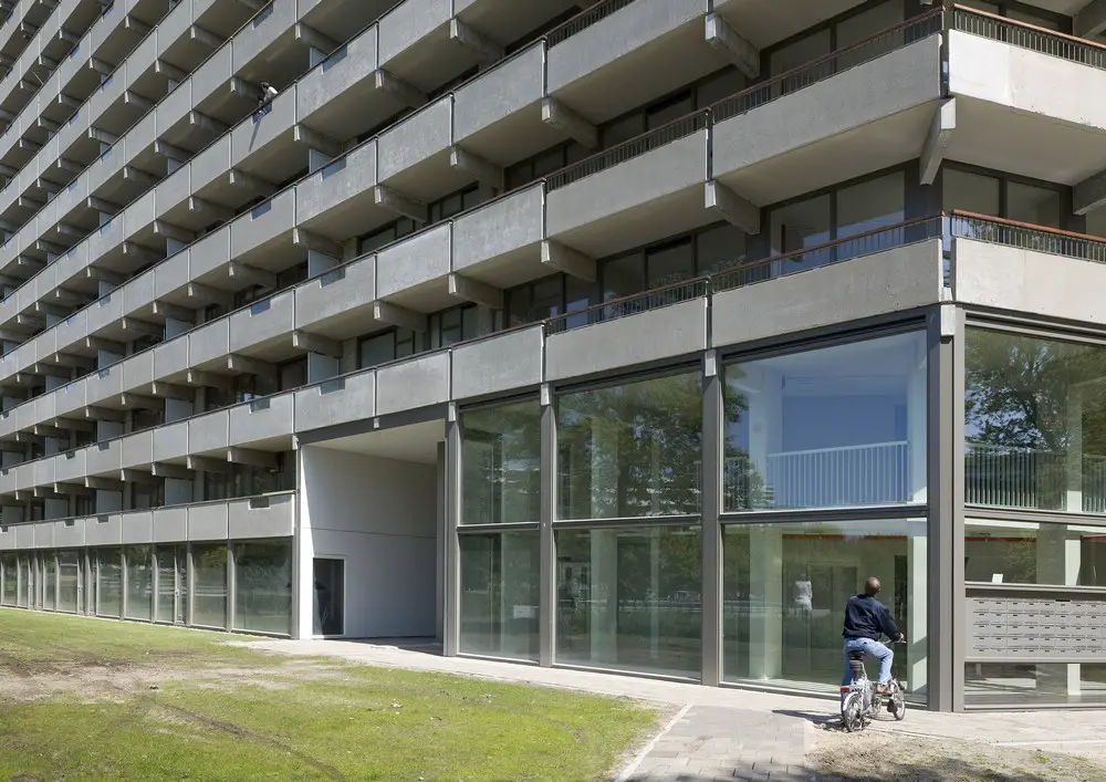
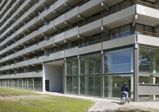
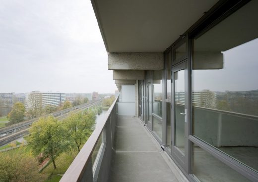
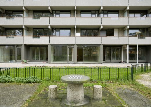
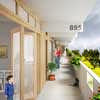
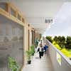
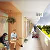
On the galleries the division between inside and outside was rather defensive: closed, not very welcoming. The closed parts of the facade were replaced with double glass. By opening-up the facade the ‘interface’ becomes a personal carrier of the identity of the inhabitants, even with curtains closed…
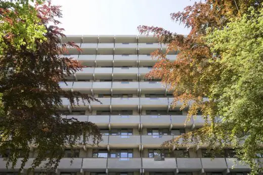
Sandblasting the painted balusters revealed the sensational softness of the pre-cast concrete: better than travertine!
Originally the storage spaces for all the units were located on ground level. The impenetrable storerooms created a ‘dead zone’ at the foot of the building. By positioning the storage on each floor we could free up the ground floor for inhabitation, activating it to create a social base and embedding the ‘beast’ in the park.
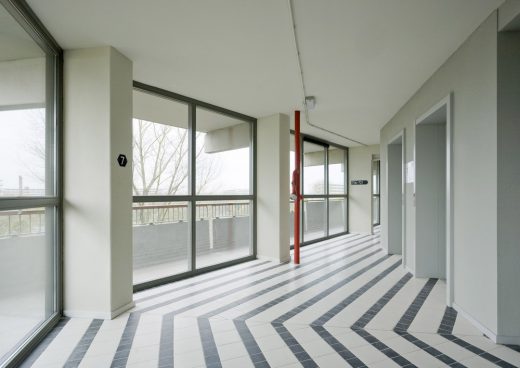
More generous, double height connections between both sides of the building were formed creating scenic relationships.
Gallery illumination has a tendency to be very dominant in the perception of apartment buildings with single loaded access. The intensity of the lamps that light up the front doors on the open-air corridors overrules the glow of the individual units. The warm ‘bernstein’ radiance of the apartments is ‘obscured’ by a screen of cold lights. But what if the gallery lights worked with energy saving motion detectors? The individual units now define the appearance. Every passer-by a shooting star!
TEXT NOMINATOR:
Tom Avermaete
The renovation of the Kleiburg apartment block in Amsterdam by NL Architects illustrates how the ‘actions’ of an existing building and people can be an important source for the architecture. In this project the existing, 1960s honeycomb apartment block in the notorious Bijlmer district, was the starting point. It is a tribute to NL Architects’ insight that instead of staking everything on cosmetic interventions, they allowed the material, formal and typological energy of the building to speak once more.
The building was not tackled according to the canonical formulas of adding terraces, redefining the elevations by way of a new cladding, or transforming the typology of the apartments. Instead, the architects opted for a completely different approach in which the potential inherent in the rationality of the modern artefact of the Kleiburg building was pivotal.
NL Architects recognized that the rational structure of the Kleiburg embodied a huge potential energy, which could be unlocked in a new way and thus activated. To maximize the expression of that energy, the architects returned to the fundamentals of the building. Its materiality was restored, the communal areas were returned to their original form and supplemented with large communal lobbies. The structure of the building was laid bare, after which the apartments were offered to future residents as bare shells.
In contrast to other buildings by NL Architects, the focus here was not on devising an impressive form, but rather on preparing a basic form for other actors. The role of the architectural project is reduced here to the definition of impulses, which have little value as such, but acquire their significance in the interplay with a future action in the built environment. The project articulates a recognizable basis in which other architects, developers and residents can subsequently intervene.
The architectural project is thus redefined as anticipating, and accommodating, the multiple actions of all these actors in the built environment. The architect’s contribution lies in recognizing the power of this communal action and anticipating it using architectural means.
10 Dec 2012
Kleiburg
Bijlmermeer, Amsterdam, The Netherlands
Design: NL Architects
Kleiburg in Bijlmermeer is one of the biggest apartment buildings in the Netherlands: a bend slab with 500 apartments, 400 meter long, 10 + 1 stories high.
Kleiburg is located in the Bijlmermeer, a CIAM inspired residential expansion of Amsterdam designed in the sixties by Siegfried Nassuth of the city planning department. De Bijlmer was intended as a green, light and spacious alternative for the -at that time- disintegrating inner city.
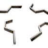
The Bijlmer was designed as a single project. A composition of slabs based on a hexagonal grid. An attempt to create a vertical garden city.
Traffic modalities were radically separated; cars and bicycles would no longer share the same space.
The area houses almost 100,000 people of over 150 nationalities. In 2009 there were 140 Christian Congregations alone.
The Bijlmermeer had a very optimistic start. But soon the enthusiasm for this radical residential area turned into fear-for-the-unknown. Fed by heavily economized execution, bad publicity and lack of understanding the Bijlmer turned into a freak circus of urbanism.
A renewal operation started mid nineties. The characteristic honeycomb slabs were replaced by mostly suburban substance, by ‘normality’.
It was decided to keep the most emblematic area -flanking the stunning, for-ever-futuristic elevated subway line- intact. The so-called Bijlmer Museum came into being; a compact refuge for Bijlmer Believers. Kleiburg is the cornerstone of the remaining ensemble.
Kleiburg is the last building in the area still in its original state; in a way it is the “last man standing in the war on modernism”.
Housing Corporation Rochdale, however, had plans to demolish it. They calculated that a thorough renovation would cost about 70 million Euro…
But bulldozing the masterpiece by architect Ottenhof will lead to a collapse of the magnificent urban composition: an unbearable thought.
In anticipation to the fierce resistance by ‘believers’ and pressure by the local government, that hopes to avert demolition, Rochdale launched a campaign to rescue the building: Kleiburg was offered for ONE EURO in an attempt to catalyze alternative, economically viable plans.
Over 50 parties responded with a range of ideas from student housing to woon/werk-units, to homes for the homeless.
Four teams were selected to further develop their ideas. Ultimately Consortium De FLAT consisting of KondorWessels Vastgoed, Hendriks CPO, Vireo Vastgoed en Hollands Licht, was chosen with their proposal to turn Kleiburg into a Klusflat. ‘Klussen’ translates as to do it yourself or ‘doing odd jobs’.
The future residents can buy the shell for an unprecedentedly low price and then renovate it entirely according to their own wishes: DIY. Owning an ideal home suddenly comes within reach…
The ambition is to open up new ways to live, to offer new typologies by combining two flats (or even more!) into one, by making vertical and horizontal connections.
Many attempts to renovate residential slabs in the Bijlmer, Kleiburg in particular, have focused on differentiation, the objective, presumably, to get rid of the uniformity, the repetition, to ‘humanize’ the architecture.
After two decades of individualization and fragmentation and atomization it seems an attractive idea to actually strengthen unity: Revamp the Whole!
It is time to embrace what is already there, to emphasize the intrinsic beauty. Sublimize!
In the eighties three shafts have been added including extra elevators: although they look ‘original’ they don’t belong there, they introduce disruptive verticality. But it turns out that these concrete additions can be removed. There still enough space in the existing shafts; the elevators can actually be placed inside the existing cores, the brutal beauty of the horizontal balusters can be restored.
The current division between inside and outside is defensive: closed, rather unfriendly. There is room for improvement. Can we imagine opening-up the facade to create a ‘border’ that is more inviting?
The idea is to create a catalogue of facade modules. The future inhabitants will be able to choose a set of window frames that matches the customized layout of their FLATs: Openable parts, sliding doors, double doors, a set-back that creates space for plants or people. As such a personal ‘interface’ will come into being that will activate the galleries.
The new facade will be made of wood, it will be tactile. The facade design creates a ‘filter’. It aspires to render a form of harmony, or homogeneity; the assembled individuality remains coherent.
In the age of iPad, ‘abstraction’ can make a comeback. Kleiburg’s minimal ‘hardware’ is already magnificent. And now the ‘interface’ has the chance to become diversified and personalized.
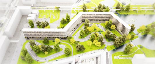
One of the central ideas of the renewal of the Bijlmer was to lower the elevated roads and to demolish the multi-story parking garages. From now on cars will be introduced on ground level. This means sacrificing the most positive feature, the green space. A devilish dilemma…
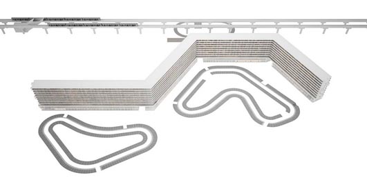
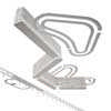
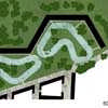
The zoning law prescribes the parking to be positioned directly next to the building. Can we explore a more generous direction? What if we examine which trees are valuable and ‘bend’ the road around them to create a parkway with the elegant curves of a race track? Zocher meets Zandvoort: a combination of park and parking.
Kleiburg Bijlmermeer, Amsterdam – Building Information
Kleiburg De Flat: Residential Revamp of a Modern Monument, Amsterdam Zuidoost 2012-13
Client: Consortium De Flat:KondorWessels Vastgoed, Hendriks CPO, Vireo Vastgoed, Hollands Licht / Martijn Blom
Architect: NL Architects: Pieter Bannnenberg, Walter van Dijk, Kamiel Klaasse Rappange & Partners Architecten bv
Team: Guus Peters with Iwan Hameleers, Giulia Pastore and Fouad Addou, Matthew Davis, Paul Ducom, Soo Kyung Chun, Adrian Mans, Paulo Dos Sousa, Carmen Valtierra de Luis
Structure: Van Rossum Raadgevende Ingenieurs Amsterdam bv
Building Physics: Schreuder Groep
Installations: HOMIJ Technische installaties bv, Amsterdam
Contractor: KondorWessels Amsterdam bv
Size: Gross floor area 65.600m², net floor area 59.400m²
Kleiburg images / information from NL Architects
Location: Bijlmermeer, Amsterdam, The Netherlands
Dutch Architecture Designs
Dutch Architectural Designs – selection:
Amsterdam Architecture – contemporary building information
picture © Adrian Welch
Amsterdam Buildings – historic building information
photo © AW
De Kameleon, The Bijlmer, Amsterdam
Design: NL Architects
photo : Luuk Kramer
Stedelijk Museum Facade – The Bathtub
BenthemCrouwel Architects
Stedelijk Museum Amsterdam building
Amsterdam Architecture Center : Arcam
René van Zuuk Architekten
Amsterdam Architecture Center
Property Design
Contemporary Property Designs – recent architectural selection from e-architect below:
Comments / photos for the Kleiburg Apartments – Amsterdam Residential Architecture page welcome

