Sassen Residence, Cape Town budget real estate, South African home, Disa River property photos
Sassen Residence in Cape Town
13 Jan 2022
Design: SALT Architects
Location: Cape Town, South Africa
Photos by Linda Smal
Sassen Residence – Modern Cape Town Home
Nestled in a valley next to the Disa River, this virgin plot of land is surrounded by various peaks of Table Mountain National Park in Cape Town, South Africa. The larger area is known as Hout Bay, with the Afrikaans word “hout” meaning wood, referencing the large number of Yellow Wood trees the original Dutch Settlers found in the area when first arriving in the Cape.
The area has mostly kept its rural character throughout the development of the greater Cape Town area with some of the larger plots exceeding a hectare in size.
Upon first discussion with the client SALT Architects agreed that the new dwelling needs to draw from the rural like typology of farm buildings in the area, whilst still accommodating contemporary needs. Furthermore, two dwellings already existed on the property, and the placement of the building needed to be done in such a way that the feeling of spaciousness of the area is maintained.
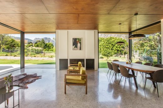
The footprint was consequently decided to take shape as close as possible to the river without compromising the ecology of the Disa River. By placing the building closer to the south-eastern corner, only one of the other homes on the property is from the new home. Also, by placing it so far back, uninterrupted views of Table Mountain’s Geelklip Buttress and Myburgh Kloof are afforded.
Upon establishing the position of the building on the site, placement of the functions could be logically deducted. The car garage, scullery and service yard is placed towards the western boundary of the site: closest to the neighbouring property. This allowed the plan to open up towards the north and east of the property. The north-eastern corner is arguably the most important part of the layout.
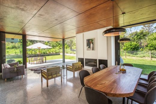
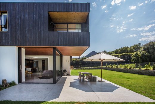
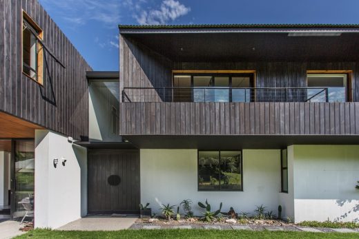
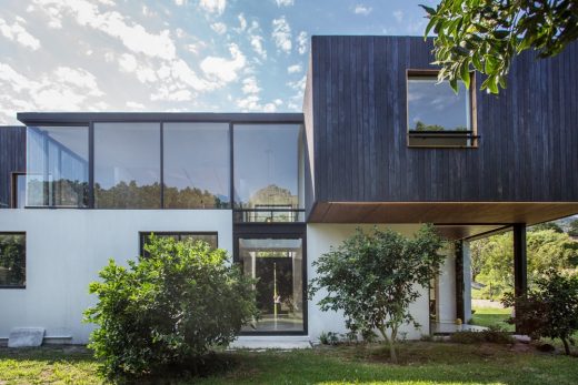
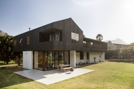
Here the living area opens up via cavity sliding glass doors to an external living area covered by the cantilevering main bedroom above. The importance of this corner is emphasised with the reference to the traditional barn like gable on the main bedroom façade.
The roof forms an integral part to the design and was conceived specifically to address the scale of the building in the landscape. The traditional gable ends taper towards a straight line, thereby referencing traditional architecture without an imposing scale. The main entrance to the building acts as link between the mountains to the north, and the river to the south.
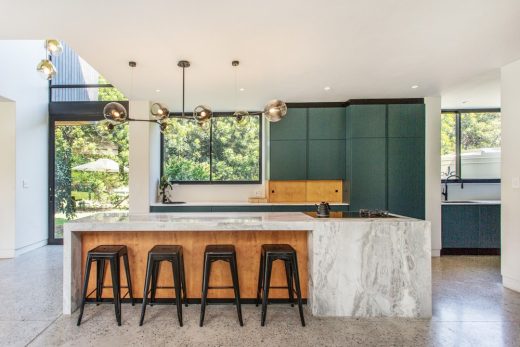
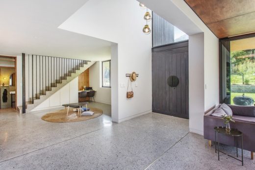
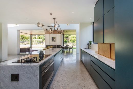
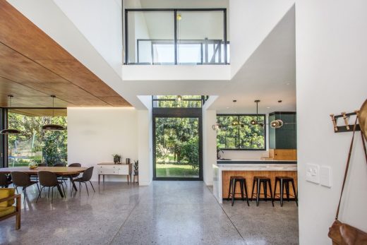
The entrance opens with large timber double doors, opening up to a double volume space framed with glass on either end and a flat concrete roof separating the two angled roof structures on either side. The entrance space opens at the southern end with a central pivot door that opens towards the garden leading to the Disa River. This entrance space also acts as a threshold between the kitchen and living areas on ground floor, and as separation between the main bedroom and kid’s bedrooms.
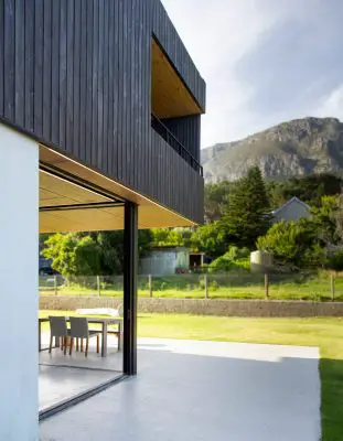
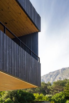
A number of design elements refer to the simplicity of an agricultural homestead – basic geometry with a simple palette of materials. The public living areas are distinguished from the more private bedrooms. This is done in a two-fold manner: a differentiation in level, and a contrast in material. White textured plastered walls frame the ground floor level where friends and family can be entertained. The upper floor – cladded in black timber – is reserved for the bedrooms and a family lounge overlooking the majestic mountains that surround the site.
What was the brief?
The brief entailed to create a new family home for the couple and their two kids. The building had to speak to the rural context, respecting the natural landscape and making most of the magnificent surroundings.
What were the key challenges?
Key challenges was to create
Who are the clients and what’s interesting about them?
The clients are a young couple. They are dynamic with a keen interest in design. What made this project interesting was that the client was intimately involved in administering the build. They contributed enormously to the end product, with a number of great design inputs and solutions
What are the sustainability features?
Rain water is collected, and provision is made for future grey water collection. Furthermore the building can run completely of the electrical grid due to the PV panels on the roof
Key products used:
Due to the restrict in budget we got creative with a number of materials. We used autoclaved aerated concrete for the upper story construction. These blocks are a third of the weight of normal bricks, thereby reducing the cost spent on structure. The cladding is a product from Lunawood, and is a thermally treated product that withstand the weather. The cladding was stained black with a natural product.
Sassen Residence in Cape Town, South Africa – Building Information
Architecture: SALT Architects
Project size: 353 sqm
Site size: 7000 sqm
Completion date: 2019
Building levels: 2
Photography: Linda Smal
Sassen Residence, Cape Town House images / information received 120122
Location: Cape Town, South Africa
South African Houses
South Africa Properties – selection from e-architect:
Winelands Villa, Cape Town
Design: ARRCC and SAOTA
photo : Adam Letch
Wave Villa Cape Town
Design: ARRCC
photo : Greg Cox
De Wet 34, Cape Town
Design: SAOTA Architects
Luxury House in Plettenberg Bay
Head Road 1815, Cape Town
++
Architecture in South Africa
South Africa Architecture Design – chronological list
South African Architectural News
Comments / photos for the Sassen Residence, Cape Town House designed by SALT Architects page welcome


