Buffelsdrift Restoration, Ladismith Conservation Architecture, Barn, Wine Store, South African Farm, Photography
Buffelsdrift Restoration in Ladismith
3 Feb 2021
Buffelsdrift Restoration
Architects in Collaboration: Jaco Booyens Architect & SAOTA
Location: Ladismith, South Africa
The restoration of the ensemble of heritage buildings on Buffelsdrift, west of Ladismith in the arid Klein Karoo region of the Western Cape, by SAOTA and Jaco Booyens Architect, a specialist in clay buildings, recently won the gold medal at the seventh edition (2019) of the international Domus Restoration and Conservation Award (www.premiorestauro.it) in Italy. The award recognises “excellence in the field of restoration, redevelopment and architectural and landscape recovery at an international level”.
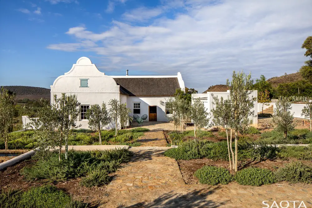
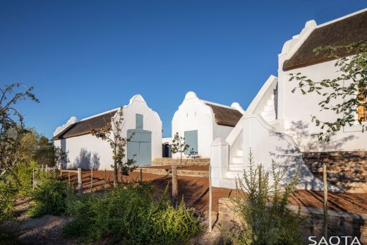
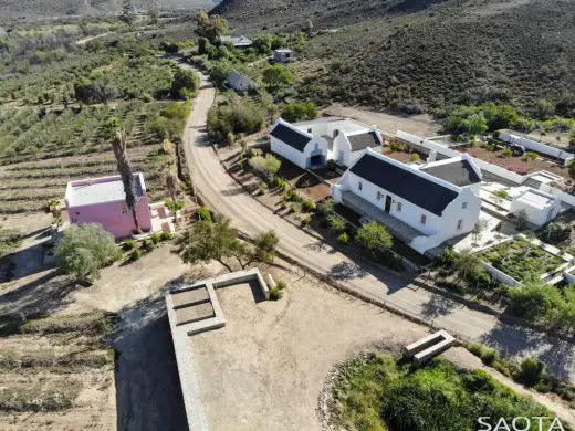
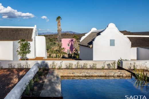
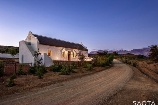
The restoration involved a cluster of Cape buildings in a valley beneath the Swartberg mountain range, consisting of a main house and two barns, plus a store. A short way off is a flat-roofed building, typical of the Ladismith style, which was originally used as a wine store. Other structures on the property include a contemporary shed, a cottage further up a hill and a graveyard.
The house, barns and wine store were all restored. SAOTA director Greg Truen, who acquired the farm in 2016, notes that while minor additions and modern alterations had been made to the buildings, the original house, was “in good condition, considering” and that the barns were “fundamentally untouched”. In the main house, evidence of earlier refurbishments in the 1970s, were stripped out, while modern kitchen and bathrooms were inserted in an adaptive approach to conservation. A new pump house was added near the dam wall on the property. Its design and construction were an experiment in contemporary architecture using the same materials and techniques as the heritage buildings, including poured mud or “cob” walls, as well as brick vaulted roofs. The landscaping around the house took the form of a series of low terraces.
Licences to graze livestock on the land date back to the mid-1700s, and it is clear that it was farmed before the 1800s. The original circular farm was divided into smaller parts over the years. The main house on this portion on the farm dates back to 1852. The date and initials IWDV, Isak Wilhelm van der Vyver, are inscribed above the door. The Van der Vyver family was associated with Buffesldrift as far back as 1768, when they first leased the farm.
Incidentally, 1852 was the year in which Ladismith was proclaimed, unlocking growth and development in the area. Fruit trees, grapes and other crops were farmed in the valley, although by the late 1800s and early 20th century, crops were largely abandoned in favour of ostrich farming, which brought great prosperity as a result of the international ostrich feather boom. The collapse of the fashion for ostrich feathers, war and drought brought economic devastation, and the once-bustling valley was largely abandoned. Now olives are commonly farmed in the valley.
Hans Fransen’s seminal study, The Old Buildings of The Cape, records “three old buildings … all with Prince Albert-type end-gables (holbol with horizontal string courses)”. The main T-shaped homestead, he says, “has massive loft steps at the side and original holbol stoepbankies”.
He notes the inscription and dating above the front door of the main house which “tallies with the plaster-framed woodwork (although the halved front door with its small-paned fanlight and fluted and dentiled entablature looks much older)”.
Architectural historian Roger C Fisher, Professor Emeritus of Architecture, University of Pretoria, who visited Buffelsdrift, wrote an unpublished account of his observations, Buffelsdrift – An Anatomy of a Vernacular, in which he details aspects of its construction and history.
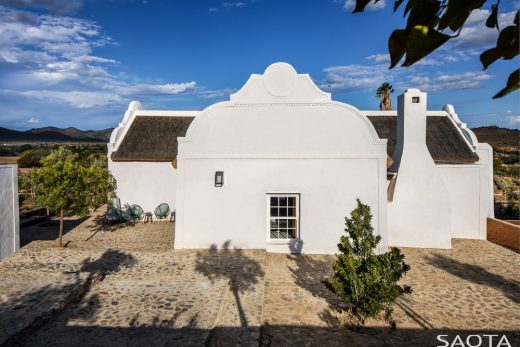
He says that a speculative reading of architectural fabric of the buildings led him to suspect that the house “was originally a simple longhouse thatched cottage” that was subsequently added to. The outbuildings, which probably predate the house, have “simpler rudimentary hol-bol gables with … semicircular pinnacles” and those of the “main body of the homestead are similar but more refined”.
“The most decorative, strangely located to the rear of the house, is the central hol-bol (concavo-convex) gable of the T-wing where the kitchen is located, with its circular capping and string-moulded bottom chord, for which Fransen has coined the term ‘Prince Alfred Gable,’” he writes. He suspects that it dates to the time when the original thatch roof was replaced with corrugated iron “somewhere in the later nineteenth century”. Truen notes that gables of the main body of the house have semi-circular tops.
Fransen also points out the unusual shutter on the fanlight. Additional research by Booyens revealed that the lock on the front door was French, dating back to the 1700s. He had it restored by a specialist in Paarl. Various articles that appeared in the press over the years as the farm changed owners note that the original stinkwood doors and wardrobes in the main house remained intact.
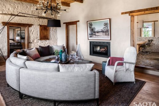
The front section of the house consists of a central living room with a bedroom on each side. The T-section included a dining area. While the front section had yellowwood beams and ceilings, the rafters in T-section were exposed. A lean-to section with a fireplace had been added in one of the elbows of the T using sundried bricks. It was being used as a kitchen.
The house and barns had been constructed according to the usual technique used by Dutch settlers in the Cape, with walls of poured mud or clay, cast layer by layer about 700mm wide. “This method of construction – ubiquitously used by Dutch settlers, trekboers and later Voortrekkers – requires a source of clayey ground into which is added ‘a good proportion’ of sand and grit, possibly straw or dung, combined in a pit, all trod through by oxen-hooves in span,” writes Fisher (quoting William John Burchell’s Travels In The Interior Of Southern Africa).
He describes the technique in detail:
“This mud must be “well-tempered”, sufficiently stiffened to be able to stand alone up to 300mm in height without slump. This was prepared at the same time as the foundations were being laid, and would leaven for about seven days, deemed ready when a ball made from it, when thrown to the ground, retained its shape. The cob was delivered to the builder on pitchforks, who then piled it in courses of about 300mm, all built over a good stone or slate foundation. Each layer was allowed to set and then paired to an even surface with a flat paddle, much as that used as a pizza oven shovel. The corners were laced through diagonally by saplings or braided cord at each layer to prevent the separating and bursting of the mud structure at this weakest point where the direction of the stresses of thrust changed. These stresses were consequent to the additional weight of the gable on the end wall, thereby creating shear while on the other was the thrust of the weight of the thatched roof.”
Once the walls were complete, they would have been finished with lime and sand plaster. Over the years this had been replaced with cement. Booyens notes that one of the biggest tasks of the restoration involved removing the cement plaster and re-finishing the walls with traditional lime plaster, which recaptured the undulating surface of Cape homes known to soften the bright karoo light. Where there was termite damage, the walls were filled in again with clay.
In some areas, when the cement plaster was stripped away, poplar-branch lintels were revealed, in many cases in pairs, which had been placed where doors were planned during construction. Fisher explains that this was done “to act as tension and compression members in the homogenised mud”. Booyens explains further that the doors would have been cut out below these “primary lintels”, probably after drilling a hole through the wall and using a cutting wire “like an igloo”. A finishing lintel would then have been added and the edges built up using sun-dried bricks manufactured on site.
Fisher notes that “a flat-arched opening at the eastern end was revealed, possibly indicating that that was the hearth, possibly with a kommyntjie or additional alcove cooking place with external chimney”. He adds that pine door frames “in all likelihood pre-manufactured” would have been imported. He also notes that sundried green bricks would have been “used for all the finer work as well as the gables, embedded in dagha (clay mortar)”.
Truen and Booyens opted to use a thin lime plaster on the interior walls between the central living room and the bedrooms on either side, not only expressing the original texture of the mud wall, but also, as Truen puts it, leaving “a little of that construction history visible, so you can get a bit of a story of how these building were put together”.
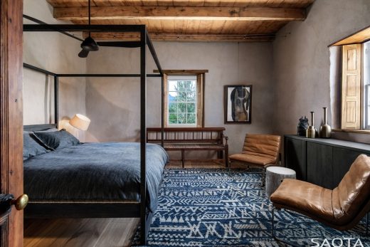
In the living space, the original yellowwood beams and ceiling were intact and could be restored. The timber floors, however, had rotted and were replaced with poplar planks, consistent with the originals, kiln dried in Oudtshoorn. The screed floors of the T-section, which was converted into a combined kitchen and dining area, bathroom and front stoep were all refinished using “stone pavers taken out of the veld”, as was the kitchen courtyard and front stoep.
The roof of the lean-to section had rotted away and a raw concrete slab was cast over it. It was converted into two bathrooms. Narrow slats for skylights flood the bathrooms and passage with natural light. A custom-made poplar vanity and shutters were added for privacy.
In fact, poplar shutters were made for all the windows, which enhances the remarkable thermal qualities of the building. “Even on a very hot day, when temperatures can rise into the upper 30s and early 40s, the internal temperature is in the mid to low 20s and is very pleasant,” says Truen.
“All the extant door and window furniture and fittings have been refurbished and retained or re-instated,” adds Fisher.
Beneath the corrugated iron of the roof, the beams, rafters and ropes used to tether the thatch, and even tufts of the thatching, remained. Fisher notes that “it was decided to reuse these and re-thatch the house, both for aesthetic and climatic comfort”. The thatch roof was reinstated by JNA Thatching, a company that, says Truen, has “historically done a lot of thatching in the Cape and knows these kinds of buildings very well”.
Where modern materials were introduced, they were carefully selected. The shower (in the recess originally used for a fireplace), for example, has been clad in terrazzo slabs, and in the kitchen, a contemporary island has been inserted, also clad in terrazzo. “We looked for a contemporary material that spoke to the original materials,” says Truen. The concrete and aggregate in Terrazzo resonate with the stone and cement paving. “The terrazzo felt like a way to work between the old and the new, where the new felt like it had some kind of genesis in the old,” says Truen.
The kitchen block also makes it possible to keep the kitchen and dining areas integrated, making it a central social space, while a 200mm raised barrier above the counter ensures that the food preparation area is unobtrusive. Appliances are stored below the counter. “There are no contemporary appliances sitting at higher levels other than this extractor fan,” says Truen. One of the only contemporary interventions was the addition of a double-sided fireplace between the kitchen and lounge area.
Recessed lights were used on the exterior walls to keep the walls unmolested by modern technology. Where lanterns were added, on either side of the front door, for example, and elsewhere on the main house, as well as on the wine store, they were custom made. Their design took cues from lanterns the legendary Cape modernist architect and restoration maestro Gawie Fagan designed for a wine cellar at Groot Constantia, one of Cape Town’s most famous historical wine farms. Fagan played a pivotal role in “figuring out a way to interpret Cape detailing and reference it in his modernist work”, explains Truen.
The landscaping of the sloped site was another significant undertaking, involving a contemporary approach to terracing at various heights, executed using traditional Cape building elements and materials. “We created a raised platform at the back of the building, so you can now come down a driveway and park at the back of the building and walk down the site towards the house and the wine store,” says Truen.
On the upper level, a stone swimming pool has been added, filled with water from a borehole, which runs down a channel and ultimately to the dam. The pool, level with the paving, appears almost as a continuation of the paving itself. “It’s really just a place for the water to pause on its way to the irrigation system,” says Truen.
The more heavily trafficked areas are paved with stone from the surrounding veld, while the rest is surfaced with peach pips to create a neat uniform surface that in time will weather to the same colour as the thatch. These terraces are planted with olive trees, and vygies and other natural vegetation has also re-established itself. Fruit trees and beehives have also been introduced.
The Wine Store
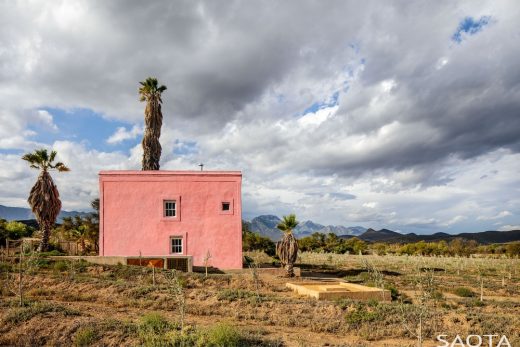
The outbuilding that is referred to as the wynkelder in reference to a time when grapes were grown on the farm, is a small flat-roofed structure that has restored and converted into a living unit. It was badly damaged and had been clumsily altered. An incongruous timber pergola and a brick fireplace had been added to the exterior. The fireplace, however, had delaminated from the wall and was collapsing. The walls were also badly damaged by termites and the floors and ceiling rotted.
When repairs began, it was discovered that the wine store had originally been a single-level building, and its parapet was raised in the 1970s to allow for another level so that it could be used as a house. “When we repaired the plaster, we could see that the bottom part of the building was made out of poured mud, and then as you go up, there are some sundried bricks, and then more contemporary bricks right at the top,” says Truen. A somewhat clunky staircase has also been added.
The repairs and restoration of the wine store involved reorganising the ground level so that it could function as a living area and kitchen, and locating the bedroom and bathroom on the mezzanine above. The ground floor was levelled and paved in stone harvested from the surrounding veld. The rotted upper floor was replaced with SA pine, which was limewashed. The roof upstairs was finished with poplar beams and a rietdak ceiling.
“We had to create a new stair between the levels,” says Truen. “Of course, that raised the question of how you insert new fabric into old fabric.”
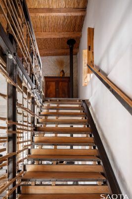
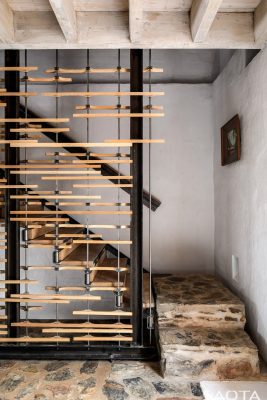
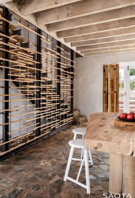
Booyens designed a new self-supporting steel staircase as a contrasting contemporary insertion. “The staircase doesn’t touch the original structure of the building,” he says. It floats above the floor and is set slightly apart from the walls, connecting at a single point on the floor and at just one point on the mezzanine level. Its contemporary unichannel frame and intricately detailed American Oak treads, suspended by a system of cables, make for a subtle intervention. The modern decorative timber screen is similarly light, but clearly expressed as a contemporary addition, respecting the historical fabric of the building through contrast and a lightness of touch.
The two stone treads at the base of the staircase are also offset from the walls and the staircase, so that they and the staircase appear as “two loose elements inside the original building” as Booyens puts it.
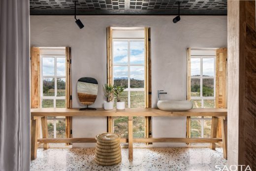
The mezzanine level has a long, narrow en suite bathroom running the length of the front wall, which also contrasts with the historical fabric. It is accessed via a large cut-out between the bedroom and bathroom to facilitate the views to the orchard beyond. “And of course take advantage of the breeze and the natural light,” adds Truen. A curtain provides privacy when necessary.
The bathroom combines contemporary materials such as terrazzo cladding and a laser-cut metal ceiling with a long poplar table that runs the length of the wall in front of the windows, and poplar shutters. The contemporary materials are natural and honestly expressed, as Truen puts it, “nesting in quite nicely”, and engaging with the building’s heritage by expressing time as a continuum acknowledging the contemporary moment.
The exterior of the wine store has been painted pink partly in reference to the historical practice in the karoo of mixing lime to make a light red or pink colour, and partly in an exploration of some of the historical connections between Cape and Mexican architecture. This avenue of architectural dialogue was prompted by a number of trips Truen had made to Mexico as a result of international commissions there. He visited various traditional Mexican buildings, as well as some famous examples of Mexican modernist architecture such as Luis Barragan’s famous Cuadra san Cristobal. “A lot of the historical buildings in both countries are made in quite similar ways, using mud and stone and materials that were immediately available to them,” he says. “And, actually, they have quite similar landscapes.”
He was also interested by what he perceived as similarities between Cape and Mexican modernism. The work of the Cape and of Mexican modernists were both rooted in their respective vernacular architectures, and fused local materials and construction techniques with modernist approaches to forge a rich, sensual regionalist approach to modernist principles.
Both Mexican and Cape modernism were particularly sensitive to the climate and quality of light, which lent itself to the use of bright colours. Cuadra san Cristobal was painted shades of pink. Truen also draws a connection between the shutter door of the main house and Barragan’s modernist redeployment of similar doors and window shutters to moderate heat, light and privacy.
This dialogue between Cape and Mexican architecture is also evident in parts of the landscaping throughout the rest of the restoration project. The pool above the main house and the water channel that runs to the dam, for example, also take cues from Barragan’s use of water features.
Pump House
The pump house is a new building constructed in response to the need for an irrigation building. “It was an opportunity to experiment and test some ideas we had to do with contemporary architecture built using traditional techniques,” says Truen.
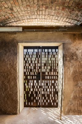
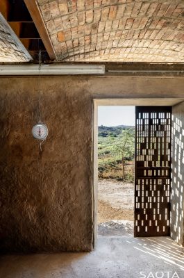
The building forms a connection between the landscape and the dam wall. Its earth-coloured walls take their cue from the poured-mud walls of the heritage buildings. “It’s a technique somewhere between rammed earth and working with concrete,” explains Booyens. “You could almost say it’s a primitive form of working with concrete, but instead of concrete, we worked with mud.”
The walls are more than a metre thick, and have been left unpainted, expressing their materiality and blending with the landscape.
The vaulted brick roof was an experiment in construction devised to simplify the expensive and highly skilled labour usually required to construct vaults. It involved creating a system of steel beams and a plywood template, and building the vault one row at a time, which proved both cost efficient and appropriate for the skills available locally. “When we took the shutter out, it stood up, because it was a real catenary arch,” says Booyens.
The rest of the roof is planted, and steel waterspouts cantilever far out from the walls so that water draining from the roof does not fall against the wall, a technique adapted from vernacular West African adobe architecture.
“For me it was a really interesting experience to go and find materials on site, and then build something that is so fundamentally in tune with the climate and performs so much better than any contemporary building,” says Truen. “There are definitely lessons there.”
Buffelsdrift Restoration in Ladismith, South Africa – Building Information
Location: Ladismith, South Africa
Architects in Collaboration: Jaco Booyens Architect & SAOTA
Contractor: Pro-Projects and De Kock Bouers
Landscaping: Fritz Coetzee
Interior Designer: ARRCC
Bespoke Furniture: OKHA
Thatching: JNA Thatchers
Irrigation: Groen Karoo
Photographer: Adam Letch
Copy by: Graham Wood
Buffelsdrift Restoration, Ladismith image / information received 030221
Location: Ladismith, South Africa
Architecture in South Africa
Contemporary Architecture in South Africa
South African Properties – listed latest first
Barloworld Automotive and Logistics Head Office in Centurion, Tshwane
Design: Nsika Architecture & Design
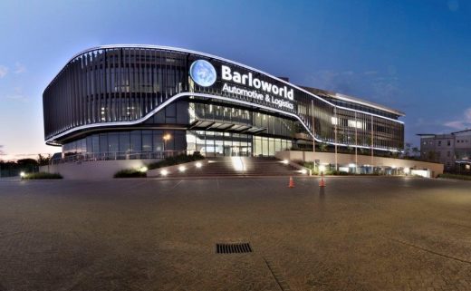
photograph : Michael Schmucker for Abland
Barloworld Head Office Building
Beachyhead, Plettenberg Bay, Bitou Local Municipality, Western Cape Province
Design: SAOTA
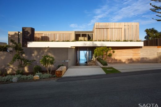
photo : Adam Letch
Luxury House in Plettenberg Bay
Hillside View House, Cape Town
Design: ARRCC Interior Design
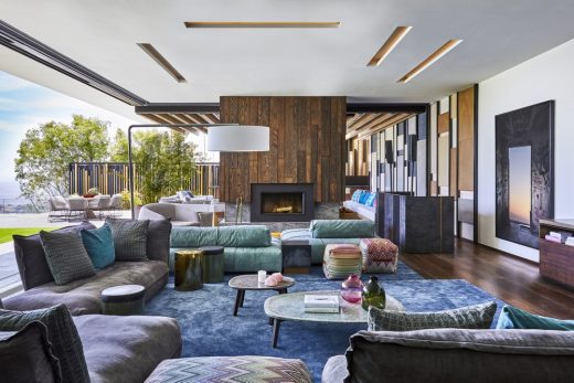
photo : Greg Cox
Hillside View House in Cape Town
The Forest House, Durban
Design: Bloc Architects
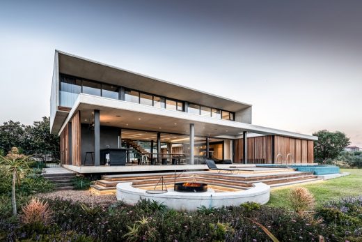
image from architects office
The Forest House in Durban
Palm House, Palm Avenue, Zimbali Coastal Estate, KwaZulu Natal North Coast
Design: Metropole Architects
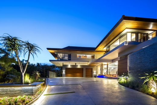
photographers : Alexis Diack Architecture & Design Photography
New House in Kwazulu Natal
Comments / photos for the Buffelsdrift Restoration, Ladismith page welcome

