Shanghai Expo 2010 New Zealand Pavilion, Warren and Mahoney Architects, Chinese Design
Shanghai Expo New Zealand Pavilion
Architecture Information China – design by Warren and Mahoney
9 Aug 2010
New Zealand Pavilion at Shanghai Expo 2010
Location: China
Architect: Warren and Mahoney
CONTEXT
The New Zealand Pavilion for the 2010 World Expo in Shanghai was commissioned through a limited design competition by the New Zealand Government. The brief called for a challenging design ambition in that it had to be both the physical representation of New Zealand’s culture and identity; as well as a symbol of the relationship between two nations.
FORM
Architects are typically engaged with built form that is an active part of an evolving urban fabric – buildings and structures that develop a ‘personality’ in the public’s eye over many years. Working in an Expo context in a foreign land requires an architectural approach which is much more immediate. With minutes rather than years to form a relationship with a building, a different approach and visual language was required.
Amongst the architectural ‘white noise’ of the expo context, the design ambition for the New Zealand Pavilion is to move beyond architecture as object – to provide an integrated experience which combines seamlessly with the architectural form and exhibition content.
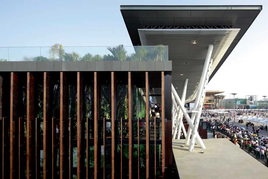
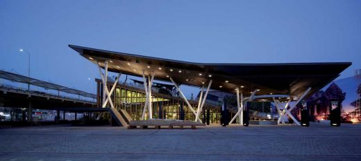
The architectural expression of the pavilion takes the form of a folded, inclined surface – a literal representation of the New Zealand landscape, transported to Shanghai. The folded surface of the Pavilion references the proximity and connection between New Zealand cities and the landscape, while promoting the idea that our urban and rural environments are balanced and sustainable.
This surface is combined with a hovering lightweight canopy ‘sky surface’ and sculptural supports in a manner that forms a contemporary expression of the Maori myth of creation:
“The Maori creation story begins with a description of darkness and nothingness – Ranginui, the sky father, and Papatuanuku, the earth mother, prevented light from reaching the world because of their close embrace, and their offspring lived in a world of darkness between the bodies of their parents. It is said that some of the sons decided that their situation could be remedied only if they separated their parents, so that Ranginui would be pushed up to become the sky and Papatuanuku remain as their Earth. They set about their task. Tane it was who finally rendered them apart by resting his shoulders upon Papatuanuku and thrusting his legs upwards and pushing Ranginui to the sky. By this separation the world of light, of existence, came into being”
Spatially, the pavilion is composed of three key sequential experiences: a welcome and arrival space; an internal exhibition space; and an external rooftop garden. Visitors are welcomed in the arrival space by Maori carvers and performers, then travelling by ramp through the internal exhibition before exiting onto the top of the sloped building and descending through the New Zealand landscape – from the mountains to the sea. In this manner, the exhibition content is delivered outside, within, and on top of the folded surface of the pavilion, eliminating any division between architecture and experience; or container and content.
The New Zealand Pavilion is about authentic experiences – real welcome, real hospitality, real performance. Authenticity is a commodity in short supply in an expo context and a manner in which New Zealand experiences and products are often positioned on the world stage. A key part of this authenticity is the concept of welcome. The New Zealand Pavilion is open and approachable and reaches out into the adjacent plaza space – the invitation to enter and engage therefore being tangible. It is the antithesis of the closed sculptural form which an audience approaches and then enters, and is appropriate to a young, multi-cultural Pacific country which prides itself on its openness, warmth, and transparency.
MATERIALITY & TECTONIC
New Zealand’s urban environments are highly connected to the landscape, and its people remain intensely aware of this relationship. The desire for connection permeates much of our lives, from understanding the origin of the water we drink, to the food we eat and the fabrics we wear. The Pavilion is made with a similar sensibility. The connections and materials are celebrated, and their origin and nature are expressed. There is a conscious move away from the slick and the sanitised, towards the tactile and authentic qualities of natural, sustainable materials. Within an expo context, which is very much focussed on technology, the resulting impression is one of calmness, with a sense of brooding, primordial mystery. The underlying message is one of honesty and openness – a response that has a depth beyond the sales pitch, and which attempts to forge a real connection with its Chinese hosts.
Shanghai Expo New Zealand Pavilion images / information from FD
Location: Shanghai, China
Architecture in Shanghai
Shanghai Architecture Designs – chronological list
Warren and Mahoney project : Christchurch Airport, New Zealand
Architecture Walking Tours by e-architect
Shanghai Building – Expo Pavilion Selection
, Expo 2010
BIG
Shanghai Expo 2010 Danish Pavilion
British Pavilion Shanghai Expo 2010
Heatherwick Studio
Shanghai Expo Building – British Pavilion
Spanish Pavilion Shanghai Expo 2010
Miralles Tagliabue EMBT
Shanghai Expo 2010 Spanish Pavilion
Comments / photos for the Shanghai Expo New Zealand Pavilion 2010 Architecture page welcome


