European Solidarity Center Building, Polish Architecture Competition Images, FORT Architects
European Solidarity Center Building Design Contest: Polish Competition
European Solidarity Center, Gdansk, Poland design by FORT Architects
9 Jan 2008
International Architectural Competition for the European Solidarity Center Building
Winner : FORT Architects, Gdansk, Poland
European Solidarity Center Building – Gdansk Design Competition Winner
URBAN LAYOUT
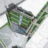
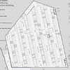
In compliance with the requirements of the competition, the building of the European Solidarity Centre has been located on a building plot of the Solidarity Square. The building covers the entire site area.
The underground car park, situated underneath the whole building, extends beyond its outline, incorporating a part of the adjacent square to the north of the plot, which is within the competition. The ground floor and three multi-storey staircases are adjacent to the building’s northern border.
Obtaining the proper formal allowances for the departure from the standard technical requirements concerning the distances of the building from the site borders, is a guarantee of making use of the quarter in the most rational way. The main entrance and the representative driveway face the Road to Freedom, and the additional entrance to the multi-functional halls is situated by the pedestrian zone next to the western facade.
Thus, events taking place in one part of the building will not disrupt or hamper any activities taking place simultaneously in other parts of the facility. The access point for maintenance and supply services, as well as the driveway to the underground car park, are situated in the street coded 029-KD81 (according to the regulations of the local masterplan) running along the north-west facade, according to the competition’s requirements.
The wall with inscription plaques, which is an integral part of the Monument to the Fallen Shipyard Workers, protected by the Historical Conservatory Office, marks the borders of the shipyard and separates the ESC building from the Solidarity Square. The authors of the competition design have decided to lower the ground level and make the austere finishing of the north wall more prominent by designing a high quality stone base in the lower belt of the wall.
The designers maintain that the structure of crude concrete should not be modified or enhanced. The crude, industrial character of hastily cast concrete should remain intact as a testimony to the times in which the wall was raised.
The space for outdoor exhibitions, complementing the indoor exhibition programme, is situated in a slight hollow along the Road to Freedom. The places for relaxation are situated in a depression which descends southwards, in the form of terraces, in the direction of the Monument to the Fallen Shipyard Workers.
This is a quiet place well isolated from the street noise and the wind. Water flowing down from the main square level is also conducive to relaxation. The surface of the water, defining the surface of the square, will serve as the foundation for The European Solidarity Centre.
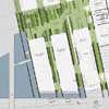
According to the designers the Road to Freedom should be pedestrianised and offer a lot of green spaces for relaxation. The shape of the Road to Freedom and the distribution of tall trees guarantees a clear view of the places of historical interest, such as BHP Hall, Gate no. 2 and Solidarity Square.
The road merges the new structures and the old historical elements into an entity of its own. The surface of the road, as well as the internal green areas of the building, have been rhythmically designed in stripes reminiscent of the sequence of spreading circles marking the Solidarity Square.
A street of such a design will be an ideal meeting point and a place for relaxation for Gdansk residents and other visitors. They will be able to contemplate and rejoice the triumph of Solidarity among green spaces and the omnipresent sense of history.
THE CONCEPT
Prior to starting design work, it was necessary to list all features the building should have. Namely, it should reflect the essence of Solidarity and at the same time appeal to the young evoking interest, not only in the history of Solidarity, but also in its currently valid ideals.
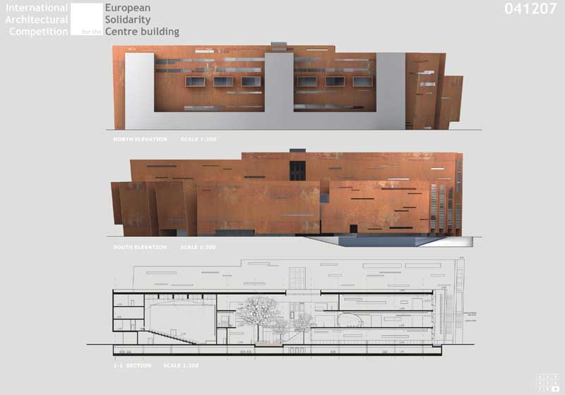
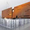
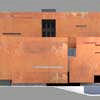
In our opinion, extreme simplicity, which characterised the aims and methods of the Solidarity movement, should be the governing design principle. The architectural design is based upon evenly distributed parallel walls. The walls are bare and uncomplex, disposed of unnecessary details, having a crude, rusty Corten steel finishing, which supports the principal of simplicity.
Steel walls, as a dominant design element, seem to be in motion. The first one cracks in half and leans forward. The others follow suit. The sense of dynamism of the historical change is achieved through slanting, rhythmically repetitive directions determined by the surfaces of the walls. The record of this historical change is to be found in the spaces of the building itself.
The main ideological principles of the design are conspicuous through the absence of excessive, redundant elements. Simplicity, as the main governing element of the design, is as obvious as once were the demands of the shipyard workers. Accessibility of the symbolic message conveyed by the building is one of the most important features of the design.
The proposed form can be interpreted in a variety of ways. It may be evocative of a sailing ship, a hull of a ship being built or of steel elements stockpiled for its construction. For many of us, the timelessness of currently valid Solidarity ideals stems from the fact that they have not yet been fulfilled.
Another message conveyed by the building is the sense of the specific Polish face of Solidarity. The building implies the attachment to the local tradition and patriotic feelings. The long stripes are reminiscent of the typical Polish rural landscape. The configuration of the green spaces of the building also evokes the image of typical Polish farms and their striped fields.
The authors of the design would like to create a building which would encourage people to come in and participate in its everyday life. A rich and diverse functional programme, which is one of the requirements of the competition, has inspired us to design a building whose one of the main features is universality – a feature not always associated with museums, containing archives or historical research centres, which are sometimes cold and unwelcoming places.
Universality was also the main trait of the Solidarity movement. Everybody could become a member of Solidarity. Similarly, everybody is now welcome to be a guest of the European Solidarity Centre.
SPATIAL AND FUNCTIONAL LAYOUT OF THE BUILDING
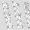
The European Solidarity Centre has been designed as a building with a varied number of floors, having a basement underneath its whole ground floor plan. The mass of the building consists of two main components – a lower southern part of 19.4m height, and a higher northern part 30.00m tall.
The main hall, starting from the Road to Freedom, leads towards the centre of the building. A restaurant with a café, an information point, shops and cloakrooms are located along the hall.
The middle section of the building is a huge open space of enormous volume. It consists of a winter garden, a system of lifts and numerous entrances to exhibition halls, which can host diverse events. The escalators take people to the first floor where they find the permanent exhibition devoted to the Solidarity movement.
A selection of multi-functional halls has been situated in the in the western section of the building. All the halls can be used simultaneously without generating conflicts with other programs of the building.
The winter garden is the central compositional element of the building’s interior. It occupies the main part of the building’s volume, and, together with the parallel crack-like corridors, dissects the structure of the building. Lush plants grow over rust-covered corten walls, with the greenery reaching all important parts of the building.
The halls of the permanent exhibition hall, situated on the first and second floor, are connected by a network of foot-bridges and stairs cutting through green passageways of the omnipresent winter garden.
The presence of green spaces counterbalances the austere character of steel elements and narrow passages between metal surfaces characteristic of the Shipyard’s landscape.
John Paul II hall is intentionally situated next to the exit from the permanent exhibition. After studying the history of Solidarity, the Centre’s visitors will be able to move on to this hall where they will enjoy a moment of reflection and contemplation.
The remaining functional units are situated on other floors in the north section of the building. The traditional library and the reading room are located on the first floor. This floor is also occupied by the multimedia library, which cuts into the main open space.
Above, there are archive storage places, office of the centre for research and academic studies, creative workshop premises, the offices of non-governmental organizations, as well as staff back-up facilities. A terrace is situated on the roof of the building – in the eastern section of the northern part, at the height of 27 metres. It is also the highest point of the building. The car park occupies the entire underground area.
The location of the Centre has a unique character. The historical events commemorated and preserved by the European Solidarity Centre took place in this very area. Rusty metal surfaces were a common element of the Shipyard’s appearance.
These images will be gradually forgotten as the Shipyard’s areas are converted into a new district of the city. In our opinion, it is vital to preserve this character of the Shipyard landscape through the symbolic architectural elements of the Centre. It is, therefore, our aim to make the Centre’s visitors associate the austere, industrial metal surfaces with the historical events which took place around the building.
A few real places of historical value, such as the Monument to the Fallen Shipyard Workers, BHP Hall and Gate no 2 will become original museum exhibits. It will be possible to observe the authentic places of historical value through the frames of precisely designed openings in the walls and ceilings.
The outline of the crosses forming the Monument to the Fallen Shipyard Workers will be easily seen from the Winter Garden through John Paul II Hall. The symbolic character of the crosses devoted to the fallen workers adds a natural quality to the interior scenery of the hall devoted to quiet contemplation and prayers.
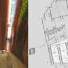
Another important element of the architectural concept is to evoke curiosity in the passers-by through intentional formal solutions. The surfaces of the walls are slightly raised.
They grant some insight to the interior of the building. The gaps, however, enable passers-by to see only fragmentary images. One could only glimpse passing human feet and shadows on the floor. The curious passers-by may be tempted to bend over and have a closer look inside or even to enter the building.
Semi-transparent dimmed glass of the façade along the Road to Freedom serves the same purpose. This facade is composed of glass of different degrees of translucency. The cracks in the walls have the same function. They encourage passing people to take a look inside.
Inside, the semi-transparent glass of the multimedia library and the flickering images of audio-visual presentations taking place in the exhibition halls, visible through the glass walls, are also meant to intrigue the visitors.
TECHNICAL AND MATERIAL SOLUTIONS
1. The construction system
The building’ s construction consists of a longitudinal wall system, with repeatable spans of about 12.0 and 4.0 meters, with walls slanted by 6.5 degrees and carrying the floor slabs. The longitudinal span of the structure is 9.0 meters.
2. The loadbearing construction
The foundations are designed as screwed piles. Considering the high level of underground waters, the underground construction is designed in the form of a water-resistant monolithic plate foundation.
Taking into consideration fire safety precautions, the columns, walls, ceilings, roofs and interior staircases are made of reinforced concrete. In order to achieve the intended architectural effect, the walls were covered with permanently-corroded corten steel panels. The remaining staircases, which do not serve for evacuation purposes, have a steel construction with construction-glass elements.
3. Exterior finishing
3.1. Walls – permanently corroded corten steel
3.2. Flat roofs:
– flat roof with inverted layers, topped with greenery,
flat roof with inverted layers, topped with rust-coloured gravel,
flat roof with inverted layers, topped with stone plates or water pond (over the part of the car park extending beyond the building’s outline)
3.3. Glass curtain walls and skylights, having a column-transom construction, partly with structural glazing point fixing.
4. Interior finishing
4.1. Main walls – permanently corroded corten steel
4.2. Glass curtain walls, with a column-transom construction, partly with structural glazing point fixing (in the fire-protection zone)
4.3. Flooring — cast epoxide mass, with polished surfaces
4.4. Suspended ceilings designed individually
5. Technical Facilities
panoramic lifts, a cargo lift, escalators, mobile acoustic walls of the multifunctional rooms, audio-visual equipment of the multifunctional halls, the exhibition areas, the library, the archives and the library-resources rooms etc.
6. Installations
– water supply and sewerage installations
– full HVAC installation (heating, ventilation and air conditioning with recuperators; supported by alternative energy sources)
– a full package of low- and high-voltage electric installations, including: the complex building management system (BMS), fire alarm, tele-technical circuits, computer network system, anti-theft alarm, etc.
First prize of the International Architectural Competition for the European Solidarity Center Building:
FORT Architects
ul. Grunwaldzka 212
80-266 Gdansk, Poland
Authors:
Wojciech Targowski, architect
Piotr Mazur, architect
Antoni Taraszkiewcz, architect
Pawel Czarzasty, architect
Author’s cooperation:
Danuta Debowska, architect
Natalia Landowska, architecture student
Jakub Szych, architect
Agnieszka Walulik, architect
Roksana Czartopolska-Betlejewska, architect
Ewa Baranowska, architect
International Architectural Competition for the European Solidarity Center Building images / information from FORT Architects, Gdansk
European Solidarity Center Building : main page
Polish Solidarity Centre Competition 3rd place : Arkitema
Polish Solidarity Centre Competition entry : Zvi Hecker Architekt
Polish Solidarity Centre Competition entry : Town Planning Design & Architecture
Location: Gdansk, Poland
New Polish Architecture
Contemporary Polish Architecture
Polish Architecture Designs – chronological list
Polish Architect Offices
Polish Architectural Walking Tours
Polish Architecture – Selection
Spectra Building, Warsaw
JEMS Architekci
Polish office building
Zlota 44 Warsaw
Studio Daniel Libeskind
Zlota 44 Warsaw
Comments / photos for the European Solidarity Center Gdansk by FORT Architects in Poland page welcome

