Sun Dial Apartment Paris Interior Refurb, Parisian Flat Renovation, Building Photos, Architect
Sun Dial Apartment Paris Renovation
13 October 2021
Architects: Manuelle Gautrand Interiors
Location: Paris, France
Sun Dial Apartment in Paris
Sun Dial Apartment Paris Interior Renewal
This colourful renovation of a Parisian apartment space successfully reunites the inhabitants with the rhythms of the day with and interior design scheme that is distincty architectural.
This is a strong architectural based design scheme aimed at making home in Paris feel more like a sunny vacation.
“We wanted to break from the ideas and images of Bourgeois Parisian apartment, and lean more towards something that is more in the order of a holiday house, like a ‘cabane de plage’, those small but colourful shelters from which one steps out to the sun and sky. We wanted to create something that leaned more towards an artistic statement, and not just a historical one.
We wanted to use colour and we wanted to sculpt the volumes. There is a kind of ambivalence and diversity of ambiences within the project, which I like” says the owner.
In Paris we can easily fall into darkness and a kind of
disintegration with the elements of nature” cautions
Manuelle Gautrand. “As someone who was raised in
Marseille, I am particularly attached to the qualities of
colour and natural light”.
Manuelle Gautrand, heads up the multiple award
winning Paris based and eponymously named
architectural practise with projects on several
continents. They recently launched into designing
interior spaces and were commissioned to remodel this
115 m2 apartment on the top two floors of one side of
a ‘Hotel Particulier’ in Paris’s Marais district- a building
that predates Haussmanian architecture by almost 200
years.
Manuelle Gautrand’s clients, a Paris based professional
couple had lived in the apartment for many years with
their two children who had since left home.
The apartment was heavily partitioned and entire
remodel of the interior volume was envisaged, making
an open, light filled, stylish space that reflected their
passion for modern art and design and making the
most of the apartments position at the top of the
building. Everyone agreed that when you have the
advantage of a visual connection to the sky in Paris,
you need make the most of it.
“We wanted to break from the ideas and images of
Bourgeois Parisian apartment, and lean more towards
something that is more in the order of a holiday house,
like a ‘cabane de plage’, those small but colourful
shelters from which one steps out to the sun and sky.
We wanted to create something that leaned more
towards an artistic statement, and not just a historical
one. We wanted to use colour and we wanted to sculpt
the volumes. There is a kind of ambivalence and
diversity of ambiences within the project, which I like”
says the owner.
Manuelle Gautrand’s plan arose from two principle
pre existing features in the apartment: an East-West
perspective, and the fact that it occupied the space
under roofline of the building. Besides creating a free
flowing, light filled space, the ‘under the roof’ aspect of
the project had to exploited to maximum effect.
The pre existing double height windows on eastern and
western facades immediately imposed a raised ceiling
level in these areas of the main room.
Manuelle Gautrand went all the way designing a
mezzanine on the western end of the space which
houses a guest bedroom and opens onto the void via
atelier style windows.
The kitchen end of the space also opens upward and
although not as high (the main bedroom is located
above), these variations in volume provide important
spatial relief, and practically serve as light wells
throughout the day.
By deliberate contrast, the apartments entry is a moody
dark wood panelled ante-chamber, inspired by a
historical cabinet.
Curiosities, anthropology in masks and photo studies of
decorated women feature on the walls, a wink to rituals
of dressing for daily sorties perhaps. But it’s intimacy
and snugness is accentuated by the decompression
and counterpoint of the main room glimpsed beyond
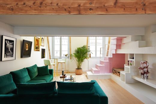
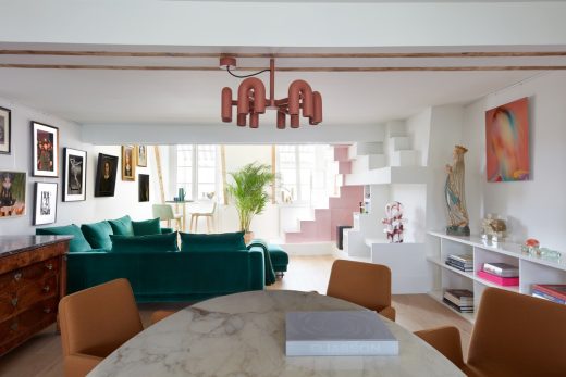
An architectural work of volume, the main room is
composed of cascading ceiling that steps between the
kitchen, dining and lounge areas. There is a clear flow
between these spaces but each is defined by its use of
colour and materiality.
The low ceiling over the dining area is conducive
to intimacy but at the extremities of the room, the
relatively low ceiling is released towards the higher
ceilings and ultimately the roof-line.
This allows the double height windows at each end
the height required to open, but it’s also part of the
recurring play of varied volumes which is clearing
thematic within the space. It’s this abundant light
source, and the decompression that the visitor
experiences in the double height volumes at either end
that gives the interior its the richness.
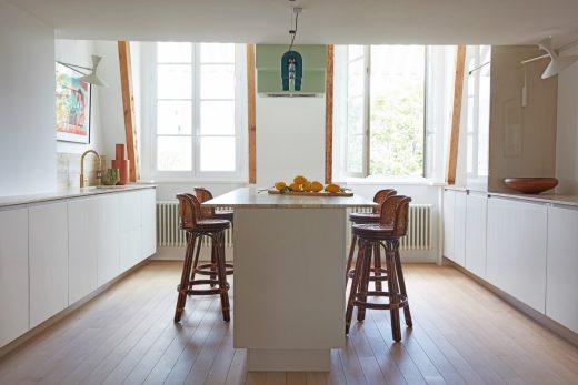
The kitchen, designed for relaxed conviviality and
sharing uses the monumental permanent quality of
seamless travertine on an island designed to be moved
around fluidly.
Travertine surfaces also define the kitchens perimeter.
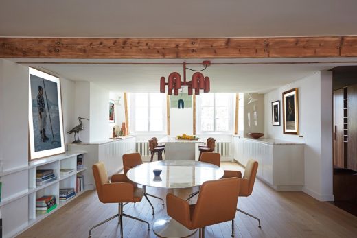
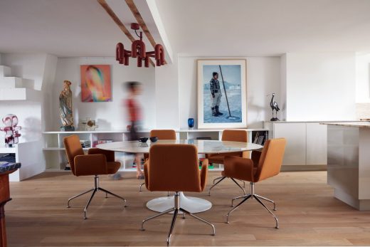
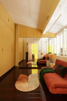
In the dining area, the icon-c singularity of an elliptical
marble form of Saarinen’s Tulip table, and deep comfort
of ‘Vik’ chairs by Thibault Desombre constitute a warm
invitation surrounded by waist high shelves displaying
monographic themed books and souvenirs.
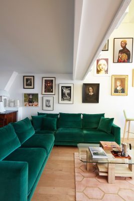
A striking collection of portraits lines one wall;
paintings, photos, in multiple styles and eras, the
common theme of which is ‘women’- everything from
an Inuit to Princess Leia. A small bar table for two is
an alternative place to take in the sun by he window,
and perhaps marvel at the centrepiece of the entire
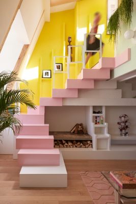
project a sculptural staircase that not only summits on
the second level of the home, but rhythmically extends
to the surrounding walls in a play of light colour and
shadow.
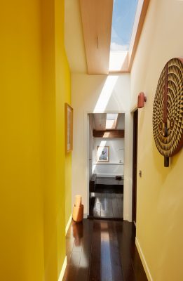
Capitalising on the daylight asset, on the second floor
Manuelle Gautrand drew what she describes as a
‘continuous and uninterrupted corridor of sky” that
extends the entire depth of the building. It’s an ever-
present reference to something that’s quite rare in Paris
homes – the sky. As she says, when you have it , you
make the most of it”, and so she did.
“The goal was to create a strip of natural light, through
which the suns influence, whether it be cold white
winter light or warm summer, could cast its shadow and
in-fluence the interior, upstairs and down, throughout
the day.
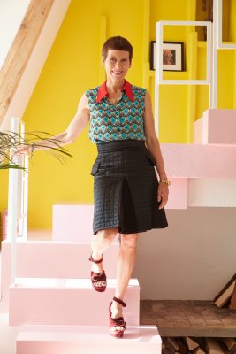
“A traditional staircase would have interfered with the
continuity of this strip of sky and so I began playing
with the relief that these 20cm thick pieces of cellular
concrete would make and the stairs came out of
this. Then I decided to make it even bigger, so that it
extended up the wall of the mezzanine and onto the
wall under the skylight.
The shadows cast, the reflections and nuance of colour
unwind and play their innumerable variations year out.
Each days particular qualities of light, from it beginning
through the windows to the east and traversing the thin
strip of sky in the roof to the windows on the western
facade. It’s not alchemy, but a natural element made
magical never-the-less. And colour in all of this was key.
Pollock Yellow, “the colour of the sun” as Manuelle
Gautrand describes it, ensures whatever the quality of
light on any day, the entire apartment is influenced by
that lights refraction off the yellow wall. “It’s a kind of
artificial sun” she enthuses.
Pink for the steps themselves was inspired from the
apartment’s original resin floor in the same colour to
which the owners were particularly attached, and
almond green is a direct reference to the plants that
cascade from the planter box under the mezzanine
window.
“We are in a universe where plants are important, and
this celadon ensures that the plants stand out. Between
the natural light and the plantings, the objective was to
bring the outdoors inside as much as possible. Besides,
these three colours go very well together” she quips.
Maintaining an element of tension, a sense of surprise
and contrast through out the interior was important.
The skylight is mirrored by a high gloss lacquered wood
floor that hints at the zen-like simplicity of the sleeping
space literally tucked under the roof at the end of it.
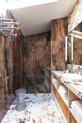
By contrast the bathroom, entirely boxed out in brown
and white marble (brown for vertical surfaces, and white
for horizontal ones) is worthy of an Italian palazzo, the
extravagance of the 1970’s light fitting by Mokoto Ishii is
an un expected touch in a space that is pure luxury and
that Manuelle describes as being like a therme.
Like the Mokoto Ishi lamp, or a spectacular pair of
earrings or broach, fine attention to the details make
the project complete, but these are hung on what is
essentially an architectural treatment of the volume to
sculpt the space. “The higher level was always gong to
interrupt the lower space but we worked to make it as
pleasing as possible.
The synthesis of the work is an apartment that follows
the suns daily arc. Its a com-pass to keep the inhabitant
in harmony with the hours of the day”
Sun Dial Apartment Paris Renewal – Building Information
PROJECT:
Major refurbishment of a two-storey apartment
LOCATION: Le Marais – Paris.
PROGRAMME:
– G+4: entrance hall, dressing-room, toilet, kitchen,
living/dining room
– G+5: two bedrooms, bathroom
CLIENT:
Private
DESIGN TEAM:
MANUELLE GAUTRAND INTERIORS: Interior
architecture – decoration
CONTRACTORS:
SL SERVICES: General contractor
SURFACE AREA:
115m2
COST OF WORKS:
200,000 € ex. VAT
CALENDAR:
Design: 2020
Site: 2021 (6 months)
Completion: October 2021
MAIN SUPPLIERS:
– Floor and wall coverings
Tiling MARAZZI
Wooden flooring AUTREMENT LES SOLS
Paints LA SEIGNEURIE
– Ironmongery
Door handles COLOMBO DESIGN
Cupboard handles FURNIPART
– Taps
Mixer tap NEVE
Shower column GROHE
– Ceramics
Basins and toilet CARRELAGES DES SUDS, VILLEROY
& BOCH and DURAVIT
Kitchen worktop CARRELAGES DES SUDS
– Electricity – Heating – Air conditioning
Plugs and switches APIR SWITCHES
Radiators ACOVA
Air conditioning DAIKIN
– Lighting
Wall lights NEMO LIGHTING, FLOS and ARTEMIDE
Ceiling lights AGO LIGHTING,
Lamps MARTINELLI LUCE and KARTELL
– Furniture
Chairs ROSET
Tables KNOLL and GUBI
Sofa ROSET
Rugs BRINK & CAMPMAN and BEGÜM CÂNÂ ÖZGÜR
PRODUCT INFORMATION
FURNITURE AND INSTALLATIONS BY ROOM
ENTRANCE HALL
Furniture – Lighting:
– wall light: vintage PEIL & PUTZER ‘Wave’ (designer: Koch &
Lowy)
DRESSING-ROOM
Fit-out materials – installations:
– cupboard made-to-measure in walnut veneer
Mobiliers – Luminaires: Furniture – Lighting
– wall light: NEMO LIGHTING ‘Linescapes Wall’
– hanging light: NEMO LIGHTING ‘Linescapes Pendant’
TOILET
Fit-out materials – installations:
– tiling: MARAZZI ‘Lume Green’
– wash basin: CARRELAGES DES SUDS, black marble
– toilet: DURAVIT ‘Happy D.2’, in black
KITCHEN
Fit-out materials – installations:
– work surface: CARRELAGES DES SUDS ‘Silver’ travertine
– sink: VILLEROY & BOCH ‘Subway XU’
– mixer tap: NEVE ‘Kik8b’, bronze finish
– kitchen units: IKEA
– appliances: ELECTROLUX, LIEBHERR, …
Furniture – Lighting:
– ceiling light: AGO LIGHTING ‘Cirkus Track modular’ (designer:
Mars Hwasung Yoo)
– wall lights: NEMO LIGHTING ‘Lampe de Marseille’ (designer: Le
Corbusier)
– vintage bar stools in bamboo and rattan, 1970s
DINING AREA
Furniture – Lighting:
– hanging light: AGO LIGHTING ‘Cirkus Chandelier – Large’
(designer: Mars Hwasung Yoo)
– lamp: KARTELL ‘Bourgie’ (designer: Ferruccio Laviani)
– chairs: ROSET ‘Vik’ (designer: Thibault Desombre)
– table: KNOLL ‘Tulip’, oval, Arabescato marble (designer: Eero
Saarinen)
SITTING ROOM AREA
Furniture – Lighting:
– lamp: MARTINELLI LUCE ‘Pipistrello’ (designer: Gae Aulenti)
– vintage glass lamp: MURANO MAZZEGA, 1970s
– wall lights: FLOS ‘Balum-A230’ (designer: Achille Castiglioni)
– sofa: ROSET ‘Enki’ (designer: Evangelos Vasileiou)
– bar stools: ROSET ‘Vik’ (designer: Thibault Desombre)
– bar table: GUBI ‘TS Column’, marble (designer: GamFratesi)
– vintage brutalist coffee table in travertine and glass, 1970s
(designer: Willy Ballez)
– rug: BRINK & CAMPMAN ‘Arris Teal Pink’
– Empire style chest-of-drawers, 1850s
BATHROOM
Fit-out materials – installations:
– tiling: MARAZZI ‘Grand Marble Look’, Frappuccino & Capraia
– shower column: GROHE ‘Euphoria Smartcontrol 310’,
brushed brass
– mixer taps: NEVE ‘Fly’, bronze finish
– wash basin: DURAVIT ‘Durastyle’
Furniture – Lighting:
– vintage wall light: STAFF ‘Muurlamp of Tafellamp’ 1970s
(designer: Mokoto Ishii)
– wall lights: NEMO LIGHTING ‘Norma’
– coat hooks: KWANTUM ‘Twist’ (designer: Frederik Roijé)
MAIN BEDROOM
Furniture – Lighting:
– wall light: FLOS ‘Flauta Riga’ (designer: Patricia Urquiola)
– lamps: FLOS ‘Kelvin Edge’ (designer: Antinio Citterio)
– vintage wool tapestry by Jean Picart Le Doux, 1950s
GUEST ROOM
Furniture – Lighting:
– hanging light: NEMO LIGHTING ‘Linescapes Pendant’
– vintage glass wall light: POLIARTE, 1970s
– rug: BEGÜM CÂNÂ ÖZGÜR ‘Eos’
– vintage Alsatian chairs: 1850
THROUGHOUT
Fit-out materials – installations:
– plugs and switches: APIR SWITCHES ‘4.0’ collection,
brushed brass
– door handles: COLOMBO DESIGN ‘Roboquattro’, Oromat
– cupboard handles: FURNIPART ‘Bench’, brushed brass
– solid oak flooring: AUTREMENT LES SOLS, ‘Home Again’
matte varnish
– paints: LA SEIGNEURIE
– radiators: ACOVA ‘Cala’, ‘Fassane Premium’ and ‘Planea’
– air conditioning units: DAIKIN ‘Stylish’
CRÉDITS:
Photos : © Gaelle Le Boulicaut
studio(at)gaelleleboulicaut.com
Text: © Jeremy Callaghan
jeremy.callaghan.journalist(at)gmail.com
Plans : © Manuelle Gautrand Architecture
Sun Dial Apartment Renovation in Paris images / information received 131021 from Manuelle Gautrand Interiors
Location: Paris, France, western Europe
New Paris Architecture
Contemporary Paris Architecture
Paris Architecture Design – chronological list
Architecture Tours in Paris – Parisian city walks by e-architect
Design: Manuelle Gautrand Architecture
photo © Luc Boegly
Edison Lite Homes Paris
Paris architect office contact details
, La Défense
Architects: Ateliers Jean Nouvel
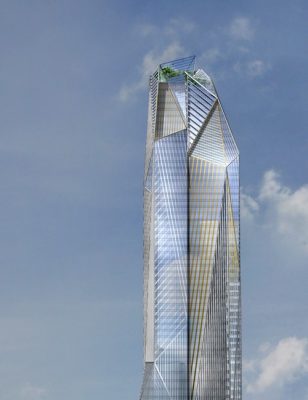
image © Ateliers Jean Nouvel
HEKLA Paris Building
Architects: Bruno Gaudin Architectes
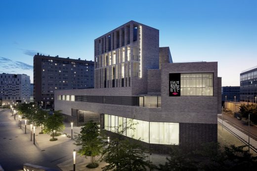
photo © Takuji Shimmura
La Contemporaine, Nanterre Building
Architects: Snøhetta
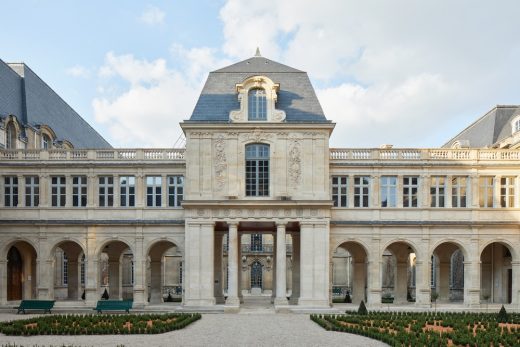
photo © Antoine Mercusot
Musée Carnavalet Renovation
Comments / photos for the Sun Dial Apartment Renovation Paris design by Manuelle Gautrand Interiors page welcome


