Freshly Cosmetics, Madrid Shop Interior Development, Spanish Commercial Project, Architecture Images
Freshly Cosmetics in Madrid
4 Nov 2020
Architects: CuldeSacTM
Location: 46 Fuencarral, Madrid, Spain
Freshly Cosmetics opens its second flagship store with CuldeSacTM
Photos by David Zarzoso
Freshly Cosmetics
The creative team of CuldeSacTM designs the second retail space of the natural beauty e-commerce Freshly Cosmetics.
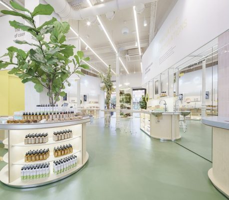
The second Freshly Store has already opened its doors in the heart of Madrid; a 100 sqm space at 46 Fuencarral.
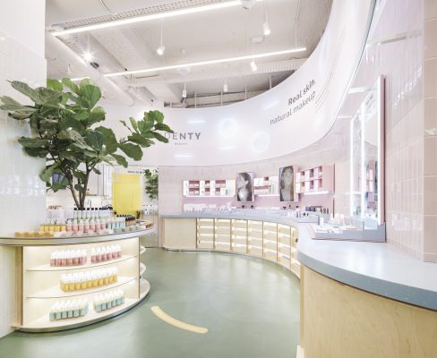
After the success of the first space in Barcelona, the Freshly Cosmetics team has once again joined forces with the Valencian studio CuldeSacTM for this new challenge. A space that is the evolution of the previous one. Freshly’s iconic curve reflects the brand’s personality: it makes things easier, speeds up routes, takes risks and breaks new paths.
A brave and cornerless brand. In addition to these attributes, there is also the DNA of Identy Beauty, the new makeup line with which the company has broken into the market. An in-store journey in parallel through the duality within the same brand. The more conventional face of Freshly in front of the spontaneity of Identy.
CuldeSac’s work has focused on translating the firm’s website into space. If Freshly was born as an e-commerce site, Freshly Stores must show that same nature. A space that has the online content and adds a social dimension by encouraging contact between brand and client.
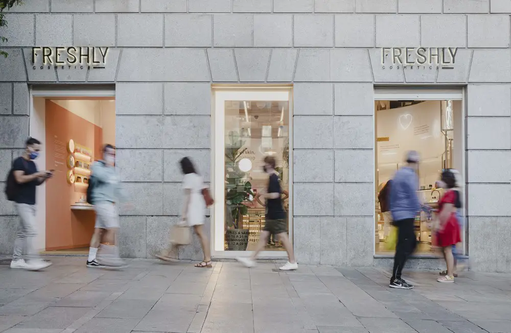
The store’s façade is divided into three sections. The central showcase works as a call to action and, in it, stands the icon of the F so recognisable on the façade of the Barcelona shop. On each side are the two entrances.
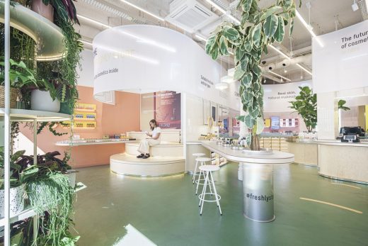
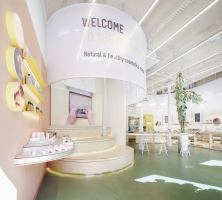
On the right, the user enters through the Freshly products, turning the curve to interact with them. On the left, the user will meet the most social part of Identy. A huge canvas hanging from the ceiling welcomes the user, who will find tiers that work as an extension of the street, which are used as a meeting point inside the store, where the user can be, sit down to charge the phone or watch the rear video wall projections with the brand’s new products.
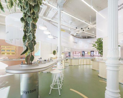
Thus, an octagonal space appears before the visitor, preserving the original structure, in which the elements designed ad hoc cohabitate and interact with the existing ones. During their journey in the shop, the user is surrounded by canvas from both brands. Freshly’s, which is more rational and ordered, transmits the brand’s values; Identy’s with inspiring messages and in larger formats.
Between the two entrances to the shop, the concept of a square is generated to walk through the space, through the duality of its identity, the organic route through the curves of Freshly and the social dimension of Identy. This parallel journey opens up two squares in the shop, both surmounted by vegetation, in allusion to the eco character of the firm. The first one belongs to Freshly and works as the central axis of the shop to interact with its product.
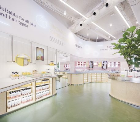
The second one emerges to generate the circulation of the space until the birth and materialization of the Identy square. A place that breathes a very natural essence, where customers can test the products and look at themselves in the mirror. At exhibition level, these squares are separated by a full-length mirror that delimits the areas and completes the curves, creating a sensation of openness in the space.
In the Freshly area, CuldeSacTM has reproduced the design already generated for the first Freshly Store in Barcelona.
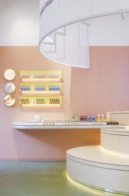
However, the team has worked from scratch for Identy to create a spatial identity with its own exhibition system, which shows the product in an elevated and orderly way.
The brand’s colour palette has determined its materiality in the shop. The canvas that dresses this area continues until it opens up to a more intimate space in which the highlights of the collections are displayed. In the background, appears the recognisable yellow stain recovered from the Barcelona shop. This spot leads to a back terrace that introduces lighting, vegetation and colour into the space.
This is how the new Freshly Store in Madrid is launched, a parallel journey through the duality of the brand that works as an offline contact point between Freshly Cosmetics and its more than 500k thousand followers.
Architects: CuldeSac TM
Photography: David Zarzoso
Freshly Cosmetics, Madrid images / information received 041120
Location: 46 Fuencarral, Madrid, Spain, southwestern Europe
Architecture in Madrid
Architecture Tours Madrid by e-architect
Madrid Architecture – recent architectural selection below:
Architects: IDOM
photo : Aitor Ortiz
REE Campus
Design: Gluckman Tang Architects – Estudio Álvarez Sala – Arquitectura Enguita y Lasso de la Vega
image Courtesy Gluckman Tang Architects
Museo del Prado Building Design by Gluckman Tang Architects
Architects: IDOM

photo : Aitor Ortiz
University of Navarre Clinic
Madrid Architect – Spanish capital architectural firm listings on e-architect
Comments / photos for the Freshly Cosmetics, Madrid Architecture page welcome

