Bliss County Amusement Park, Nashik Leisure Building Development, India Commercial Architecture Photos
Bliss County Amusement Park in Maharashtra
24 May 2021
Bliss County
Architecture: Ar.dhananjay Powar, Synectics Architects
Location: Nashik, Maharashtra, western India
Photos by Yasar Curtay
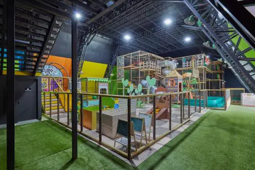
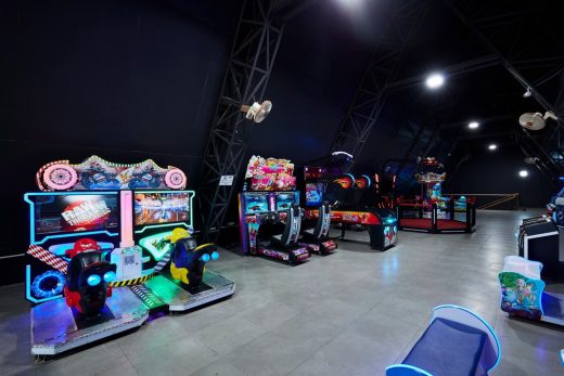
Bliss County Amusement Park is located on the right-hand side of the pocket in this property which has a separate entrance from the entrance lobby. An indoor amusement park was introduced where an individual between the age of 2 to 80 years get engaged into the theme of it.
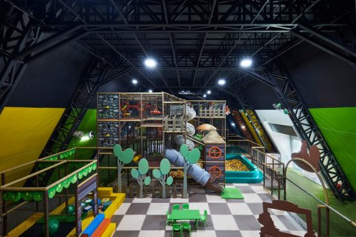
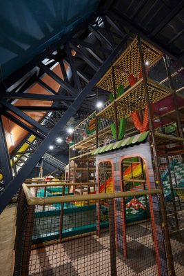
The Amusement park was designed in such a way that it reflects an imaginary thought of a child’s dream. The ground floor has a jungle theme play area having different pockets of games.
The ground floor has a sprawling area of 12000 sq.ft. with a height of 7.5 m. The interiors have a playing grey colour theme with vibrant wall colours, hence engendering a colourful ambience for the kids playing there. On the ground floor, you are introduced by 2 staircases which are placed on either side of this block.
One guides you to the mezzanine/first floor where you have the card and coin games such as we are in a virtual authenticity. The other staircase on either side acts as an exit way from this space. Here again, the colour theme is intentionally kept in a dark grey tone engendering a sense of concentration onto the activities transpiring. The mundane toilet block is located below the staircase.
The orientation of the Amusement Park block is designed angular style to enhance the entire composition of sundry pockets designed. It additionally has an outdoor sports area beside the park-like net cricket and sundry outdoor activities.
Challenges
1. The site was located on the outskirts of the city due to which the first challenge we faced was how to magnetize the walking customers.
2. The second task after a visitor steps in was to keep them engaged throughout the journey.
Solutions
1. Four Pockets Of Restaurants
These pockets give an individual four different options to explore at a time maintaining the flexibility of spaces.
The reason behind four pockets increases the probability of a visitor visiting again to explore the themes exhaustively.
2. Amusement Park
An indoor amusement park was introduced where an individual between the age of 2 to 80 years get engaged into the theme of it.
The Amusement park was designed in such a way that it reflects an imaginary thought of a child’s dream.
Wave Form
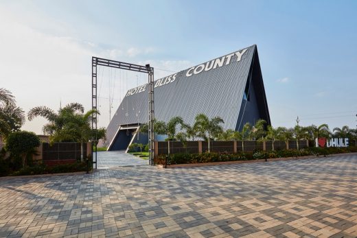
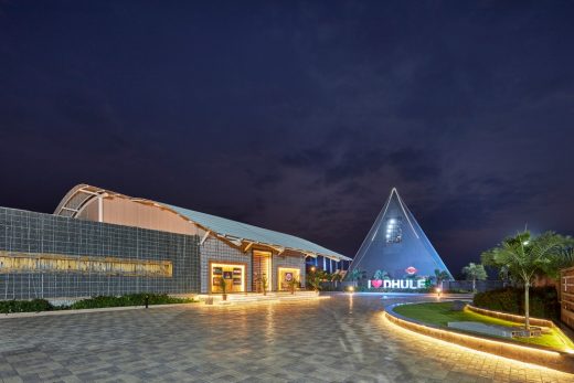
The site being located in the outskirts with a minimum built context around, one could experience breeze and views of mountains which inspired us to introduce a free-flowing structure in the form of a wave for the restaurant spaces.
Gabion Wall
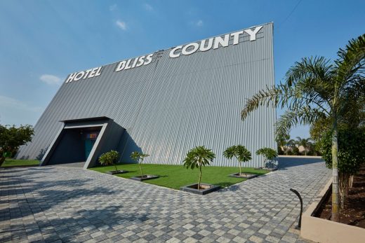
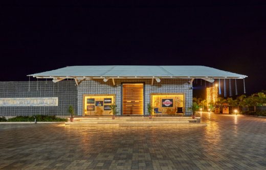
The gabion wall designed in the facade is the reflection of the Laling fort, the site is situated at the foothills of the fort, thus giving us an experience/glimpse of the fort wall/fortress.
After entering the prevalent entrance lobby, you are welcomed/greeted by an astronomically immense door that altogether breaks human anatomy. There are two pockets designed on either side of the entrance door which acts as a selfie point for the passer-by.
The external front façade has a huge linear Gabion wall which again reflects the fortress of the Laling fort, where the site is situated at the foothills of the fort.
This Gabion wall consists of all the excavated stone chips/rubble which was excavated from the site itself.
At the entrance bay, the Gabion wall monotony is been differentiated with white pebbles, again differentiating its own identity.
At the entrance, you are introduced to the prevalent entrance lobby/reception area from where you are guided towards the four pockets that we have designed which again has different themes thus, engendering their own identities.
The four theme restaurants are designed with the intend of regaling an individual with a different ambience and cuisine.
The four theme restaurants are been elaborated as per following:
1. Open Window
It’s a fine dine air-conditioned restaurant designed in the introvert theme of open windows, where different patterns of windows are rendered with rudiment levels onto the wall and ceiling engendering a fascinating collage altogether on the given canvas on wall and ceiling.
We have endeavoured to camouflage the AC units which are suspended from the ceiling with the pattern of windows which is rendered onto the ceiling.
The furniture/couch is designed in such a way that it gives a feeling of royalness without hampering the main theme. Here, linear profile lights have been introduced onto the wall acting as a salient feature of highlighting avail.
2. Shamiana
The intention for introducing the Shamiana theme was to have a sense of extrovert feeling where one can get connected to the sky during the daytime and with the stars during the dusk.
Hence, this space is been loved by individuals as they get a feeling of dining onto a gazebo. Here, we have introduced raw wooden flooring onto which we have placed individual nine numbers of gazebo.
This space has a dramatical ambience in the day as well as in the dusk time.
Here, we have suspended desultory filament bulbs onto the roof which acts as a lightning avail for this particular space.
3. Sunny Da Dhaba
The purpose of introducing this particular theme in this pocket was to get connected to the highway culture transpiring around the vicinity of the site (i.e NH 3)
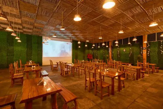
Here we have introduced a Dhaba theme which is again an introvert space that reflects the dhaba culture through its cuisine and ambience.
The furniture over here has been carved from raw wood and designed by keeping/maintaining its identity intact.
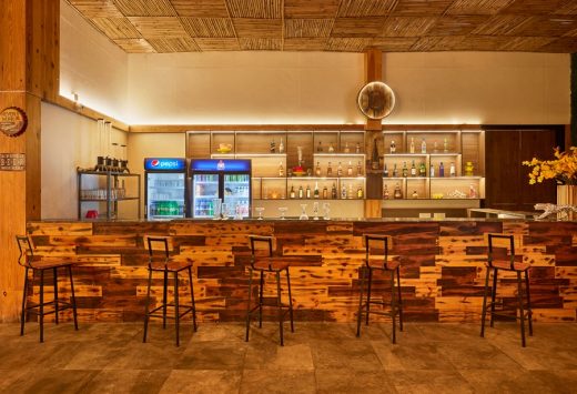
Here we have rustic shahabad flooring and the ceiling has several bamboo sticks juxtaposed in such a way that it introduces daylight/skylight in the daytime altogether giving it an identity of bamboo roofing.
All four sides of the wall are cladded with green artificial walls engendering a cozy atmosphere into space.
The bar counter over here is the main element of magnetization which is designed in a very rustic way.
4. Rock-on : The Lounge
Here you are greeted with a vibrant entrance door with a diagonally placed rustic bamboo handle.
The interiors have been designed with a single dark grey tone where the flooring has a rustic pattern and the ceiling has vibrant lightning avails, which engenders a throbbing atmosphere /mood inside. Here, we have introduced a vintage car that is placed upside down having vibrant colours suspended from the ceiling giving a sense of zing effect to the overall ambience.
The furniture has pastel colours which again stands out in the overall monotony. The admin block and the kitchen is located at the rear side of these four pockets which acts as a passive zone for the entire property.
A minuscule open lawn area is located at the rear terminus of the property which acts as
Architects: Synectics Architects
Photographer: Yasar Curtay
Bliss County Amusement Park, Nashik images / information received 240521
Location: Nashik, state of Maharashtra, west India, south Asia
Indian Architecture
Contemporary Architecture in India – architectural selection below:
Indian Architecture Designs – chronological list
Indian Architect – design firm listings on e-architect
Maharashtra Buildings
Architecture: Sunil Patil & Associates
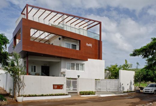
photo : Hemant Patil
New House in Pune
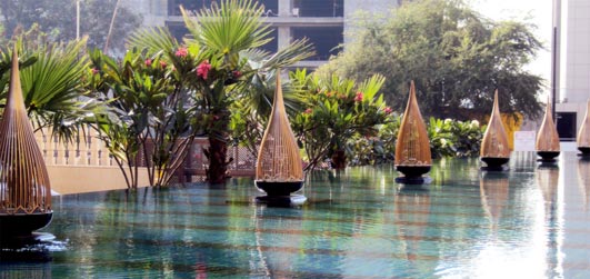
photo : Ruchika Grover
Hyatt Regency Pune
, Pune, Maharashtra, western India
Architecture: Sunil Patil & Associates
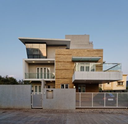
photo : Hemant Patil
Wanzare Bungalow in Pune
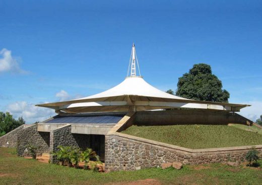
image from CCBA Architects
YMCA Campsite Nilshi
Comments / photos for the Bliss County Amusement Park, Nashik page welcome


