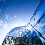
Grimmwelt Museum Kassel building, Northern Hesse architecture design, Brothers Grimm exhibition space Germany
Grimmwelt Museum Building
Contemporary German building design by Kadawittfeld Architektur in Northern Hesse, DE.
post updated 23 September 2023
Design: Kadawittfeld Architektur
Location: Kassel, northern Hesse, Germany
Grimmwelt, Kassel – A Place of Contrasts
Photos © Jan Bitter
15 Oct 2015
Grimmwelt Museum in Kassel
Competition
The design of Grimmwelt was determined by a competition in 2011. It was launched with the objective of developing a museum for the presentation and exploration of the Brothers Grimm’s works and creating a centre to keep alive the spirit and mind of the two linguists. From an urban design perspective, the new build is the key part of a master plan, which forms a triad together with the Grimm monument and the Grimm display in the Hessian State Museum close by.
Architecture and topography
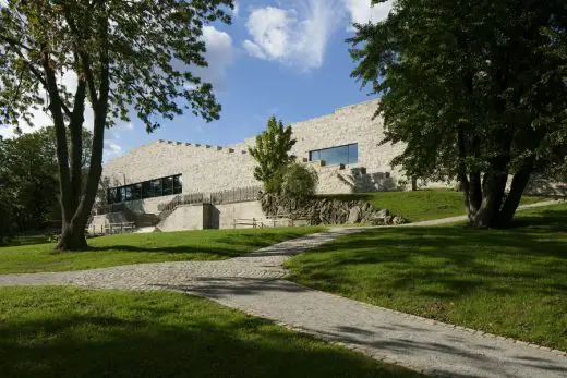
The particularities of the location formed the design: the building is positioned on the southern side of Weinberg in the middle of a beautiful listed park. The accessible sculpture is perceived as a structural continuation of the steep slope, which was terraced at the turn of the last century for the construction of two factory owners’ villas. The remnants of a stairway and a wellhead are a reminder of the so-called Henschel Haus, which was destroyed by an air raid in 1945 and now functions as the position for the museum. The stone relics will continue to be part of the garden with the effect that the new build is not only embedded in the urban landscape but also in the history of the grounds.
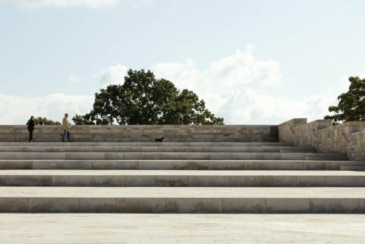
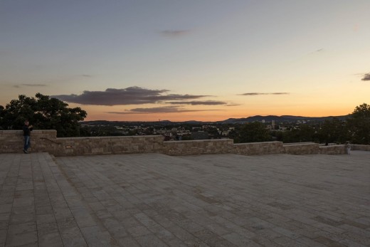
The building protrudes from the slope like a further rampart and literally invites visitors to explore and clamber the broad and slightly tapered stairway embedded in the southern facade that leads up to the roof: an accessible area ten metres above the ground measuring 2000 square metres and designed as a rising terraced landscape. The exterior walls are drawn up beyond the roof level as parapets and stepped to match the level of the roof landscape. A variety of events can take place on the spacious terrace – even outside opening hours – in order to make up for the valuable space lost to public use by the museum.
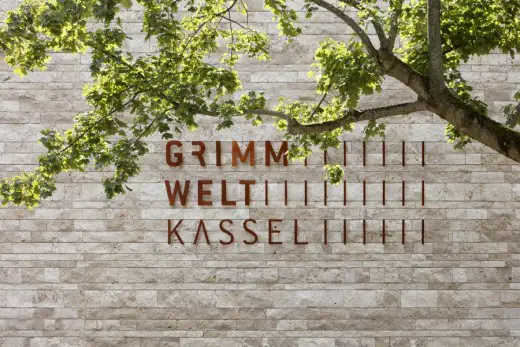
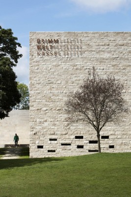
The reinforced concrete structure is clad in light natural stone, Gauinger Travertin, with alternating thicknesses. The building is compact without, however, appearing stout. The choice of material is in itself a reminiscence of the former vineyard, since the hill is made of limestone. A glass box projects from the iridescent roof surface reflecting the surrounding environment. It is in fact a lift, which provides barrier-free access to the roof terrace.
Inner landscape
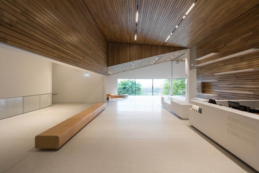
After entering the building, visitors are awarded with a spectacular view of Kassel’s surroundings. The foyer is high and reaches the full depth of the building ending in floor-level windows that open up to the familiar panorama.
The most fascinating room, the introductory room, is to the left of the foyer. It is positioned in the centre of the building, spans four levels and has two very specific functions. Its full-height, pearly white and fine-grain plastered walls are used as projection surfaces and are thus part of the exhibition. But more than anything else, the space functions as a distributor, and this is where visitors start to understand the impact the terraced structure has on the interior’s arrangement: there are no conventionally stacked levels, but staggered planes designed according to the split-level principle. The height of the introductory room allows views into all four publicly accessible areas of the museum, thus connecting the different contents within the 1600-square-metre exhibition space.
The café, which is also used outside museum opening hours, is attached to the introductory room. The sloped ceiling traces the outdoor stairway on the southern side of the building; the flow of space is emphasised by the uniform sheathing of the walls and ceilings in the foyer. Oak panelling has been used as a reference to the frequently repeated theme of the forest in the Grimms’ Fairy Tales. The ceiling in the foyer, as is the case for all other areas in the museum except for the offices and ancillary rooms, is also sloped; right angles are an exception throughout the entire building. Most floors are finished in light terrazzo.
The administrative wing with offices for the employees is located on the right side of the foyer, looking south. It is a very basic, clear structure. Glass partition walls and simple screens encourage communication among colleagues. A wide ribbon of windows wraps around the north-west corner of the building; a separate entrance to the office area is positioned in the west facade.
The exhibition areas, which are accessed from the introductory room, have a life of their own due to the clear layout of space and can therefore be devoted to a variety of different subjects. The small embrasure-like windows on level -1 only allow diffuse light to penetrate into the exhibition space. Level -1 and -2 accommodate the permanent exhibits. The museum concept designed by Holzer Kobler Architekturen and hürlimann+lepp is organised according to individual letters and terms taken from the Brothers Grimm’s German Dictionary. Level 0 with the entrance area also provides access to the highest level E1 with 400 square metres for changing exhibitions and a ceiling with white lamella panels. In contrast to the window-less room, the adjoining area for museum pedagogy is fitted out with a panorama window providing yet another privileged view to the south.
The ups and downs of paths through the terraced park, the stairways and alternating levels are continued inside – in a sense, it is a building designed to persist with its environment and not only in it. It is a museum that does not only want to present contents, but mediate their existence in a playful way, adopting the visitors as participants and providing them with an aesthetic and multifaceted framework for the experience.
Grimmwelt Museum in Kassel – Building Information
Location: Kassel (DE)
Volume: GFA 6,000m² incl. roof area GV 24,400m³
Completion: 2013-15
Competition: 2011, 2nd prize; VOF procedure 2012, 1st prize
Client: documenta Stadt Kassel
Architect: kadawittfeldarchitektur | www.kwa.ac
Exhibition design: Holzer Kobler Architekturen
Curatorial concept: Hürlimann + Lepp Ausstellungen
Photography © Jan Bitter
Grimmwelt Museum in Kassel images / information from Kadawittfeld Architektur
Location: Kassel, Germany, western Europe
Architecture in Germany
German Architecture
German Architecture Designs – chronological list
9 Jun 2017
Chilean artist Cecilia Vicuña and architecture collective Ciudad Abierta de Ritoque at documenta 14
The National Council of Culture and Arts Chile is pleased to announce that artist Cecilia Vicuña will participate in documenta 14. Documenta, now in its 14th edition, consists of two venues: Athens, Greece and Kassel, Germany where it originated sixty years ago. The poet and visual artist Cecilia Vicuña and the project Open City of Ritoque were selected by the curator of the exhibition, Dieter Roelstraete, to be part of this edition.
documenta 14 Kassel
Golden Workshop Münster
modulorbeat Architects
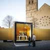
image © Christian Richters
Golden Workshop Münster
Temporary Pavilion that was on display in Münster for the exhibition “Golden Glory. Medieval Treasury Art in Westphalia”, a small, attractive pavilion containing a gold workshop as well as an information point.
Jewish Museum Berlin
Daniel Libeskind Architect
Jewish Museum Building
Müritzeum
Wingårdh Arkitektkontor AB
Müritzeum
German museum building : Folkwang Museum, Essen
Comments / photos for the Grimmwelt Museum in Kassel, Northern Hesse building design by Kadawittfeld Architektur page welcome.
Website: Kadawittfeld Architektur


