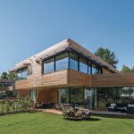
Boeselburg Student Housing, Münster Buildings, German Architecture Design
Boeselburg Student Housing
German Apartment Development design by kresings architektur
18 Sep 2015
Boeselburg Student Housing in Münster
Design: kresings architektur GmbH
Location: Münster, Germany
Train of thoughts
What is it that people expect from a new large complex of dormitories? People expect such a housing complex to make efficient and effective use of expensive space by means of a log building system and straight borders. Right angles, paths and squares, symmetrical bike parking racks, benches and green spaces allow the surface to be used in an optimal manner; in addition, they make straight lines appear orderly and smooth.
However, symmetry and efficient use of surfaces may also have a chilly and static effect.
Why is it that medieval urban structures with its crooked streets the ends of which are not visible, with its detailed structure and its scale, make us feel comfortable? What is it that attracts us in such a magic way, without mentioning the cute facades? It is the instantly sensual and physical effect, a sense of home in terms of warmth and security. Those with an architecture-academic mind may despicably say: ”A doll house!“. The body, however, exclaims: “That is exactly where I feel understood and cradled.”
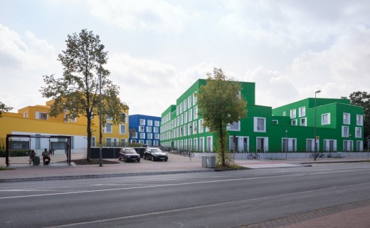
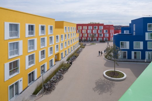
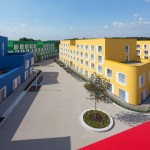
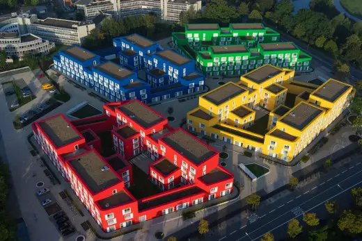
The complex of student housing erected at the Boeselagerstraße in the city of Münster takes up these ideas and, with a total of 535 residents on a living space of 18,000 m⇢ after all, creates a flowing, asymmetrically arranged urban space of its own which conveys an almost rural sense of security rather than having an intimidating effect.
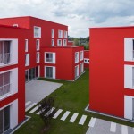
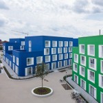
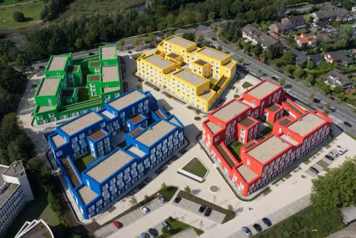
The core of the strategy is formed by four building blocks. They have the same basic form without copying one another though; they rather act as true individuals, this impression being particularly supported by the way they are positioned. The building blocks themselves do not form any regular rectangles, the short sides have different lenghts, and there are no right angles.
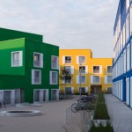
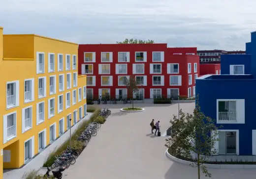
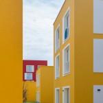
This slight shift alone causes dynamics in itself. The blocks are arranged asymmetrically towards one another, too, and they give the impression of randomly dropped puzzle pieces. Narrow passageways are created at those spots where the building blocks almost touch one another, whereas surprising triangular places emerge at those sites where these blocks are placed further away from one another.
The play of contrasts – in this case narrowness and wideness – is typical of the complex of dormitories located next to the lake Aasee in Münster. The structures overlap – interior and exterior, high and low, condensed and decondensed –, as do the functionalities.
Consequently, there are not just either public or private areas, but there are many gradings and intensities, similar to structures typical of a city from the so-called Gründerzeit (years of rapid industrial expansion in Germany at the end of the 19th century). There are the clearly public spaces, the streets and paths, the main squares, created by means of the asymmetrical building blocks irregularly positioned towards one another.
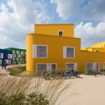
There are paths, verandas and stairways close to the house which, although being public parts, answer to both the immediate access to the individual houses and to the residents’ recreation and which are therefore a little bit more private than the main paths. This differentiation between public and non-public areas is supported by hedges, walls and fences as well as by private stairways leading to the upper floor levels.
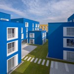
The four building blocks themselves form four closed interior courtyards; and here, too, it seems quite logical to make use of the analogy with the classical building block. The blocks are restful and intimate, but create the shared location of a clearly defined community, and of the urban block.
The building blocks are shaped and formulated in a sophisticated way. They each consists of four main houses and four rear houses thus creating angles and corners, opened-out areas and narrowing spots as well as beautiful diagonal views in the interior courtyard.
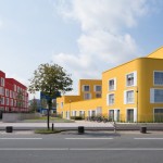
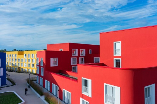
The main side of the house leading to the main paths also varies in height and thus leads to an optical denticulation of the interior (courtyard) and of the exterior (public areas) space. The character of community and block is underlined by the maximum of four floor levels. Everything appears overlapping, small and detailed, despite a lateral length of 75 meters.
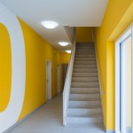
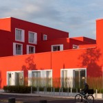
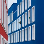
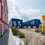
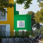
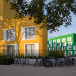
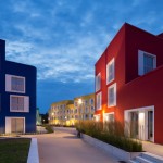
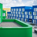
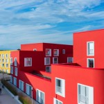
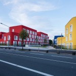
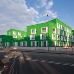
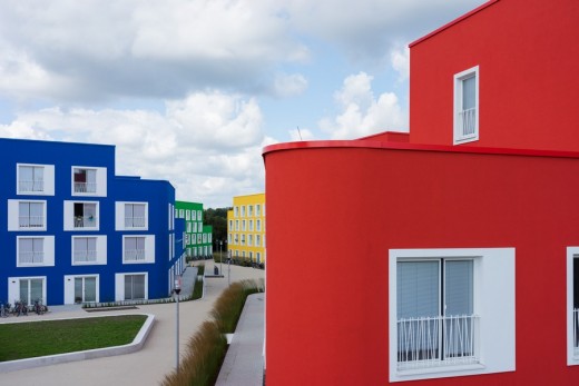
The colors of the frontages provide for vividness. The luscious color shades and their intense brightness create a sense of intimacy and sympathy. The red is a tomato red, the yellow is a sun yellow, the green is a grass green, and the blue color created by Ives Klein reminds people of things like the sky, the sea, the sun, and southern countries. Combined with white-colored frames that are irregularly positioned around the windows, this builds up a positive chain of associations, a Mediterranean, relaxed, liberal and open flair, which maybe is also young and playful. The nuances may be quite different depending on the various persons, but the linkage of thoughts is always a positive one.
What thanks to a very sophisticated ground plan and the absence of parallel block borders and paths still gives an academic impression when taking a look on the layout plan, makes visitors feel homy and be curious right away. The visual relationships are dynamic; sometimes, the view is stopped; sometimes, it is redirected, and there are other spots where unexpected places open up. Upon the first visit, nothing is predictable, and the walk through the areal turns out to be a sequence of visual surprises.
Here, the relationships among the individual elements, i. e. the urban qualities, are almost as important as the individual design. Real spaces have been created, which are usable, individual and urban spaces and not just a temporary scenery of dormitories. This is where people do not only study and sleep, but this is where they spend the entire day, optionally together with the residents of the same house, of the same block, or of the total areal.
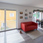
The living spaces of the apartments range from 25 m⇢ to 180 m⇢ , depending on whether you consider a 1-room, 2-room or 3-room apartment or one of the collective apartments with 5 integrated apartments.
The quality of urban building and a high living quality as well as flexible ground plans were crucial requirements indicated yet in the invitation to tender. The quarter, which was erected in passive house standard, allows mixed coexistence of students, families and elderly people, with the concept of barrierfree buildung having consistently been adhered to. Depending on the further development of the number of students, there might be a purely non-student living area one day. In any case, the given infrastructure is able to meet such kind of demands. There is a pub, a kiosk, a daycare facility for children, a launderette, as well as other community facilities.
Boeselburg Student Housing in Münster – Building Information
Architects: kresings architektur GmbH (Rainer M. and Kilian Kresing)
Building: Council and student housing at the Boeselagerstraße, Münster
Architects: kresings architektur GmbH | Lingener Str. 12 | 48155 Münster (Germany)
Project staff: Stefan Fuchs (job captain), Guido Becker, André Pannenbäcker, Jan Tölle
Building contractor: Studentenwerk Münster (Student Administration)
Supporting framework: gwi Gantert + Wiemeler Ingenieurplanung, Münster (Germany)
Landscape architect: RMP Stephan Lenzen Landschaftsarchitekten, Bonn (Germany)
Completion: April 2014
Location: Boeselagerstraße No. 69 – 75, Münster (Germany)
Photographs: HG Esch, Attenberger Strasse 1 53773 Hennef (Germany)
Boeselburg Student Housing in Münster images / information from kresings architektur GmbH
Location: Münster, Germany, western Europe
Architecture in Münster
Münster pavilion building design by modulorbeat on e-architect:
Skulptur Projekte Münster 07 exhibition
image from modulorbeat Architekten
modulorbeat : Skulptur Projekte Münster 07 exhibition images
Another Münster Building, on e-architect:
RS+Yellow Furniture
Design: BOLLES+WILSON
photo : Markus Hauschild © BOLLES+WILSON
RS+Yellow Furniture Münster
Architecture in Germany
German Architecture
German Architecture Designs – chronological list
Jewish Museum Berlin
Design: Daniel Libeskind Architect
Jewish Museum Building
Müritzeum
Design: Wingårdh Arkitektkontor AB
Müritzeum
German museum building : Folkwang Museum, Essen
Comments / photos for the Boeselburg Student Housing in Münster page welcome
Website: kresings architektur


