Special Wooden Floors for the Whitney, New York Building, Architecture, Architect, News
Special Wooden Floors for the Whitney
Gallery in Manhattan, NYC, USA – article: Joel Solkoff, PA, USA
9 Jul 2015
Special Wooden Floors for the Whitney in New York
Article by Joel Solkoff, PA, USA
Joel’s Column Vol. III, Number 4
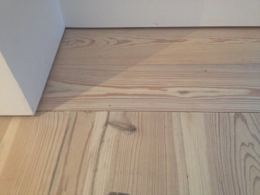
Photograph of Renzo Piano’s special floors for the Whitney Museum of American Art which opened in the Meatpacking District of New York May first. Photograph provided exclusively for e-architect by Sarah Schmerler.
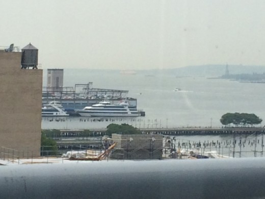
From Renzo Piano’s central point of design namely; the eighth floor of the new Whitney, visitors can see New York harbor. When the air is without clouds, one can see clearly the Statue of Liberty directly to the right. Photograph by Joel Solkoff.
Renzo Piano’s Special Wooden Floors for the Whitney Museum of American Art In New York City: What architects building museums need to know about art.
“Piano’s team brought the wood in to the building a year before the opening to let it ‘cure,’ to acclimate it (or else it would have warped). Nail holes are still visible in the strips,” writes art critic Sarah Schmerler in her review below of the new Whitney. Sarah has been an art critic and journalist in New York City for 19 years, contributing reviews, news features, and profiles to TimeOut NY, Art in America, The New York Times, ARTNews, The WG News + Arts, The Village Voice. Sarah frequently curates and organizes shows in both gallery and non-traditional spaces around the City. Sarah has been covering the opening of the new Whitney since before its May first opening day. She attended the press briefing on April 23rd and has spent hours indeed days analyzing the museum.
Architects should be aware there is a global boom in building museums—a subject to be discussed in a future column in this Piano Whitney series. The key to Renzo Piano’s success as a museum designer is his respect for the collection. What follows is Sarah’s report
++++
Sarah Schmerler’s report for e-architect on the Whitney:
“No one lives in a museum. When the lights are off and everyone goes home, the real inhabitants are the paintings, the sculptures, the works on paper, the conservation tables and equipment, the archives… yet there is a huge amount of cultural capital and clout that ‘lives’ there as well.
“A museum’s Permanent Collection is its declaration to the Culture of its net worth, and we come to view that work as our legacy. (How much more so when you’re talking about a museum of American Art?) “
++++
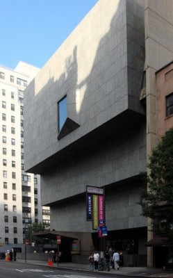
Photograph courtesy Wikipedia which notes: “The Whitney Museum of American Art’s former (1966-2014) home on Madison Avenue. The Marcel Breuer-designed building will be leased by the Metropolitan Museum of Art beginning in 2015.”
++++
“Moving the Whitney’s collection from regular display on two floors (if memory serves; many floors of the old were purposed for rotating exhibits) to the huge, lebensraum it has now is a game changer.
“It may, if all goes well, show us a new side of our American legacy. I would hope architects will find it useful to consider my curatorially savvy visitor’s point of view (one who has clocked in hundreds of hours walking around NYC’s galleries and museums, from Buswick to Museum Mile). I wonder: can we thank a building for giving us more of America? And if so: how?
“When you are an art critic, and have grown up seeing reproductions of a museum’s permanent collection since you were a kid, visiting those paintings over the years in person makes you feel like a supplicant on a kind of pilgrimage. I felt that way about the Whitney. I grew up in Florida and only saw the Marsden Hartleys, the Arthur Doves, the Edward Hoppers, in postcards. “
++++
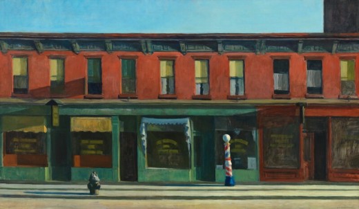
Edward Hopper’s Early Sunday Morning is the most famous work of art in the Whitney. The President of the United States has Hopper’s original work in the Oval Office. The President and First Lady are Edward Hopper fans. Photograph courtesy of the Whitney Museum of American Art., New York; Purchased, with funds from Gertrude Vanderbilt Whitney.
++++
“Later, when I came to New York in my teens and finally went to the Whitney in person, I felt as if those paintings belonged to me. They were a part of my psyche; they affirmed all the art history I was studying in books. What’s more, I felt a sense of pride in the museum that owned them. To me, the Whitney was the Steward of American Art.
“The flipside of this sort of fan-dom is intractability. The refusal to let one piece get moved from one room to another, loaned out, re-contextualized. (Formerly housed on the 5th floor of the Marcel Breuer building on Madison Ave., the Whitney Permanent Collection felt sacrosanct, small, consume-able, reliable. You knew just where to find what.
“Ah, there is the John Sloane. All is right with New York.) After seeing the Calder Circus, for instance, I knew that I could grab a Lavazza espresso across the street (served to me by a barista in a bowtie); I could browse the designer handbag shop, hit the French macaroon place, and get to the Lexington Ave. subway relatively unscathed if I timed it all right. It was all part of a ‘package’ experience that I had worked out for myself, and enjoyed consuming. America’s legacy art was soothing.”
++++
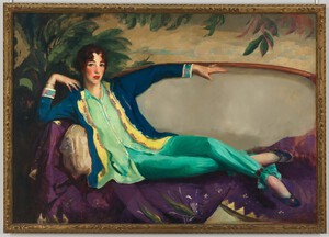
Credit line: Whitney Museum of American Art, New York; Gift of Flora Whitney Miller Sarah wanted to bring to attention the Museum’s label under this portrait of the woman who founded the original Whitney back when collecting American art was regarded as daring. Label: “Gertrude Vanderbilt Whitney, founder of the Whitney Museum, commissioned this portrait in 1916 from Robert Henri, leader of the urban realist painters who had shocked the New York art world barely a decade earlier with their images of ordinary people and commonplace city life. By 1916, Mrs. Whitney, a professional sculptor, had founded the Whitney Studio in Greenwich Village, a lively center for the support and exhibition of new American art. When Henri’s portrait was finished, Mrs. Whitney’s husband, Harry Payne Whitney, refused to allow her to hang it in their opulent Fifth Avenue town house. He didn’t want his friends to see a picture of his wife, as he put it, “in pants.” Mrs. Whitney’s attire and self-possessed demeanor were highly unusual for a well-bred woman of her day. In this painting, Henri transformed the traditional genre of a recumbent female—usually a nude courtesan or the goddess Venus—into a portrait of the quintessential ‘modern”woman. The portrait hung in Whitney’s West 8th Street studio, which in 1931 became the first home of the Whitney Museum.”.
++++
“Sometimes a permanent collection can take on a shrine-like quality, one that, in the long run, is deadening to the spirit of the work itself. (This is particularly the case in the art history of a country as young as ours.) Every work from the canon of art history was once contemporary and new; honoring it as such is an important and rather tricky thing to do, and when you are the curator or perhaps the head of a museum, you have a lot of responsibility on your shoulders if you choose to take that on.
“This new Whitney museum, designed by Renzo Piano, helmed into construction by Cooper Robertson, and activated by the many guards and assistants and office workers and curators, not to mention you and me, the ‘public,’ shoulders the burden admirably. In terms of curatorial integrity, it is humming like a top. Every detail has been given consideration; every option for display that could possibly be considered has been left open; and, sensitive decisions have been made about said works’ future and preservation.
“When I visited Arthur Dove’s “Foghorns” on the 8th floor, I leaned in close because I almost felt I could hear it humming. ‘Finally,’ it seemed to be saying, under Renzo Piano’s signature ‘sawtooth’ glass clerestory ceiling, close by the Hudson River light. ‘I can breathe the air.’
“The best thing about the Whitney isn’t the fact that the permanent collection has got a lot of space or light or lebensraum or whathaveyou. The best part of literally being in the Whitney is the floor. It exemplifies Renzo Piano’s commitment to the boots-on-the-ground artlovers like me, who clock in lots of hours looking and very little time sitting, or eating, or shopping.
“The floor is made of 100-year-old, yellow, hardwood pine; some of it sourced from Louisville, KY, some from a factory in Upstate New York. Piano’s team brought the wood in to the building a year before the opening to let it ‘cure,’ to acclimate it (or else it would have warped). Nail holes are still visible in the strips.
“This wood was not taken from the floors of the original buildings, but from the rafters. It “breathes,” it has warmth. Taking into consideration that the Whitney would want to have live performances in the space as needed, the floor has a been ‘sprung’ (as are all classic dance floors, so that it has a bit of ‘give’ under foot). But I’d like to think that the Whitney’s powers-that-be know something deeper, namely: that the proper display of paintings and sculptures is a performance in and of itself; a show that we, as visitors, enact, and as such, deserve to feel well cared for.
“Let us get to the work on display. Or rather, we all ostensibly know what the work IS — the permanent collection — but how it is displayed? Smart choices have been made. Socially smart, that is. Race is one of the two big issues in America today (the other is ‘Class,’ but more on that later), and you will find the curators sensitive and eager to provoke discussion on it, even though they are working with existing material: they have chosen well, pulling otherwise-obscure or under-recognized African-American names out of storage and into the forefront. The result is that we question if we ever really knew the Collection all that well. And that’s a good thing.
“Nancy Elizabeth Prophet (a colleague of E.B. DuBois) contributes a cherry-wood head that gets pride of placement in the center of the 8th floor; a terracotta head by Elizabeth Catlett fills a picture window onto the Hudson (‘real estate’ that is a far cry from when Catlett had to rent a room off campus when she studied at the University of Iowa under Grant Wood); and Richmond Barthé’s “African Dancer” is made a highlight of the 8th floor, along with better-known ‘hits’ like that of Arthur Dove, just paces away.
“A female African-American guard, standing near ‘Dancer,’ had a silhouette that seemed to echo that of the work, so I asked if I could take a photo of her. She assented. Things seem to be coming full circle. At least on the old-school-art score. If only Society followed suit.”
++++
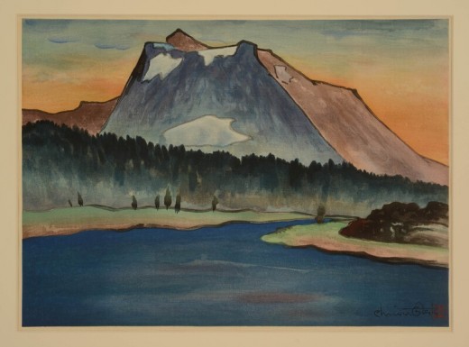
‘El Capitan’ by Chiura Obata by permission Whitney Museum of American Art, New York; Gift of Gyo Obata
++++
“The lesser-known-artist trail is pretty nicely paved here, in general, and geeks like me have to point to Chiura Obata’s meticulous watercolors for proof. The Japanese artist (who spent time in internment camp during WWII) used to haunt the National Parks — so devoted was he to the echt, American landscape. Undeterred by his internment, he was prolific, making meticulous, labor-intensive, color saturated images that are deceptively simple, yet based on the layer-upon-layer method of printing traditional Japanese Ukiyo-e prints. The curators place him (whom almost no one knows), right next to a not-too-large-ish print by Ansel Adams (whom everyone knows). The latter’s iconic ‘Moonrise, Hernandez’ gets re-contextualized now: just another gorgeous shot of the American West.”
++++
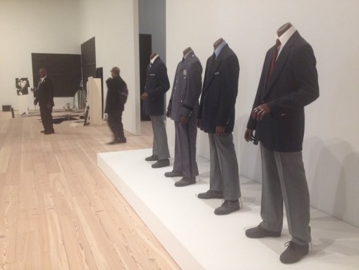
Fred Wilson is an African-American artist known for re-contextualizing the extant collections of museums and cultural institutions. Here in this photograph by Sarah Schmerler for e-architect, one sees a stand-alone artwork by Wilson called “Guarded View” (1991), featuring the actual guard uniforms of four of the major museums in New York — including the Whitney. The uniforms are all worn by by black mannequins. It’s a well-known story that Wilson gave a tour of “Guarded View” at the Whitney in 1993, in situ. The participants in the tour had lunch with him first, and then he asked them to meet him near his own work, upstairs. He then donned a Whitney Museum guard uniform and stood next to his own artwork, under a sign with his name on it. No one in the tour recognized him, though they had seen him minutes before. An actual, current Whitney Museum guard, of color, is visible guarding the piece as it is installed in the new building, in the distance.
++++
“Ansel Adams was roaming free on November 1, 1941, (commissioned by Harold Ickes, [President Franklin Roosevelt’s conservation minded and art minded Secretary of Interior]) making Adams’ famous print. Around that time, Obata was decidedly persona non grata; by 1942.
“Obata was interned in a camp. Funny how things work out. Or don’t, for artists — Depending on how long they are willing to wait. Who could have predicted that New York City would be a tourist playground, with soaring property values, where once stood abattoirs?
“As you make the transition from one floor to another, via outdoor staircases, you might get a little vertigo-feeling that lets you see Piano’s building more as a ship-of-art recently docked than a permanent edifice? You will hear the seagulls, anyway (yes, for real, they fly overhead).
“Expressionism? Minimalism? Pop? America has many stylistic ports of call; here they are arrayed in their dress whites, thanks to Piano’s sensitive and versatile design. How long will the amazing-new vibe of the old-school work stacked in perfect harmony last? Calling the curators; All Hands On Deck. Contextualizing America’s art during the next millennium is going to be a bumpy ride.”
So ends Sarah Schmerler’s special e-architect report.
++++
It is not yet time for a parade and celebration. For that read Column three of this Piano Whitney four part series.
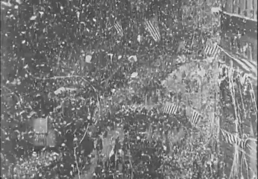
Screen shot by Joel Solkoff of public domain video of the Charles Lindberg parade in New York City. The size of New York’s enthusiasm for Renzo Piano took on a quality of celebration that is astonishing by any standard.
The question posed in this column’s previous issue is whether the flood of visitors coming to the Whitney can destroy Renzo Piano’s great vision for the Whitney. Charlie Rose, the best interviewer on U.S. television asked Renzo Piano about his vision for the Whitney. Charley Rose said to Renzo Piano, “Here is what you said. You hoped to incorporate the following efforts into the museum design: ‘social life, urbanity, invention, construction, technology, poetry, and light. That’s a huge undertaking.’”
Renzo Piano laughed and said, “That is true. Architecture is about putting all these things together.”
++++
The huge fuss the Piano Whitney opening created resulted in attendance figures far higher than the consultant who was hired to prepare had anticipated. In the last year when the Whitney was at its previous location, 372,000 visitors attended in a year. From May first until the third week in June, the new Whitney had 260,000 visitors in less than two months.
++++
How safe is Whitney’s design from being ruined? In the next installment, Joel’s column discusses Piano’s Whitney design goals and compares them to the design goals of Piano first New York museum, the Morgan Library and Museum. The Whitney may be Sarah’s favorite collection. The Morgan is mine. More lessons for aspiring museum architects will be presented.
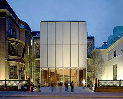
Renzo Piano’s Morgan Library and Museum completed 2006. Photograph by Michael Denancé published by permission of the Morgan.
Good night and good luck.
–Joel
This column copyright © 2015 by Joel Solkoff. All rights reserved.
Special Wooden Floors for the Whitney in New York information / images from Joel Solkoff, PA, USA
Piano’s Whitney Neighborhood – a follow on article, November 22nd, 2015
Address: 99 Gansevoort St, New York, NY 10014, United States
Location:99 Gansevoort St, New York, NY 10014, United States ‘
Architecture in NYC
Whitney Museum, 945 Madison Avenue, Upper East Side
Date: 1966
Architect: Marcel Breuer
Whitney Museum Building New York
Whitney Downtown Museum Design
Architectural Provocateurs Axis Mundi Imagine a Different Whitney Downtown
Design: Axis Mundi, architects
imaeg from architects
Axis Mundi NYC
Whitney Museum Architect – Marcel Breuer
New York City Architecture News
New York State Architecture Designs
New York Architecture
Guggenheim Museum Building, East Harlem
Design: Frank Lloyd Wright Architects
photo : David M. Heald, © SRGF, New York
Guggenheim Museum New York
Design: Herzog & de Meuron, architects
image © Herzog & de Meuron, Basel, 2008
56 Leonard Street
Rockefeller Center
Design: Raymond Hood, Architect
photograph © Andrew McRae
Rockefeller Center New York
American Museum Buildings
photograph © Aislinn Weidele/Polshek Partnership Architects
Comments / photos for the Special Wooden Floors for the Whitney in New York Architecture page welcome
Special Wooden Floors for the Whitney in New York : NYC Architecture page
Whitney Museum – Website: www.whitney.org

