hug City Flagship Store, Chengdu City Shop, New Sichuan Retail Building, Chinese Architecture Photos
hug City Flagship Store in Chengdu
12 Oct 2022
Architecture: ATMOSPHERE Architects
Location: Chengdu City, Sichuan Province, China
Photos: Chuan He from Here Space
hug City Flagship Store, China
In the face of rapid changes, all kinds of similar content quickly filled our lives through social media channels. In this phenomenon, hug, as a person who had a vanguard view and gradually stabilized the core attitude, hoped more that with the help of the clothing space, she could communicate with the outside world about the brand attitude, and create a real effect, and improve the modern city’s fragments of life, so that people could calmly express their own quiet corners, return to the field of physical and mental peace, and regain rational thinking, In this way, they could strengthen the mutual trust between the shop itself and its customers and complete the evolution of their brand.
For this purpose, the hug 3.0 was located in the core commercial area of the city, extracting the pure and gentle atmosphere derived from the nature, which was in accordance with the current situation. Through the consideration of color combination, the selection of materials like concrete, reinforcement, and the layout of curved points, the natural feeling was connected with the city’s atmosphere. He hoped that this space could give this lively city a different sense of ease and ease, Every passer-by here could feel the natural healing of human beings through the hug’s window, so as to complete the presentation of the design theme of the city valley.
Part1
Seeking gully
Mountains gathered, streams passed, and green plants were formed. Under this picture, the design attempted to complete the creation and expression of the copy of nature in the city through the visual presentation of the material combination.
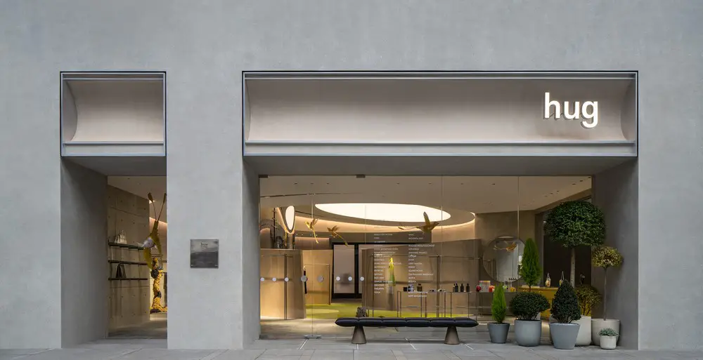
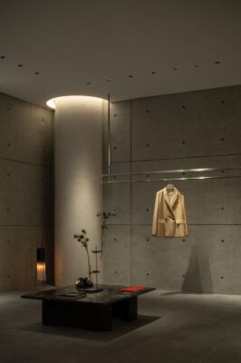
The outer wall of the space was cast with concrete, returning to its original color. With a smooth and delicate texture, it could transmit the sense of the atmosphere that one was introverted. It jumped out of the lively and noisy environment of the big environment. With the materials as the guide, it could realize the transition connection between the theme inspiration and the city’s language. It could create a simple place in the core area of the city.
In addition to the material, the left side of the entrance takes natural sections, and is decorated with small green plants to complete the interactive area outside the space. At the same time, it is used with large areas of glass to break the hard and distance of the concrete itself, to penetrate it, to increase the breathability, and at the same time, as a picture, to bring the space into the eyes of the viewer. Combining with warmth and curved surface shop settings, balance the overall sense of cool and warm color, complete the shaping of the first impression of space with an affinity and attitude.
And in doing so, spatial coordination, through the annotation of morphology and material, and sequential nature and design, have bridged the two, constructing a brand new narrative context that is detached from the present expression of homogenization. Return to pioneer perspective and move without restraint.
Part2
Oasis
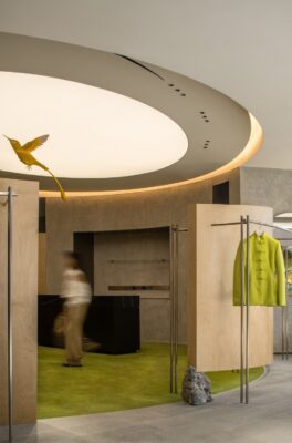
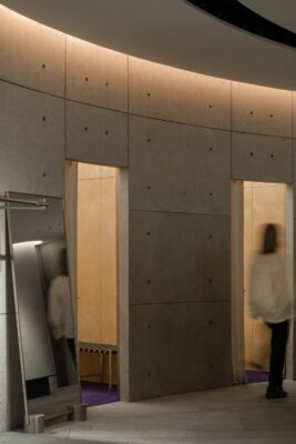
Into it, natural images are deconstructed and transmitted through material combination. Concrete, steel bar and light are integrated here to break the inherent pattern of space. Starting from the audiences’sense of body, the space atmosphere is created and the comfortable and comfortable field signal is transmitted to the entrants. The visual perception is carried through the combination of soft outfit selection and color matching which conform to brand taste and style tone. It is spread vertically in the annular space from the outside to the inside to convey the familiar and surprising viewing experience belonging to Hug.
At the same time, as far as fashion shoppers are concerned, the combination of garments, accessories and viewer browsing lines in series is undoubtedly the core of the entire space functional panel design. In order to fit the design theme and create a brand-new experience under the natural atmosphere, we also hope that in the design and thinking of display order, we can achieve progressive action line guidance based on brand narrative dimension and new retail exhibition thinking and immersion feeling. Under this plan, the long silver bars in the space become visual indexes, carrying the functions of space body display and line guidance. Include diverse styles and lead the entrants to follow the directions and follow them to explore the core hinterland.
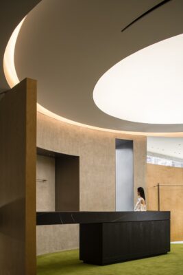
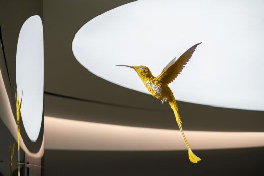
A three-dimensional wooden arc resembles a valley and sits in the center of space. Surrounded by four sides, mountains and rocks as the base, enrich the spatial level, but also create a unique spiritual fortress. Inside, you can see the light scattered at the top, combined with a large number of linear and curved lines to deduce the image of the moon around the stars. In this scenario, the hummingbird, which is simulated by 3D printing technology in extreme momentum, also flies with its wings. Green velveted carpet is laid on a large area at the bottom, surrounded by various colors of clothing. All elements blend in wonderfully harmony with each other, like a small and vibrant urban oasis, giving people a feeling of affinity and vigor. The design here tries to adapt the surreal imagination to the contemporary context, give a new natural understanding, and rebuild the urban corridor.
Part3
Symbiosis
In addition to the pattern, the flowers have their own full vitality, but also give more vivid color levels and rhythm to the space through the expression of curves and shapes. By doing so, the neutralization and buffer of the steep materials can enrich the sensory experience between the asynchronous scenes, and make the space closer to the viewer with a softer and more friendly posture to feel the natural atmosphere.
At the same time, the flower shapes with different postures also symbolize this hug 3.0 One of the selection facets under the iteration update of the brand – blending multiple styles, focusing on women’s clothing, meeting the current multi-scene function and taste needs, mining unique attitudes, highlighting soft and sharp.
——That’s [hug attitude],that’s [hug 3.0].
In the moment of the uncertainty of change, return to the nature of life and complete self exploration and expression more Subserviently.
hug City Flagship Store in Chengdu City, China – Building Information
Name: hug City Flagship Store
Location: Chengdu, China
Area: 265 sqm
Date: Mar 2022
Design Firm: ATMOSPHERE Architects
Chief Designer: Tommy Yu
Cooperative Design: April Lo. Chloe Chen. MaoMao
Animation Design: ViVi Lee
Installation Art: Louis Shengtao Chen. Zenus Arts Studio
Lighting Solution: ArtLuci x Owen
Wall Craft Solution: souls
Photographer: Chuan He from Here Space
hug City Flagship Store, Chengdu City images / information received 121022 from a9a rchitects
Location: Chengdu City, Sichuan Province, China
Chengdu Buildings
Architect: Andrew Bromberg at Aedas
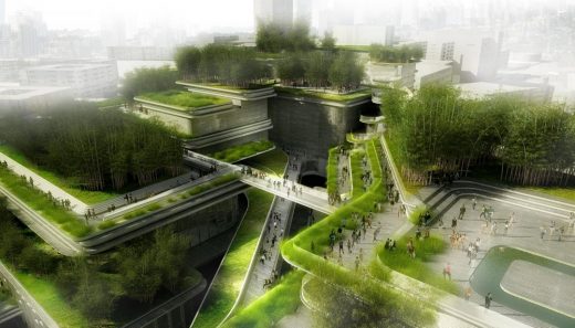
image from architects
Chengdu City Music Hall Complex
Valextra Flagship Store
Architects: Neri&Hu
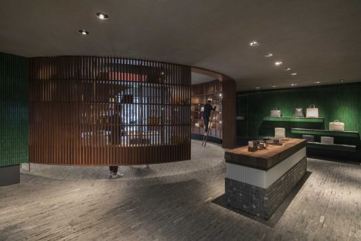
photograph : Pedro Pegenaute
Valextra Flagship Store
Design: Steven Holl Architects
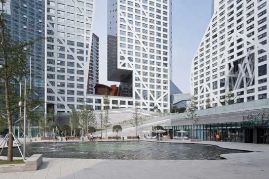
photo © Iwan Baan
Chengdu Building Complex
Design: Massimiliano and Doriana Fuksas
Chengdu Tianfu Cultural Centre
Design: Adrian Smith + Gordon Gill Architecture
Chengdu Tianfu Great City
Design: Steven Holl Architects
Linked Hybrid
Design: Nikken Sekkei
Bank of Chéngdu Headquarters
Architecture in China
China Architecture Designs – chronological list
Chinese Architect Studios – Design Office Listings
Tianfu One Exhibition Gallery in Chengdu
10 Design Shenzhen architects office
Comments / photos for hug City Flagship Store, Chengdu City designed by ATMOSPHERE Architects page welcome

